2021.06.16
Let’s Think About Composition!
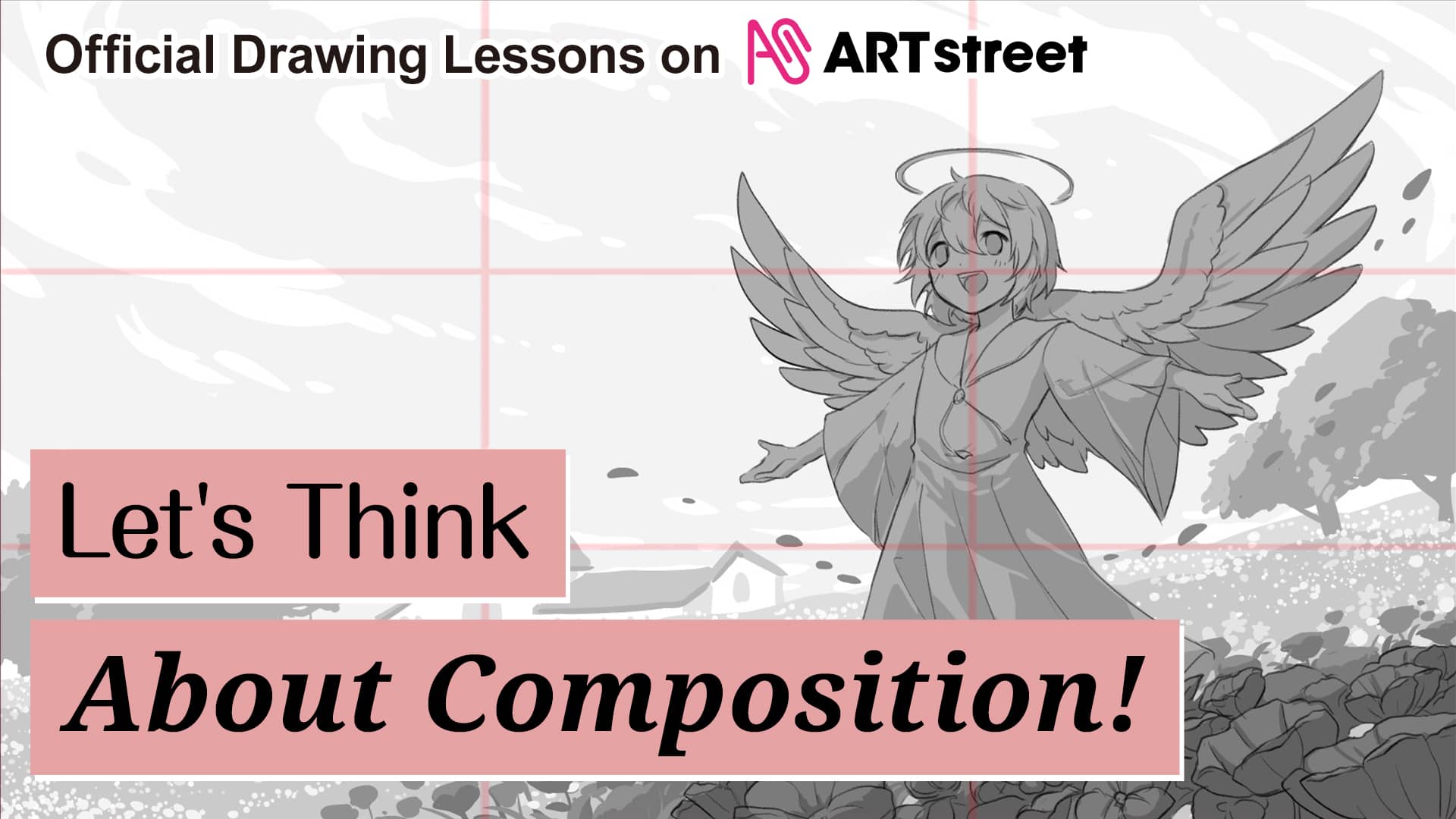
Composition is the key to express a theme or message.
This article will introduce the rules, concepts, and tips of composition, along with some simple examples.
Furthermore, I will show you how to start thinking about the composition from scratch, so please refer to it.
-What is Composition?-
When you see illustrations on the Internet or SNS every day, you also see some comments that say “The composition is great!” and “The composition is cool!” right?
Composition refers to the arrangement of elements such as characters, backgrounds, and small objects to form a picture.
“Powerful”, “Dynamic”, “Epic”, “Vast”.
What causes these sensations and emotions in the viewer is the fact that the composition matches well with the theme of the picture. Conversely, if the composition is well done, it not only conveys the intention of the creator but also manipulates the impression given to the viewer.
Many things make up a composition, such as “color,” “lightness/darkness and contrast,” “visual guidance,” and so on, but this time let’s think about composition in terms of grayscale silhouettes.
-Canvas Size and Proportion-
Before deciding on a composition, you may be wondering, “What should I do about the size and proportion of the canvas?
If that’s the case, please refer to these ratios.
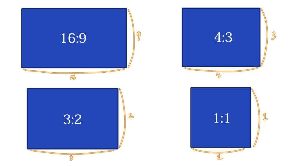
These are all that we call “ratios that look beautiful to humans.”
【16:9】・・・1920x1080px is common. This is the ratio often used for videos.
【4:3】・・・1024 x 768px is common. This is the ratio used for TVs and computer monitors.
【3:2】・・・1080x720px is common. This is a ratio used for film photography.
【1:1】・・・The ratio of a square used for social networking icons etc.
Another effective method is thinking of a composition within a set ratio.
There are already presets for ratios in the app, or you can choose from presets for paper sizes such as A4 or B5.
-Composition Method-
There are rules of composition, that if you follow these guides, you will get an effective composition.
Let’s take a look at five of the most common composition methods, with brief explanations of the two main types: character-based and landscape.
①Rule of Thirds
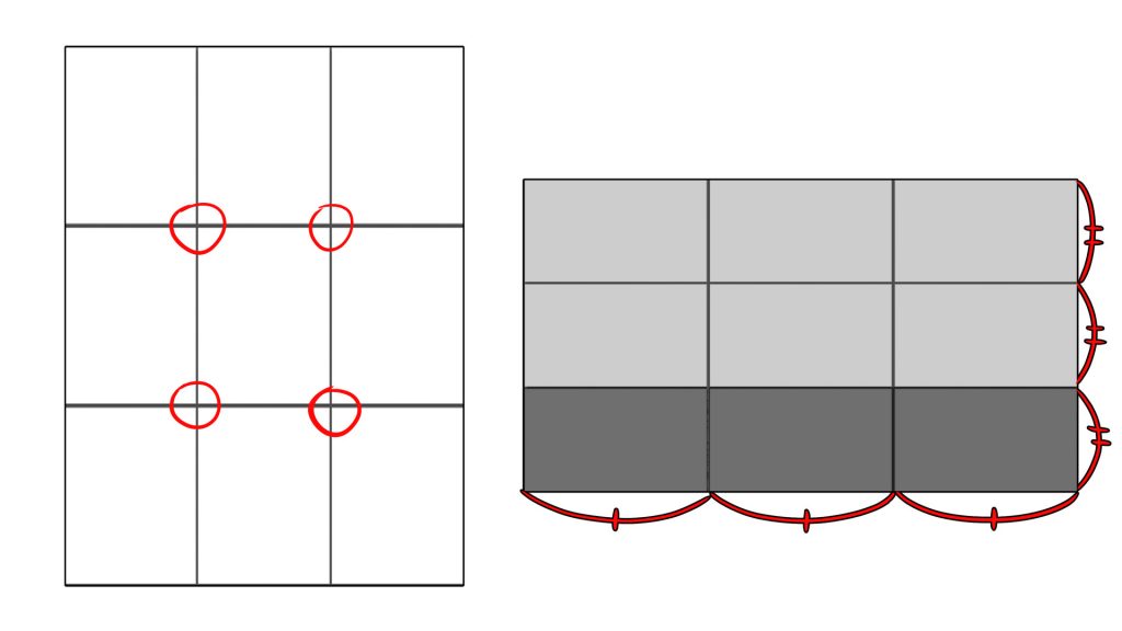
This is a composition in which the screen is divided into three equal parts vertically and horizontally, and the object to be shown is placed on the four intersections.
You can also use vertical and horizontal lines and columns.
【When should I use it?】
The rule of thirds can be used for basically any case.
It creates a sense of “stability” in the picture.
【Rule of thirds Tips】
・Place the main object at one of the intersections.
・Place the elements along the vertical and horizontal lines.
・Use columns divided horizontally and vertically to create boundaries of space and contrast.
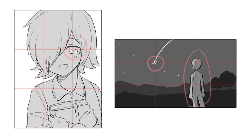
In the vertical composition, the main focus is on the eyes of the character, while in the horizontal composition, the main focus is on the person and the shooting star. In horizontal composition, the main focus is on the person and the shooting star.
These are the first things that the viewer will notice when looking at the picture.
【NG Examples】
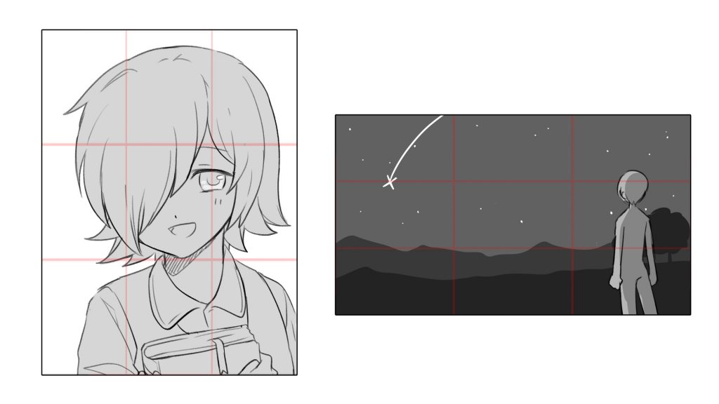
This is an NG example.
The main subject of the picture is far away from the intersection point, so it is hard to tell what the viewer is supposed to focus on when looking at the picture.
Unless there is a specific reason, the main subject should be placed at the intersection or along the horizontal and vertical lines.
【Advanced Tips】
In addition to thinking about the background along the vertical and horizontal lines, there is also the option of deliberately shifting the background.
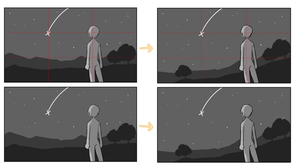
The horizontal background gives a sense of stability, but by tilting the background slightly, as shown in the figure on the right, the “depth” and “openness” of the image are greatly increased.
Also, by ignoring the horizontal and vertical lines of the rule of thirds, the effect is to focus the eye on the characters and the shooting star.
②Fibonacci Composition (Golden Ratio)
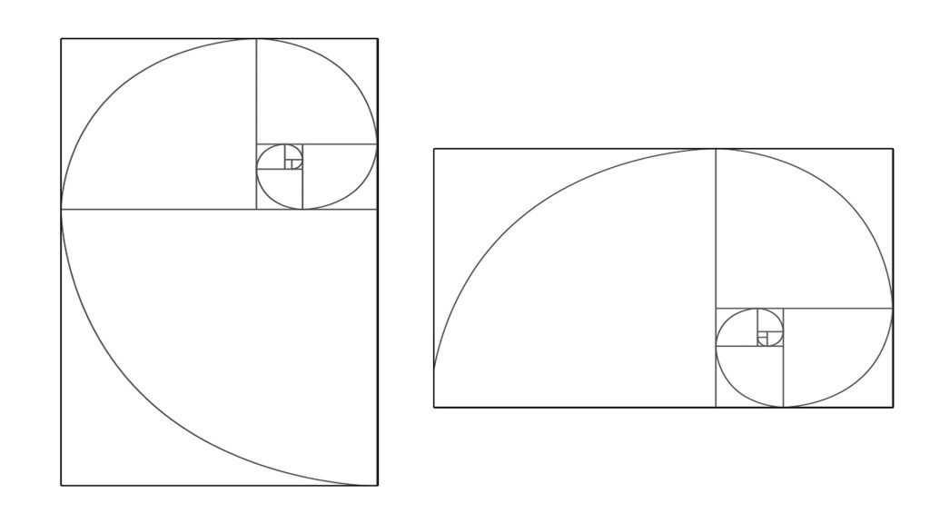
This is said to be “the ratio that people find most beautiful.
This is a composition in which elements are placed at the start of the spiral or along the spiral, and the endpoint is the one you want to show the most.
【When should I use it?】
Like the rule of thirds, this method can be used for basically any type of painting.
It is best suited for work that is conscious of the flow of the picture plane.
【Fibonacci Composition Tips】
・Place the main character at the end of the spiral.
・Place elements at the beginning of the spiral or along the spiral.
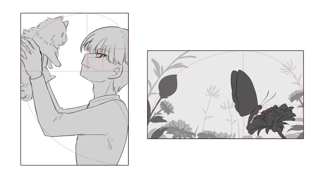
In the vertical composition, the character’s arms and dog are arranged along the spiral, and the main character’s “face” is placed at the endpoint. In the horizontal composition, the surrounding plants are arranged along the spiral, and the main character, the butterfly, is placed at the endpoint.
【Advanced Tips】
Placing elements along a spiral effectively directs the eye toward the main subject.

The example above shows the addition of clouds along the spiral.
Starting with the flower as the starting point, the eye follows the curve of the cloud and is drawn to the butterfly.
③Diagonal Composition
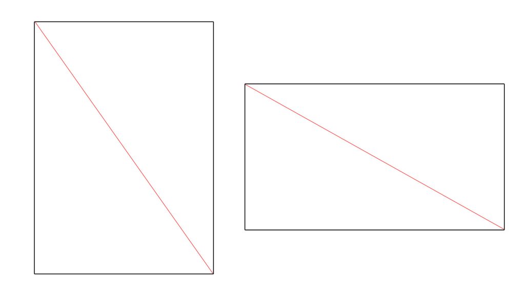
This is a composition in which you place the objects you want to show along the diagonal lines.
【When should I use it?】
This is effective when you want to add a sense of “dynamism,” “movement,” or “impression” to the picture.
【Diagonal Composition Tips】
・Place the person and background along the diagonal line.
・Separate the screen with diagonal lines.
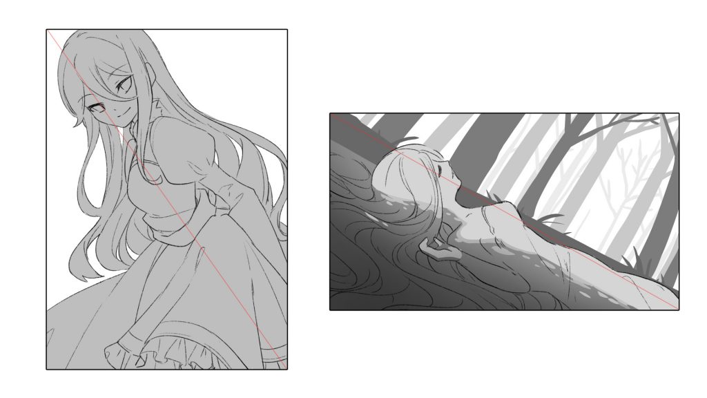
In both compositions, the character or background is placed on the diagonal.
Rather than simply placing the characters and background straight on, you can create a sense of power and movement by placing them at an angle.
【Advanced Tips】

You can also divide the screen along the diagonal like this.
By dividing the area between the character and the background, you can give the screen a more vivid look.
④Triangular Composition
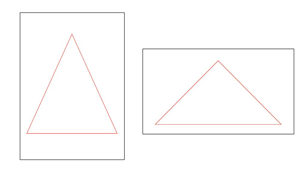
This is a composition that creates a triangle in the picture.
There is no fixed guide, and the characters and elements are placed so that they fit into the triangle placed on the screen.
【When should I use it?】
It can be used for a wide range of purposes, from standing characters to backgrounds, and can express a sense of “stability” and “cohesion” like a solid mountain. The famous painting “Mona Lisa” was also drawn with this composition.
【Triangular Composition Tips】
・Place the triangles first.
・Place the object you want to show at the apex.
・Use as wide a base as possible.
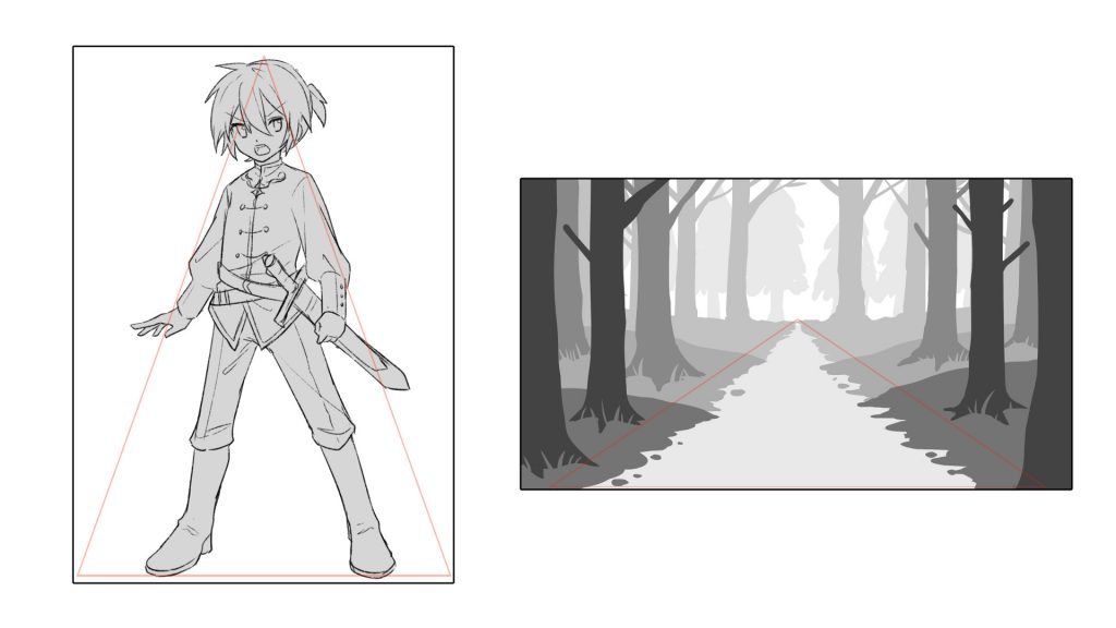
In the vertical composition, I created a triangle with the character’s entire body, and in the horizontal composition, I created a triangular composition along the path of the forest.
【Advanced Tips】
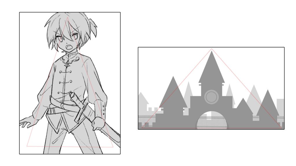
Of course, you can also use only the upper body for the characters.
It is also possible to create a triangular composition by placing a mountain, castle, building, or other tall building in the center.
⑤Inverted Triangle Composition
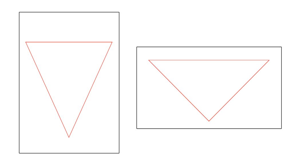
This is a composition that creates an inverted triangle in the picture.
There is no fixed guide for this either, but characters and elements should be placed so that they fit into the inverted triangle placed on the screen.
【When should I use it?】
This one can also be used for many situations.
Contrary to the triangular composition, it creates “instability” and “movement”.
【Inverted Triangle Composition Tips】
・Place the inverted triangle first.
・The angles and lengths of the triangles can be broken up.
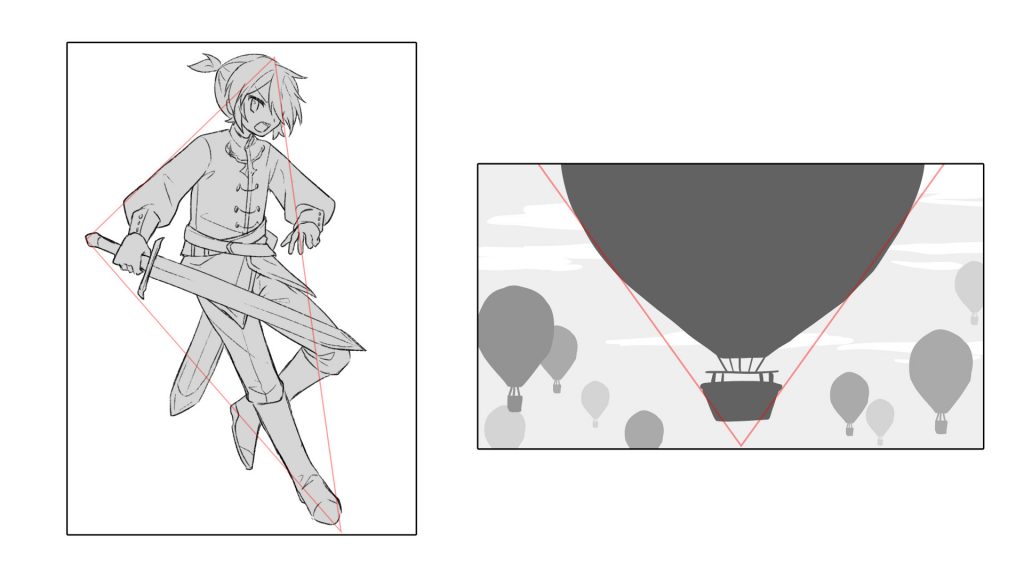
In the vertical composition, the character’s entire body is used to create an inverted triangle, and in the horizontal composition, the shape of the balloon is used to create an inverted triangle.
【Advanced Tips】
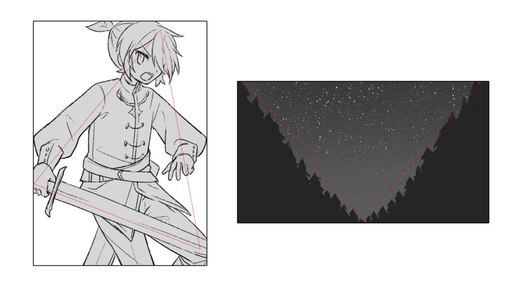
For characters, it is possible to create an inverted triangle using only the upper body, as in a triangular composition.
In landscapes, you can also use surrounding elements to create an inverted triangle instead of an “inverted triangle shape”.
-The Impression of Margins-
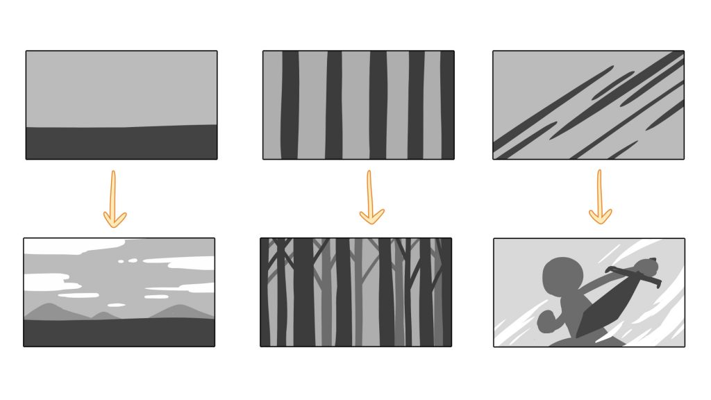
Based on the above rules, I would like to talk about the impression that margins give.
The negative space is the area where nothing is drawn.
Depending on how you use the margins, the overall atmosphere of the picture will be affected.
Let’s take a look at three examples to see exactly what I mean.
①Stability and Openness
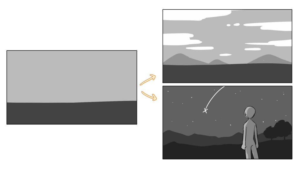
A composition with horizontal margins creates a sense of stability and openness.
It creates a sense of stability and openness. It can also create a sense of “vast and magnificent scenery”, or a sense of “time flowing slowly”.

Also, by adding a large element at the top of the screen, you can create a sense of “blockage” or “oppression” in the screen.
②Height and Rhythm
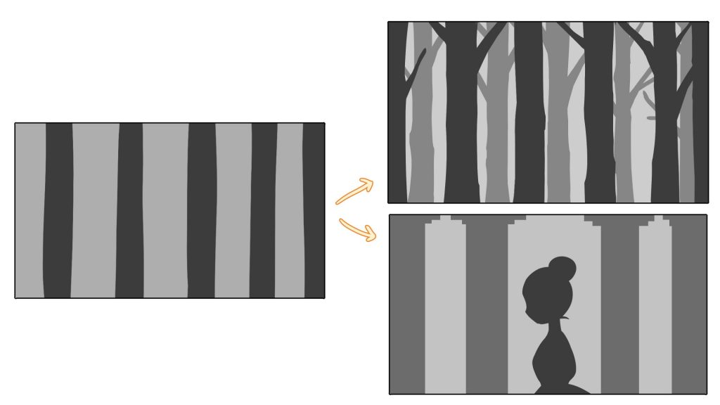
A composition with vertical margins creates “height” and “rhythm”.
The height of the trees and buildings and the rhythm of the elements arranged in a regular pattern can give the viewer a sense of rhythm.

You can also create irregular rhythms by arranging the elements irregularly so that the screen does not become monotonous, and you can also create “unexpectedness”.
③Dynamism and Instability
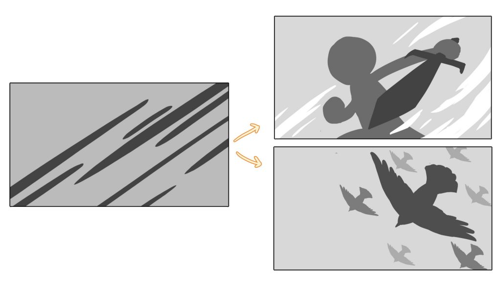
Composition with diagonal margins creates a sense of “dynamism” and “instability.

Also, depending on how the elements are arranged and spaced, it is possible to create a sense of “speed”.
As shown in the figure on the right, when elements of different sizes are lined up, “speed” and “flow” of the picture are created.
Vertical Composition or Horizontal Composition
When you are not sure whether to use a vertical or horizontal composition, it is a good idea to base your decision on what you want people to see.
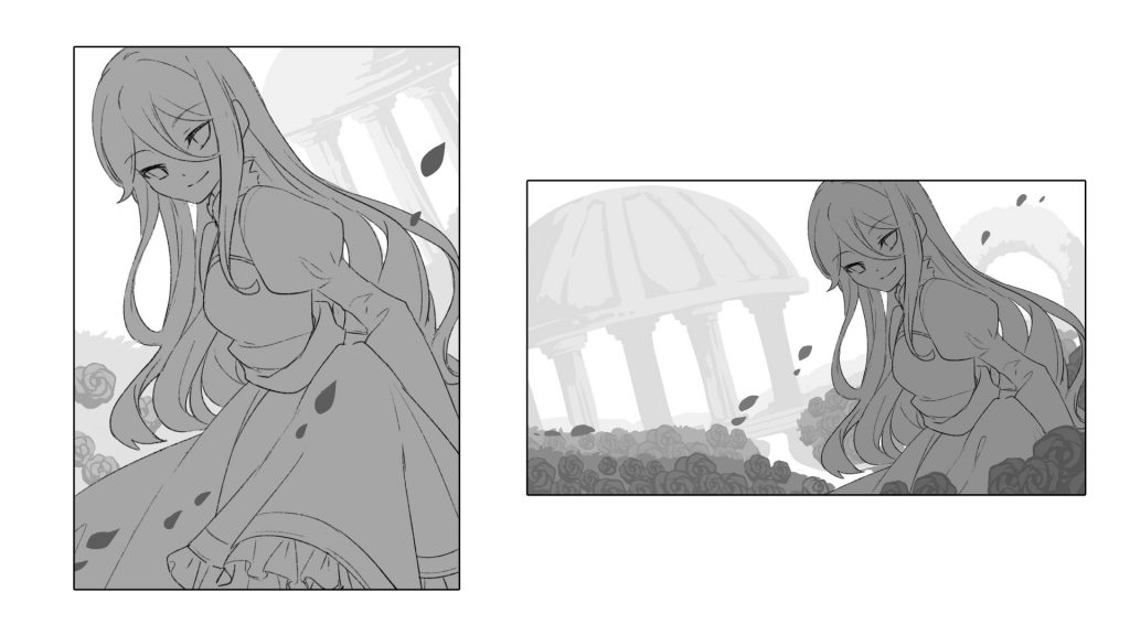
In this example, the vertical composition gives a close-up view of the “character,” while the horizontal composition pulls the camera back a little from the character to convey the “breadth of space” and “view of the world.
Vertical composition is used for works where you want to show a character or a specific motif on a large scale.
The horizontal composition is best suited for works that emphasize scenery and worldview, such as movies.
-The process of deciding composition-
Finally, I would like to practice the sequence of events from conception to composition.
①Theme
First, please decide on a theme and think of something to draw, such as “a girl,” “the night sky,” or “a cat,” and let your imagination run wild from there, like an association game.
In this case, I chose the theme of “an angelic girl singing in a flower garden.
②What do you want to impress?
Next, think about the “impression” you want to make with the theme.
It is better if you have a setting that allows you to imagine the scene in as much detail as possible.
For example, It’s good to think about “what kind of appearance and character the angel girl has,” “when she is in the flower garden,” and “what, how, and why she is singing.”
“A kind-hearted angel girl is singing a joyful song in a vast field of flowers under a blue sky.”
“An angel girl, wounded in body and soul, sings alone in a small flower garden at night.”
Just by adding a few words, I think you will be able to visualize it quite clearly.
In other words, if you have a little “story” in mind, you will be less likely to stumble in the following process.
This time, I chose a story about an “A kind-hearted angel girl is singing a joyful song in a vast field of flowers under a blue sky.” To convey this theme, I need to give a positive impression of “fun,” “openness,” and “freshness,” so I’ll keep them in mind.

③Main Element
Next, let’s write down the main elements of the story.
From the sentence “A kind-hearted angel girl is singing a joyful song in a field of flowers with a clear blue sky,” we can see that the main character is “a kind-hearted angel girl.” From the sentence, “A kind-hearted angel girl” is the main character, “a field of flowers” is the secondary character, and “a clear blue sky” in the background.

④Placement
Now that the elements have been decided, it is time to place them.
This is where compositional methods such as the “rule of thirds” and “Fibonacci composition” come into play. You can use these guides as a starting point, or you can draw out the image in your mind first and then match it to the guide.
In this case, we will use the “rule of thirds” to compose the image on a 16:9 canvas.
Let’s start with a rough drawing.
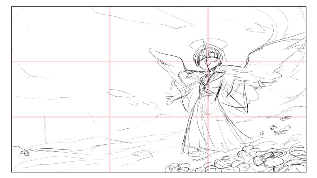
The placement can be decided by silhouette or lightly drafted with lines first, as shown here, so proceed in a way that suits you.
The main angel should be put firmly at the intersection.
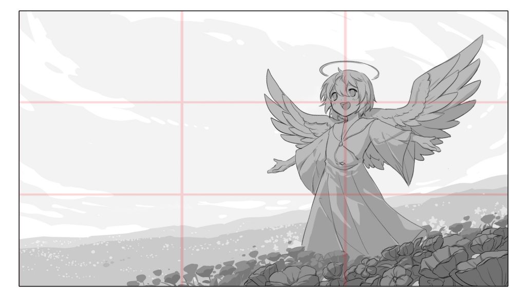
Once you’ve decided on the general placement, adjust it up a bit.
⑤Add Details
The last step is to add additional elements that do not interfere with the main one.
(You can of course do without them if you feel they are not necessary).
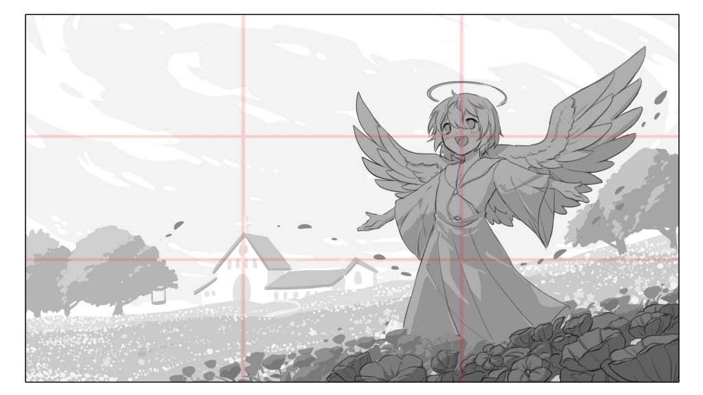
Petals and trees are added to create a breezy, refreshing atmosphere and sense of nature. I added the church, which is associated with angels, to the background.
The composition adds depth and freshness to the picture and also gives a sense of the world.
There is no problem in fleshing out the story that you have thought of at the stage of deciding the impression later.
(Be careful not to deviate too far from the original theme to prevent the theme from becoming blurred.)
That’s it! Thank you for reading this article!
What did you think?
Many elements make up a composition, such as “guiding the viewer’s eye,” “light and dark, contrast,” and “color,” but if you can think in terms of “silhouettes,” as I did this time, I think you will make fewer mistakes when thinking about composition.
I would be happy if you can understand the fun of creating various compositions.
CopyRight:星灯れぬ
Click here for the collection: https://medibang.com/u/Caphricina/
Click here for the interview: https://medibang.com/page/interview/Lenu/
twitter: https://twitter.com/Caphricina02
https://lenulenushi.wixsite.com/fesria
\ We are accepting requests for articles on how to use /


