2022.10.27
【For Beginners】Easy to put into practice! Ideas and tips for portrait illustration backgrounds♪
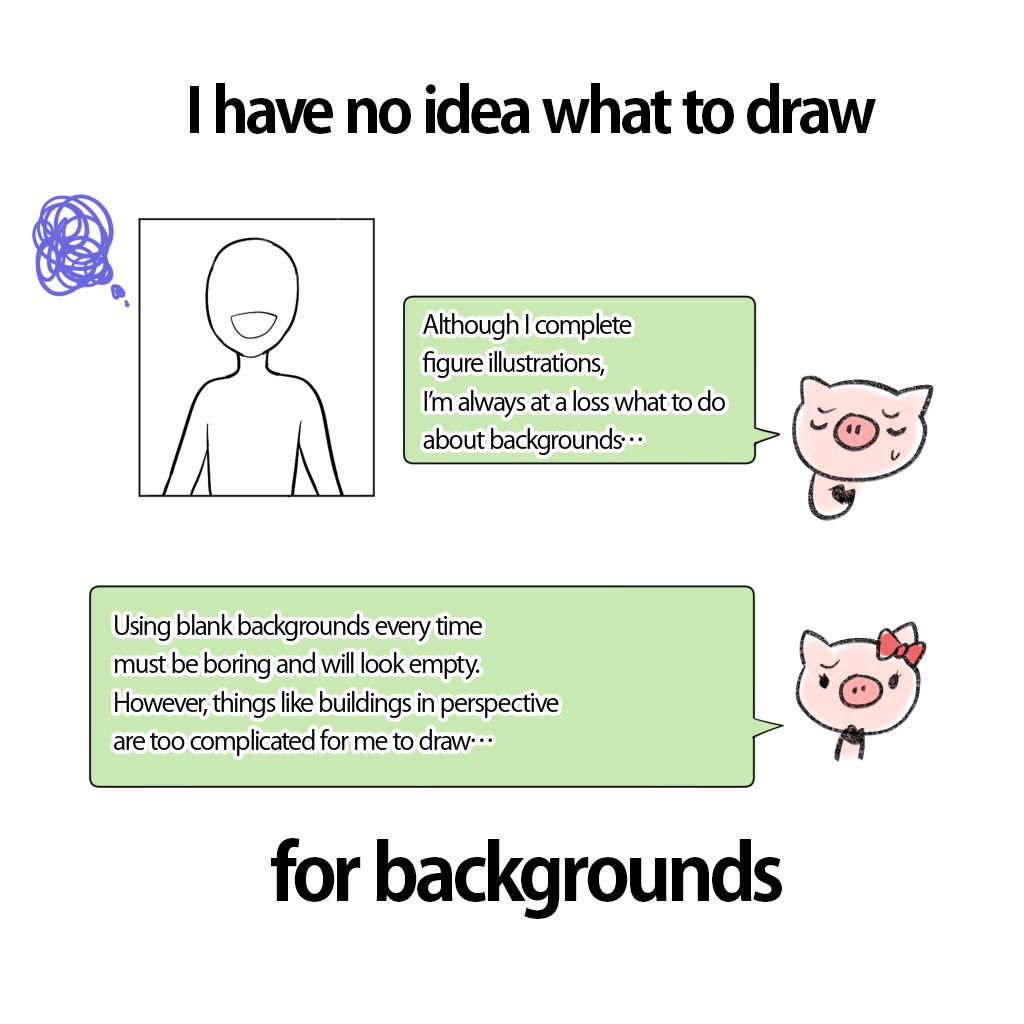
- I’ve finished drawing my favorite character!
- Now I’ve got used to drawing people a bit!
- But I have no idea what to do about backgrounds!!
I believe that not a few beginners have difficulty in drawing backgrounds.
Why not start with easier backgrounds?
What I am going to show you this time are ideas and tips for backgrounds which require no difficult techniques and are also easy to practice.
Before drawing illustrations…Think what you want a painting to look like
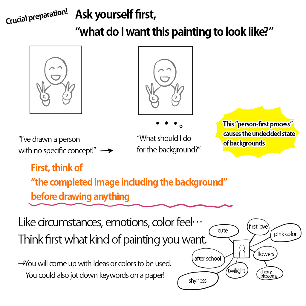
Let’s learn “the way of thinking of backgrounds”.
To tell you the truth, this preparation is the most important part of the entire process.
“I’ve drawn my favorite character with no specific concept!”→“Then what to do about the background?” Beginners tend to proceed with this stream.
This is the cause of the state where you can’t come up with the idea for backgrounds.
Think “what picture do I want as a whole?”
Before drawing characters, at the stage where you have a blank paper, you should ponder “what picture do I want as a whole?”
- What are the circumstances of illustrations?
- Is it in the morning or at night?
- How is the emotion of the character?
- Are they lively, sad, mad, or nervous?
Jot down the ideas found in your mind and pull them together.
This detailed image creation is the key to success in drawing illustrations!
Imagine “the atmosphere and colors you want to use” before drawing
Get into the habit of thinking this first.
- What kind of atmosphere do I want it to have?
- What kind of colors do I want to use?
Even for beginners who cannot draw buildings or landscapes, or do not understand perspective, this will save themselves the trouble of deciding on a background design.
Let’s practice! Background idea examples
①Solid-color background
②Patterned background
③Background with figures or objects
④Background with blurred-color nuance
①Solid-color background
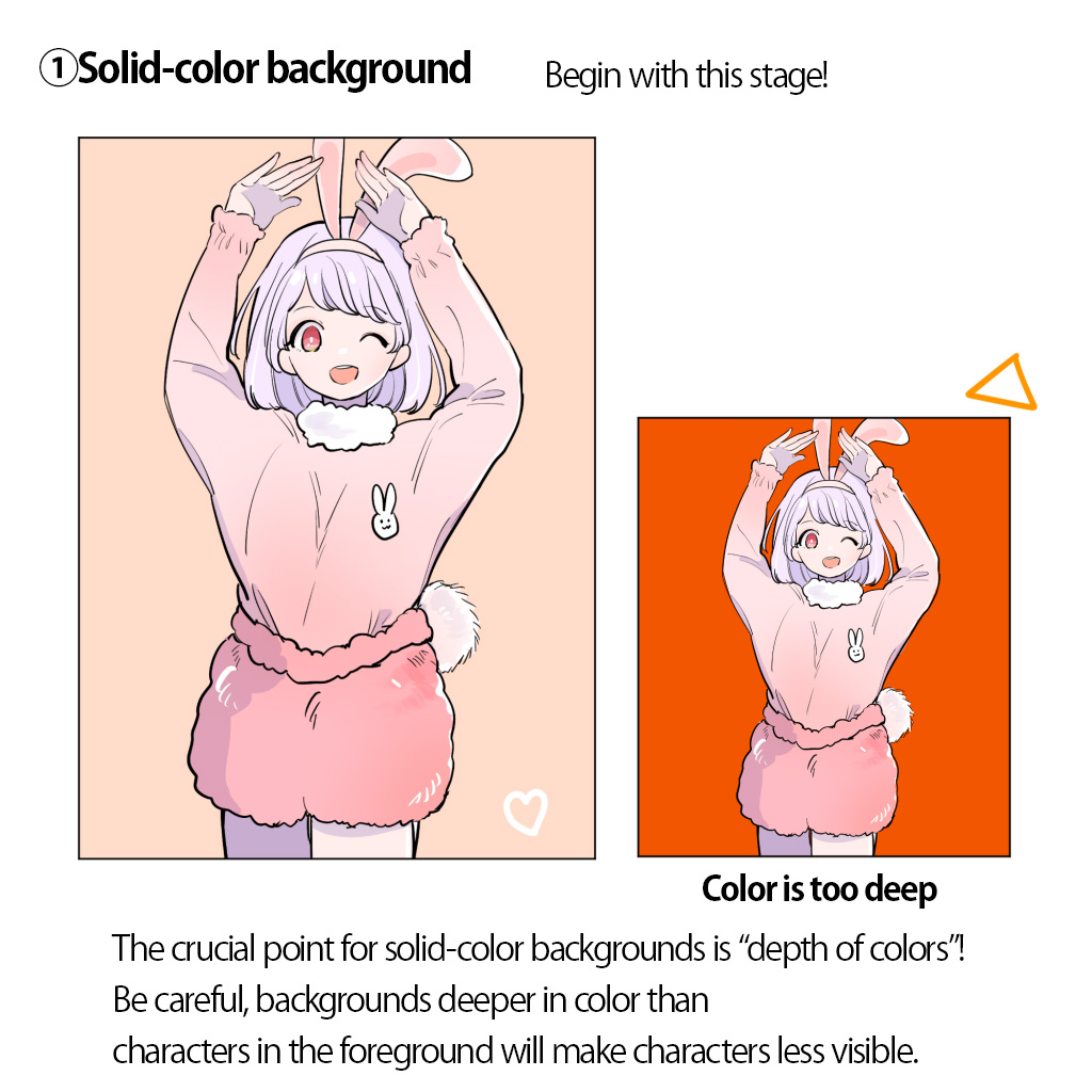
This is the background which is solid-painted in your favorite color.
You should start with this background!
What matters is how you select colors
Since this is a simple background, color matters.
The primary aim is to make the characters stand out.
Choosing too deep color will diminish the character’s visibility.
Choose rather faint colors at first, and you should have few failures.
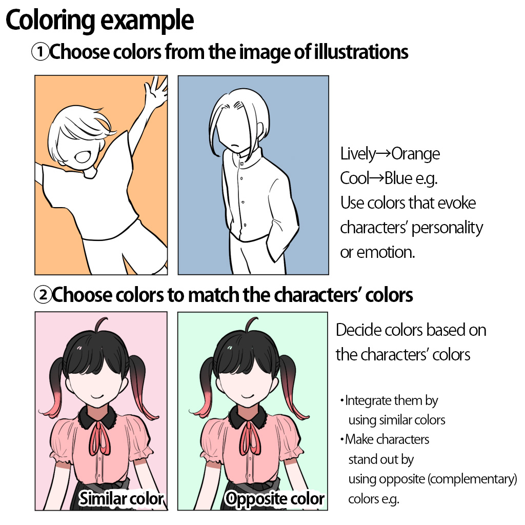
When you choose colors…
- Matching colors with images you want (lively, cool, etc.)
- Use similar colors to characters’
- Use opposite (complementary) colors to characters’
These will work effectively to stabilize illustrations.
Try out various colors!
Choose gray when you couldn’t decide!
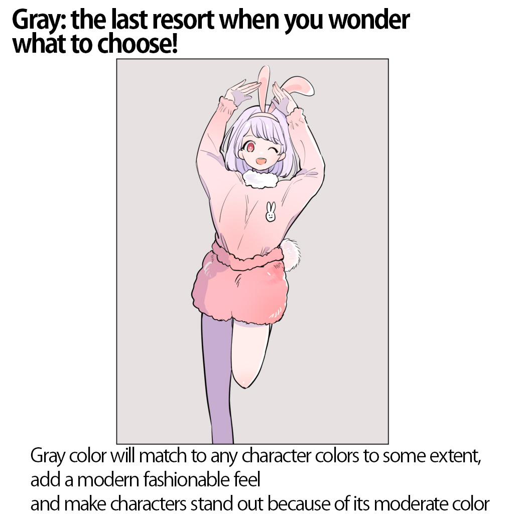
When you face trouble deciding colors and are like “no color matches!”, the “Gray color”, the last resort, is versatile and can add some stylish feels.
The color leaves something to be desired for depicting brightness.
Although, it works well to make the illustration look modern with no special effort.
Application: Trim the solid-background into shapes you like
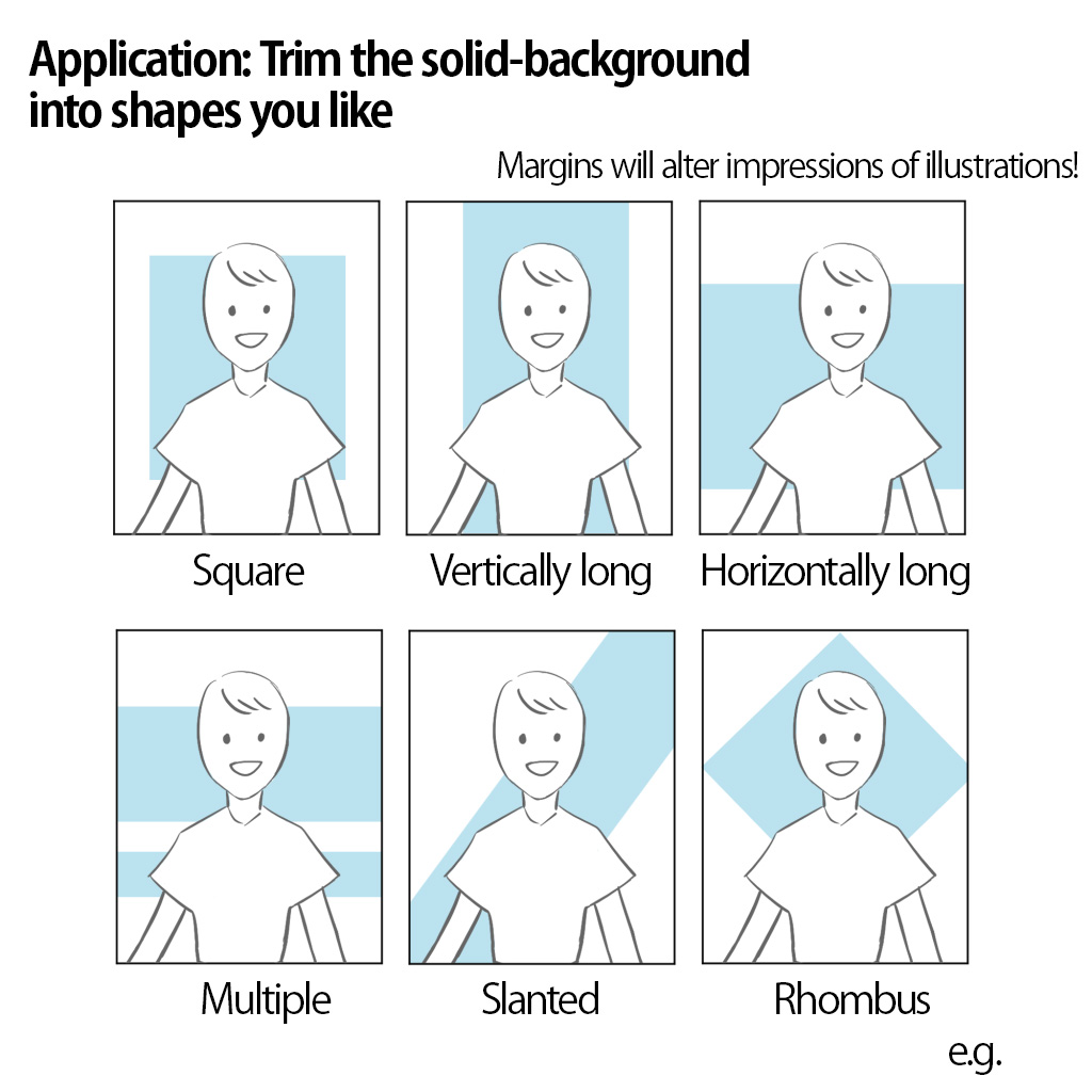
Earlier, we used solid-painted backgrounds, but it’s also fine to use backgrounds with blank margins or trimmed in square.
This technique allows you a range of applications, for instance…
- Use a square to highlight the face of a character
- Use a vertically long square to highlight the nice figure of a character
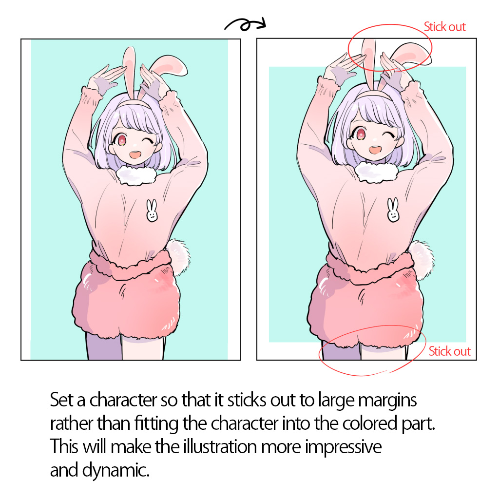
You’d do well to put a picture of people so that it sticks out from the colored part. It will add action and impact to the illustration.
②Patterned background
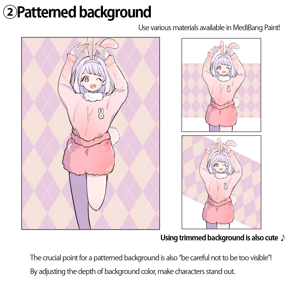
Polka-dot, diamonds, camouflages, etc…
Try out various materials for patterns which are available in MediBang Paint.
Or you could use websites where you can get complimentary cute materials.
The crucial point is “stay modest than character paintings”
All you need to remember when using patterned backgrounds is “stay modest than character paintings”!
If patterns are standing out too much, you can
- Make them faint by reducing opacity
- Trim them just like solid-color backgrounds
Read more about the usage of MediBang Paint materials↓
[For Beginner] How to Use Materials on MediBang Paint
You can draw them by yourself
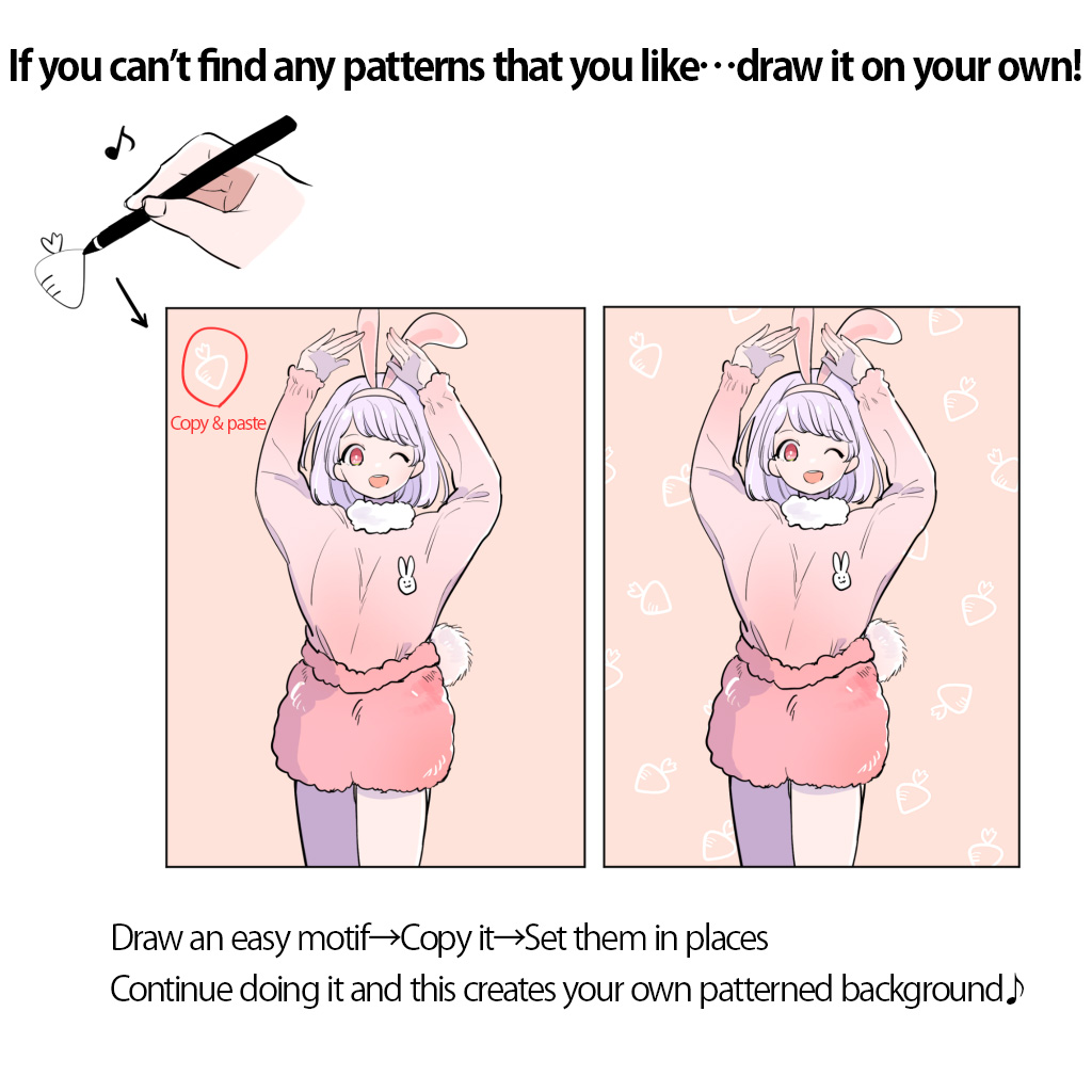
If you think “there’s no pattern that I feel right!”, you can draw them by yourself.
This is a low-key work to draw easy freehand motifs.
Designs made by this procedure will fit into these cute pictures.
③Background with figures or objects
For those who think “using a solid-color background must be unexciting! but I can’t draw full-fledged landscapes!”, why don’t you try backgrounds with large figures or objects?
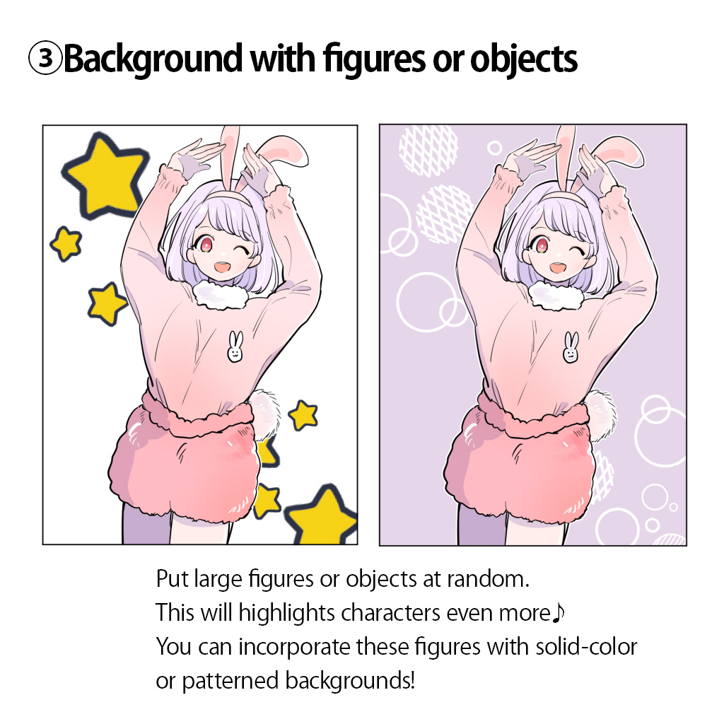
☆The point when adding large figures
Compare these two pictures below.
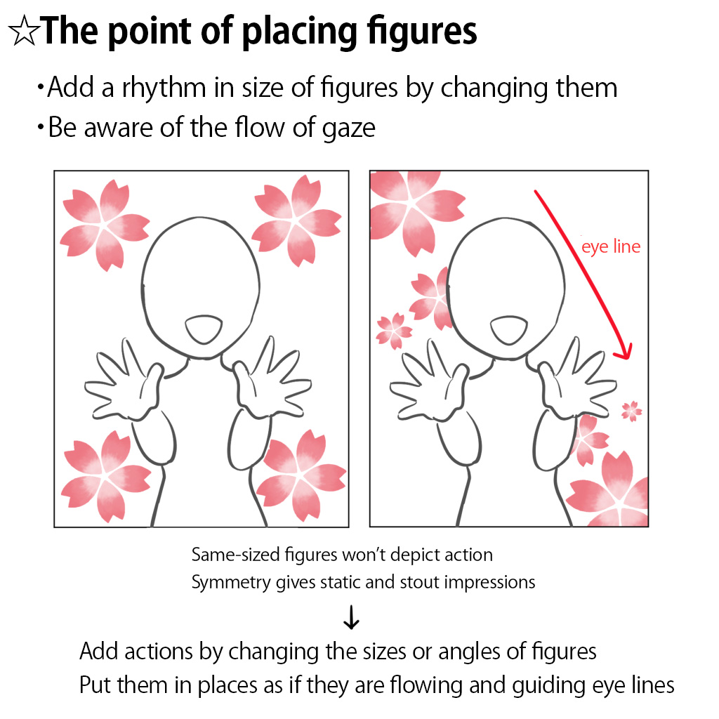
- Vary the sizes of figures
- Be aware of the flow of gaze
In these two pictures, the same character and motif are placed. The motifs used in the left picture are the same size, while that of the motifs in the right varies.
Also, the impression the work gives may differ profoundly depending on where the motifs are placed.
In the left picture, the motifs are isolated from each other. Conversely, the motifs in the right picture are arranged as if they flow from the upper left to the lower right along the character.
Such arrangement adds the action to the illustration and as a result, the right picture looks more lively.
Try to be aware of the flow of gaze once you get used to choosing backgrounds.
④Background with blurred-color nuance
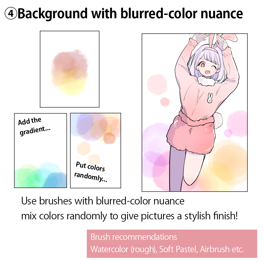
Arranging some soft designs with no specific shapes is also a great idea!
Add the color gradient, or you could just put some mixed colors randomly to make the work gorgeous.
There’s no rules in particular, but remember the basic priority as before: “characters come first”.
Use brushes with nuance such as…
- Pastel
- Crayon
- Watercolor
When the background doesn’t fit in…Blur the background! The extra technique
We have learnt ideas for backgrounds so far.
After deciding the design of the background, you will start painting. However, it is possible that you will find that the finish of the background comes to be different from what you have thought, like “the background is somehow not fitting in…”
I want to make the character stand out more and add some emotional feel, while retaining the placement or patterns of the background!
If that is the case, blurring the background is easy and useful as an extra technique!
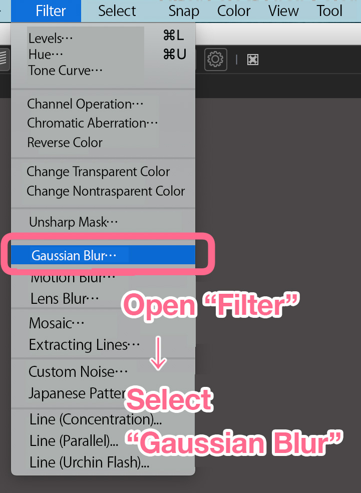
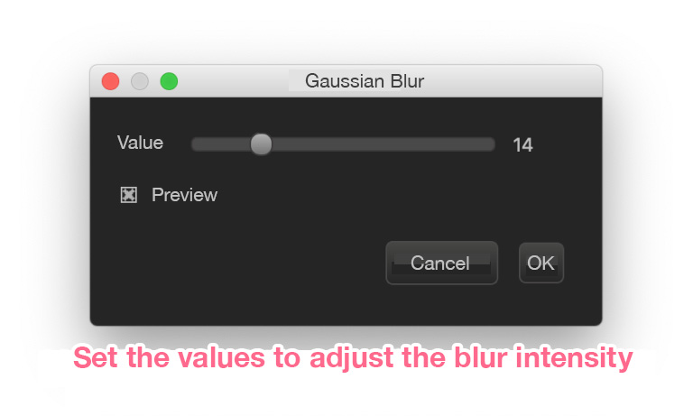
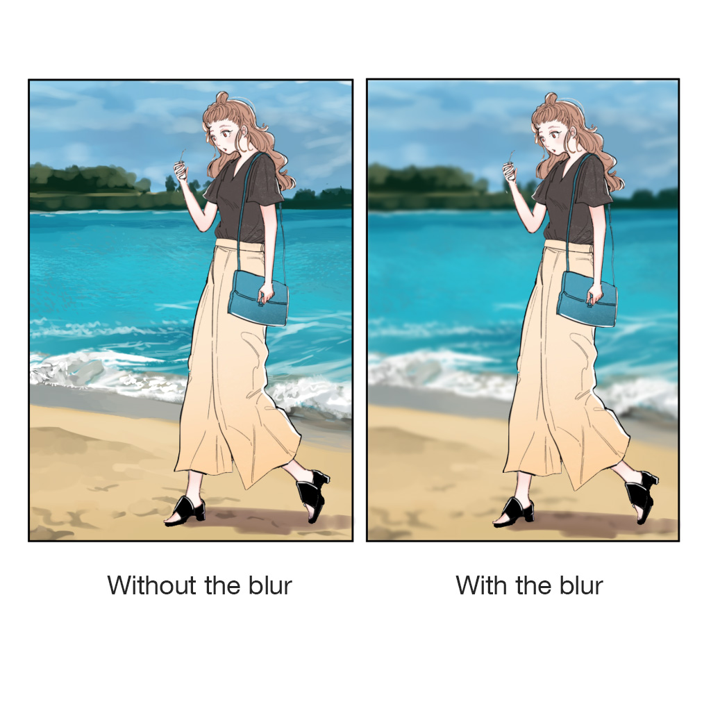
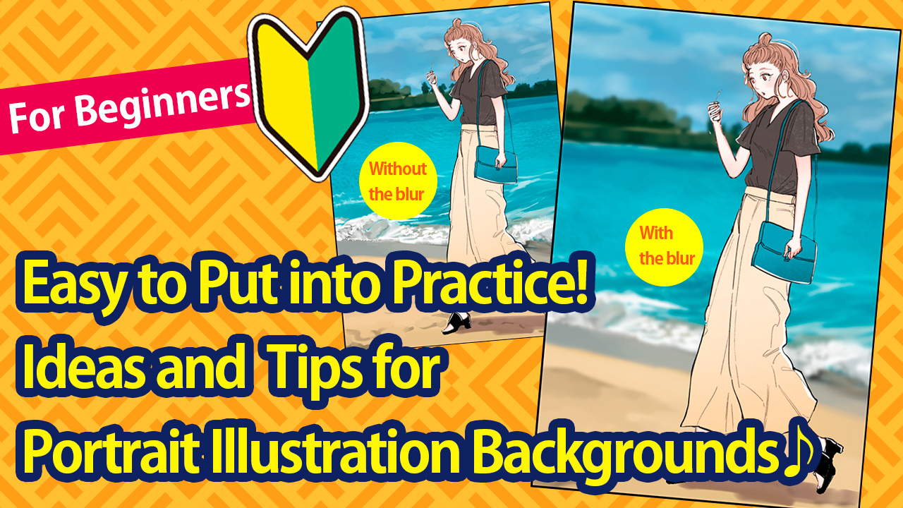
Choose the background layer and open the “Filter” → “Gaussian Blur” from the menu bar, and adjust the value (blur intensity).
The Gaussian Blur adds the depth in the picture and makes the character stand out!
Conclusion: the enchantment of illustrations can be multiplied depending on the background depiction!
So these are the easy models of backgrounds for beginners.
- Before drawing illustrations…Think what you want a painting to look like
Think “what picture do I want as a whole?”
Imagine “the atmosphere and colors you want to use” before drawing - Let’s practice! Background idea examples
①Solid-color background
・What matters is how you select colors
・Choose gray when you couldn’t decide!
・Application: Trim the solid-background into shapes you like
②Patterned background
・The crucial point is “stay modest than character paintings”
・You can draw them by yourself
③Background with figures or objects
④Background with blurred-color nuance - When the background doesn’t fit in…Blur the background! The extra technique
The enchantment of illustrations can be multiplied depending on the background depiction!
Starting with the one you find easy, try out various backgrounds, and I hope you will find the one you like!
(Illustrations・Text/はらなおこ)
\ We are accepting requests for articles on how to use /


