2022.11.16
Rotate your illustration! Drawing with a powerful composition
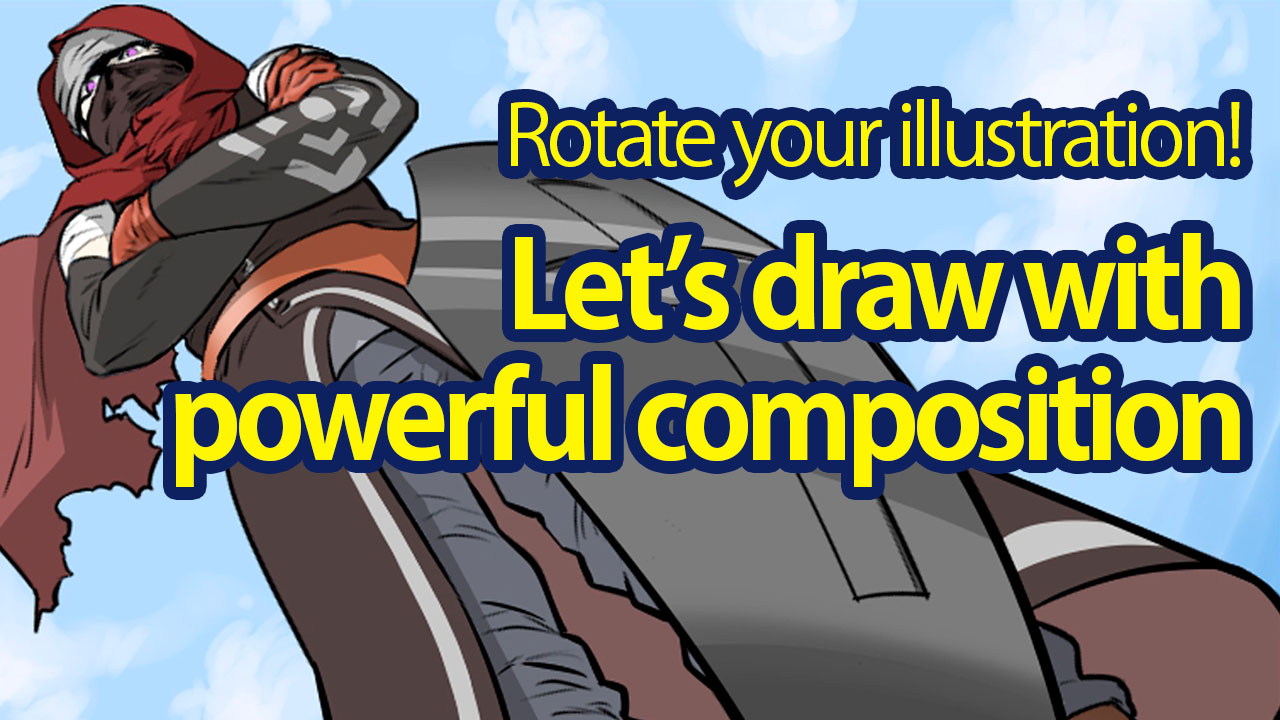
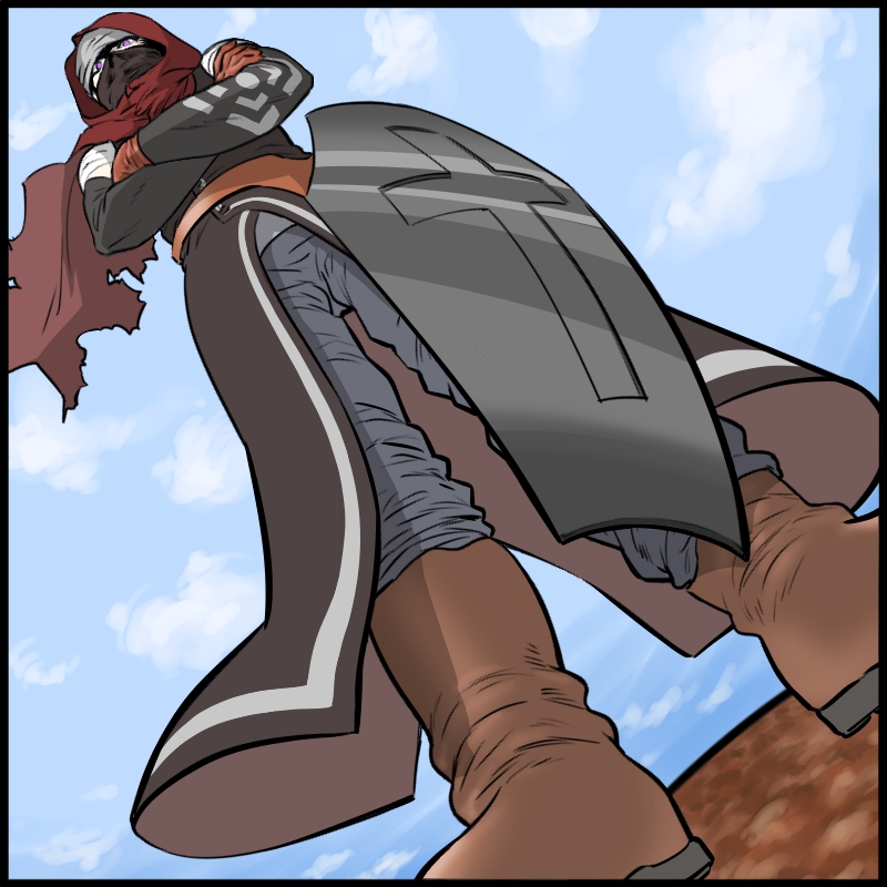
Do you pay close attention to the composition of your illustrations?
Even if you look them up on the internet, it seems difficult since there are too many ways to pick and decide on your composition.
If you know the secret to the right “way of showing”, you can aim to portray certain moods or emotions and target the intended effects.
In this tutorial, I will be introducing easy compositions you can use to upgrade the strength and power of your illustration.
Let’s add dynamics to a motionless picture!
Comparing compositions
If you have a reference illustration you can use, take them for comparison.
Look at the two illustrations below, which one feels more powerful?
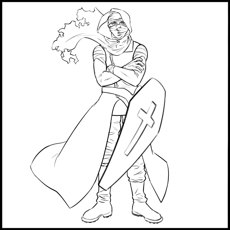
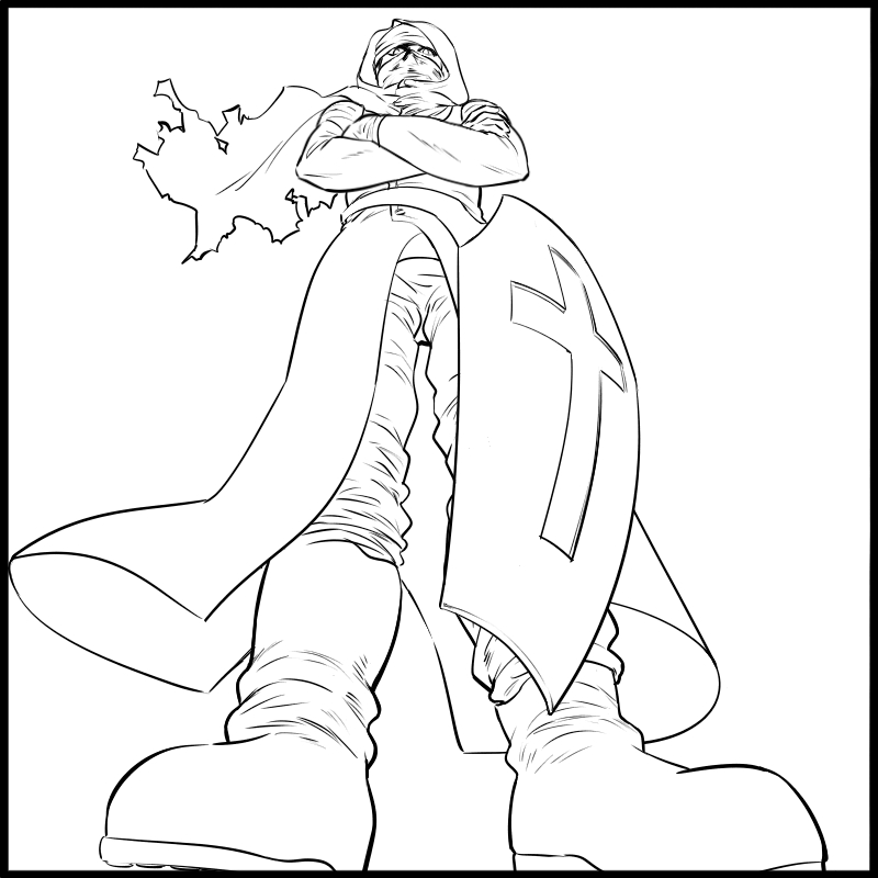
I’m sure many of you felt that the second one has much more strength.
How do the two compositions compare?
I will explain as I make a single illustration.
Rough sketch with a regular composition
I will be drawing a human character.
If you know what character you want to draw, decide on the rough design using the regular composition facing the front.
I’ve created a proper line drawing in the image below but you can keep it as a rough sketch.
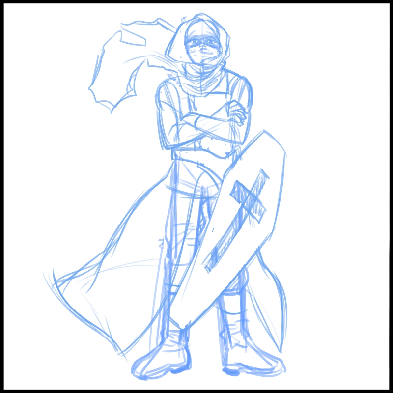
This is the design I decided on.
Pick the expressions
Next, think of what you want to portray in the illustration containing this character.
The two major compositions for a motion picture (of a human/building) are ① “High angle” and ② “Low angle”.
They differ in the intended effects so think about how your illustration would be categorized.
① High angle (Looking down)…
Weakness, ability gap, short (height), height of the current position, hates to lose… etc
② Low angle (Looking up)…
Coercive attitude, strong atmosphere, tall (height), power/authority, strong mentality… etc
I think the low angle composition suits best for this illustration.
Using the sketch as reference, draw it in a composition of the character looking down.
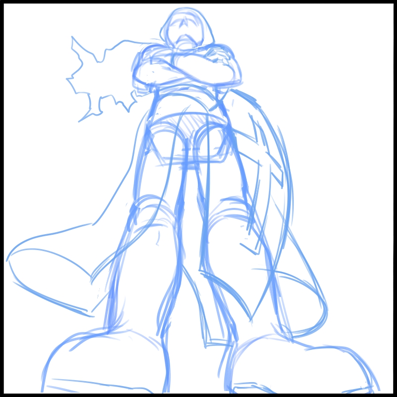
Create depth with perspective
You can also use perspectives to portray power and force.
Don’t overthink it.
The most important thing here is to draw the main part of the character large.
There is a method to draw it small but that is only for a special case like when you want to create distance for the main part.
The basic rule is to make the main part large so it stands out well.
First, think of what you want to draw as the “main part”.
The best way is to think of it like a word association game.
What is the first thing you want to tell someone who looks at your illustration?
Example 1:Strong passion and wish of the character…
①Through their eyes → Eyes or facial expression as the main
②Through the clenching pose → Clenching fist as the main
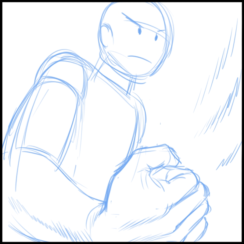
Example 2:Speed of the character…
①With a running posture → Frontal foot as the main
②Speed of the bullet train/shinkansen → Frontal train car as the main (in such cases, you can draw the main small)
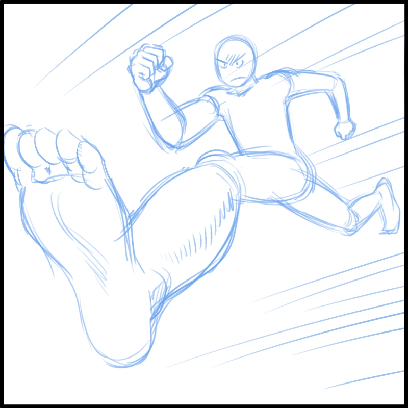
The expressions would differ a lot depending on the artist.
In my example here,
I want to portray the coercive attitude of the character and his strong mentality…
By illustrating his grounded posture → His foot and the ground as main
That is what I decided on.
Since I chose the low angle composition, the foot will naturally be huge but I will emphasize his toes a bit more.
Rotate for a powerful picture!
Let’s make the line drawing.

When you are creating a line drawing, small tricks will upgrade its powerful look.
Try making your strokes a little longer and stronger than you usually do.
Additionally, pay attention to drawing with thick lines around the top if you are working with a high angle illustration and around the bottom if you are working with a low angle illustration.
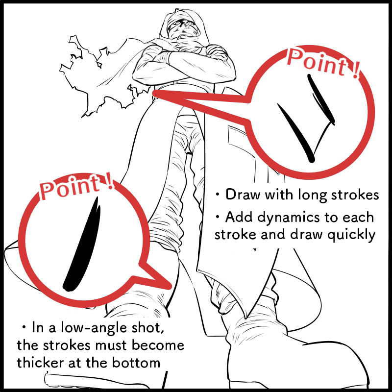
You can already feel his coercive attitude but I will add a little twist.
Keep the line drawing layer selected and from the Select tab, click “Transform”
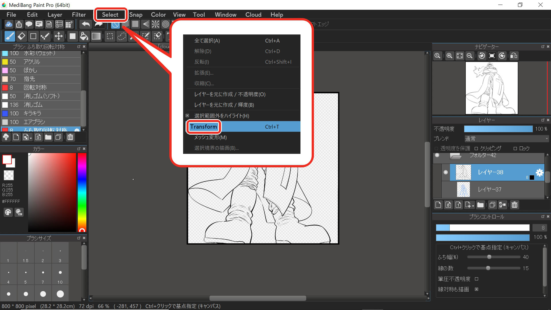
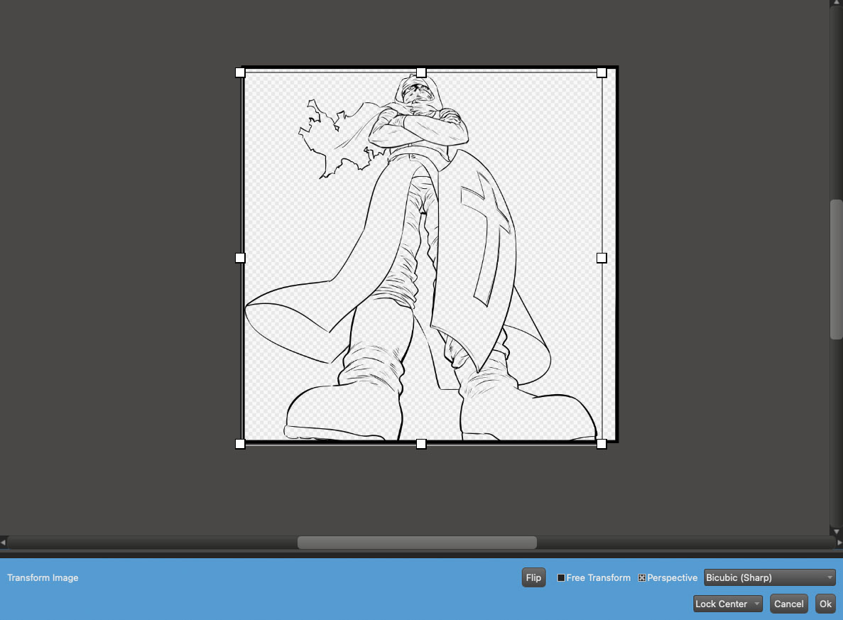
and you will see that the selected layer is surrounded by a big box frame with white squares.
If you move your cursor outside the frame, drag the cursor to the left/right and click OK, you can rotate the layer.
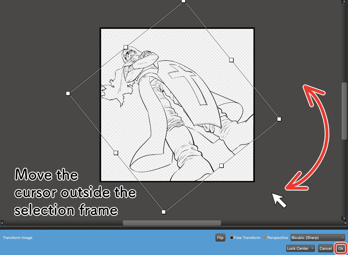
More details on how to use the “Transform” tool↓
When you rotate the layer, make sure your character is aligned diagonally to the canvas.
You can now feel more pressure from the screen since the empty spaces are divided with the diagonal line.
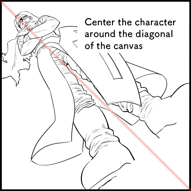
This is effective for any illustrations, including illustrations with motion since it will create dynamics and portray huge movements.
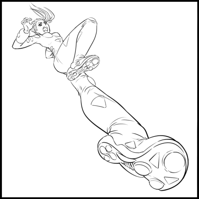
If you find the third step of redrawing in the low angle composition a little too challenging, you can also just use only the “rotate” trick.
Add force with the background
How was this tutorial?
The composition allowed me to emphasize the message I wanted to convey.
Compositions are very important for expressions so check how the other creators are selecting their composition and use them for reference.
I’m sure you will have a variety of styles of expression.
Lastly, let’s create impact with a colored background.
By making use of the distorted screen, I allowed for depth together with its role of visual guidance.
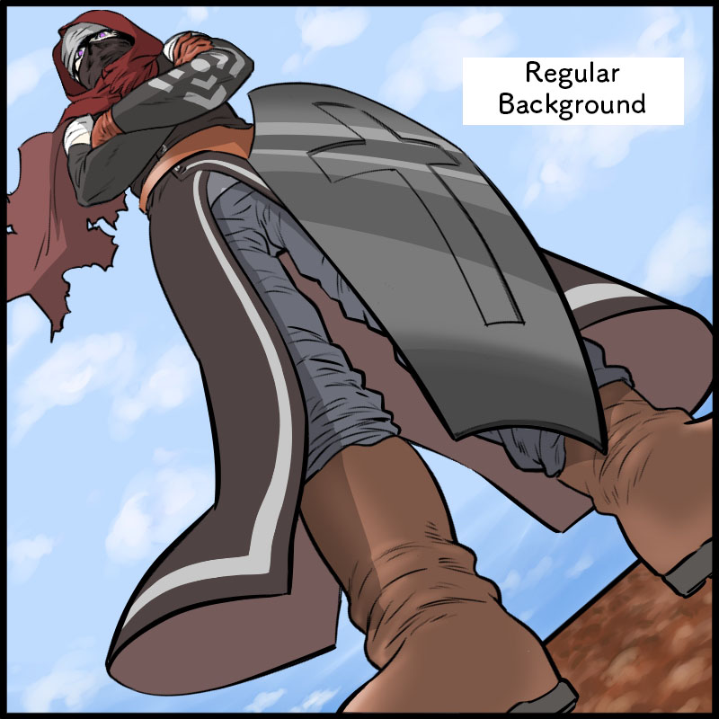
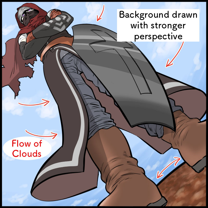
Read more about Mesh Transform to distort the screen into a spherical shape↓
『Easy fisheye lens processing with mesh deformation』
Read about “visual guidance”↓
『The Rule of Concentrated Linework! How to draw water splashes with a Japanese brush』
You don’t need complicated steps to create a unique composition.
I hope you try drawing illustrations with the method I introduced here!

(Text・Illustration/竹内 洋)
\ We are accepting requests for articles on how to use /


