2020.07.17
How to draw and shadow an attractive three-dimensional object

In this article, I’ll show you how you can make small items and backgrounds look much more realistic with a few tips.
It’s a very simple technique, so try to incorporate it into your everyday illustration work!
Draw a cube
First, let’s draw a cube.
One side is a square, so if you change the angle slightly, you get this.
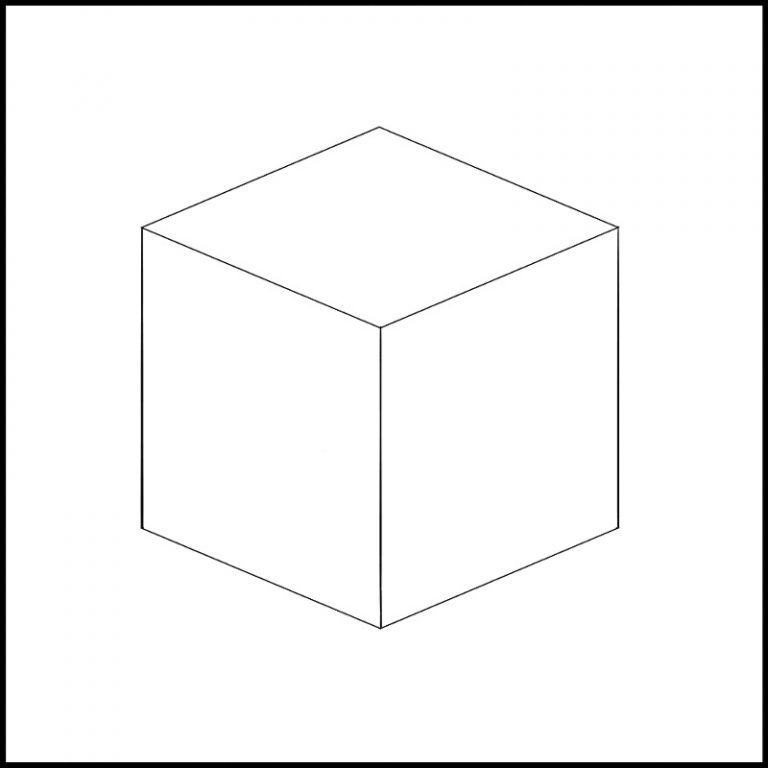
It looks like a figure, so I’ll add a shadow.
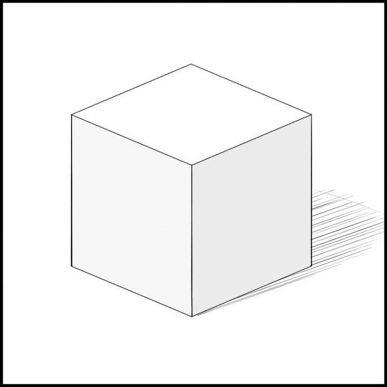
It’s not wrong, but it’s a sloppy and uncomfortable illustration.
The way the naked eye sees
Now let’s consider once again the way we see things around us from the human eye.
Suppose you have a lot of cubes lined up vertically.
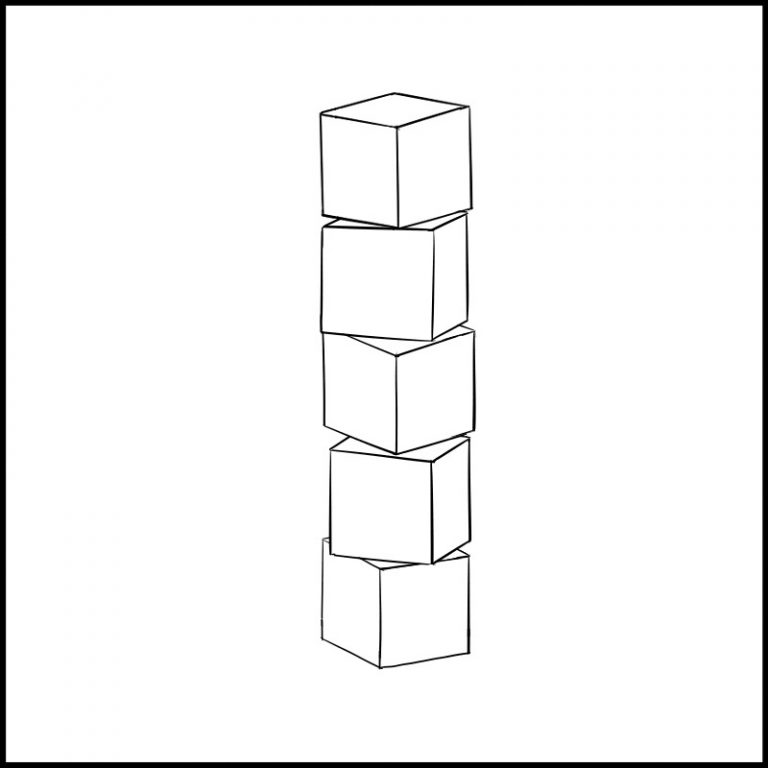
At first glance, it feels like a very natural screen, but the field of vision of a person is large in the foreground and becomes smaller as it gets further away.
We often hear the term “perspective”.
It’s a natural phenomenon,but In fact, the computers and desks you see today are also based on this principle.
In other words, if the position of the eye (eye level) is at the middle cube, the farthest point, the top and the cube at the bottom looks small.
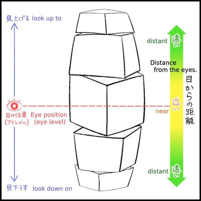
This is how it looks in extreme cases.
(This is just a modified original image, so it’s different from how it looks in real life.)
If your vision is distorted like this, you can’t walk straight.
That’s where your brain is processing the information properly.
Once you try standing directly in front of a door or refrigerator.
If you move your eyes only up and down while your head is fixed, the upper and lower sides should appear shorter.
If you slowly move your gaze up and down, it may appear to be a gentle curve as well.
Perspective drawing
Now that we know how things look, let’s take a look at a method that can be applied to actual drafting.
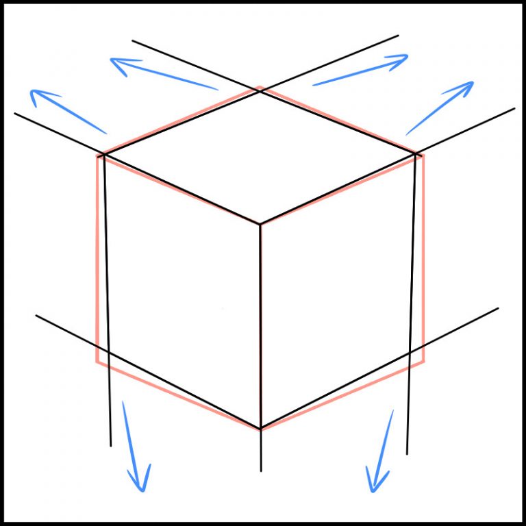
You may already be familiar with the “Perspective drawing” method, which is based on taking a point on the screen and drawing a line of concentration to that point. This is a method of drafting a three-dimensional object.
Depending on the need, there are 1-point perspective, 2-point perspective and 3-point perspective.
Let’s try to draw the cube shown in the previous example using the 3-point perspective method.
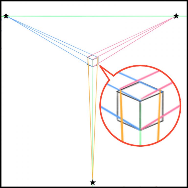
You can see that the lines are a bit off from the first cube I drew.
If I redrew it from this…
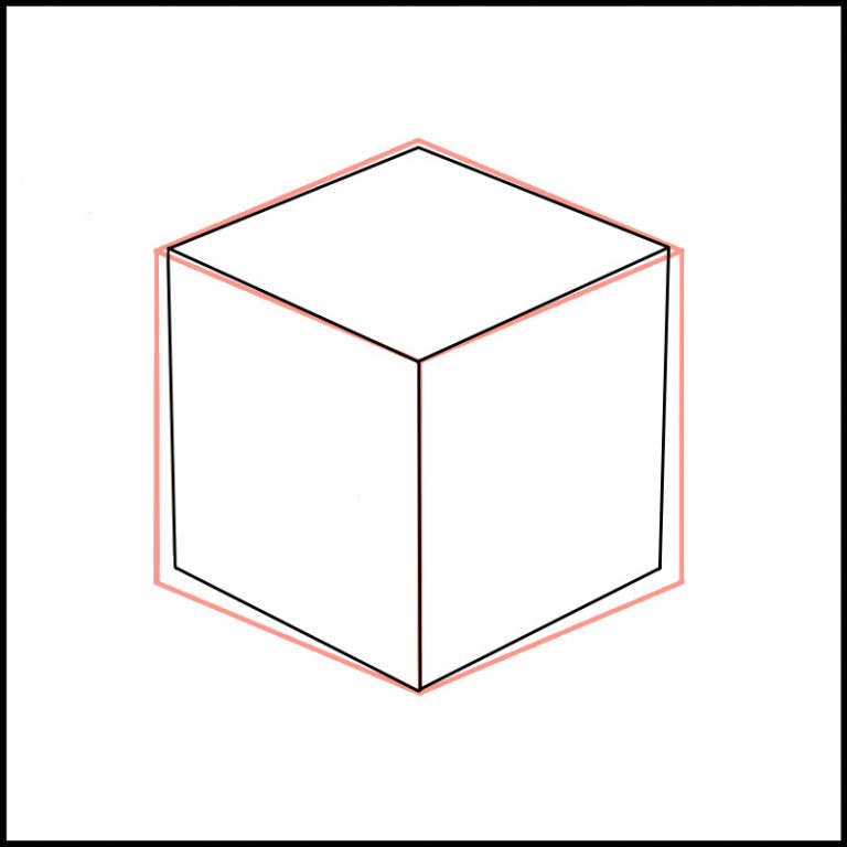
(The red line is the first cube I drew.)
It’s now squeezed inward a bit like this.
This is what it looks like when you add a shadow to it.
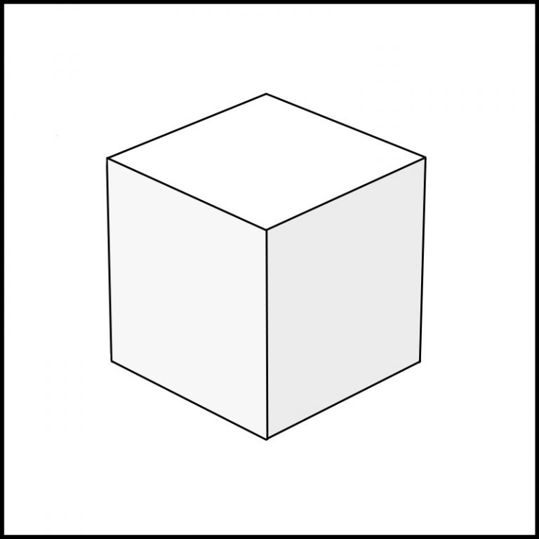
What do you think?
Doesn’t it feel a bit like a natural cube?
Backgrounds, for example, can be made very convincing by using this drawing method, especially in the background.
You can’t use this method for all the little things, etc., so squeeze the lines inward just a little bit. It’s a great way to create a natural and realistic illustration.
How to Add Shadows
Finally, I’ll show you how to create a shadow.
The size and shape of the shadow is determined by the direction and height of the light source.
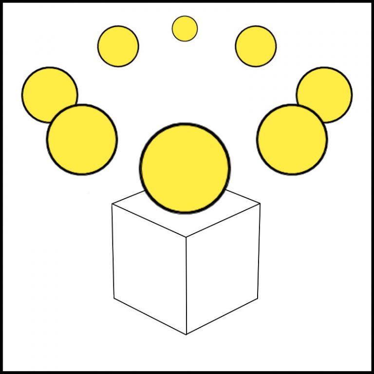
The light source can be hit from anywhere in 360 degrees like this: in front of the object, behind, low, high, far, or near. Possibly.
Decide whether it’s sunlight or fluorescent light and its position in the room, which is roughly right.
If the shadows are unevenly distributed on the same screen in the illustration, there will be a strong sense of discomfort.
In order to make the shadows uniform, you need to decide on the light source.
Now let’s decide on a light source in front of the cube and a little lower than 45 degrees.
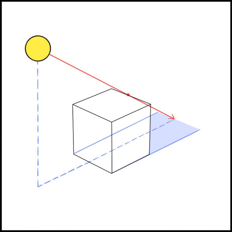
Draw a straight line from the light source, passing through the top of the object and reaching the ground at the point where it reaches the top of the shadow.
Don’t care about the detailed shape of the object or the exact position of the light source.
・If the light source is in front of you, the shadow is at the back, and if it is at the back, the shadow is in front of you.
・The shadows are longer if the light source is low, and shorter if it’s directly above.
Just remember these two points.
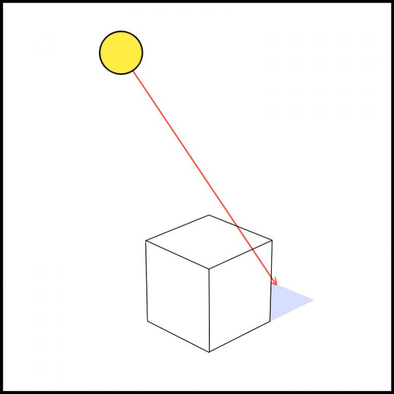
(The higher up the light source is, the shorter the shadows.)
An illustration with perspective and light source in mind
I’ve redrawn the cube again.
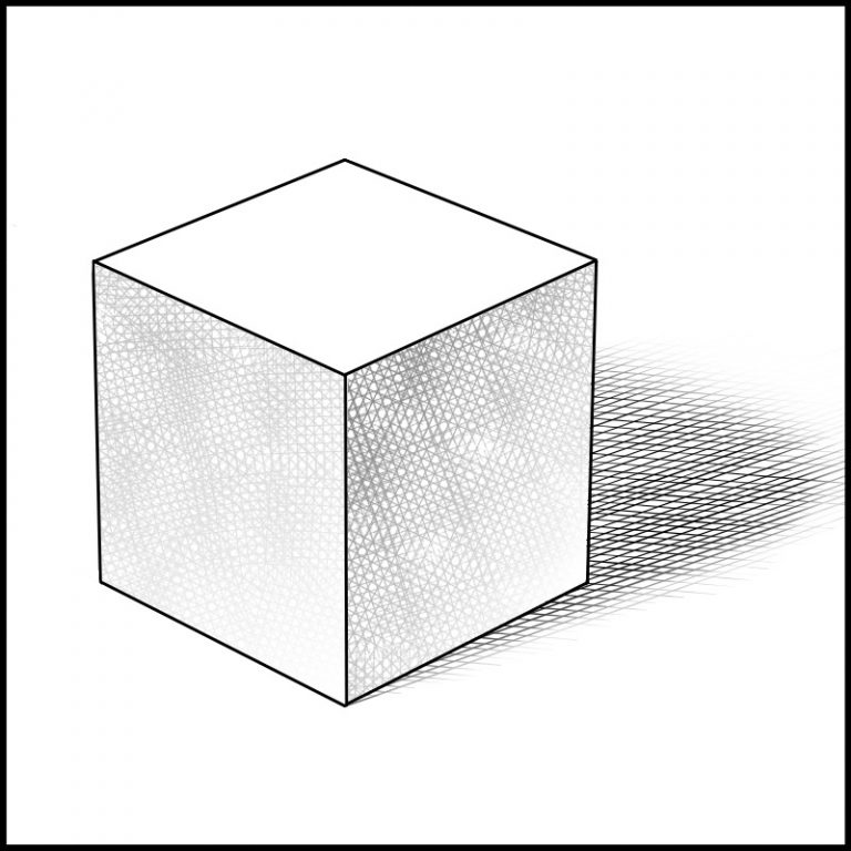
Can’t you feel the weight, solidity and depth of a cube?
Thanks to the shadows, I’ve been able to express how firmly it is grounded in the ground.
By the way, blurring the outline of the shadow creates a nice atmosphere!
You don’t have to have a perfect perspective and an exact light source set up for every illustration.
Just keep these two things in mind for a little while and you’ll have a very attractive illustration… ♪
You must try it!
\ We are accepting requests for articles on how to use /

