2020.09.02
Let’s have some color!

Index
1. Introduction
Even when the same line drawing is painted in color, just changing the color can completely change the image.
Color is such an essential element in creating the atmosphere of an entire picture.

In this article, I would like to introduce the three attributes of “color” and how to make the most of them in painting.
2. The three attributes of color
First of all, the three attributes of color are Lightness, Saturation, and Hue.
3. Lightness
The higher the brightness of a color, the brighter it is, the closer it is to white, and the lower the brightness, the darker it is, the closer it is to black.
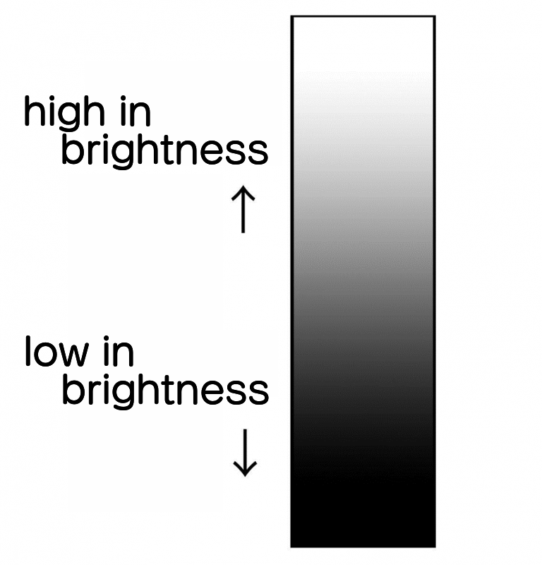
If you have a black box and a white box, as shown in the image, the black box looks heavier than the white box.
The higher brightness makes the box look lighter and softer, while the lower brightness makes the box look heavier and harder.

4. Saturation
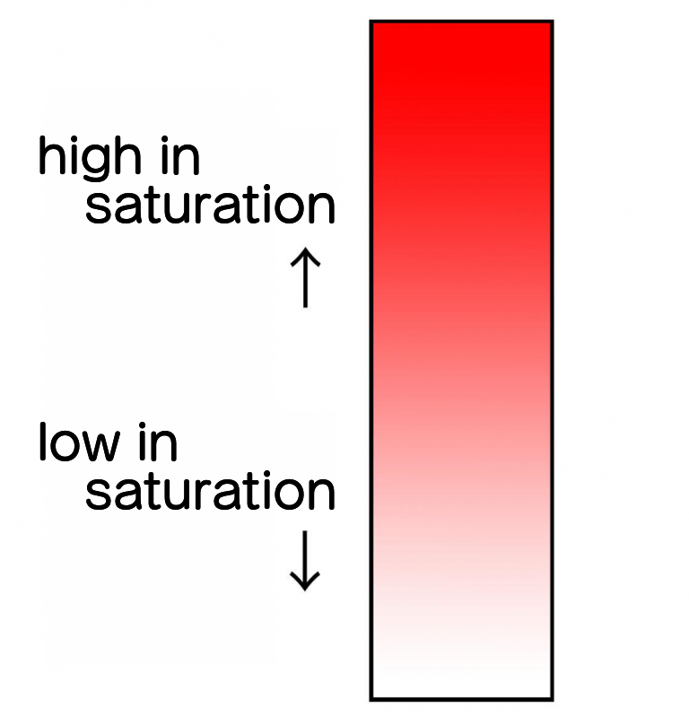
Saturation, which represents the vividness of colors, the higher the value, the more vibrant and energetic the colors are, and the lower the value, the weaker and calmer and calmer the impression.
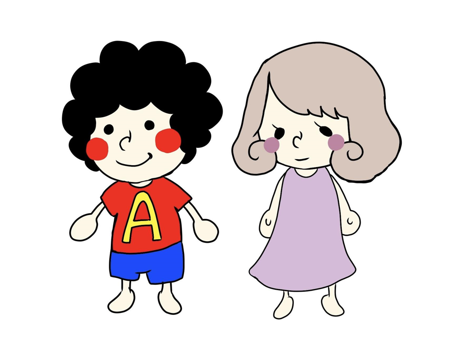
So if you want to draw a bright and cheerful child, you can use highly saturated clothes, and if you want to draw a fragile and gentle woman, you can use less saturated clothes to create a more atmospheric look.
5. Hue
Finally, the “hue” represents the colors of red, blue, yellow, etc.

Each color has its own associated image (e.g. red is warm, blue is cold, etc.), so it’s best to incorporate them into the theme of the painting you’re working on to create the right atmosphere.
We’ll go into more detail about these color images in a separate article.
It is also interesting to note that hues have colors that repel each other or harmonize with each other, and the combination of those colors can also change the overall impression of the painting.
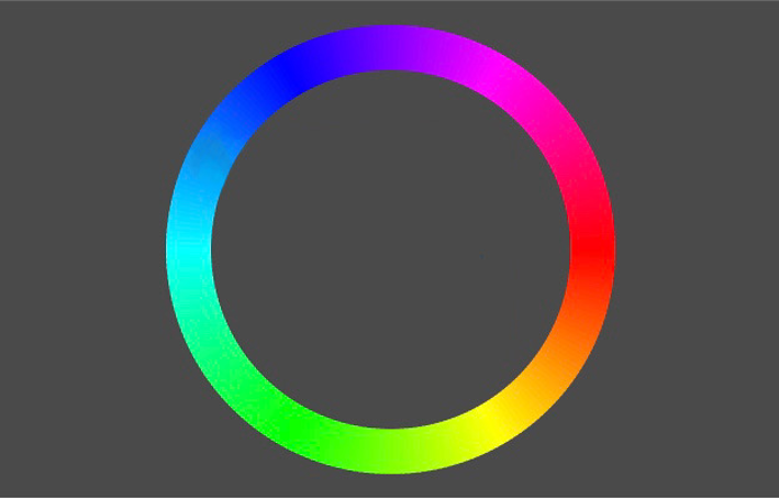
There is a hue ring which is made by connecting the colors in the form of a circle.
I think this is useful when thinking about color combinations, so please take a look at it.
Just as the rings are facing each other, they become a combination of strong contrasting colors called complementary colors.
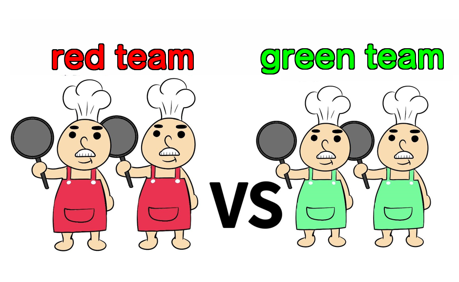
This is an effective color scheme to make the conflict between opposing forces clear, such as in a cooking competition between teams.
It is also an effective way to emphasize each other and make them stand out, as the colors seem more saturated when viewed side by side.
On the other hand, if you want to create a cohesive impression as a family or a team, it is useful to remember that adjacent colors in the hue ring are cohesive and harmonious to each other.
There are also two types of colors: achromatic and chromatic.
Achromatic colors are so-called monochromatic, and these do not have saturation and hue.
Compared to achromatic colors, the range and diversity of color combinations is less, so they are easier to match.
You can match any hue, so if you are unsure of how to choose a color, I recommend that you first try to draw shadows using only achromatic colors, then divide the painting into layers and boldly add colors.
With this method, you can get an idea of the overall atmosphere of the painting.
Now you have a general idea of what the word “color” means.
It may be hard to think of color combinations at first, but once you get used to it, you’ll be able to come up with them naturally!
\ We are accepting requests for articles on how to use /

