2021.09.06
[For beginners] Easy to see and read on your smartphone! How to make a vertical scrolling mangas!
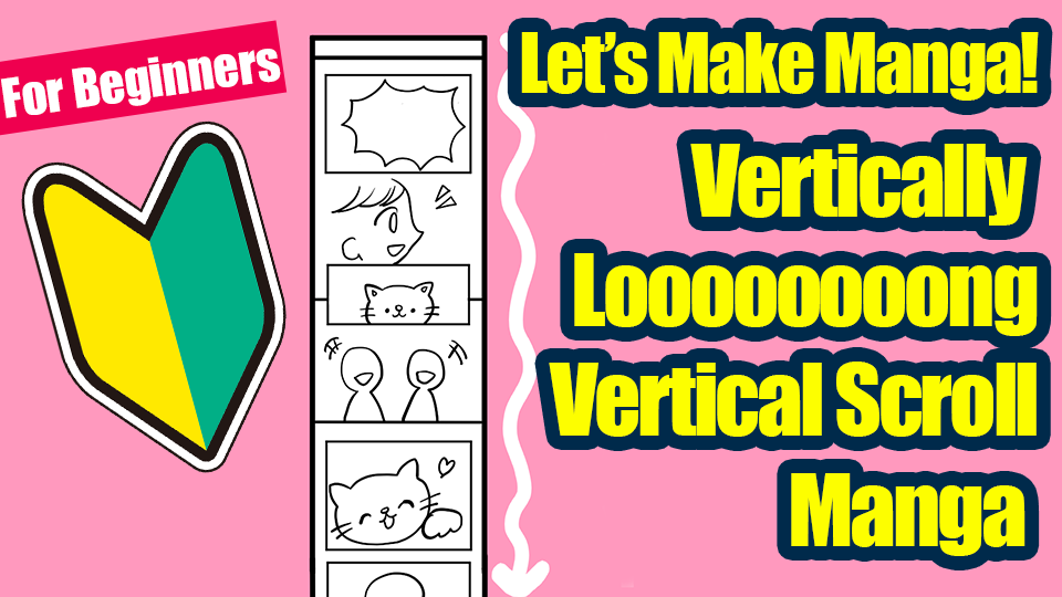
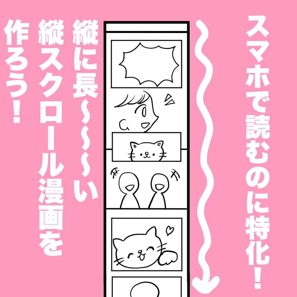
“Vertical scrolling manga” has become well established in the past few years.
As the name suggests, it is a vertically long manga specially designed to be easily read on a smartphone.
In addition to commercial mangas distributed electronically, you often see vertical fan arts on social media nowadays.
The ease of reading it from top to bottom on your smartphone is appealing!
I want to make some myself! I’m sure there are many people who thinks this way.
Vertical-scrolling comics are completely different from the “ordinary comics” that we have introduced in the previous lessons so far in terms of how to make them and what to pay attention to.
So here is a detailed explanation of how to make them.
Index
☆ Set up your canvas
The main feature of a vertical scrolling comic is that it uses a single vertical canvas.
Instead of adding a first page, a second page, and so on, as in traditional comics, you keep everything on one canvas.
There are two main ways to set the paper. .
Choose the method that is easiest for you.
Method ①: Make a vertical canvas first and draw on it
This is a method where you create a long canvas first, and then you draw on it in from top to bottom.
● MediBang Paint for PC ●
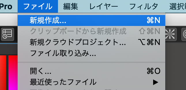
Select [File] → [New].
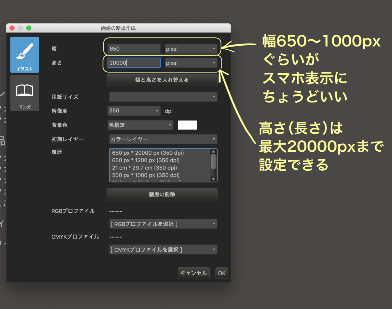
Set the [Paper Size].
Width: about 650-1000pixel
→The width varies depending on your device, but in many cases, the website your post your work will automatically adjust the manga’s width to the readers’ phone, so you should be fine if you make it this wide.
Height: up to MAX 20000pixel
In the PC version of MediBang Paint, you can set up to 20,000 pixels.
You can also cut it down later, so make sure to set it larger.
※The PC version allows you to set up to 20,000 pixels from the start, but the default vertical size for the smartphone and tablet versions is different.
If you are in the middle of working on the ipad or smartphone version, you can still extend the size to 20,000 pixels later.
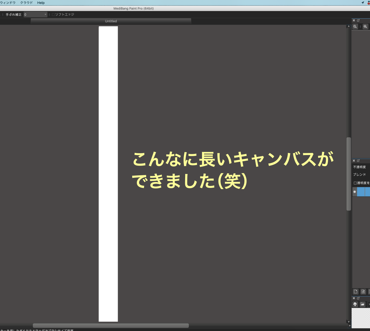
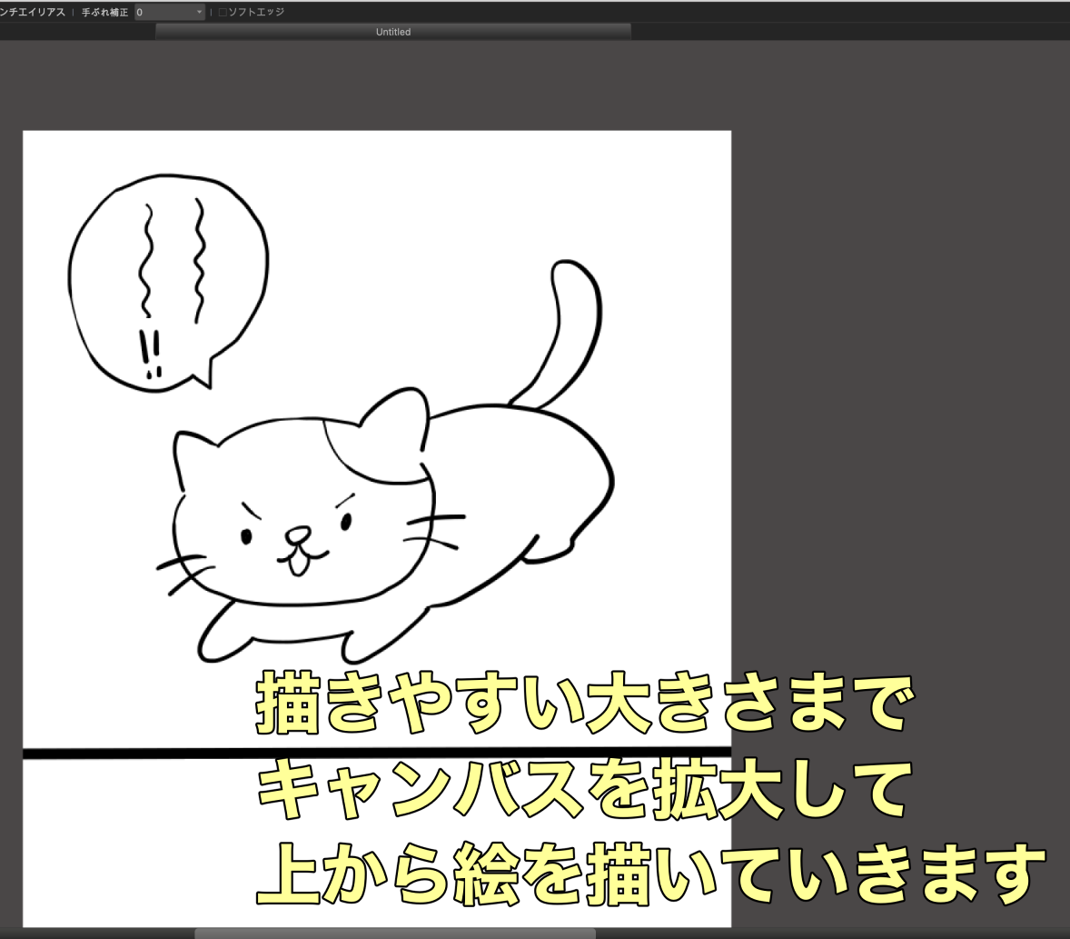
Now we have this long and narrow canvas.
Zoom in and draw one frame at a time from the top.
Method ②: Draw by stretching the canvas downward
First create a canvas that is large enough to fit on one screen of your phone.

Select [File] → [New].
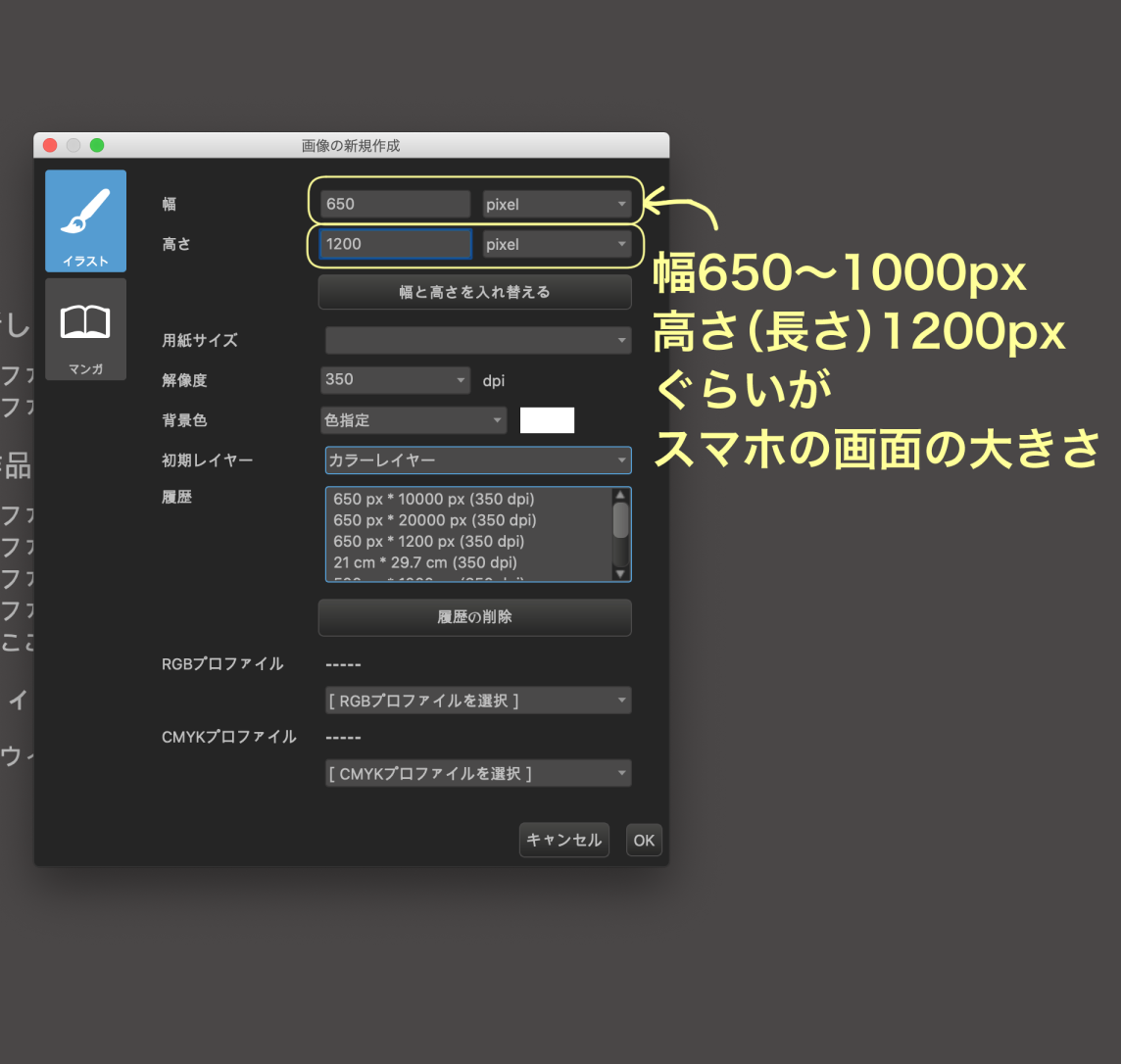
Setting [Paper Size].
Depending on the device, a size of roughly 650-1000 pixels wide and 1200 pixels high is suitable for smartphones.
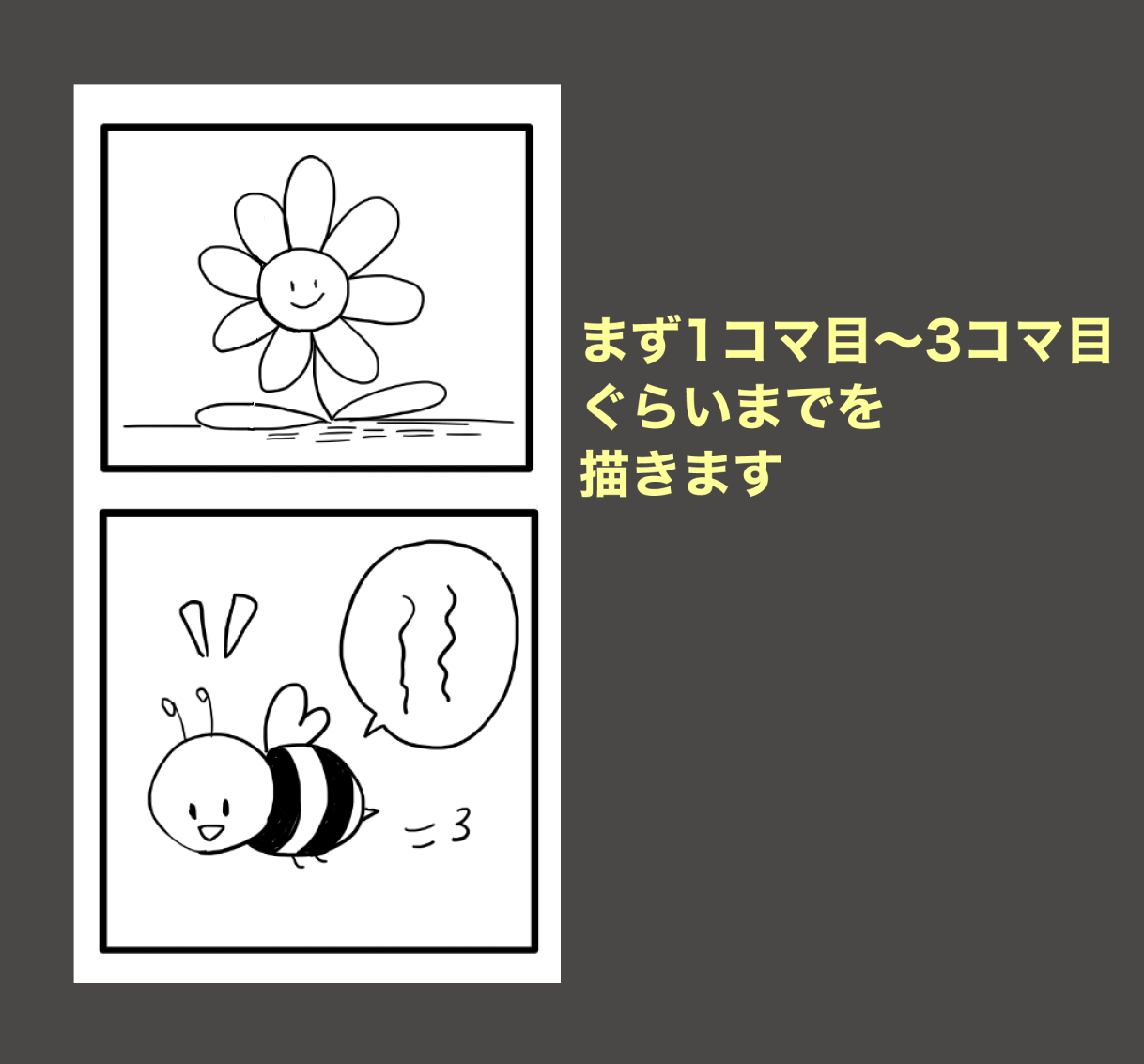
The paper size settings are now ready.
Draw the first three manga panels here.
Add a white canvas below this.
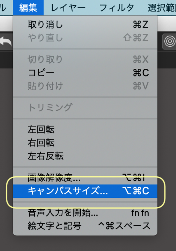
[Edit] → [Canvas Size].
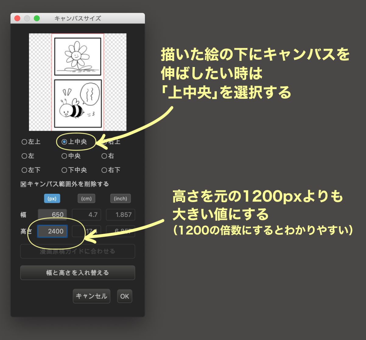
Select [Top-Center].
Make the height longer than the current 1200 pixels.
→For clarity, I recommend adding the height by 1200, such as 2400, 3600, 4800….
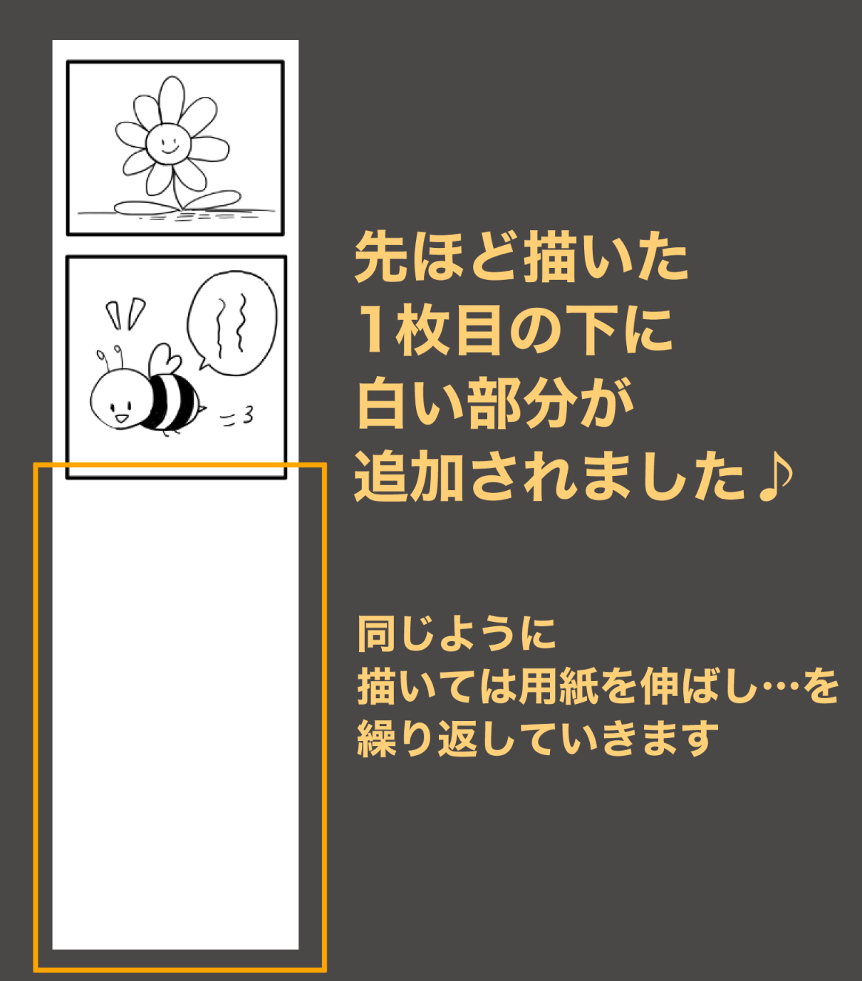
A white canvas is now added below the frame you just drew.
You will repeat drawing and stretching the image to make it vertical.
● For the smartphone version ● (The image is from Android)
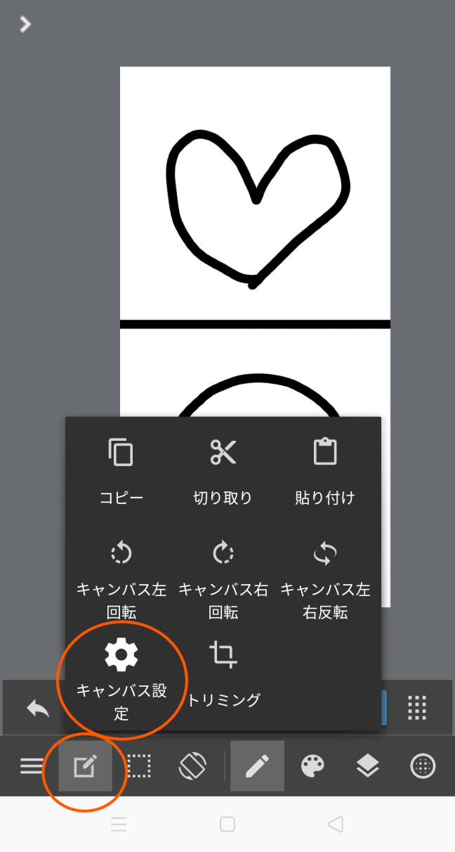
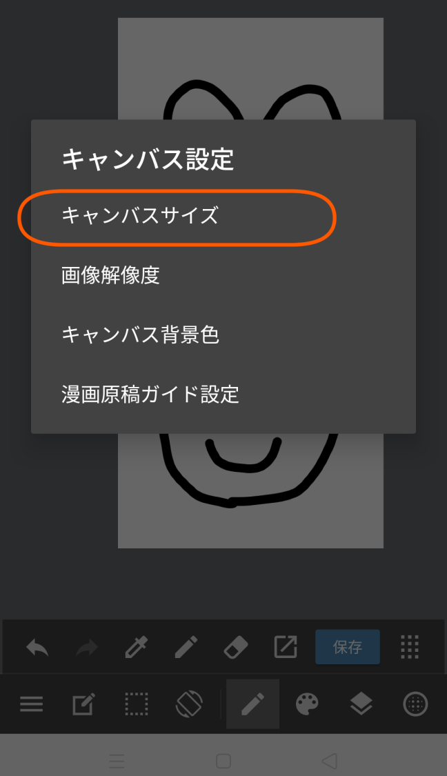
From the bottom left icon, click
[Canvas Settings] → [Canvas Size].
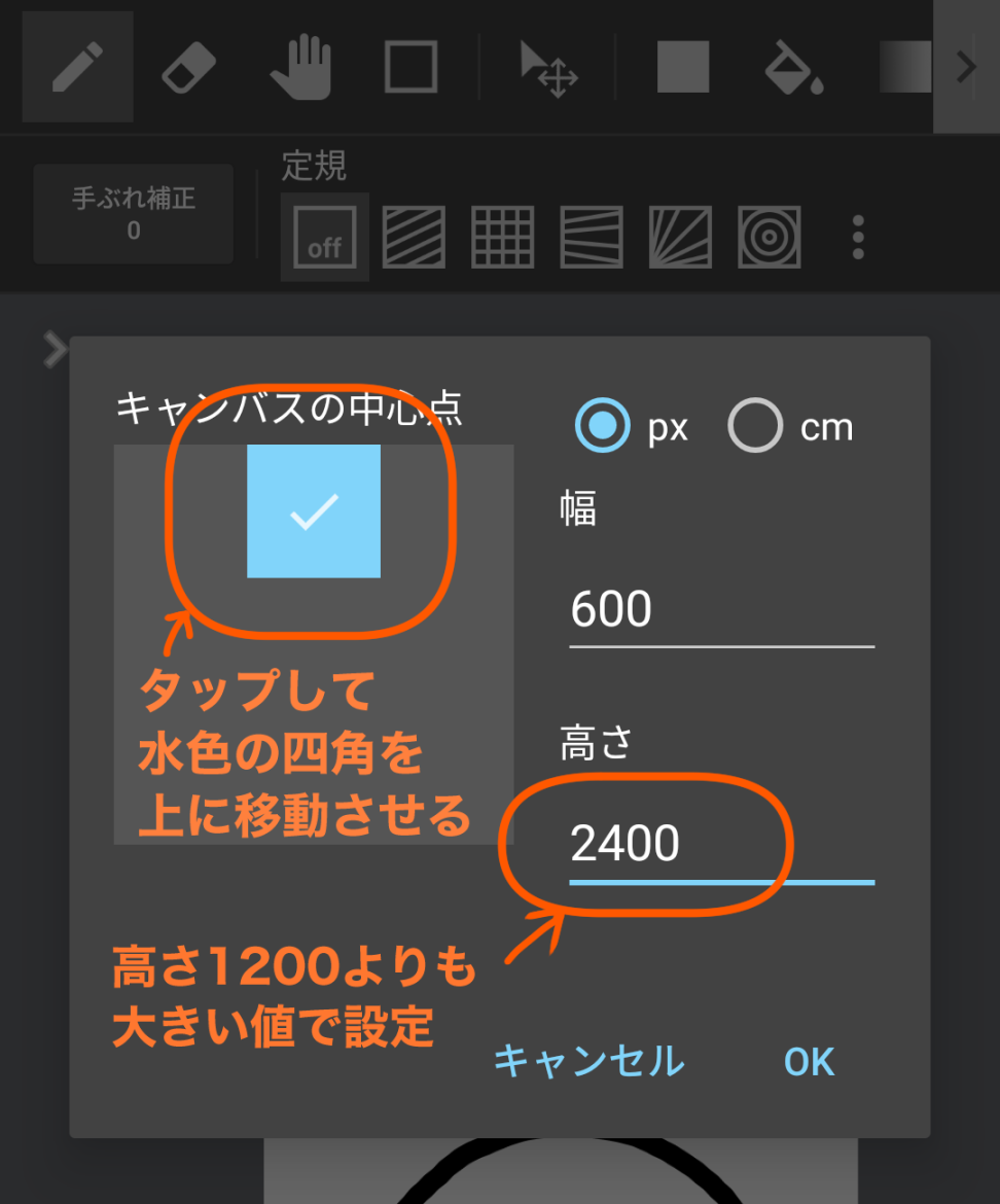
Set the square of [Canvas’ Center Point] to the upper side (tap to move the square).
Set the height to be longer than the current 1200 pixels.
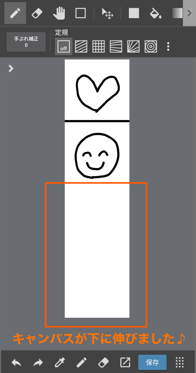
Just like the PC version, a white canvas is now added below the drawn frame.
You can use either method ① or ②, but I recommend ② for beginners as it is easier to see and handle the screen.
☆ Tips for making vertical scrolling manga easier to read
● Be conscious of the readers’ eye movements
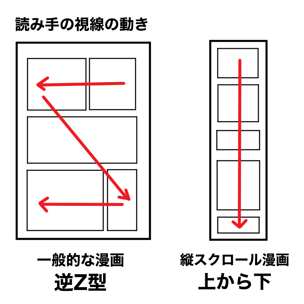
The biggest difference between a vertical scroll manga and a typical manga printed on magazines is the “visual guidance” for the reader.
In a conventional manga, the reader’s gaze moves in the form of an inverted Z, starting at the top right and ending at the bottom left, as shown in the image on the left.
O n the other hand, a vertical scrolling manga keeps the reader’s gaze strictly from “up to down”
This is a double-edged sword, because depending on your arrangement, it can become very easy or difficult to read.
Let’s think of a composition based on the “top-to-bottom” structure.
● Tips on panel layout
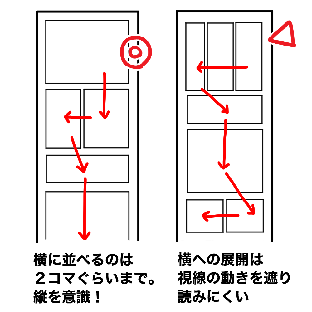
Vertical scrolling comics are all about readability.
So it is best to avoid too many horizontally moving panels so it will not to interfere with the readers’ eyes going from top to bottom.
Lining up one to three panels per screen is recommended.
If you want to arrange them horizontally, limit them to two frames.
Any more than that will feel cramped and slow the visual guidance.

You could just line up the squares, but that would feel monotonous.
It would be better to use breakaway panel and transformative panel to illustrate change in scenes.
● Making the best use of verticality
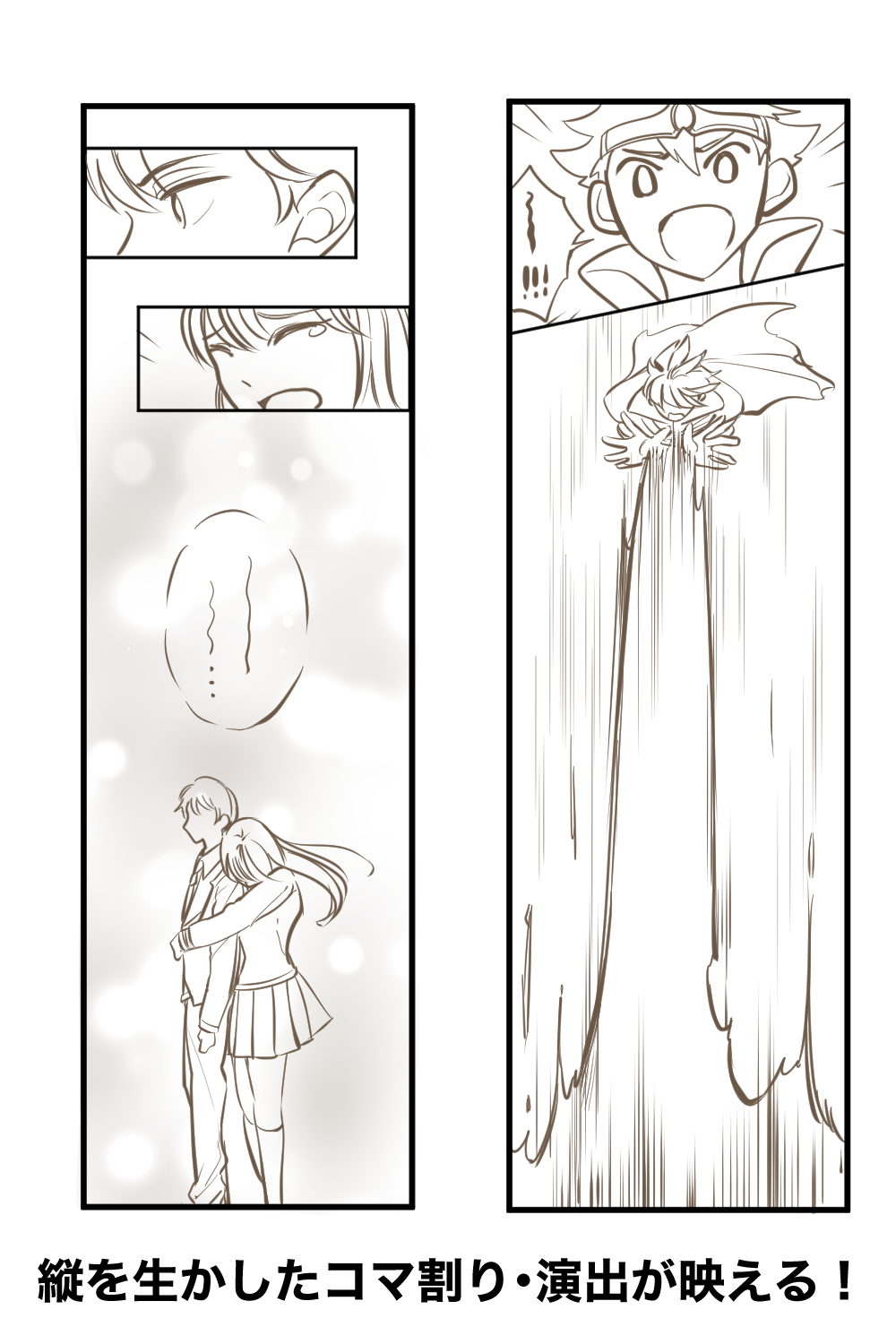
One of the strengths of vertical scrolling manga is that you can stretch the panels up and down as much as you want. This allows you to create effects that are impossible with conventional manga, where the size of a page is fixed! For example, by creating a long and open vertical space, you can illustrate “falling from a high place”, “shooting magical effects to the sky”, or “a sense of loneliness” which can attract the reader’s attention.
☆ Points to pay attention to
● Keep the amount of dialogue small!
If you use too much dialogue, the screen will be filled with text and it will be very difficult to read.
Also, on smartphones, many people like to read at a fast pace, so if you have too much dialogue, they may get give up reading halfway through.
Therefore, try to minimize the amount of dialogue in each frame as much as possible.
● Pause between panels
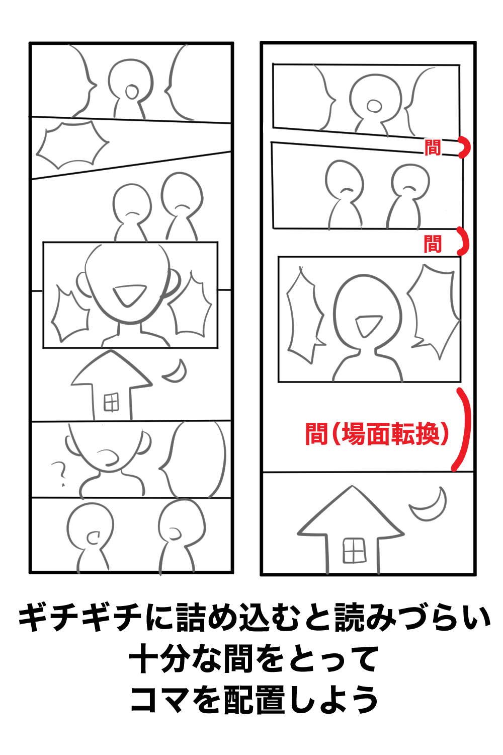
If you put the panels in a row without any intervals, the manga will look cluttered and the reader won’t be able to catch a breath and will get tired reading.
For vertical scrolling manga, be especially conscious of pauses.
Creating a blank space between the pictures makes it much easier to read.
Margins can also show the passage of time.
If you make large margins when changing scenes, day or night, the reader will naturally will feel the change in time.
● Subjects suitable for vertical scrolling and unsuitable for vertical scrolling
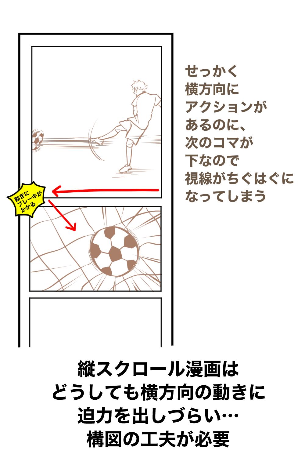
But remember, vertical scrolling comics also have a weakness.
It is “vulnerable to horizontal movement”.
Naturally since it scrolls from top to bottom, it easily feels oppressed by horizontal movement, and is incompatible with horizontal action.
For example in the scene of kicking a soccer ball as shown in the image, even though the player’s powerful shot point to the left, the next frame’s action points downward, so the panel’s direction and the direction of the readers’ eyes are out sync.
In this case, it is necessary to change the picture to one where the ball is kicked in front of the viewer.
On the other hand, since it is possible to fill the screen with people’s expressions, vertical scrolling manga is a good match for romance stories, comic essays, and works depicting heartwarming daily lives that focus on people’s emotional movements.
It’s best to choose a specification that suits the subject you want to draw.
Not suited for (requires effort): Sports, action, and other subjects with a lot of movement
Suited for: Love stories, heartwarming daily life, comic essays, and other subjects that focus on the emotions of the characters.
And that’s the introduction on how to draw vertical scrolling manga, which is gaining popularity right now!
Vertical scrolling manga has a high degree of freedom, and depending on your ideas, there are infinite possibilities.
Why don’t you give it a try?
(Text and pictures by Naoko Hara)
NAO Manga Production Room
twitter:@nao_comic
\ We are accepting requests for articles on how to use /


