2021.11.21
Useful for Backgrounds and Kimonos! How to Draw a Japanese Pattern!
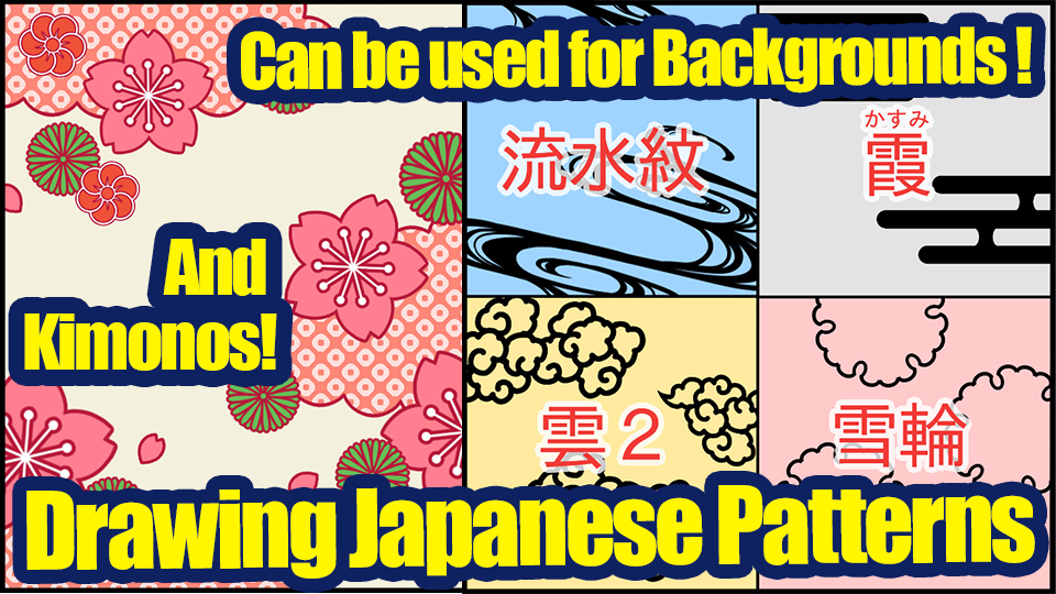

When you want to add Japanese patterns to my illustrations, do you download images from the internet?
However, there must be many cases where you find a good one, but it is someone else’s work, or there is nothing you want in the free images.
If you can’t find what you are looking for, you can make it yourself!
To anyone saying “It’s easy to say, but I don’t have any sense of style…and it’s hard to make something from scratch.”, don’t worry !
I will be showing you how to make a Japanese pattern!
If you make them in a certain order, you can create as many original Japanese patterns as you like.
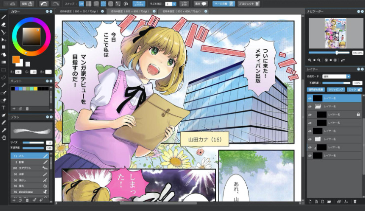
(The captured images below are from the PC version.)
1.Determine the composition
The most important thing in any illustration is to decide on the overall composition. That’s the same with Japanese patterns!
So let’s get started and create a new canvas.
The Japanese pattern is roughly composed of
(1) Background
(2) Large parts
(3) Medium parts
(4) Small parts.
The background will be plain, so I’ll skip the drafting of (1).
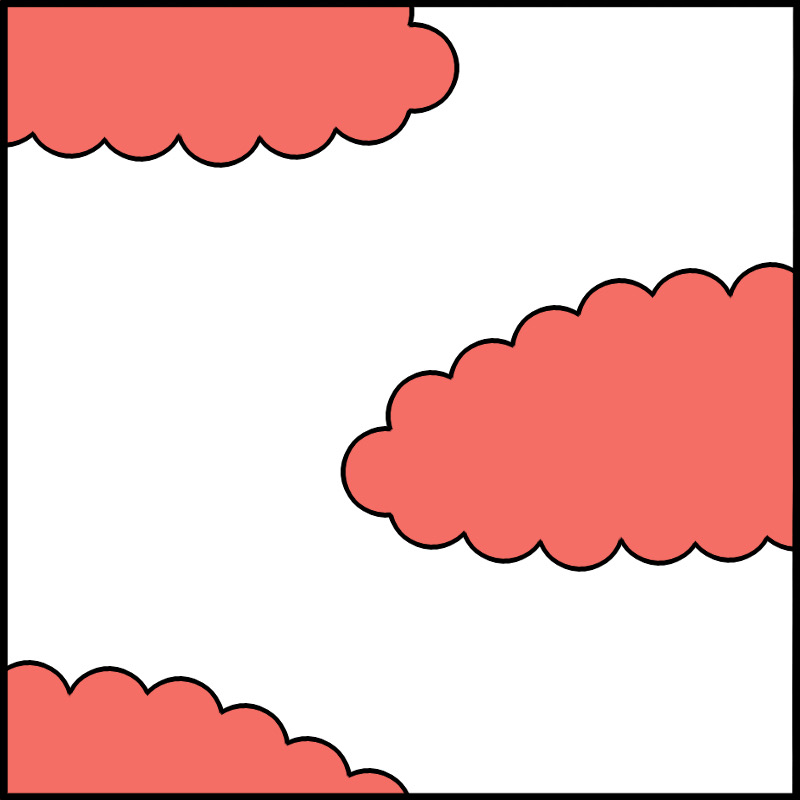
Next is the (2) large parts, and this time I will use “clouds”.
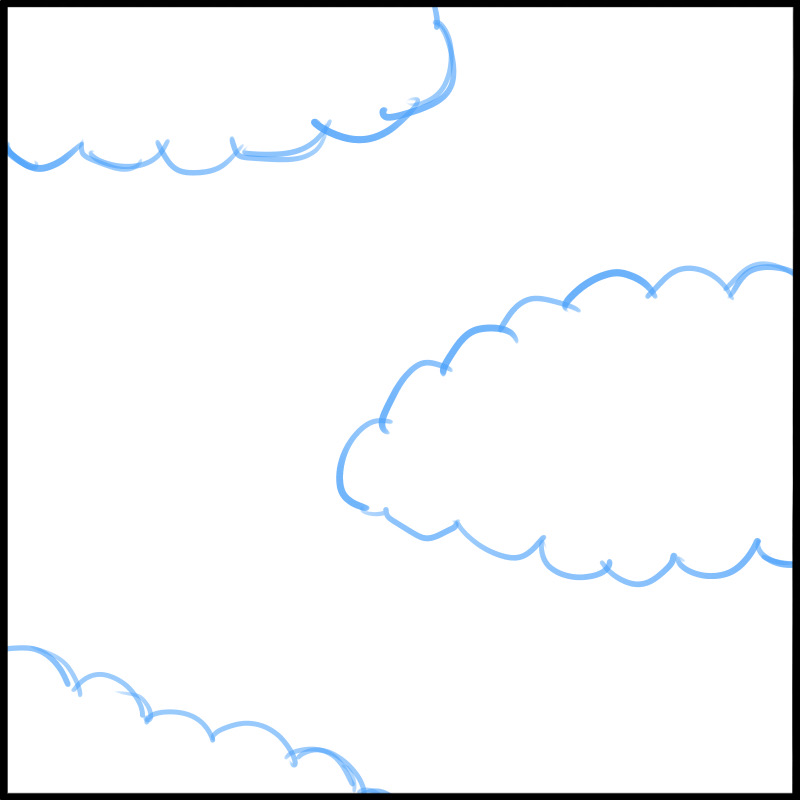
This is what it looks like when you draw with the “Pencil Brush”.
If the spacing is this large, the screen will not be cluttered.
?Trivia!?
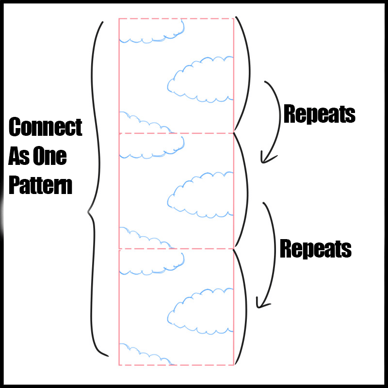
There is a concept called “Okuri” in kimono and obi (kimono belt) patterns.
Which means that a pattern is lined up horizontally and vertically like tiles to form a continuous pattern.
In this case, I made it so that there would only be “okuri” in vertical direction.
You may not need to think about it at first, but if you make a pattern with this in mind, you can use it later when you want to make a larger pattern.
Now, let’s get back to the main topic.
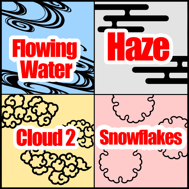
This time, I decided to make “clouds” as the (2) large part, but you can use any shape that can be transformed freely and has less impression !
There are plenty of reference images on the web, so you can try out different atmospheres by arranging them.
(Ryuusuimon: Flowing Water, Kasumi: Haze, Cloud 2, Yukiwa: Snowflake)
Next, decide the placement of the (3) middle part.
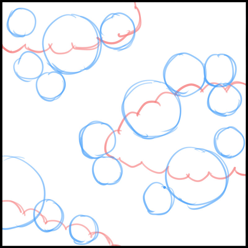
If you place the (2) large parts in a unified manner, you can make it look neat even if you use many kinds of patterns.
The patterns should overlap each other a little, and the size of the (3) medium parts should be uneven.
Finally, the (4) small parts.
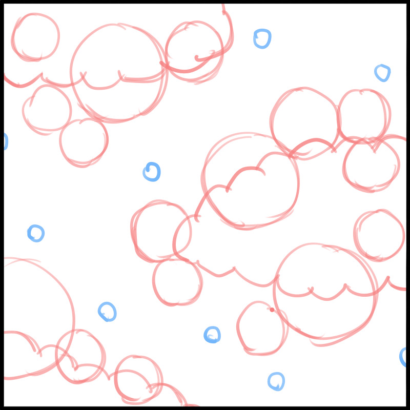
This should be scattered to fill in the gaps throughout.
It makes the visual feel less empty and a little more gorgeous.
2.Determine the material for each part
Once the overall composition is decided, it’s time to decide what each part should look like.
I already introduced a couple materials for the (2) large parts earlier.
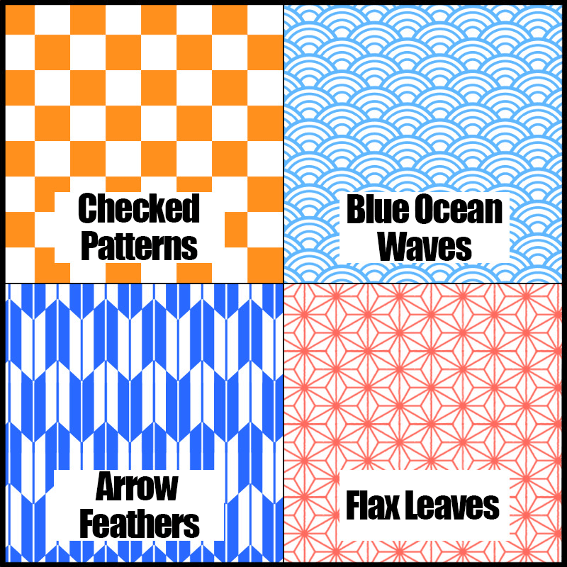
(1) As for the background, this time it will be plain, but there are many types available on the internet.
There is no specific pattern to use for the background, so you can use anything with a continuous pattern.
There are many different names, so it might be interesting to check them out.
(Ichimatsu, Seigaiha, Yabane, Asanoha)
The material itself can be found easily by looking up free materials online.
If you are going to publish them in a place where people can see your work, please make sure to check the copyright issues.
Next is the (3) middle part, and since I would like to set this one as the main pattern, I will choose a flower design that is a little more detailed.
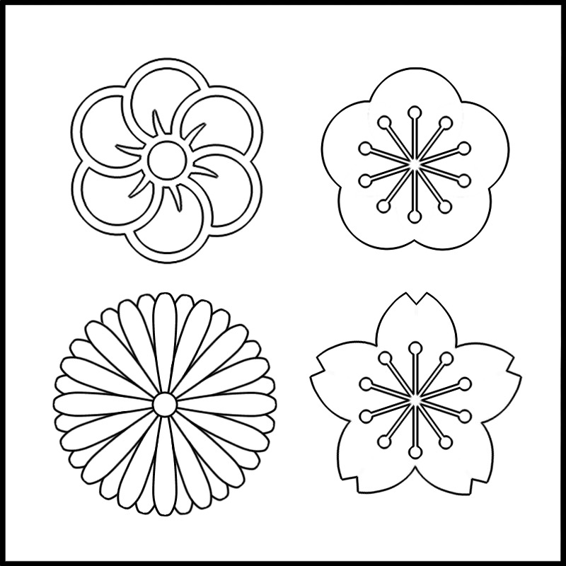
Flowers and backgrounds symbolize different seasons, so it’s a good idea to make them consistent. That way, you will not confuse those who are familiar with Japanese patterns.
Then, let’s decide on the (4) small parts.
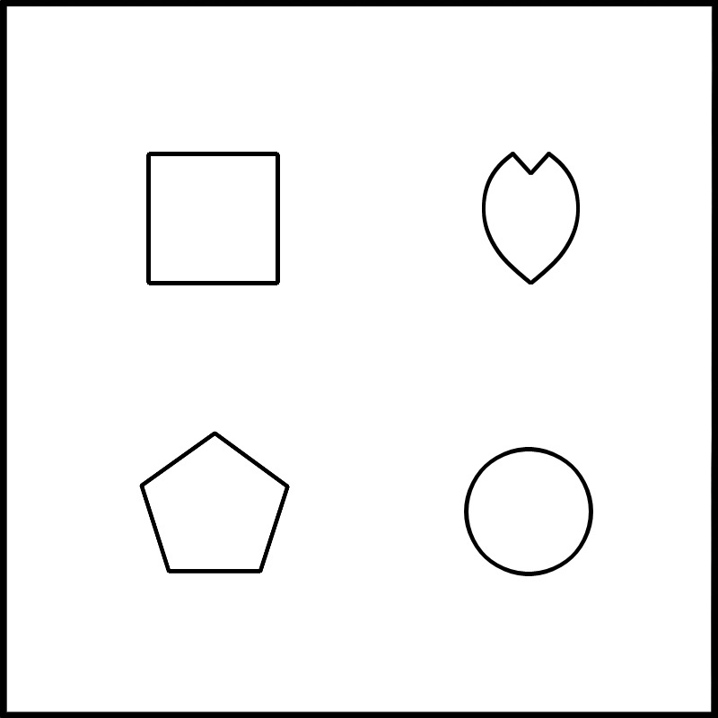
This is a relatively simple pattern.
Since it is small, simple shapes are fine.
3.Draw the Border Line
Now it’s time to draw in the pattern. Many Japanese patterns have a clear outline.
With clear border lines, there will not be a blur between similar colors placed adjacently so I think beginners should draw the outline on each pattern.
First, place a new layer on top of the draft layer.
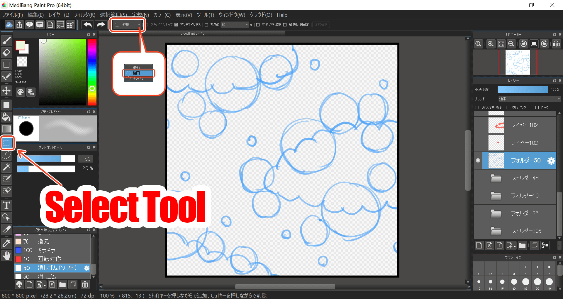
Use the Selection Tool (ellipse) to make a selection anywhere on the cloud pattern, and fill it in.
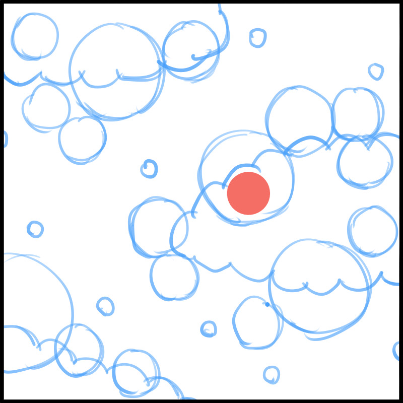
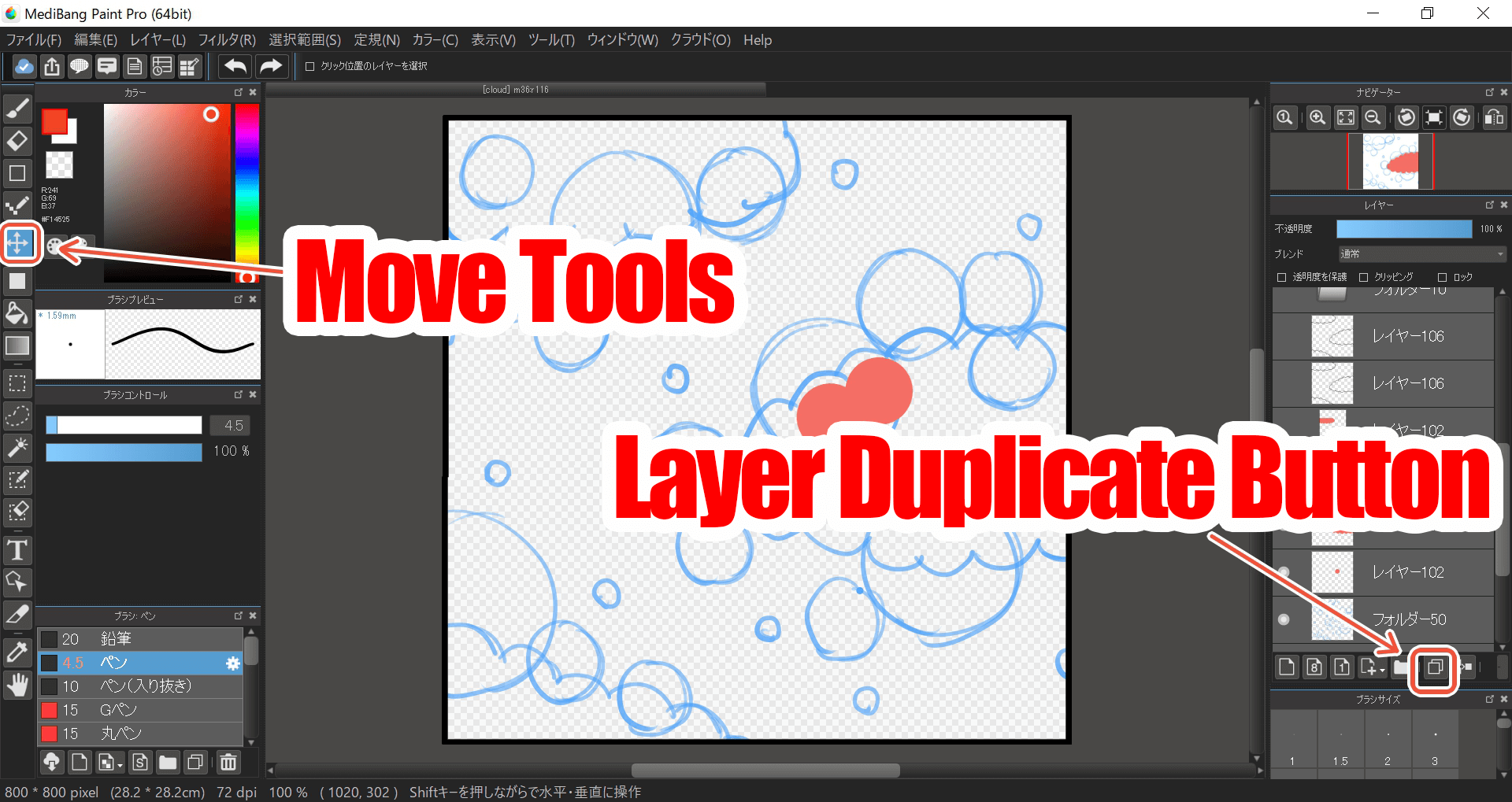
Duplicate the layer of this thick dot and use the “Move Tool” so that the two dots touch each other.
Repeat until you have the entire outline of the cloud.

When you are done, use the “Bucket Tool” to fill it in.
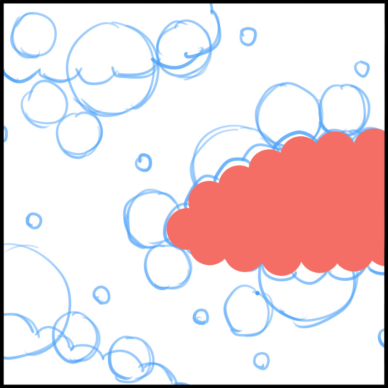
You have created a silhouette of a cloud.
Let’s make two more clouds in the same way.
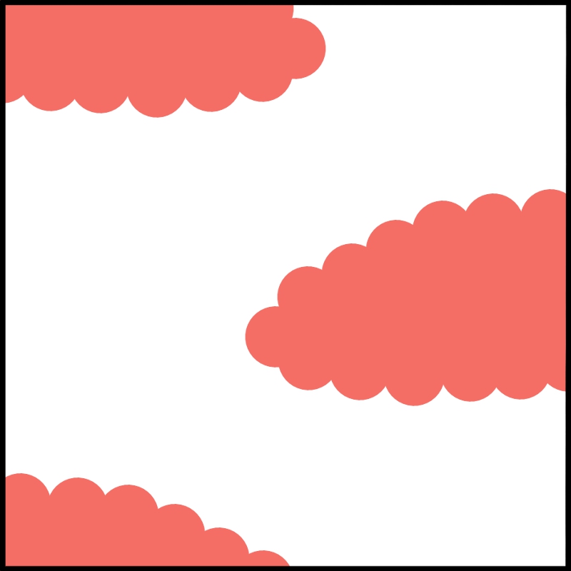
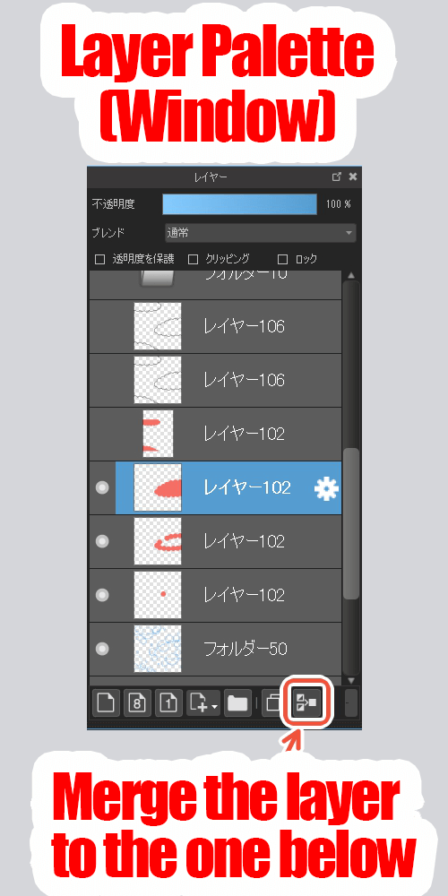
Once you have done this, you can merge the three “clouds” into a single layer.
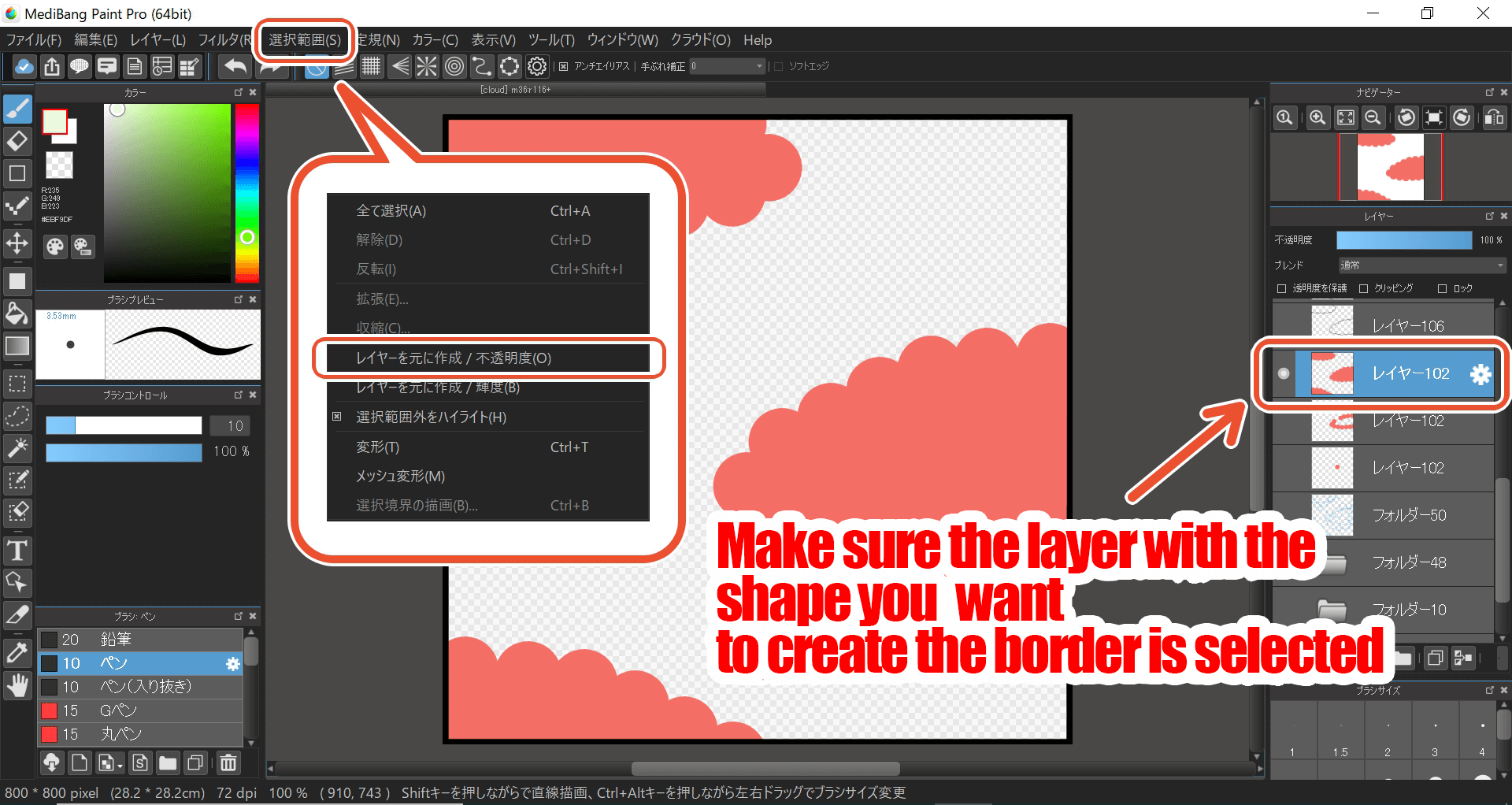
Next, with this ‘Clouds’ layer selected, click “Create Selection from Layer (Opacity)” from the selection tab and create a selection with the outline of clouds as its boundary.
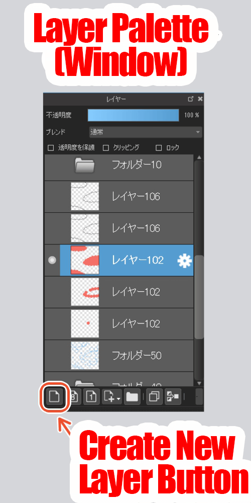
Now create a new layer.
Then click on “Draw Selection Border” from the selection menu again, decide on the details, and press OK.
Then, it will draw a beautiful line along the clouds.
This is convenient because you don’t have to trace the line yourself.
This method will come in handy in many situations, so I hope you memorize it.
Hide the silhouette layer (sometimes it is useful to keep the silhouette layer, for example to change the color later when the drawing is complete, so hide it instead of erasing it).
Place the (3) middle part and the (4) small part in the same way along the draft, and border them.
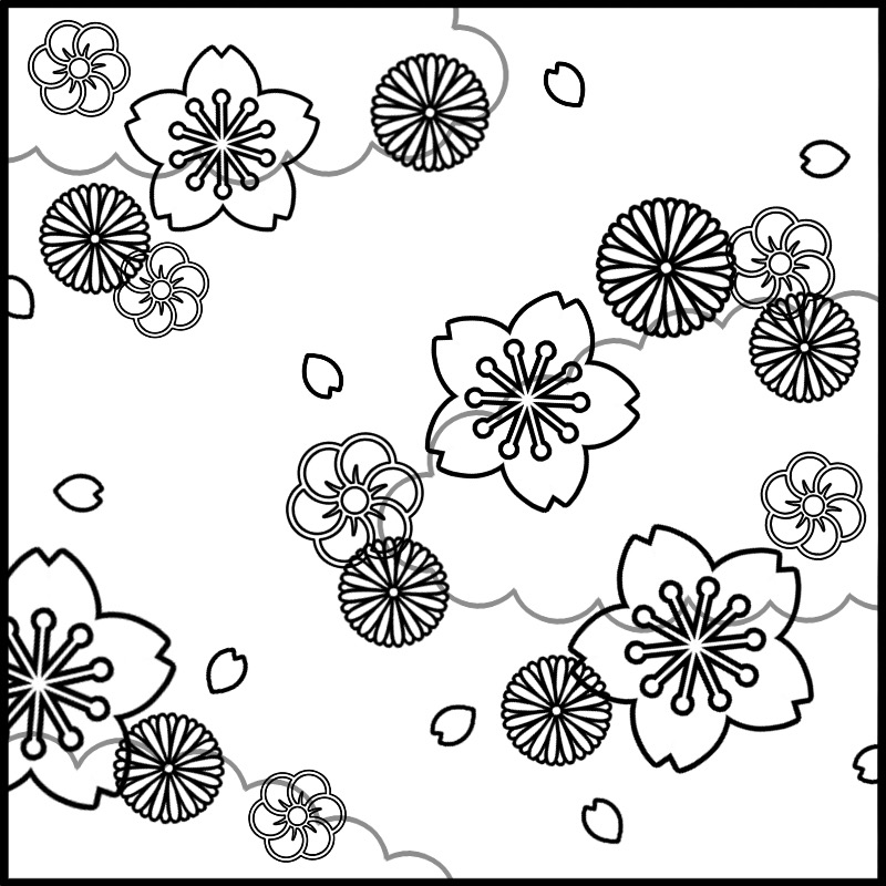
(The cloud layer has been made gray to make it easier to see.)
4.Customize the Color Combinations
Now it’s time to paint each color but if you use a random set of colors you like, it will not look like a Japanese pattern.
So, let me explain a little bit about color here.
(1) Hue Circle
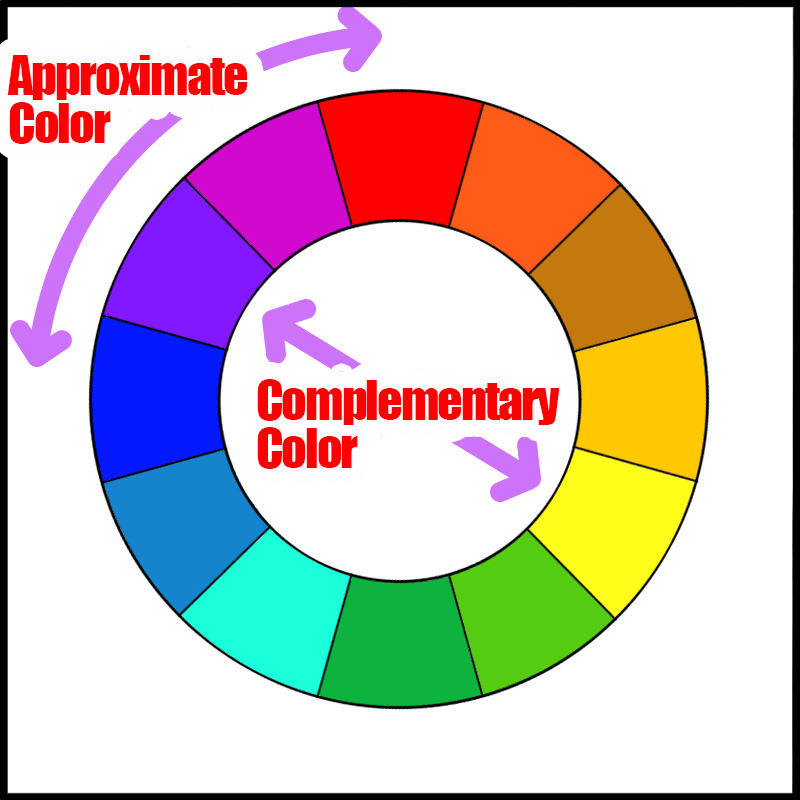
Each color has its own relationship to each other, and this is represented by the “hue circle” as shown in the figure.
(This may vary slightly depending on the software you are using.)
You may know what an “approximate color” is, right?
When you mix a few different colors, you get an approximate color, such as pink for red or light blue for blue.
Complementary colors are colors that contrast.
When you see them side by side, they are unsettling, and they assert each other clearly on the screen.
If you want to send a strong message on a poster, you can use complementary colors for the background and text.
If you use only complementary colors, you will end up with an unsettling illustration. Therefore, it is the best to use only approximate colors or a pair of complementary colors with approximate colors.
(2) Three Color Attributes
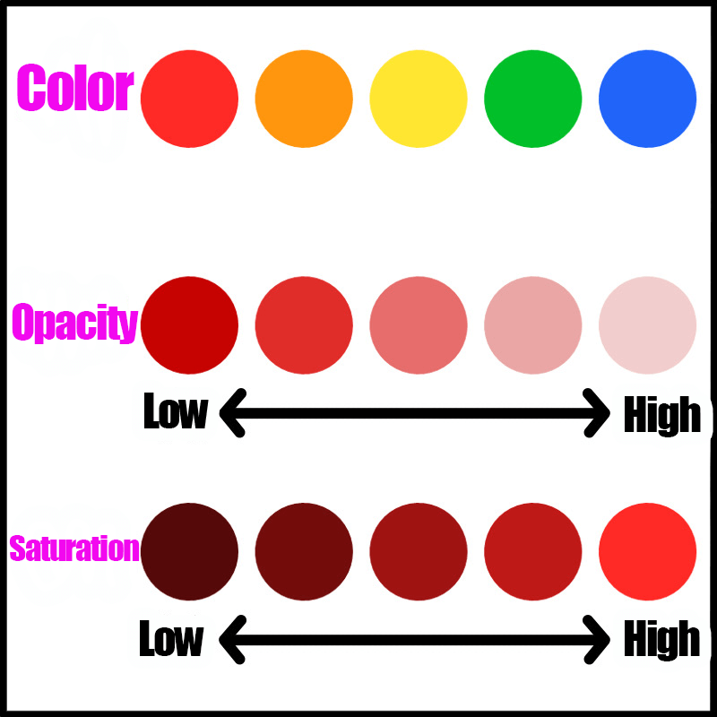
Next, let’s look at the three attributes of color.
This refers to the three elements that make up a color.
Hue refers to the colors that are close to the primary colors, such as red, green, and blue, which are represented by the hue ring mentioned earlier.
Lightness is the brightness of a color, and saturation is its vividness.
Brighter colors are described as “brighter” and more vivid colors are described as “more saturated.
When you want to make your paint brighter, you mix in white, right?
In fact, just like black, a little bit of white will make the color duller and less saturated.
Keep in mind that brightness and saturation are linked.
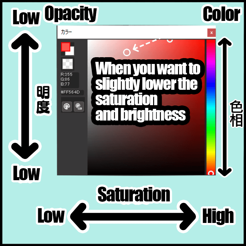
In terms of MediBang Paint’s color palette…
The upper right edge of the image has the highest “saturation”.
The closer you get to the top left corner, the more white is mixed in, and the lower you go, the more black there is.
If you don’t want the saturation to be too low, it’s better to keep it near the top right.
(3) What colors fit Japanese Patterns?
Now that we’ve talked about colors a lot, let’s get back to Japanese patterns.
The easiest way to do this is to look at actual kimono or photos for reference, but if you have the above knowledge of colors, you can also make your own color scheme!
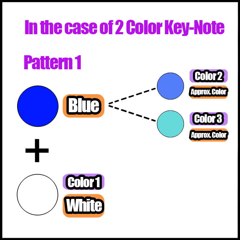
First, decide on two or three colors to use as a base.
You can use anything the hue circle or use any primary colors you can think of like RGB. (Blue and white in the image.)
Once you’ve thought of a color, change its brightness, saturation, and hue to create an approximate color.
Now you have three colors.
If you have many parts and need more colors, you can add color 4, color 5, and so on.
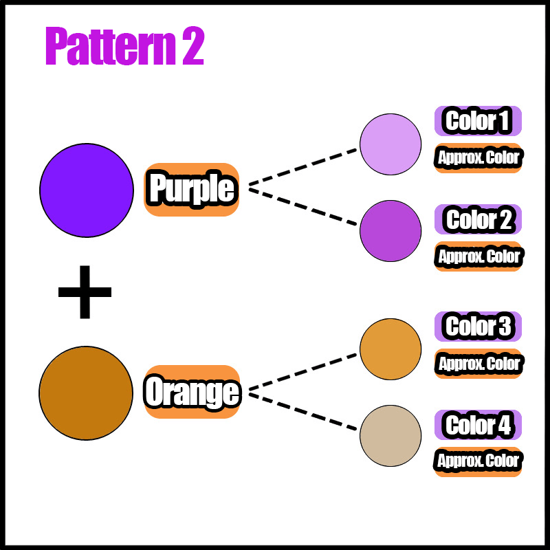
Now let’s try to choose a base color other than the approximate colors.
This is an example of four colors, each with its own approximation.
The result is a very modern look.
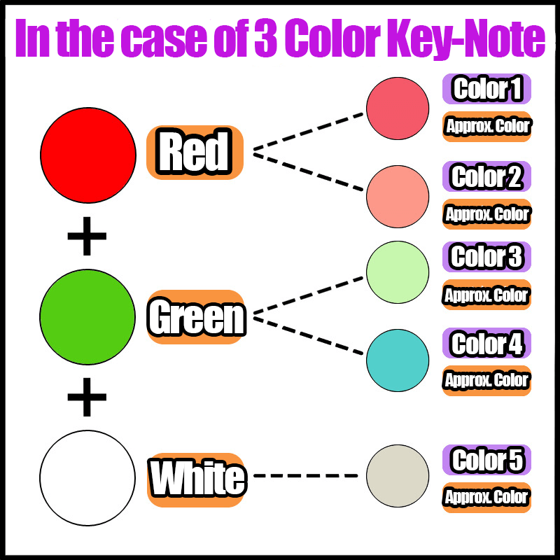
Let’s also look at a case where three base colors are used.
This time, I chose two more base colors from the complementary colors (colors that contrast) to create a total of five colors.
If I use the base colors as they are, it would look like a European painting, but by reducing the saturation of each color a little, I was able to create a Japanese atmosphere.
5.Add Color
Now that we have all the colors we need, it’s time to start coloring!
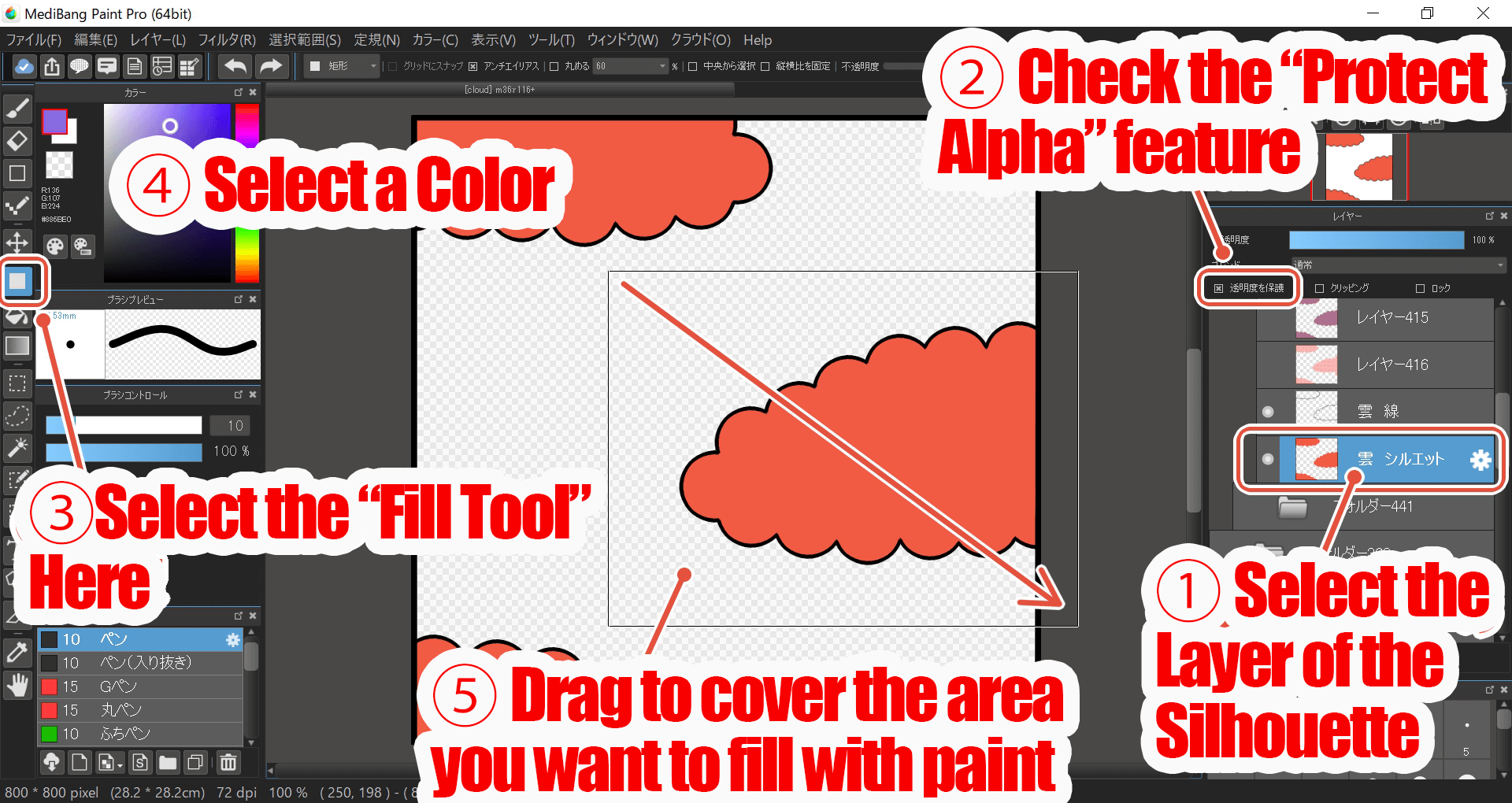
You have a silhouette layer that you used to create the borders for each part.
Click the “Protect Alpha” checkbox on the layer and replace the colors to save you the trouble of filling in the layer from scratch.
This is the one I made mainly with white and red colors.
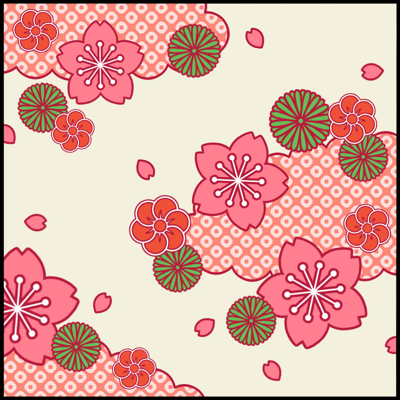
I changed the color of the outline in the same way as the paint.
I added a complementary color to give it a little more depth.
If we use only similar approximate colors, we get a chic look.
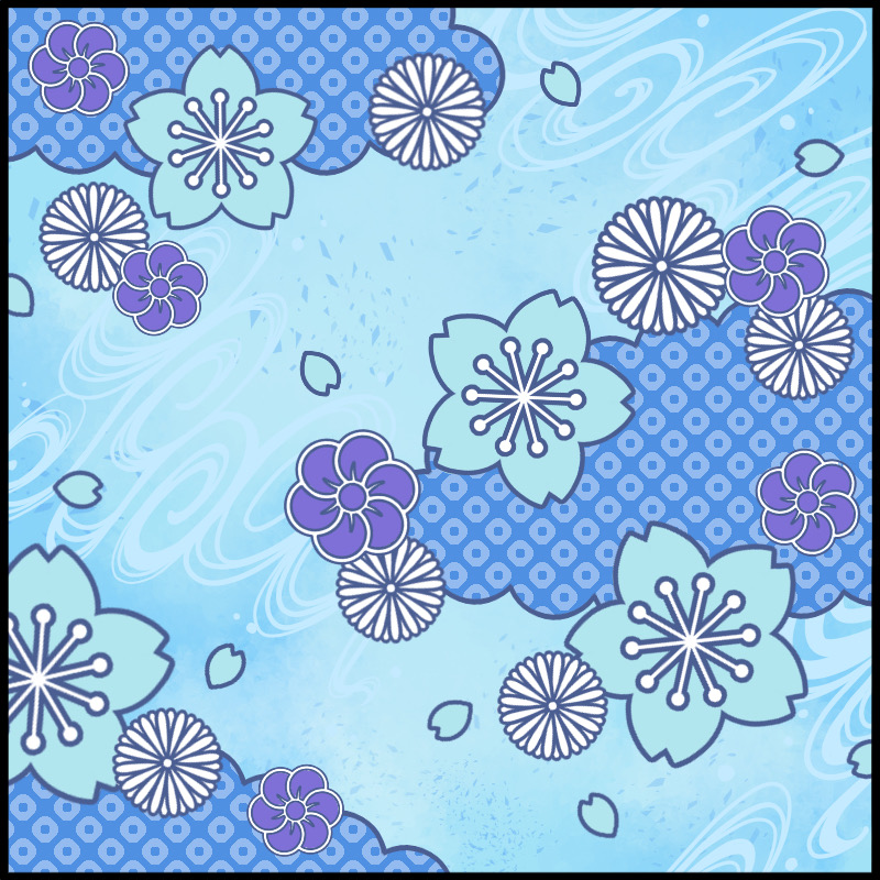
The whole image was a bit lonely, so I added a flowing water pattern to the background.
Of course, you can also use a darker background.
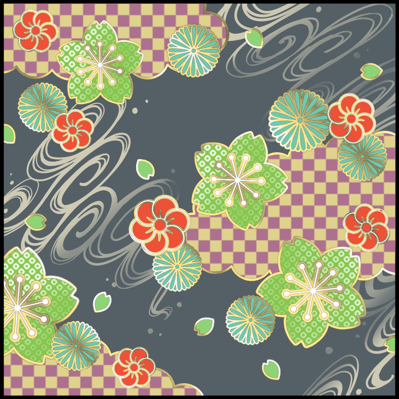
It is also possible to add a pattern to the paint of the parts like this.
This is a bit too much but if you think it’s a little empty, add a simple gradation and keep an eye on the balance.
I also used a gradation for the borderlines to create a gold leaf-like effect.
6.Conclusion
What did you think?
In this article, I introduced how to draw Japanese patterns that you can design yourself from scratch.
If you keep in mind the key points of composition, motifs, and colors, you can create as many variations as you like!
I hope you will try creating your own original Japanese patterns.

(Text and illustrations by Hiroshi Takeuchi)
\ We are accepting requests for articles on how to use /

