2021.03.24
Enhance your character! Creating a cool background
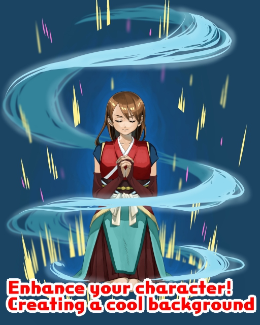
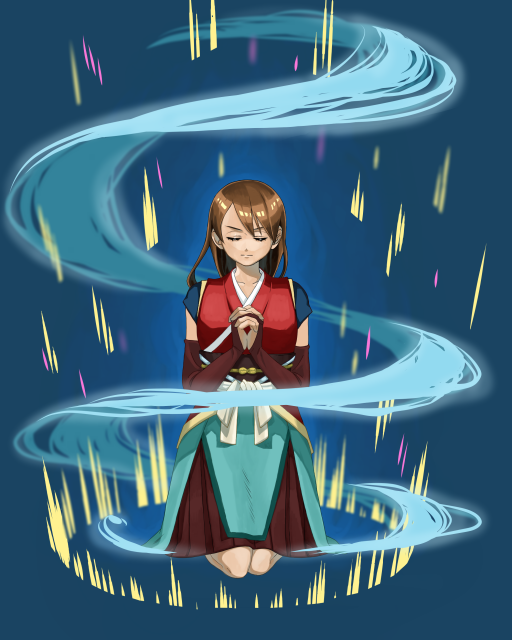
When you create a character illustration, have you ever thought, “I’ve drawn the character, but what do I do with the background?
In this article, I’ll show you how to draw backgrounds to make your illustrations more “cool! In this article, I’ll show you how to draw a background that will make your illustration more “cool”.
1-Aura
1-Drawing in
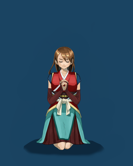
Here is the illustration I created.
The background is monochromatic, with only the shadows cast.
The image is of a pose that looks like the beginning of a battle, as if the character is storing up power.
First, I would like to draw the aura that seems to come from the character.
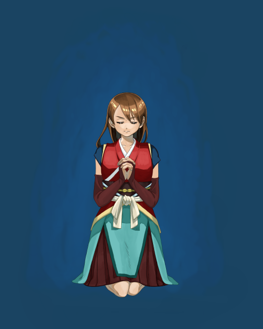
I used a slightly lighter color than the background color to spread the paint.
This time I used a watercolor brush.
To use the watercolor brush, select Brush Tools -> Watercolor Brush from the left side of the screen.
The watercolor brush blends in easily with the colors, so you can create a misty look just by spreading the paint.
Set the layer below the character.
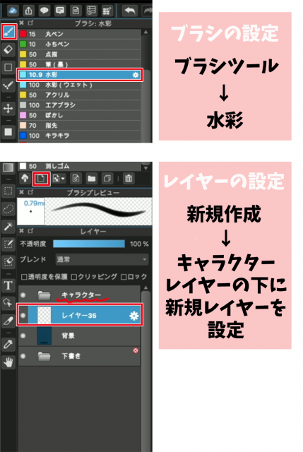
Brush settings Brush tool → Watercolor
Setting up a layer Create New → Set up a new layer under the character layer
Overlay the haze with another brighter color.
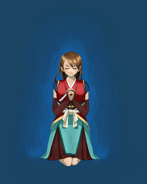
Let’s expand on the fluffy image.

I added another bright color along the edges of the character, roughly three colors to create the aura.
To make it easier for the colors to blend together, I traced the border back to the first and second colors and blurred them out.
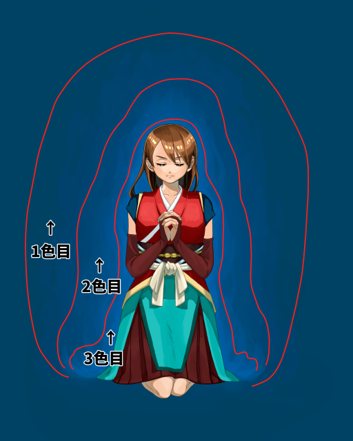
First Color
Second Color
Third Color
2-Swirling winds
1-wind flow
The next step is to draw the wind flow.
When storing power, it’s cool when the wind rises up.
Let’s express the wind in a cool shape.
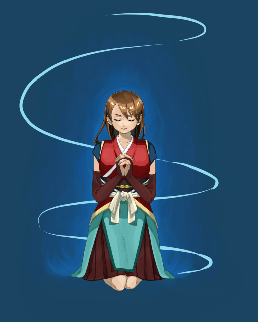
The first step is to draw the wind flow in lines.
We want to draw the wind flowing around the character, so we’ll draw a spiral to the left and right.
This time, I used the pen tool.
Once you’re done, the layer can be under the character layer.
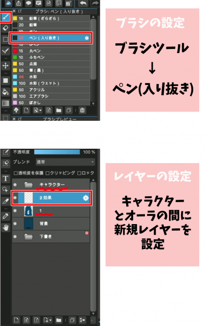
Brush settings Brush tool → Pen (Sharp)
Setting up a layer Set up a new layer between the character and the aura
Let’s draw the wind flow along the lines.
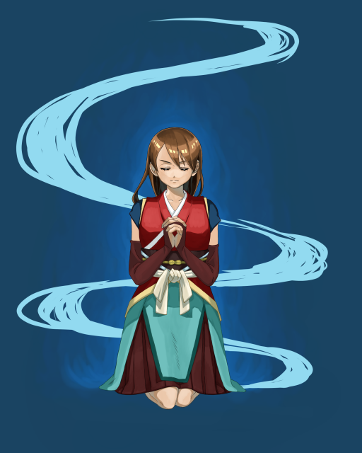
At this point, try to keep in mind that curves are thicker and straight lines are thinner.
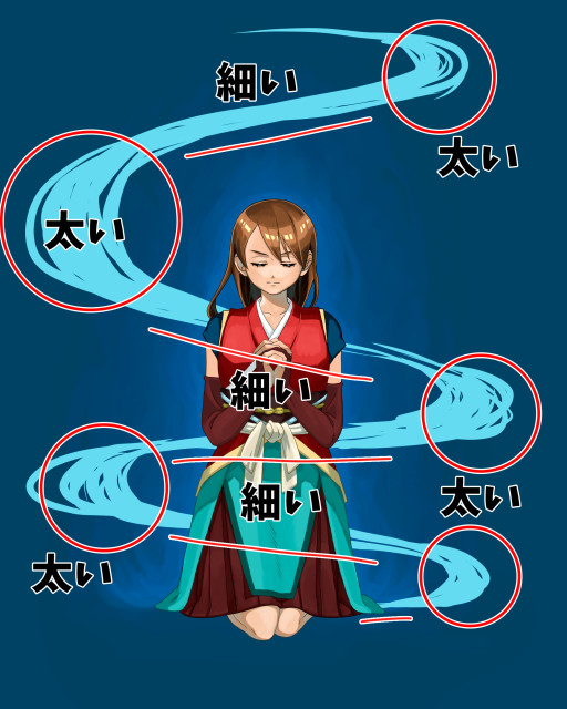
太い…Thick
細い…Thin
2 Creating a 3D effect
Next, separate the layers so that the wind appears to be blowing up around the character.
At this point, make your selections while keeping the back and front in mind, as shown in the figure.
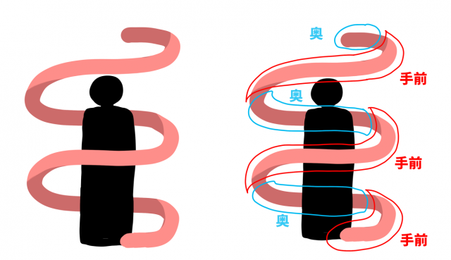
奥…back
手前…front
Choose the free selection tool and trace the wind.
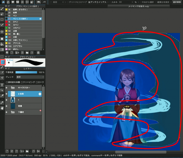
Once you have made your selection, copy-paste it as is.
【mac ⌘C+⌘V】
【windows Ctrl“C”+Ctrl“V”】
Keep the original layer and erase only the right half of it with the eraser.
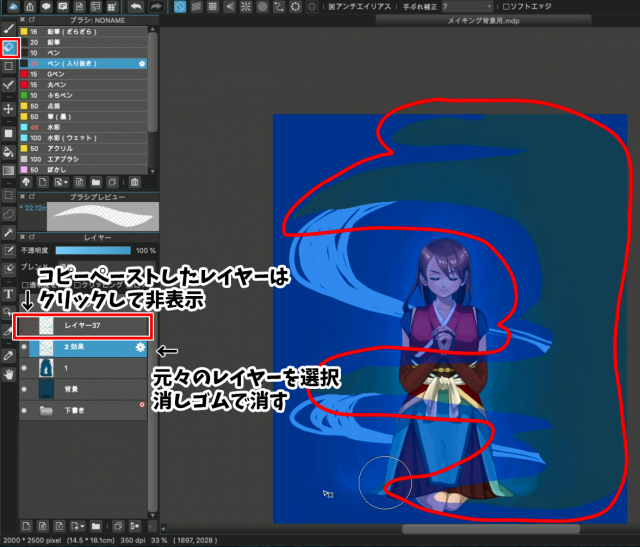
Hide the copy-pasted layer
Display the right half of the image that you just cut out and move it to the top of the character layer.
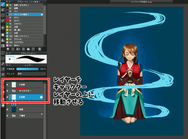
Next, let’s change the color of the wind behind the character.
Create a new layer on top of the lower wind layer.
Click on Clipping
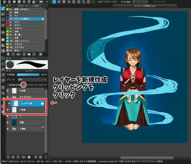
Then paint a darker color than the first one.
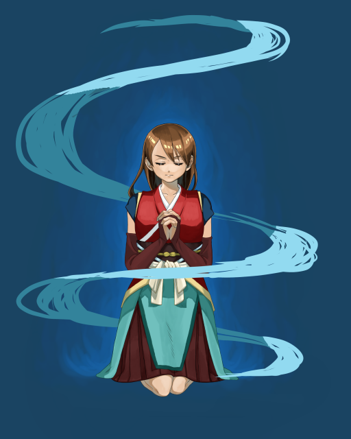
When I finished painting the layer, it finally looked like the wind was swirling around the character.
3 Align the wind
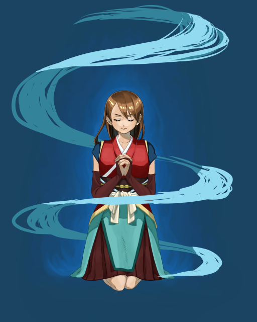
Let’s shape the wind.
Use a pen to draw in a quick, crisp motion along the flow.
You can draw a thin, sharp wind if the lines are well-defined as in the example, or a turbulent wind if the lines are broken up.
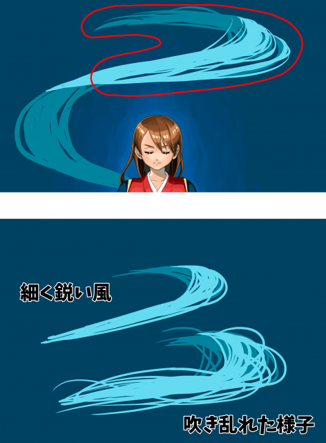
thin, sharp wind
turbulent wind
This time, I didn’t want it to be too random, but to represent a well-organized vortex-like wind.
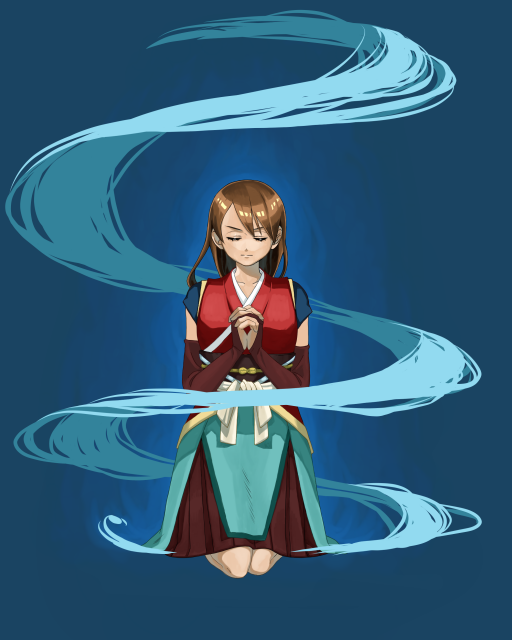
This is what it looks like when the whole thing is aligned.
3-Popping Light
1-Preparation
It would be cool to have a bouncy, electric glow around the character.
Next, let’s make the light.
First, let’s create an ellipse around the character’s feet.
Add a new layer and select Shape Tools -> Ellipse.
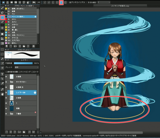
Once you have selected the ellipse, create an ellipse at the foot.
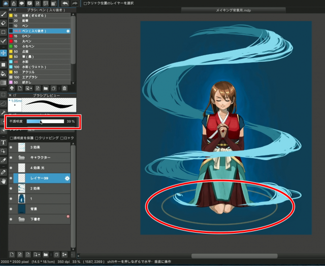
Since we want this ellipse to be the basis for adding light, we will keep the layer we created selected and set the opacity to around 40%.
Next, we will use the vanishing point of the ruler tool to add the light.
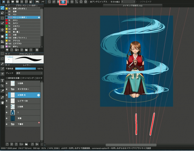
With the Pen tool selected, select the vanishing point at the top of the screen.
Create a vanishing point by selecting four points to spread out on top.
2 Draw the light
Now that we are ready, let’s add the light.
First, we’ll add a bright yellow color along the ellipse.
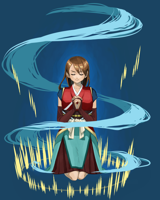
Then, let’s add yellow to the whole image.
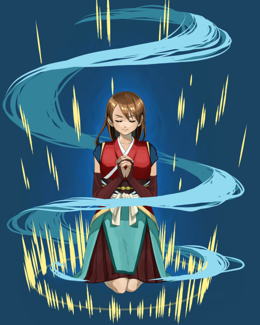
Once you have done this, erase the bottom half of the circle with the eraser.
By doing this, you can emphasize the light that seems to pop out from the ground.
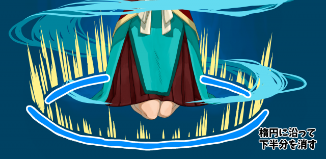
I also randomly erased the bottom half of the light in the sky to give it some movement.
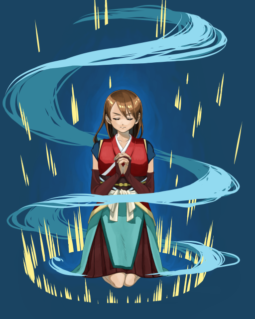
4-Creating an airy feel
1-Blur the blur
Next, let’s blur the light.
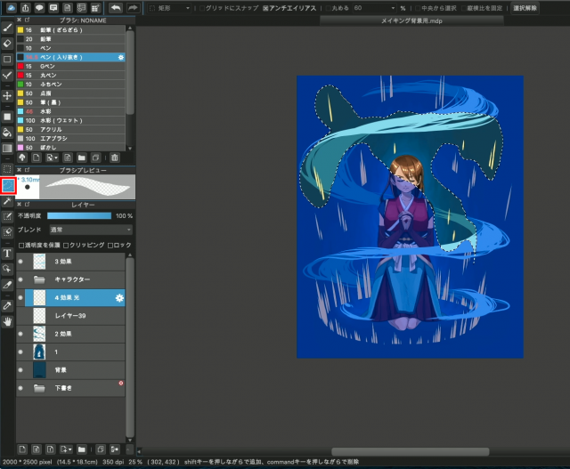
First, select some light in the air and choose Filter -> Gaussian Blur from the menu bar.
Change it to about 6 as you see fit.
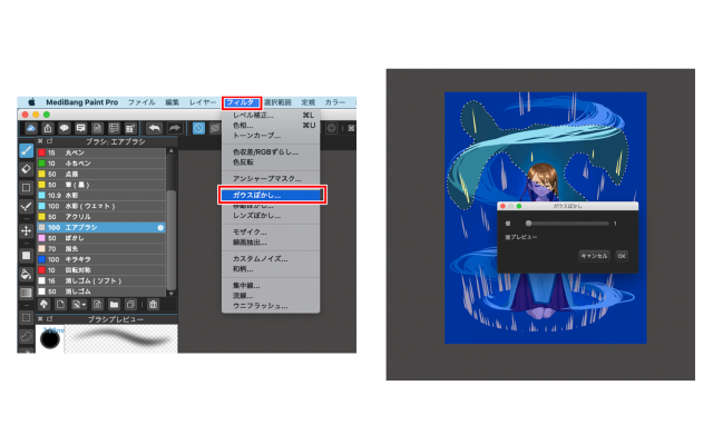
Using the same method, I also blurred the wind behind and the light on the ground behind to create depth.

This way, you can feel more space on the screen.
It’s still not enough, so I added more light in colors other than yellow.
The background is generally blue, so I used a red light to add a little accent.
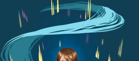
2 Add to the wind
Finally, we will use the airbrush to add more airiness to the wind appearance.
Let’s select the airbrush from the brush tool.
Change the opacity of the layer to about 40%.
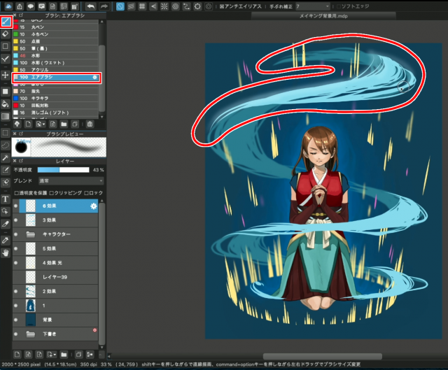
Gently trace over the wind from the top of the screen.

Continue on to the entire wind.
The airiness has increased at once.
Here is the finished product!
I think this illustration is much cooler than the first one.

When you create a single picture, please try to use this technique.
Even if you use just one of these techniques, such as adding aura, wind, or light, your illustration will be different from what it was before!
Thank you for reading!
(Text and pictures by Hiromi Arakane)
\ We are accepting requests for articles on how to use /

