2021.07.03
Make your characters stand out! How to draw rooms and accessories

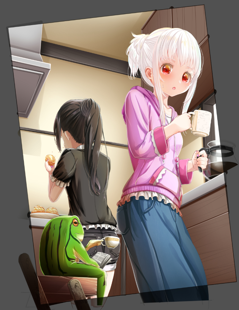
The Rough Drawing
・Let’s think about the situation and composition.
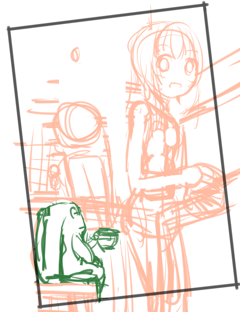
The situation is two sisters getting ready to drink coffee and a frog begging for a cup of coffee.
The camera is positioned over the frog’s shoulder.
In this illustration, the frame is slanted.
When I draw an illustration with a slanted frame, I draw it normally without rotating the canvas and then rotate it at the end.
Do what’s easiest for you!
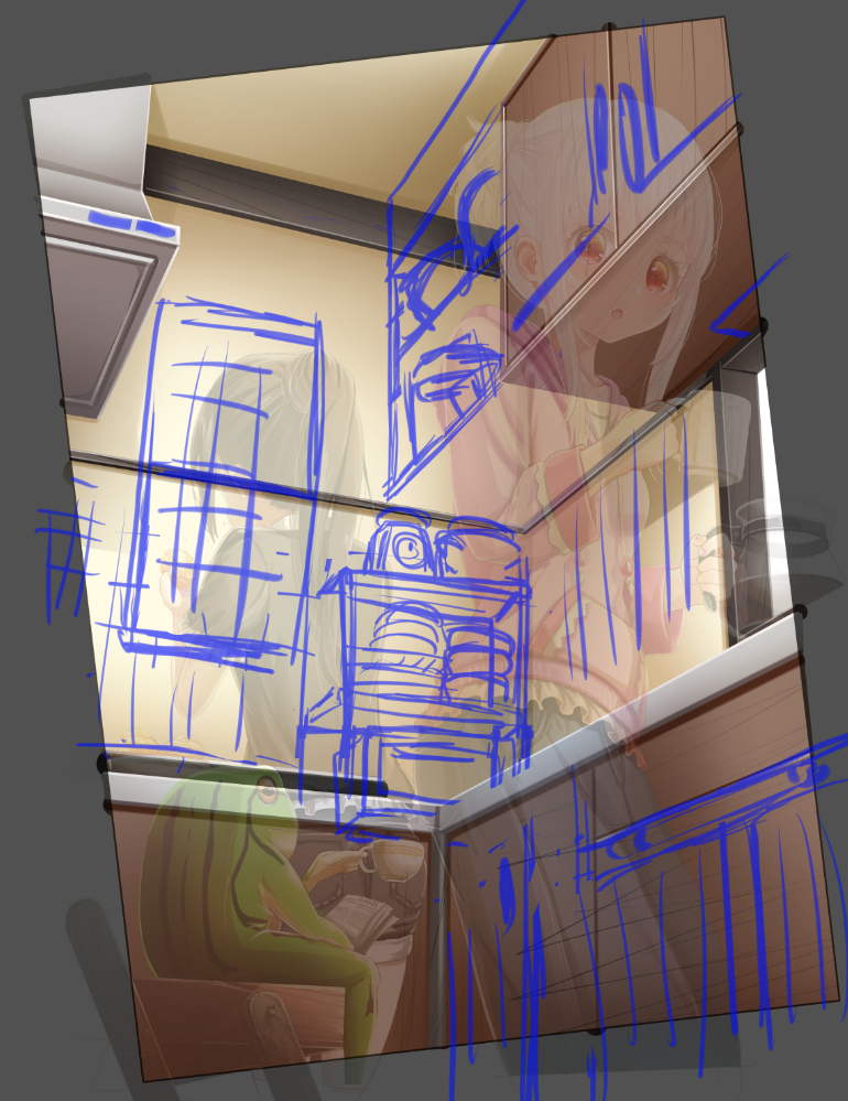
・Set the perspective based on the rough draft.
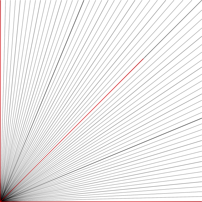
The image below is transformed and rotated to create a perspective. The vanishing point is the area where the lines meet.
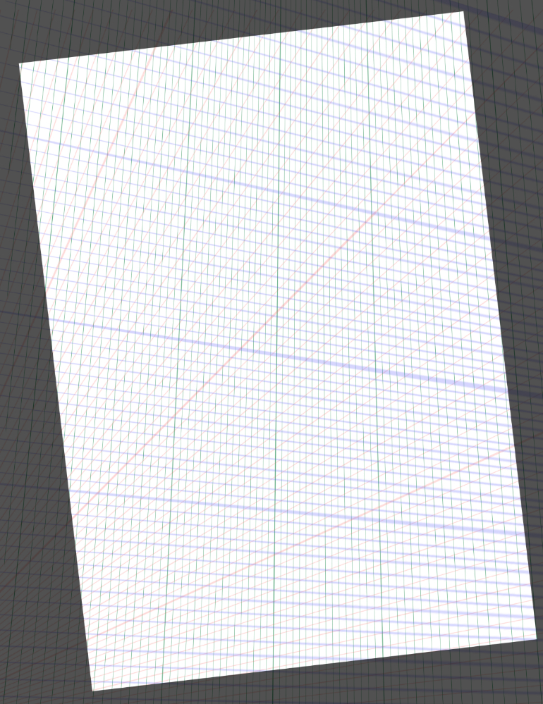
I added perspective to the vertical lines.
The green line is set perpendicular to the ground in the picture.
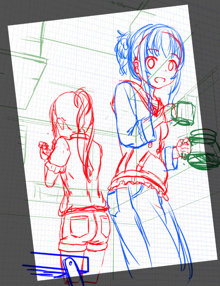
In the rough draft, I plan about the ceiling, shelves, platforms, etc., so that I don’t have too many strange places in the height and depth of things.
Consider the colors and look at the balance of placement and size.
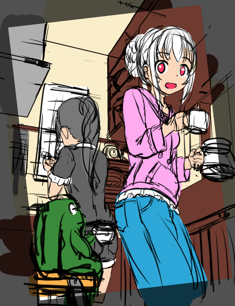
If you look at the screen and feel that you want to color, you can do it.
The line drawing and coloring of the background.
・Line drawings of the background.
I simply drew a wall and a shelf.
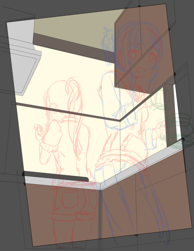
Line drawings may be reduced in opacity or hidden in the end, so I use them as a guide for painting.
It’s also a good idea to think and draw the direction of texture and setting from the beginning.
A wooden board can be clean, old, varnished, slippery, or naturally bumpy.
Also, a metal can be mirrored, slippery, cloudy, scratched, rusted, etc.
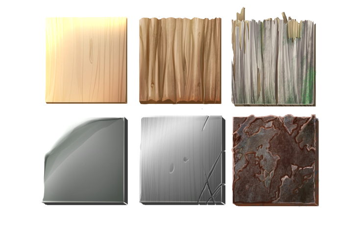
I think it helps to think about how scratches and stains got there to make it more realistic.
If it’s a new house or an old house of someone who likes to keep it clean, you can make it look clean and shiny.
If you have something dirty in a clean place or something clean in ruin, it can be uncomfortable and make it stand out.
・Shadow 1
I added shadow to the corners of the walls and the edges of the surfaces.
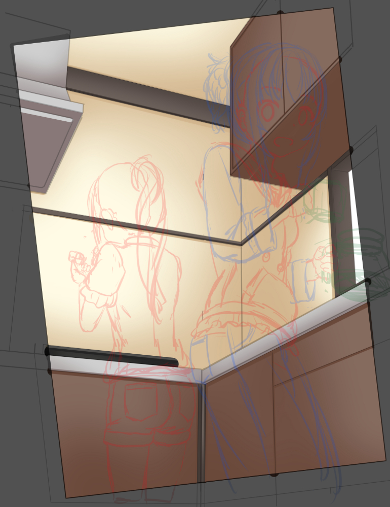
・Shadow 2
I used darker colors to make the relationship between front and back and space easier to understand.
Rather than the exact position of the light source, I tried to create explanatory shadows in the form of brighter shadows on the front and darker shadows on the bottom and far side.

・Highlight
I emphasized the corners, edges, and grooves of the surface. I think it makes the shape easier to understand.
After drawing in bright colors, I used a soft eraser to erase areas that were too conspicuous.
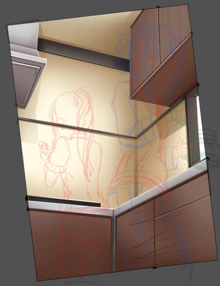
・The grain of the wood.
It’s okay to use a photo, but be careful not to use a photo as is, because it will be too obvious.
I tend to draw simple things by hand.

If the background is too realistic or too detailed, the character may be sunk in it, so I need to be careful about the balance.
Additional details and accessories.
・Accessories
For each situation, think of something that looks like it, a standard accessory, a stylish design, or something that would be useful.
Searching for images or looking at the websites of furniture stores will help you visualize.
For a picture of a room, it is recommended to draw a window, as it will add a level of depth.
To make it easier to adjust later, work in separate folders for the room pattern, shelves and windows, and small items such as plates.
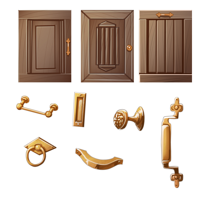
There are many different designs for walls, door patterns, drawer, and shelf handles.
In real life, some designs hide handles, etc. so that you can’t see them, it’s better to adopt something easy to see and understand.
・Additional patterns to the walls and cupboards.
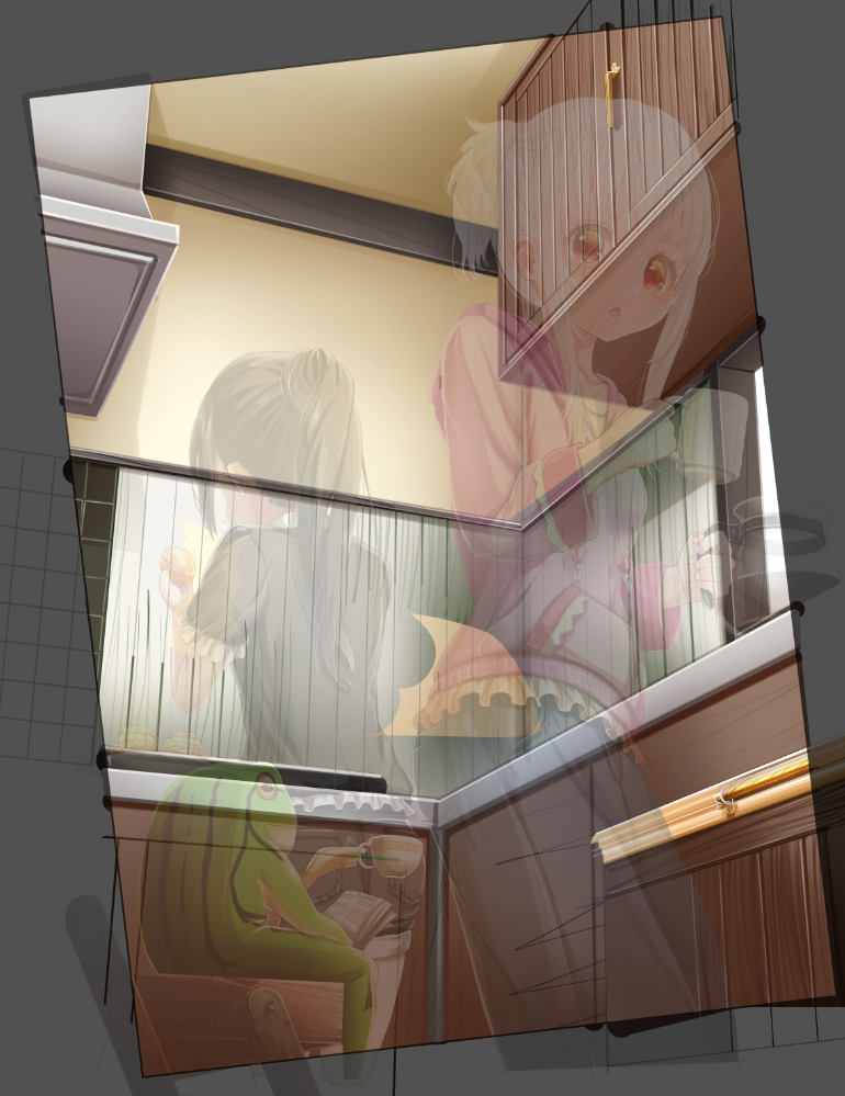
Draw a vertical line, copy it, move it sideways, merge it, copy it, move it, merge it, and repeat it to draw evenly spaced lines.

You can easily transform these lines to create a guide that matches the perspective.
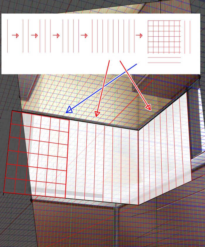
For designs with shallow depths, such as tiles or dugouts, it is easy to draw them on a flat surface and then fit them to the perspective.
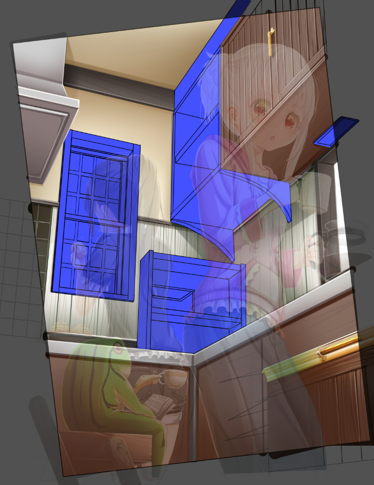
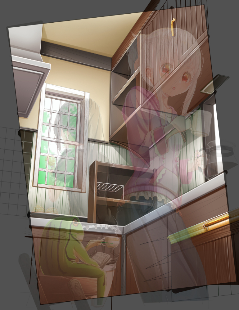
・The shelves and windows.
This is a shelf for storing small items. I drew it in the same way as the wall.
I didn’t want dust to accumulate between the cupboard and the ceiling, so I covered it with a board.
・Small things
Since the colors are sparse and many, I’ll use a different method than the one I painted above.
I painted the ground and one shadow and two shadow highlights together with no color.
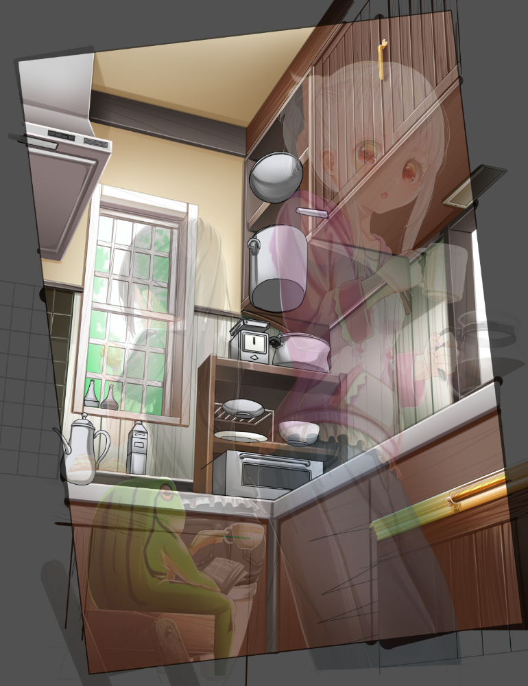
Create an overlay layer and a multiply layer between shadow 2 and the highlight to add color.
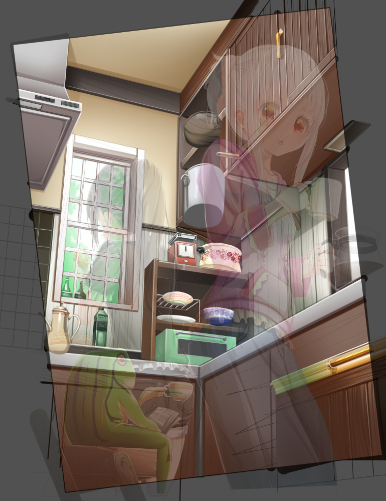
Merge and copy the layers of the small objects. Add more plates and then erase the areas that are hidden by the shelves.
We live with three people, so we have three plates each.
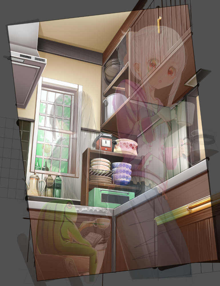
If you copy something that stands out, people can notice it.
It will look better if you transform it or add a few lines.
That’s all for the background.
Finishing
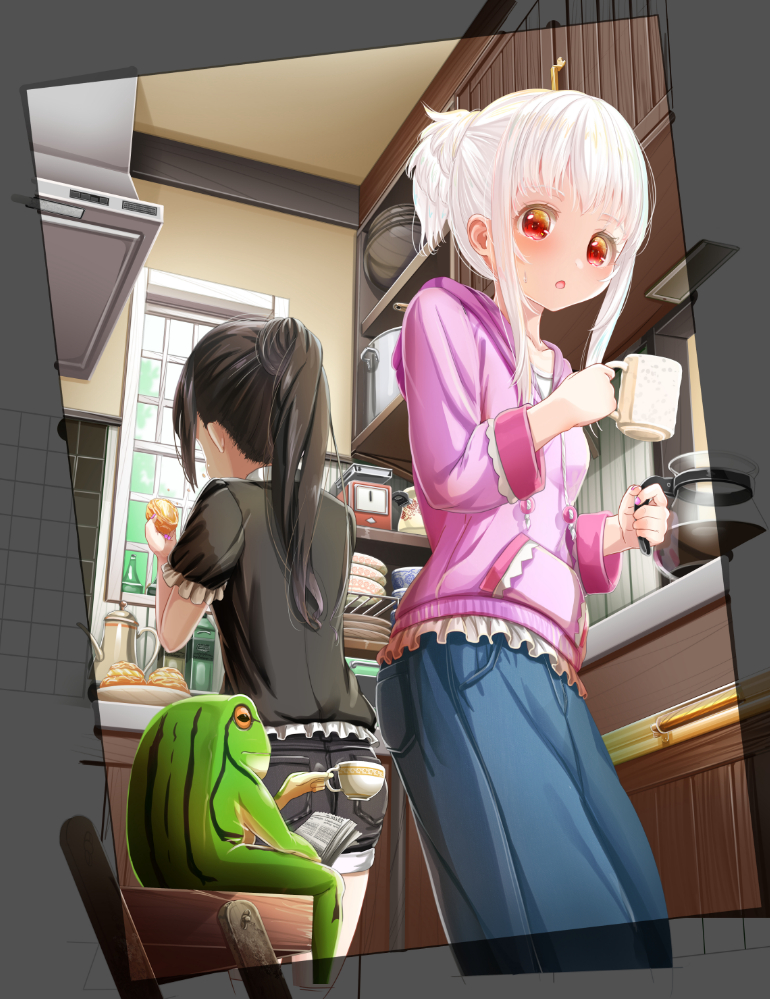
I added shading to be aware of the shadows and light sources affected by the character through overlay and multiplication, and to make the character stand out, I thinly filled in prominent areas of the background to hide the contrast.
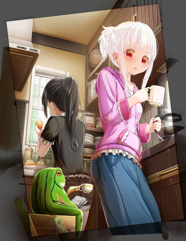
Integrate the background, blur the back, and add details and integrate.
Adjusted the colors with color tone adjustment.
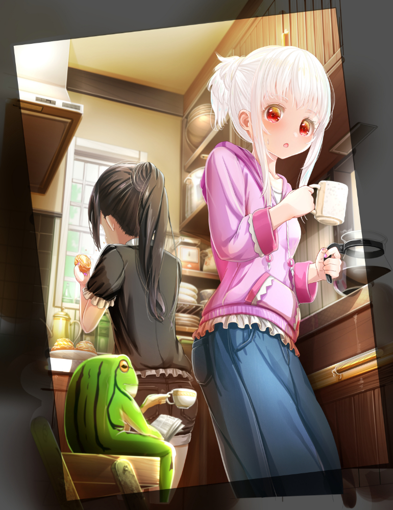
Rotate and crop to complete.
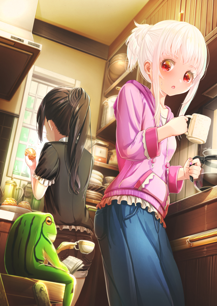
I modified the position of the eyes of the character in the foreground and the elbow of the character in the background.
This time, I drew plates and a kettle as standard kitchen accessories in a kitchen with a lot of wood.
If you draw things that are common or useful in each place, people may find them interesting.
I think the background is a part of the character that shows the character’s taste and living environment.
If you’d like to try drawing with my style, please!
ーーーーーーーーー
Creator Rank Benefits
https://medibang.com/page/about-creatorrank/
”Illustration Work” Introduction
ーーーーーーーーー
「あいうあぼ」
ART street
Click here for the collection:https://medibang.com/u/aiuabo/
Click here for the interview:https://medibang.com/page/interview/aiuabo005/
twitter
https://twitter.com/aiuabo
fantia
fantia.jp/fanclubs/7719
YouTube
https://www.youtube.com/channel/UCjMU9P63KuehSokYEAvr6-w
\ We are accepting requests for articles on how to use /

