2021.08.11
[For Smartphone Beginners] What is the best thickness for line art? A comparison of each px.

When it comes to drawing an illustration, many people become stuck on how thick the lines should be.
So here, I would like to draw illustrations with various line thickness and compare the different impressions they give.
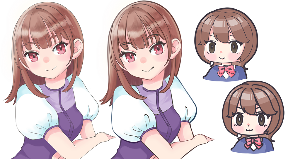
1. How thick do you draw your lines?
Before I start drawing, I would first like to find out of how thick do you all draw lines.
I looked at places like Twitter and Togetter, illustration line technique books, and I found out that most people were drawing lines with a thickness of roughly 1-12px.
We can categorize these
・Small: 1 to 3px
・Medium: 4 to 8px
・Large: 9 to 12px
into these measurements
I have gotten the impression that many people prefer drawing with 3 to 5px.
(*These are just my impressions based on a quick look at social media and books, so if you want to check it out, please check them out)
Now, based on these results, I’d like to try drawing with MediBang Paint’s pen brush in different thicknesses.
2. Comparing the illustrations and their line thickness
This time I set the resolution to 350dpi and the canvas size to 1200x1600px.
2-1. Color illustration
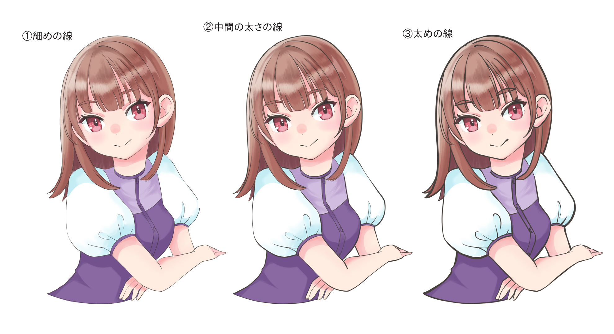
① Thin line (Main line: 3px / Sub line: 2px)
Thin lines have the characteristics of blending easily with colors.
Even if the lines color is black, they serve as good complements to the colors and won’t interfere with the color of the paint.
This is also useful when you want to create a light color or gentle atmosphere.
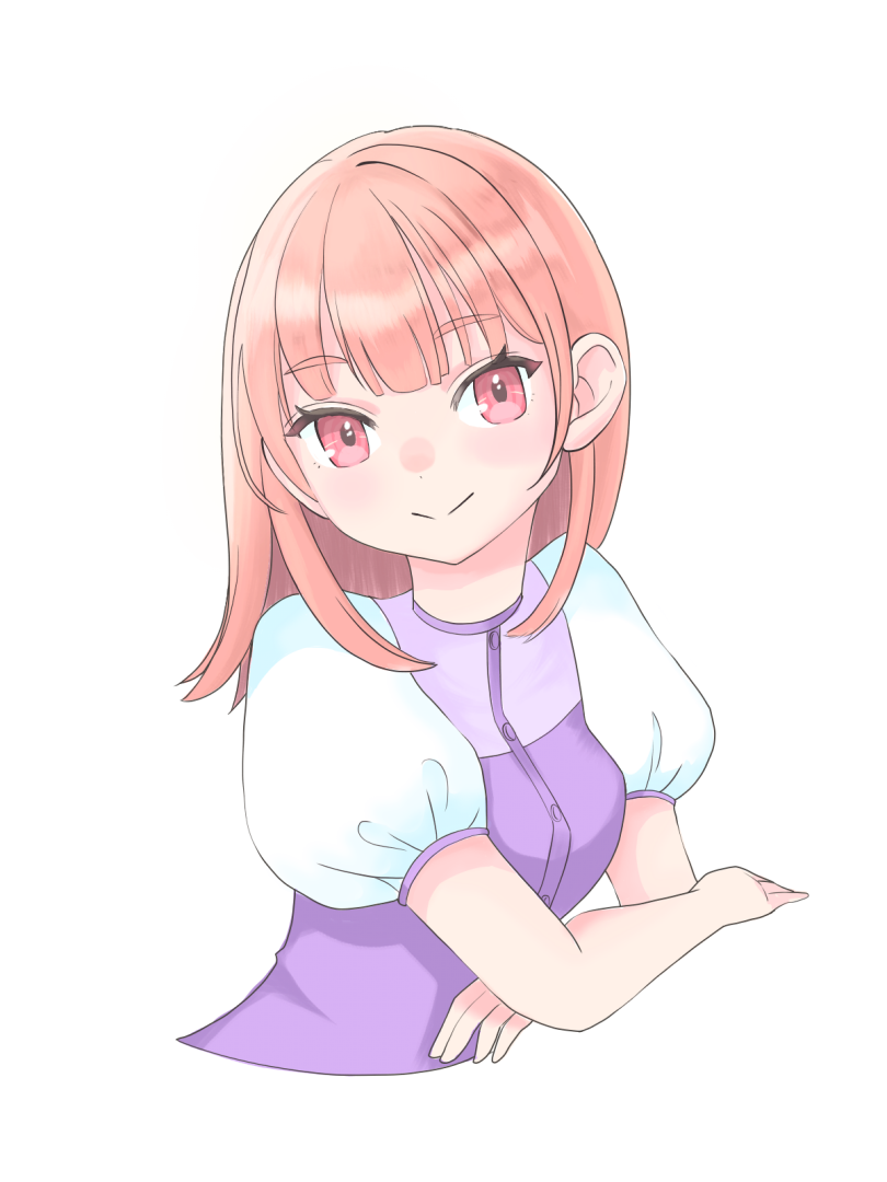
Recent anime also have a lot of thin lines with less inflection, so it is good for creating an anime-like look.
② Lines of medium thickness (main lines: 5px / sub lines: 4px)
This image is a blend of characteristics ① and ③.
It makes the contrast moderately clear and brings out both the fill color and the lines in a well-balanced manner.
③ Large lines (main line: 12px / sub-line: 8px)
Because the lines are assertive, the contrast is clear and easily noticeable.
It goes well with highly saturated and clear colors and impressive pictures with strong overall contrast.
In some cases, thicker lines are used to enhance the impression of the animation when it needs to be powerful.
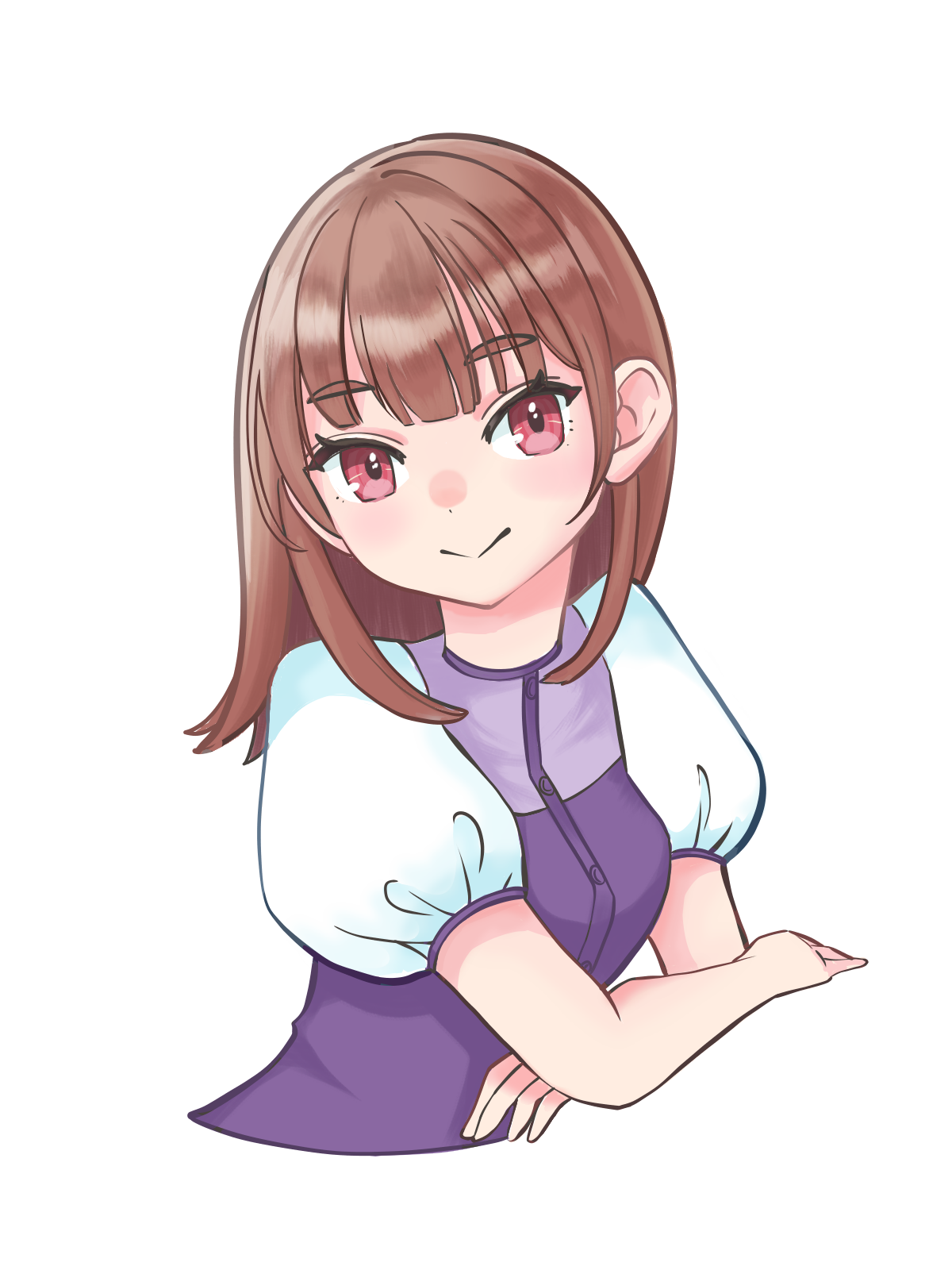
You can blend the colors with color tresses for a slightly lighter look, or suppress the inflection for a POP look.
2-2. Monochrome illustration
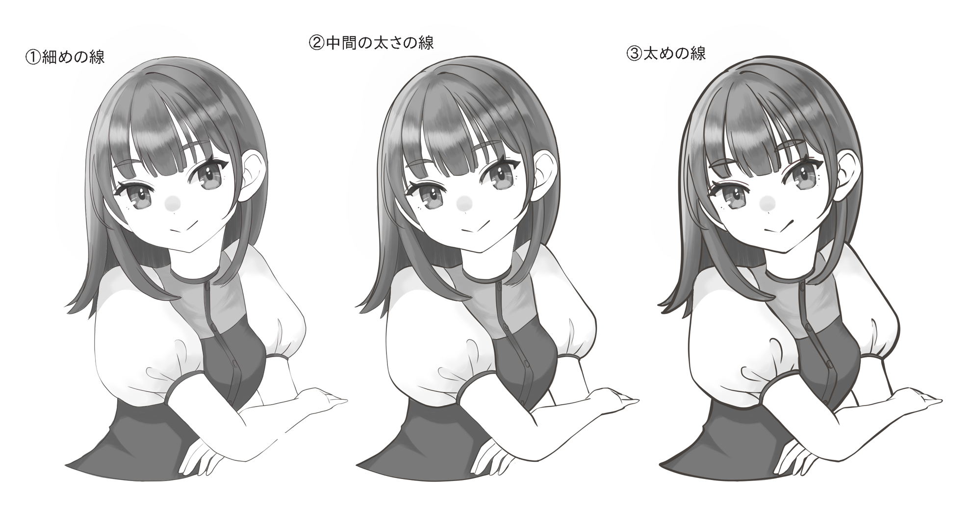
① Thin line (main line: 3px / sub line: 2px)
Gives a delicate and fragile impression.
This style is recommended for shoujo mangas and when you want to express softness and delicacy.
If the lines are quite thin, it is difficult to create intonation, so the intonation is created by overlapping the lines.
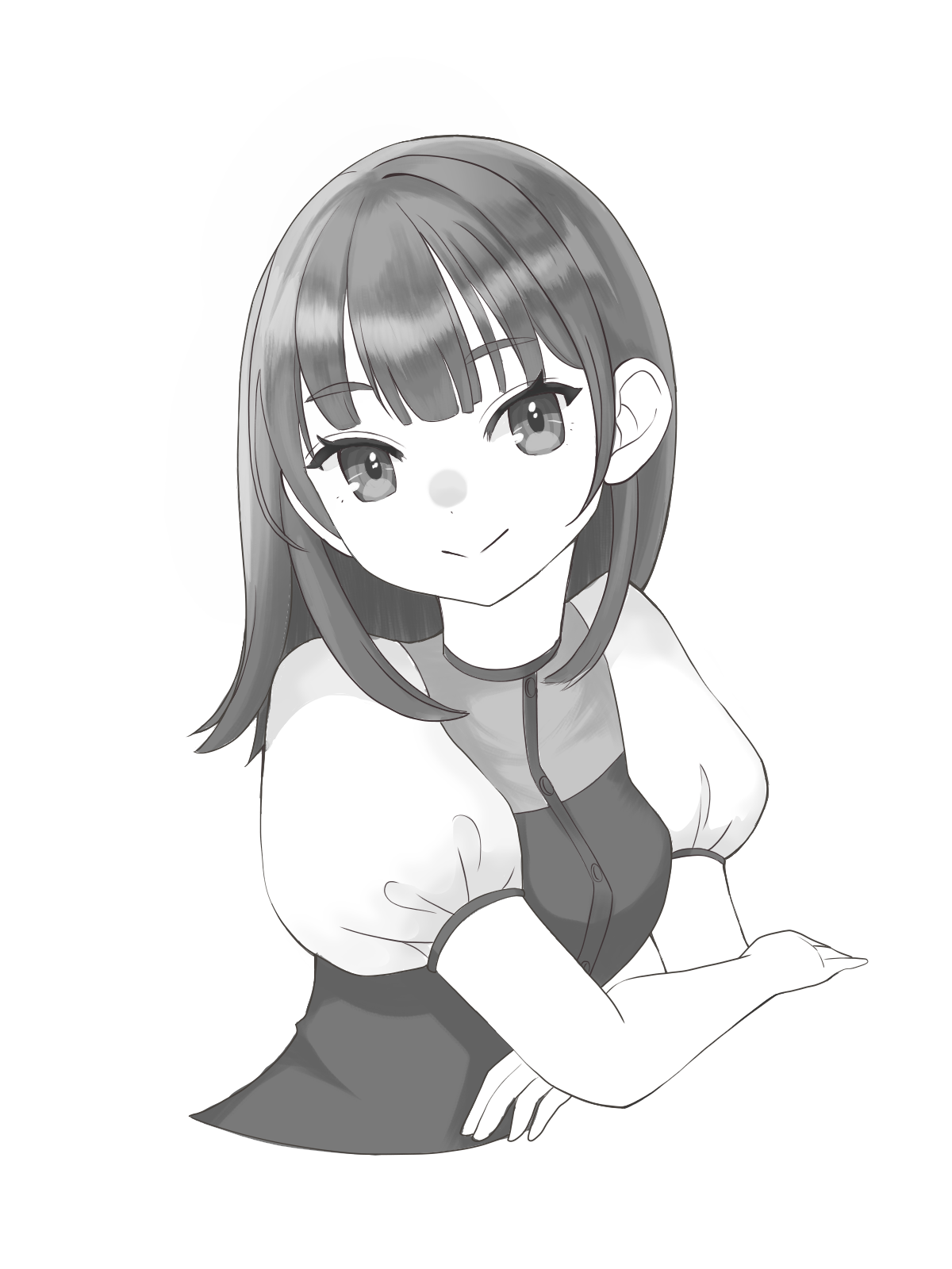
② Lines of intermediate thickness (main line: 5px / sub line: 4px)
You can draw lines with intonation and moderate contrast.
You can think of it as a standard line.
③ Thicker line (main line: 12px / sub line: 8px)
The contrast between black and white is clear, which creates a strong and powerful picture.
You can also make it look like a paper cutout picture depending on how you draw it.
2-3. Chibi-chara
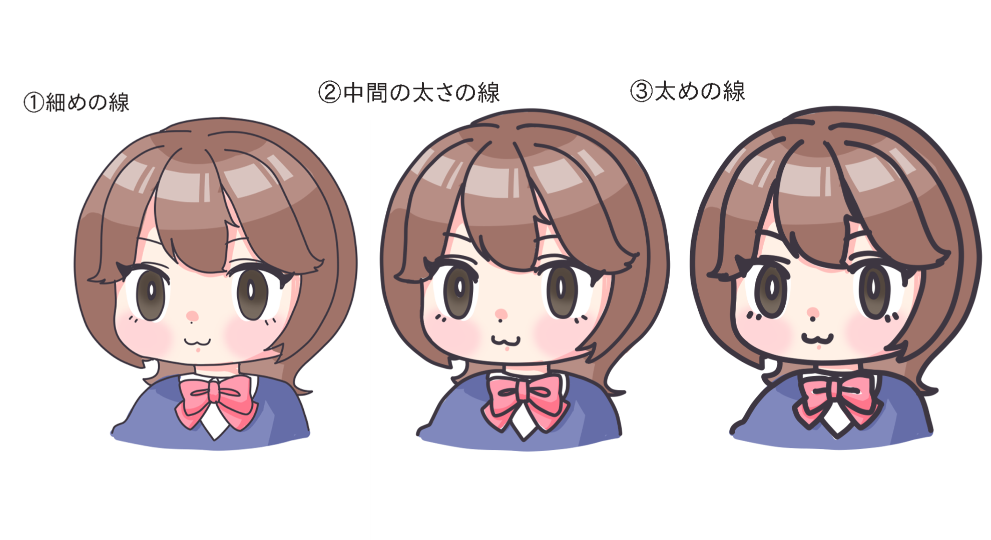
① Fine lines (4px)
Since it allows you to draw in fine details, you can use this for mangas with chibi expressions or chibi characters.
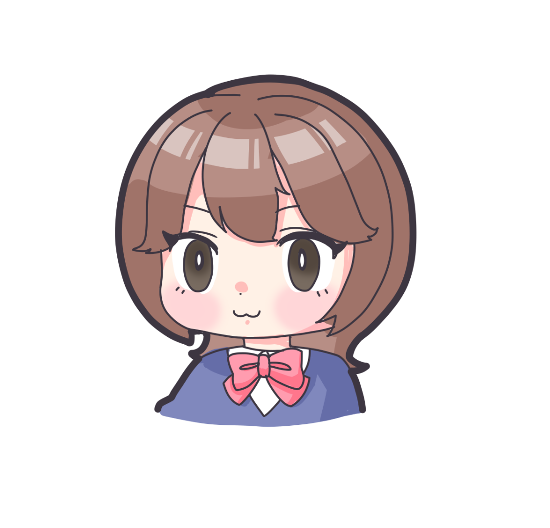
If you make the outside thicker, you can also make the character stand out well.
② Lines of intermediate thickness (8px)
The lines are more solid than those in ①, so it has a bigger impact
With this you can draw in more detail, so it is suitable for mangas with less complicated child characters or small characters.
③ Thicker lines (12px)
The impact of the lines is strong and eye-catching.
It also tends to give a cute impression, so it is suitable for character novelty goods or mascot characters.
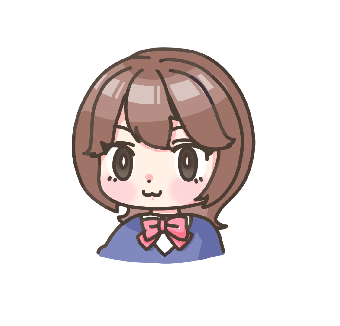
You can also change the lines’ colors with color tracing to give it a more lighter look.
3. What thickness should I use in the end?
The thickness of a line in an illustration depends on the person drawing it.
There is no one-size-fits-all “correct” thickness because it as gives the artist individuality.
However, you can choose the thickness of the lines according to the illustration you want to draw.
For example, if you want to draw a delicate illustration, use “thin lines”, and if you want to draw a powerful illustration, use “thick lines”.
If you find a line that may fit into what you want to draw, please try drawing it with that thickness.
If you want to improve from there, try gradually adjusting the thickness to get closer to what you want to draw.
It is also a good idea to observe the lines drawn by the artists you admire, and try drawing in a similar way.
(Text and drawing by Sakaki)
\ We are accepting requests for articles on how to use /


