2022.07.06
[Easy] How to draw backgrounds using perspective guides
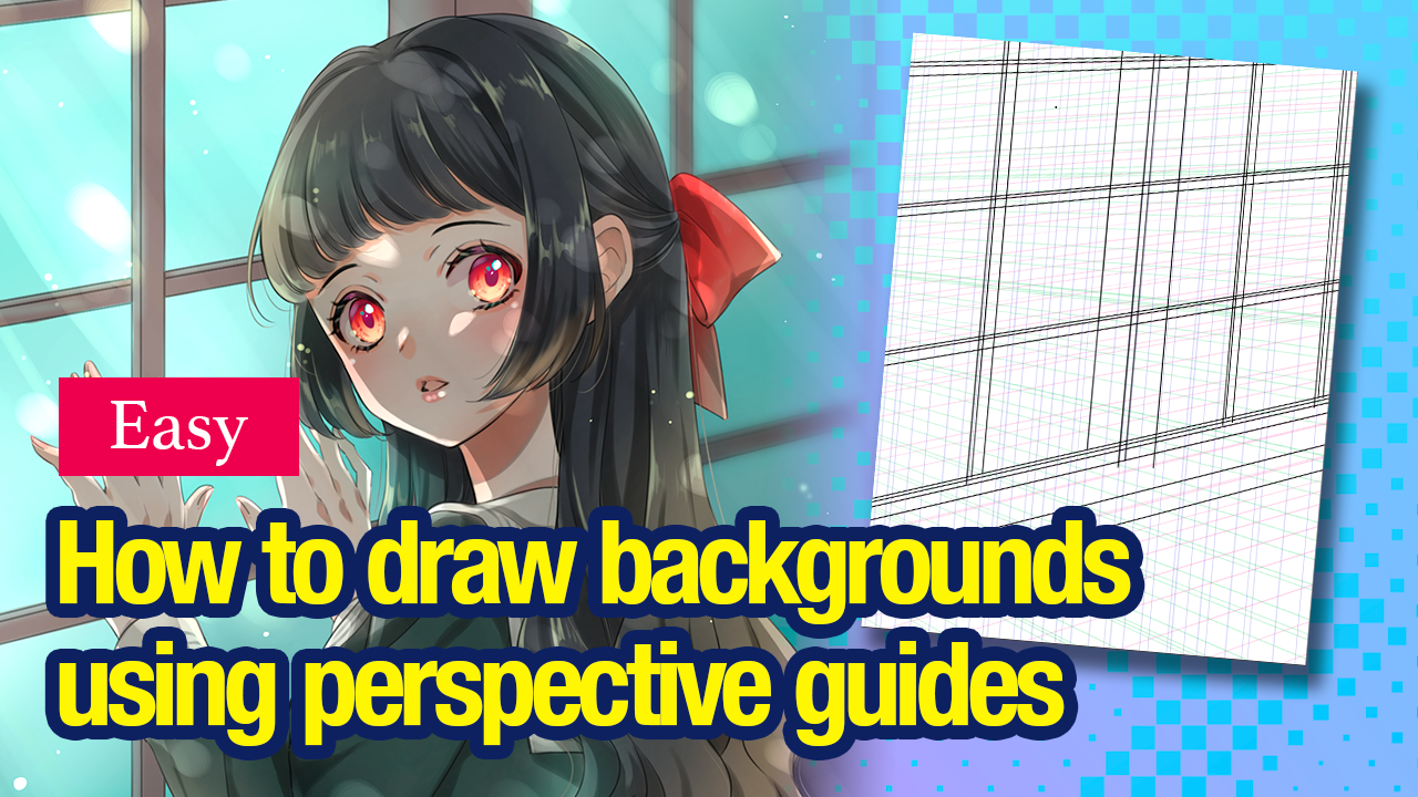
“My character is done but I have an empty background… I want to add something”
You might often come across similar cases.
In this tutorial, I will be introducing an easy method to draw the background, using the “perspective guides”.
*Please note that I did not create a perfect perspective guide here. The background in this illustration is a very simple example.
1.Roughly sketch the background
First, start off by thinking of what kind of background you want to draw.
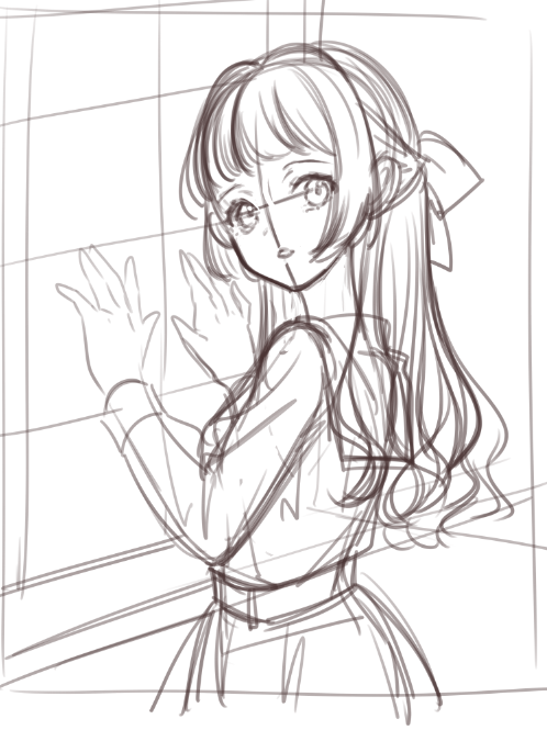
With this illustration, I began drawing with an overall image in my mind so I will be taking the perspective based on that.
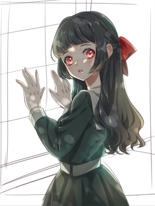
Character painted
Sketches only
2.Use the Perspective Guide on your sketch
If you start drawing directly from the rough sketch, the direction of your lines will not be stable and will be likely to end up looking odd, so the Vanishing Point Snap will come in handy for drawing proper lines.
When you draw a space, think of the three vectors; “Height, Width and Depth”.
In this illustration, those translate to the three perspectives below:
・Perspective narrowing down towards the back (horizontal lines of the window frame)
・Perpendicular vertical lines (vertical lines of the window frame)
・Depth created towards the outside of the windows (I will not be using this as much since the character mostly covers the window)
Start by using the Vanishing Point Snap.

Click two points on the canvas, along the rough sketch.
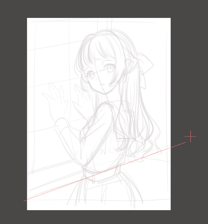
Similarly, click two points on the canvas along a different line within the same vector. As you can see in the image below, one of the perspectives is complete.
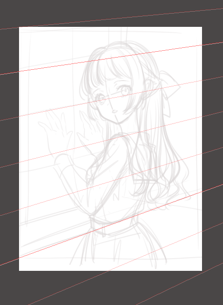
You will be able to trace the perspective and draw straight lines along the snap. Now follow the perspective guide and draw approximation lines you will use when you create a line drawing later.
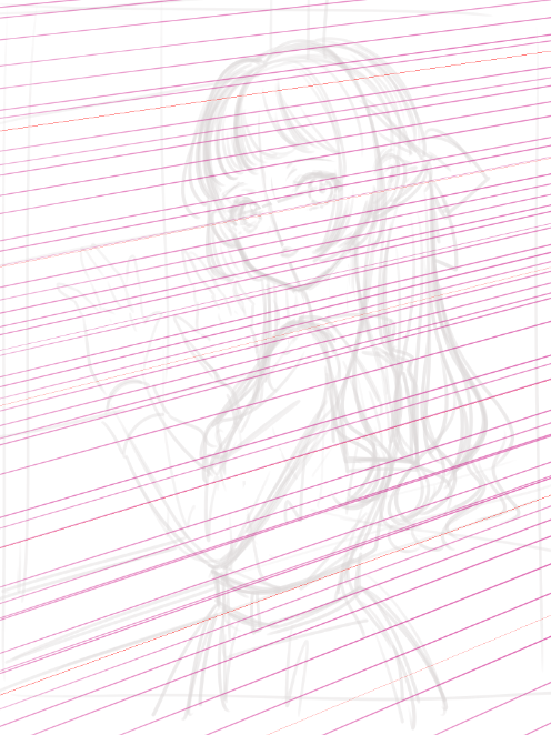
Do the same for depth perspective, just like in the two images below.
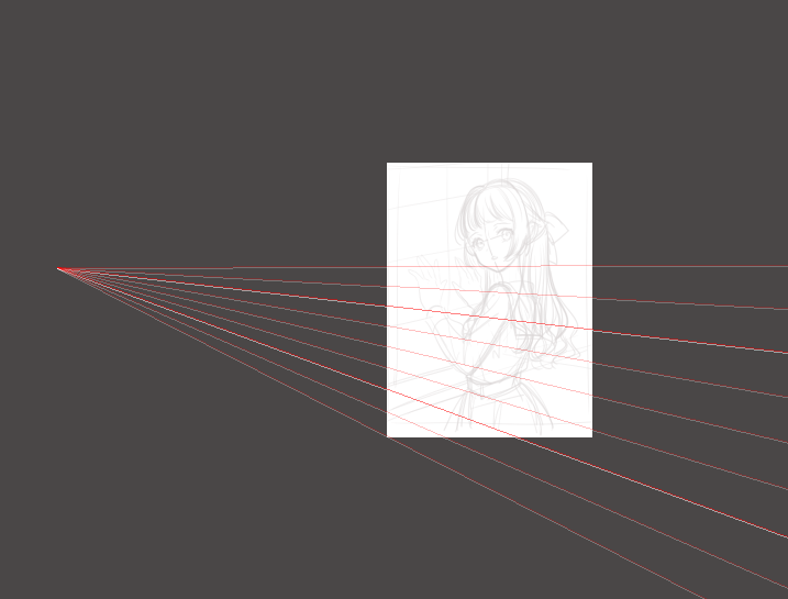
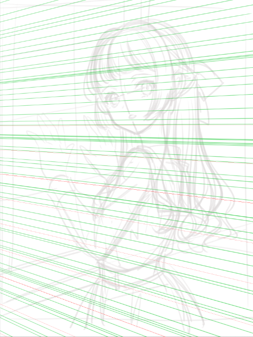
*If you want to reset the snap, click the gear icon on the further right.

Next, take the vertical perspective guide.
I want the perspective lines to be perpendicular so I chose the Crisscross Snap.

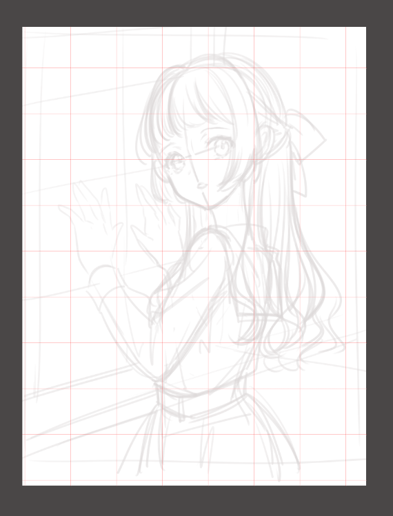
You will be able to draw perfect lines both vertically and horizontally by following this snap.
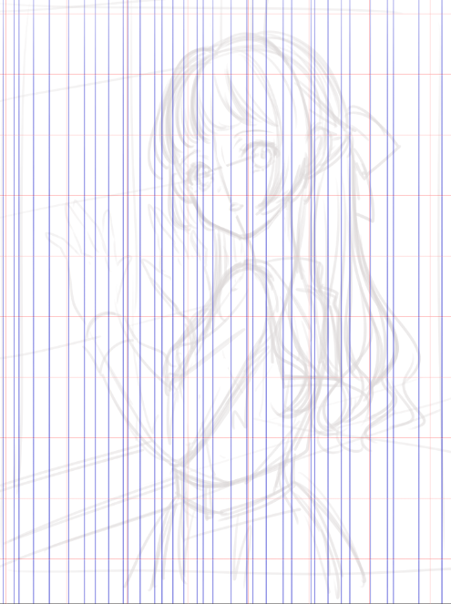
Now I have all three perspectives done.
This is how it looks combined.
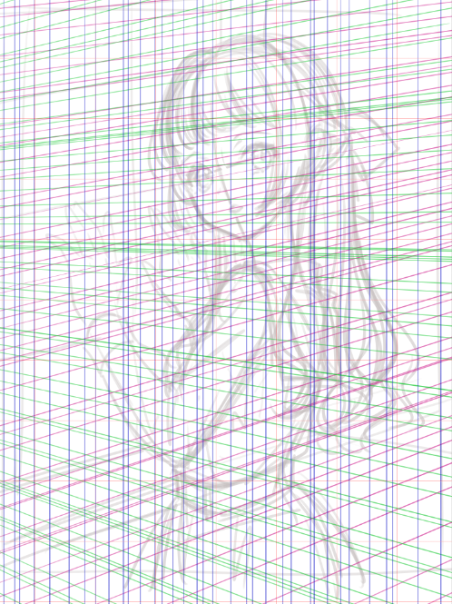
3.Create a line drawing of the background, following the perspective guides
Use the perspective lines as guides and start illustrating the line drawing.
(I used the “Watercolor” brush for this line drawing.)
When you want to draw perfect lines, click on where you want to start and move the cursor while pressing the Shift key.
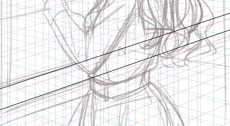
This is how it looks as I trace all lines.
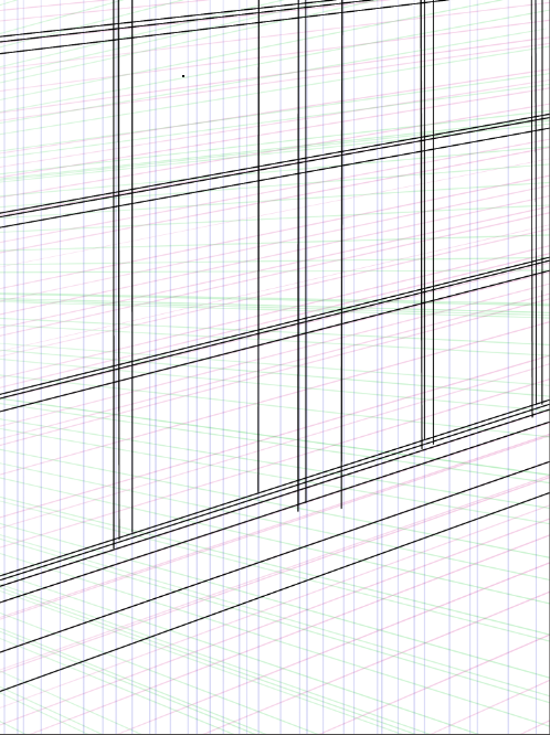
Erase the overlapping parts and now the line drawing for the background is complete.
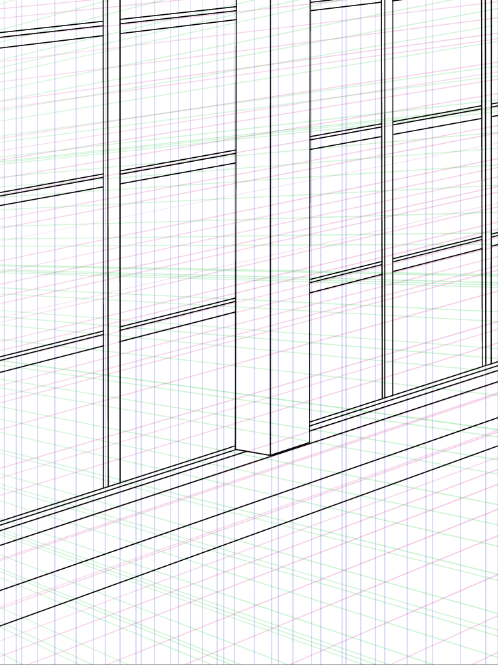
4.Paint the colors
Paint the background with the illustration of your character shown.
You must paint on layers below the character layer.
For this illustration, I want the character to stand out most so I will not be painting much here.
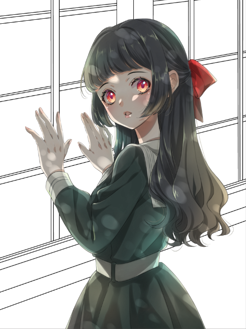
Fill the layer with low saturated color.
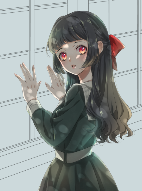
Add more colors to each part, one by one.
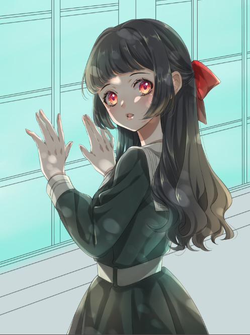
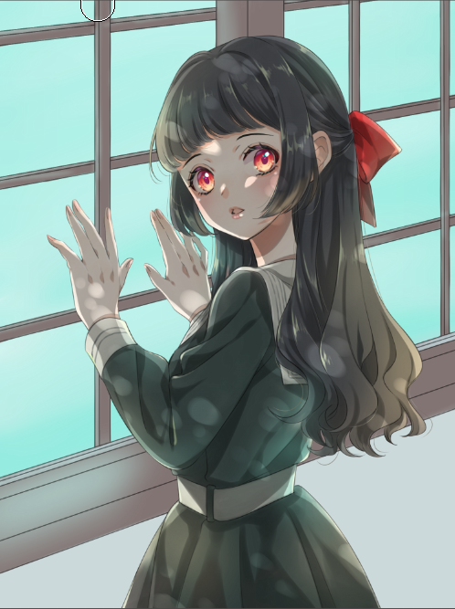
I created a new layer with gray paint, with its blending set to “Multiply” to add the “dark to light” gradation effect from the lower right to the upper left.
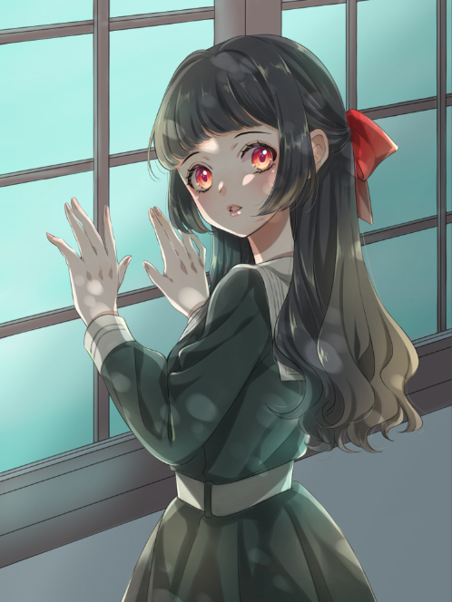
Now the base painting is complete.
5.Adjust the overall balance
I will be adding “the light” to create an illustration with natural light striking through the windows.
Create a new layer on top of all layers, and set the blending to “Add”.
For the color, I chose a shade of pale yellow, that is very close to white.
Here I used the “Watercolor” brush and the “Blur” brush.
Change the brush size to a relatively large number and draw the diagonal light striking in from the upper left to lower right.
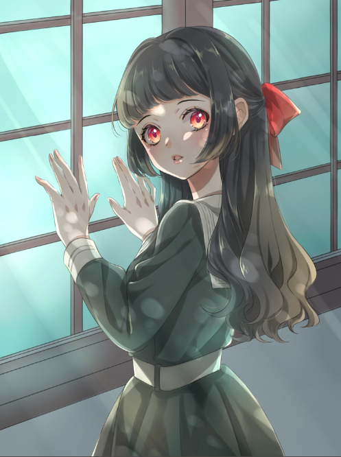
It felt a little empty so I will be adding dots and circles of light, creating the dappled light effect.
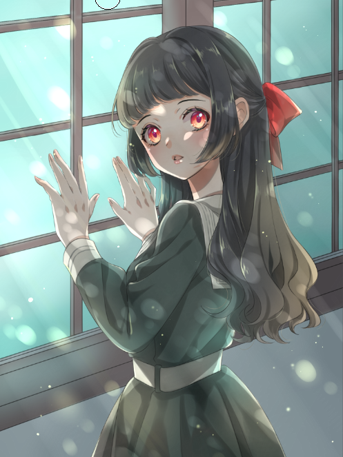
If the lights are too bright, lower the transparency of the layer.
The last step is the final touches.
Marge the layers you used for the background.
Use the “Blur” brush to blur the back of the illustration and make the front area stand out.
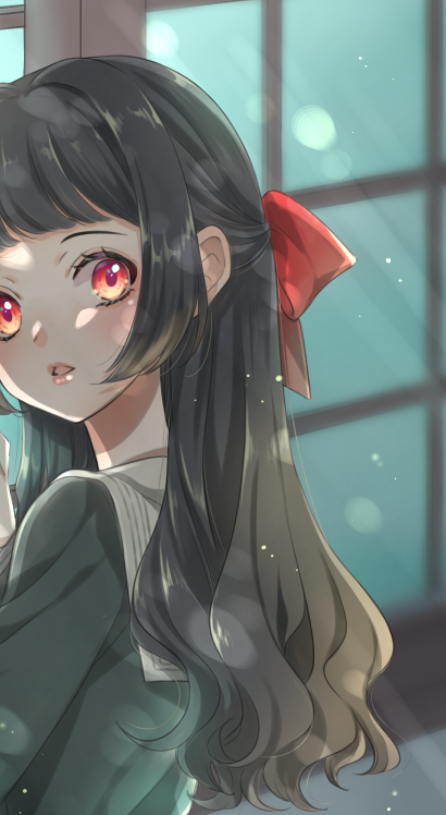
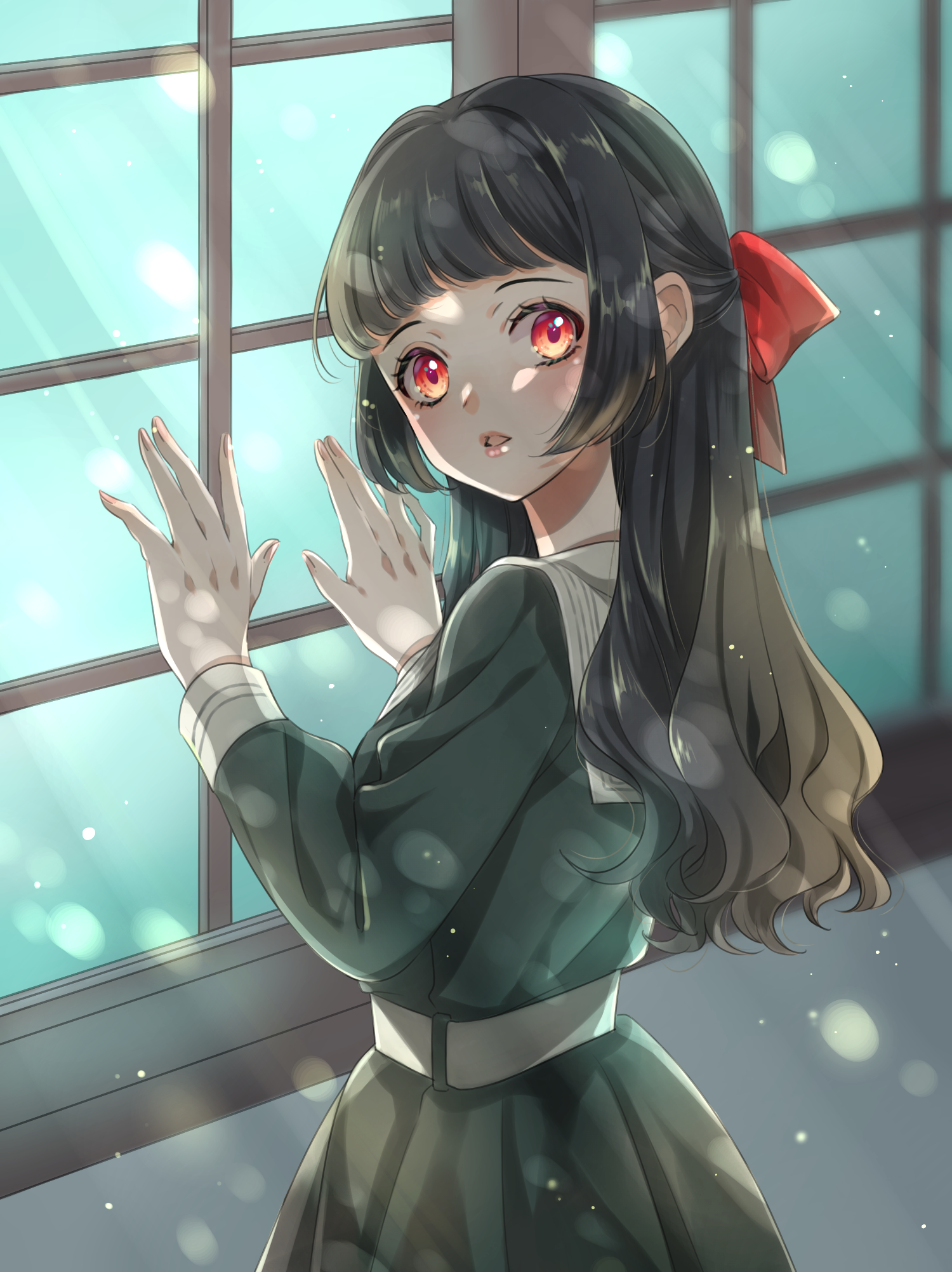
Adjust the hue of your illustration via “Tone Curve” of the Filter tab to fit your liking.
How was this tutorial?
Although it may sound difficult to create a perspective guide, remember that using these snaps will help you draw a natural background so I hope you give it a try!
(Text・Illustration/りーりん)
*twitter @ichidanmepile
*instagram @ichidanmepile
*web site https://ri-rin.jimdosite.com/
\ We are accepting requests for articles on how to use /

