2023.04.03
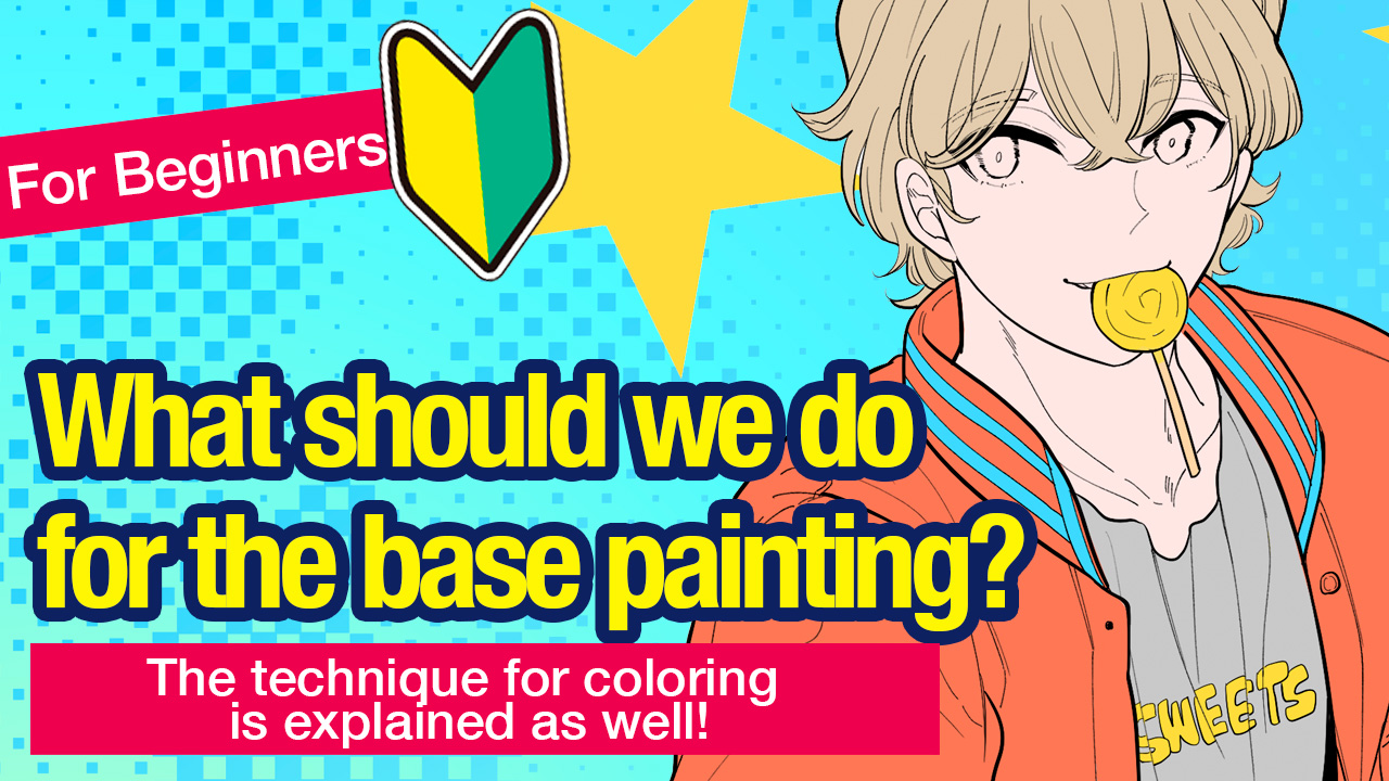
[For Beginners] What should we do for the base painting? [The technique for coloring is explained as well!]
Do you do the base painting in your art process?
This is done before you add colors, shadows or patterns to your illustrations.
In most illustration making videos, people tend to fast forward through the base painting scenes.
Today, I would like to show you beginners how to do the base painting and also the technique for coloring!
Preparation for base painting
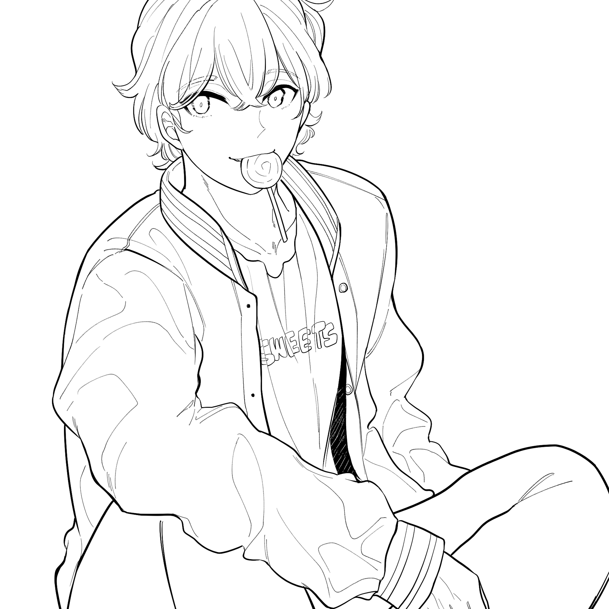
This is the line drawing we are going to add colors to.
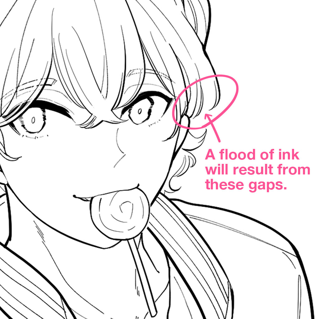
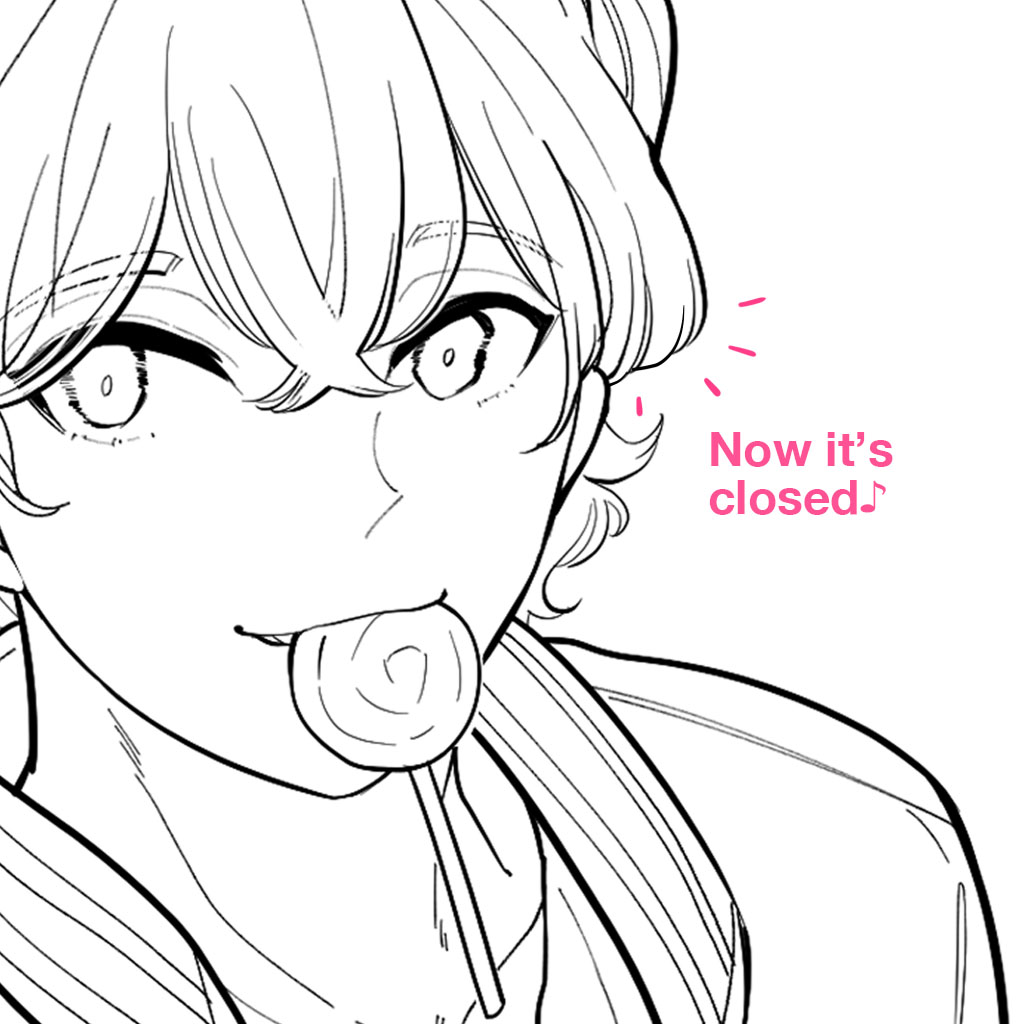
①Make sure there’s no gap between the lines!
If there is a gap between the lines, it will be difficult to select areas for color fill later.
If possible, close the gaps between the lines.
②Separating the folders
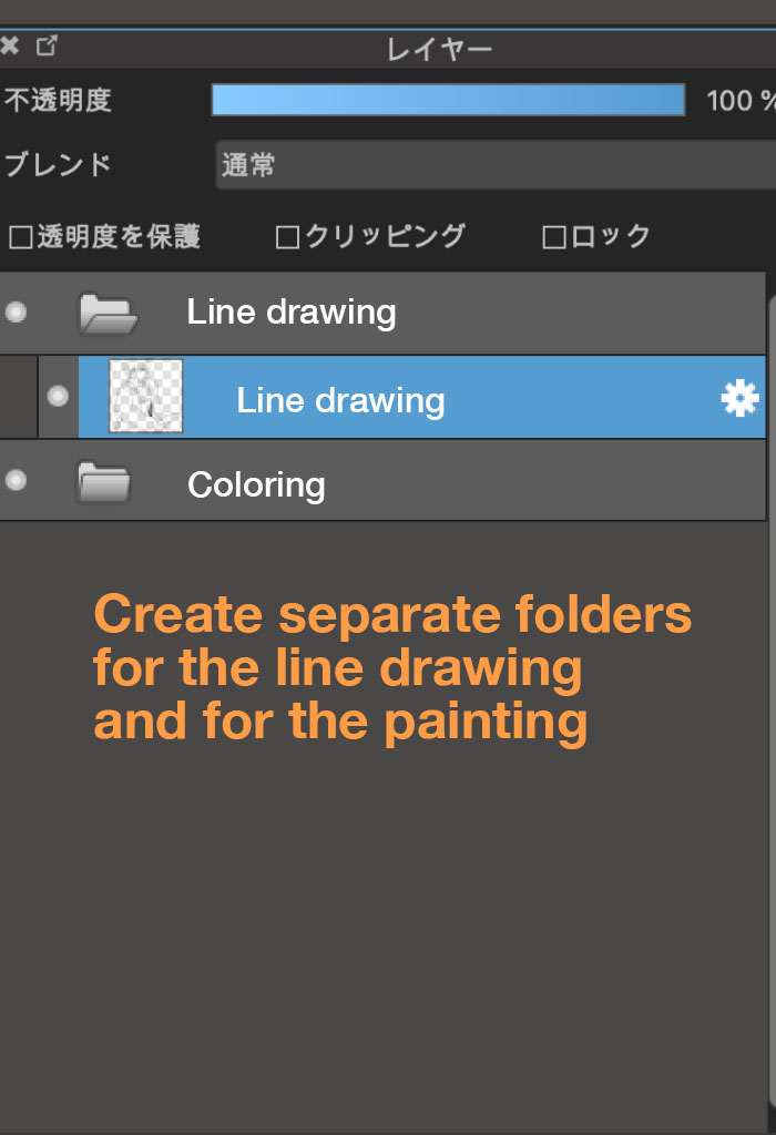
You are sure to get into trouble if you add colors to line layers.
That’s why you should create separate folders, one for line layers and one for color layers.
③Base painting for the skin
Now that you’ve separated the folders, let’s start the base painting of the skin.
Select the Magic Wand tool from the toolbar.

Select the area of the skin.
If there are several parts you want to paint, hold down the Shift key and left-click to select multiple areas.
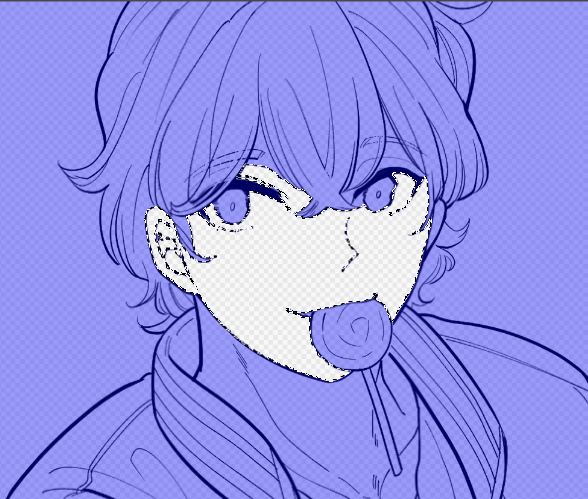
After you have selected the whole of the area that you want to paint, select the Bucket tool.

With the Bucket tool, click on the area you have selected.
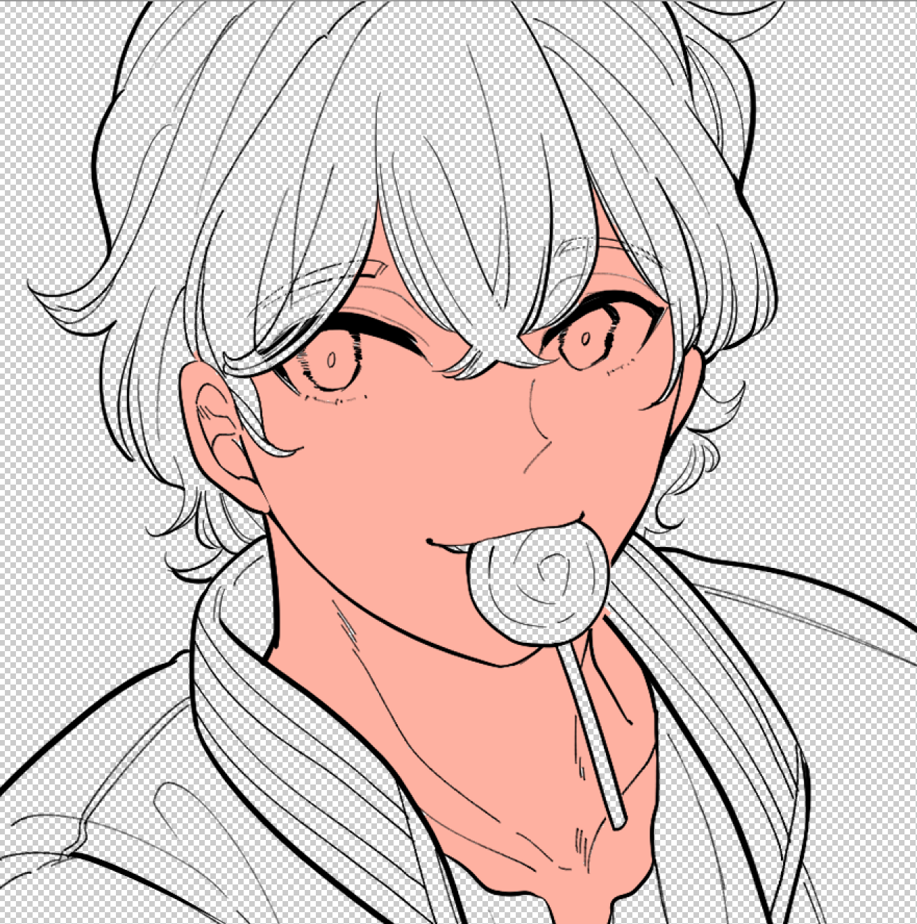
The selected skin area is now painted!
If you paint in a pale skin color at this first stage, it will be difficult to check whether the detailed areas are painted accurately.
So I recommend that you paint in a darker color (you can adjust to a lighter color later, so any color is fine as long as it is dark!)
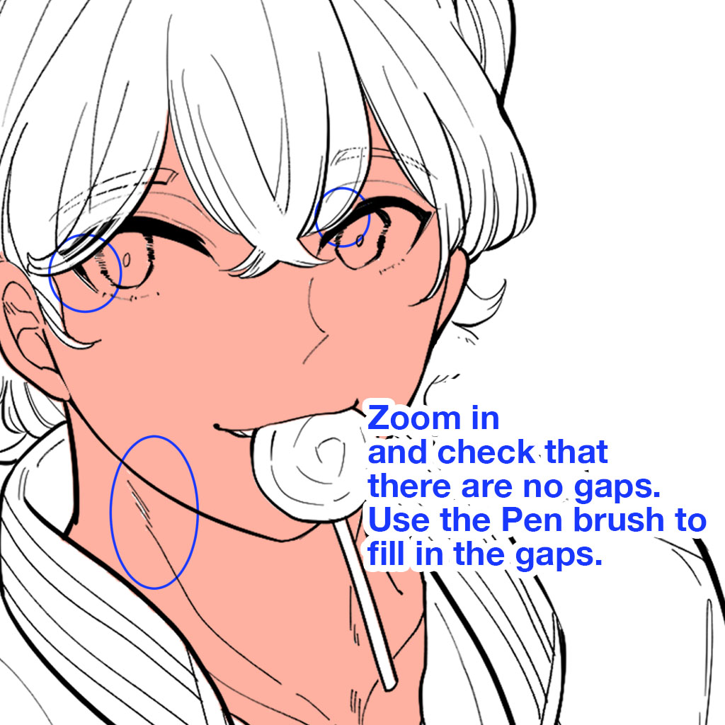
If you look closely, you’ll see that there are some gaps that haven’t been painted.
Use the Pen brush to paint the gaps.
Fill them in with great care.
This effort will result in a refined finish to the work!
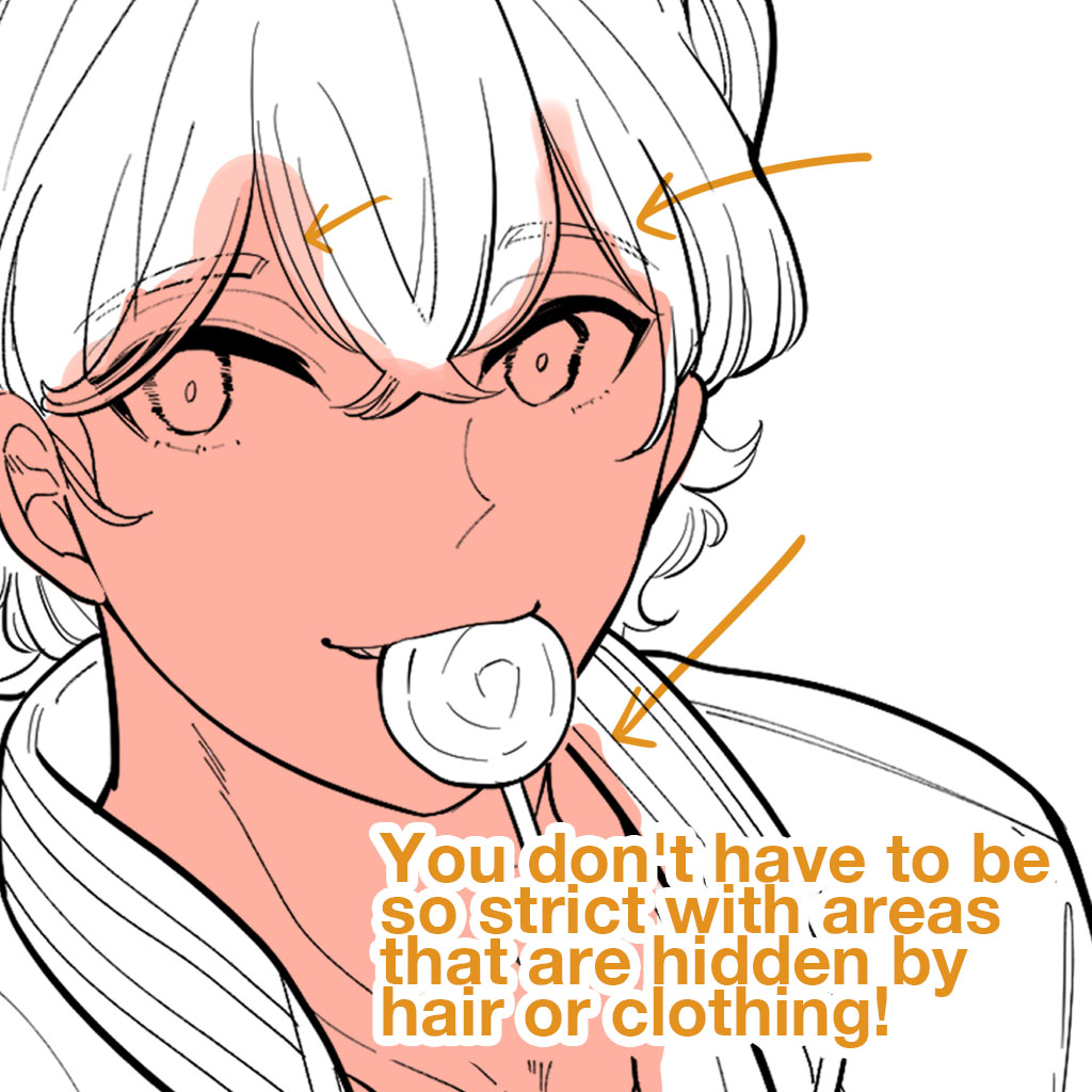
It’s okay for colors to show up in areas that are covered by hair or clothing.
That’s because the hair and clothing layers will later overlap the skin layer.
Remember that it’s fine for the color to stick out in the area that will be covered by layers.
④Base painting for the hair
Now apply the base color to the hair in the same way as for the skin.
Try to concentrate on painting right up to the edge of the hair!
Add a new layer on top of the skin layer.
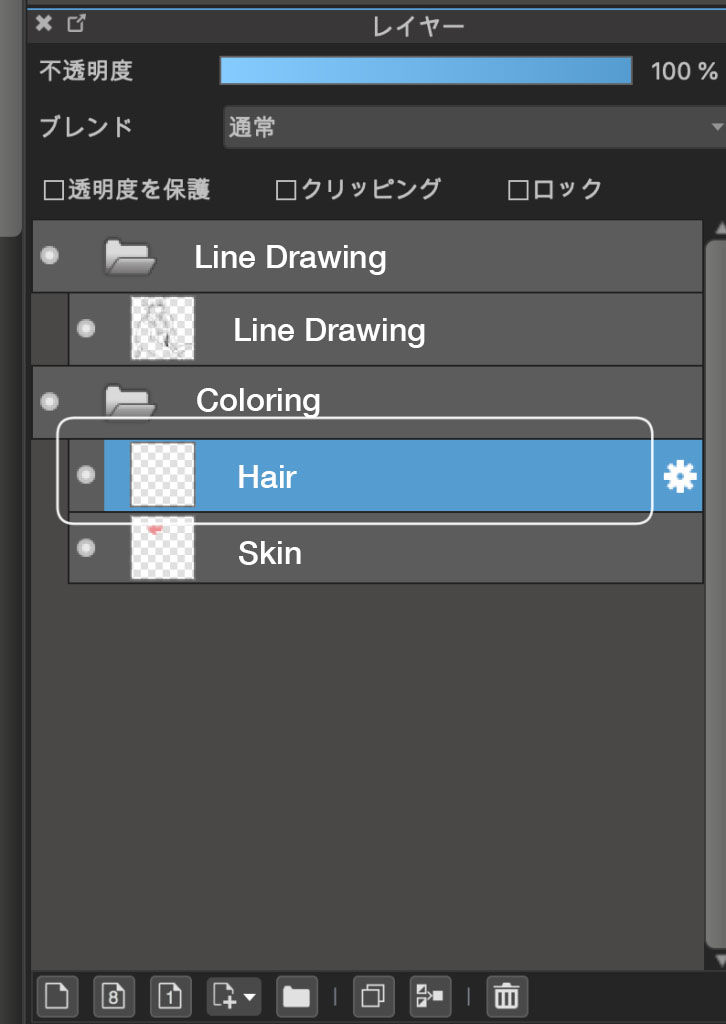
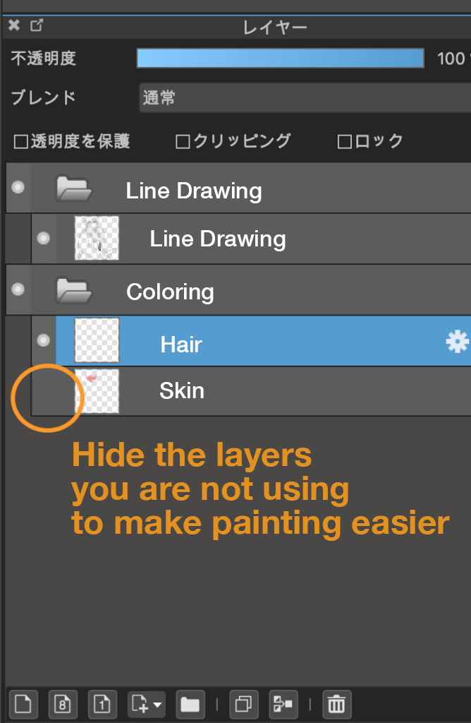
To make it easier to select areas, uncheck the display checkbox for the painted skin layer to make it invisible.
Then select the area where you want to apply color using the Magic Wand tool.
Fill the hair area with color.

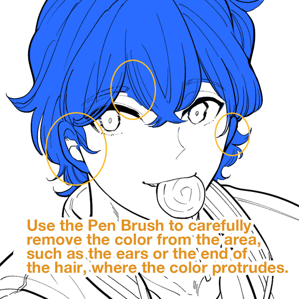
After filling the hair with color, use the Pen brush to modify the following parts.
・The ears, where color is applied unintentionally
・The ends of the hair where color is missing
Concentrate on painting the colors so that there is no area where the color protrudes!
Then hide the line drawing layer to make sure there are no gaps.
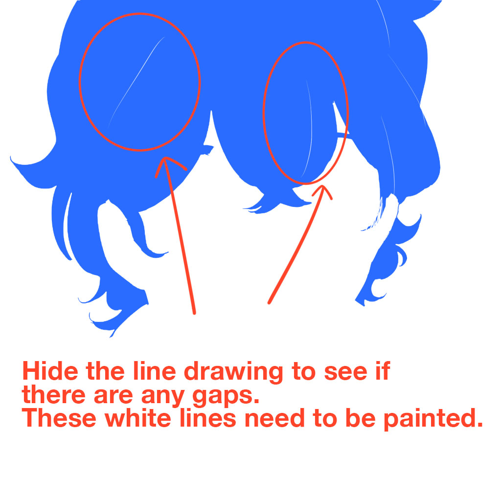
Hiding the line layer, as in the picture above, makes it easier to check that there are no white gaps.
Paint the area below the line drawings perfectly, otherwise you will find unnatural white gaps when you draw shadows later.
⑤Base painting for the clothes
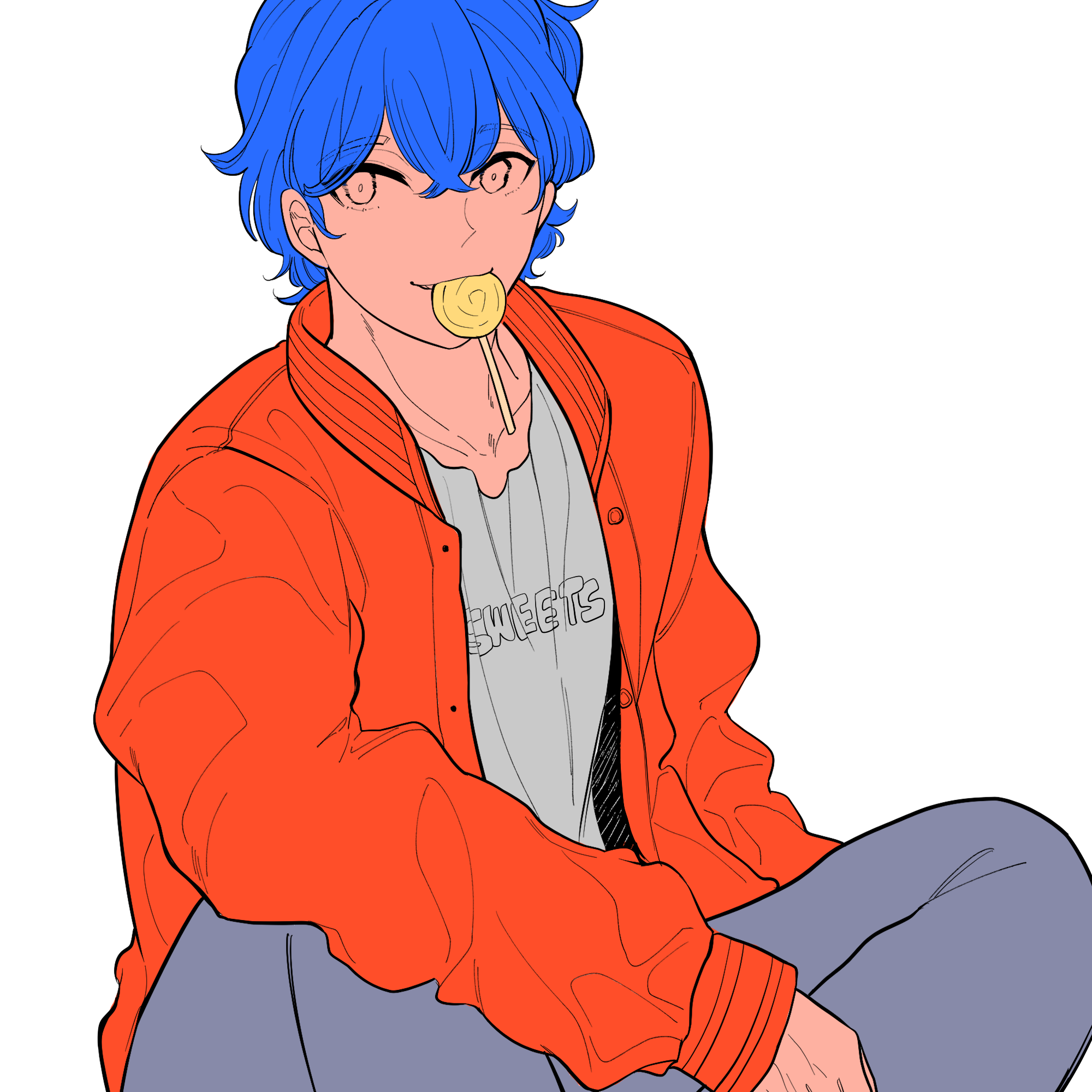
Paint the clothes in the same way as the skin and hair.
Remember to create layers for each piece of clothing, such as the jacket, shirts and trousers, before the base painting.
This will make the color adjustment more efficient.
Paint the accessories or objects as well. This time a lollipop.
Change the colors after you have painted all the areas.
⑥Changing the colors
From now on, adjust the colors of each part (at this stage, the darker colors are applied for simplicity’s sake).
Start with the skin!
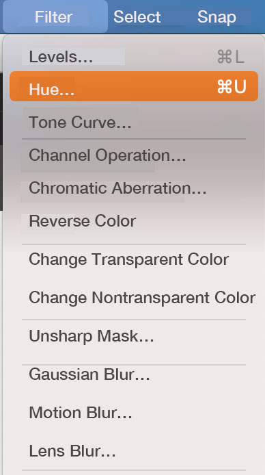
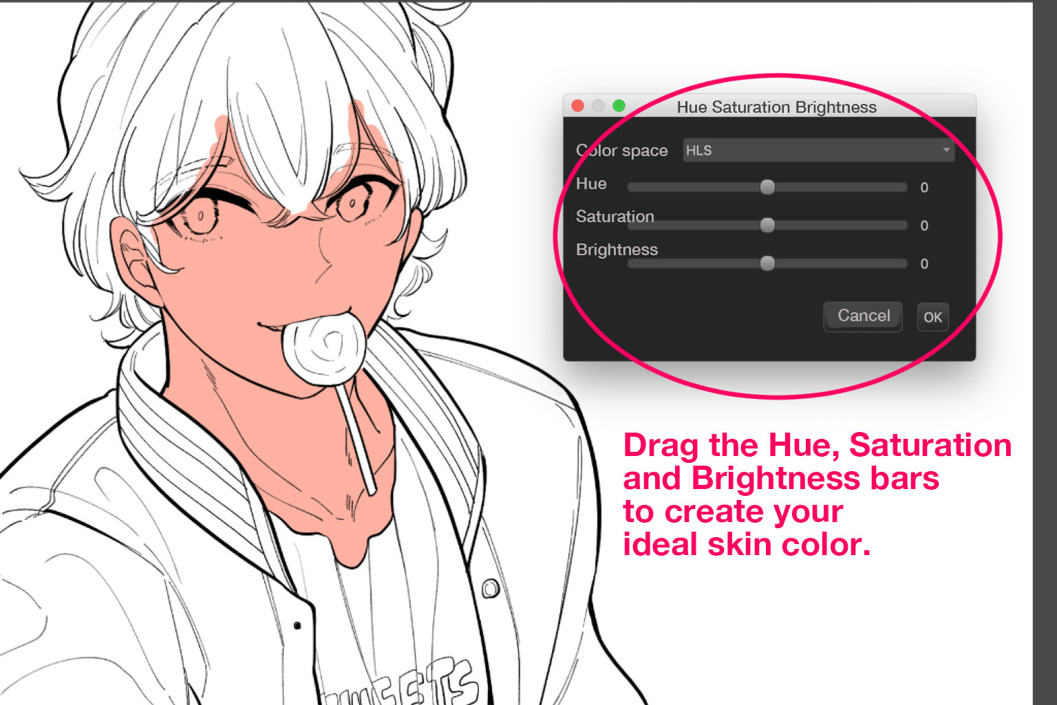
Select the skin layer, choose Hue from the Filter menu to change the skin color.
Drag the Hue, Saturation and Brightness bars to create your ideal skin color.
The overall colors will become deeper as you add shadows or fill in details.
That’s why it’s best to use lighter colors when you’re painting the base.
Also adjust the colors of the hair and clothes.
Make sure that you keep the light colors and do not paint too much darker.
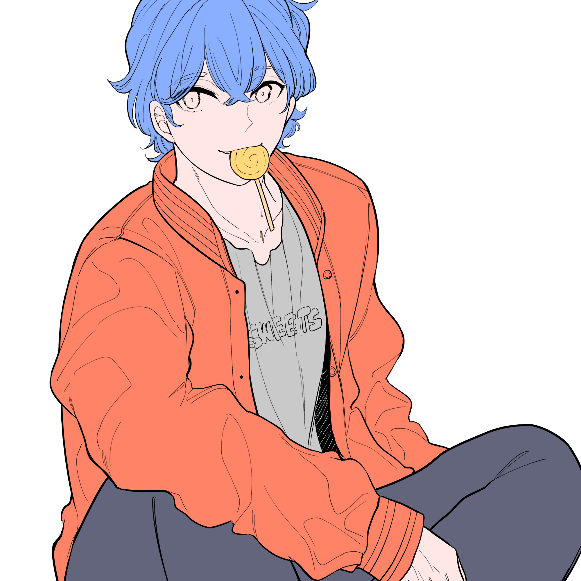
Now we have finished painting the base♪
Technique to adjust when you can’t choose colors
If you are drawing existing characters, such as fanarts, you will simply paint their individual colors.
However, if you are creating original characters or clothing, you will have trouble deciding on colors for each part.
If you have a problem with a lack of color coherence, take the following steps and choose colors to create solidarity!
①Choosing the main color
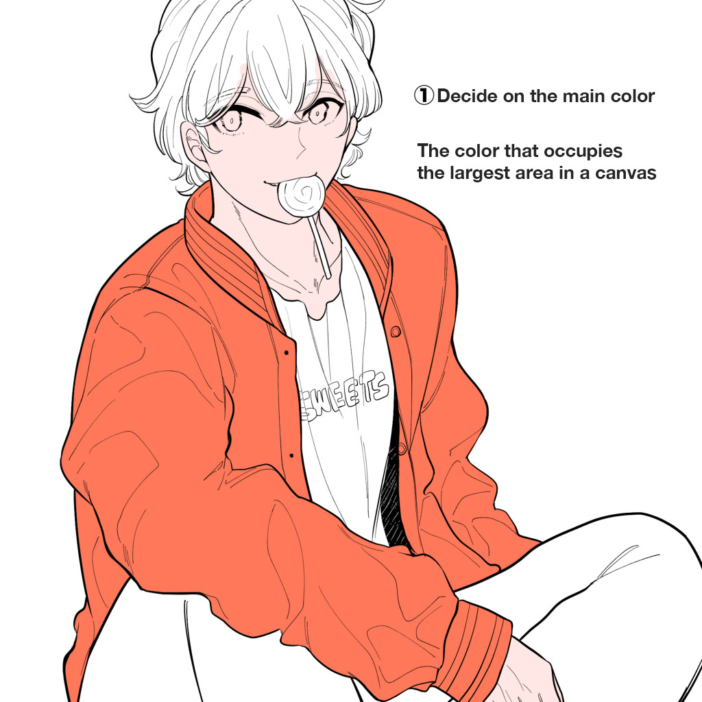
Select the color you want to use or you like, and set it as the main color.
The main color is the color that covers the largest area of an artwork.
This time, choose a bright orange for the jacket.
②Choosing the supporting colors
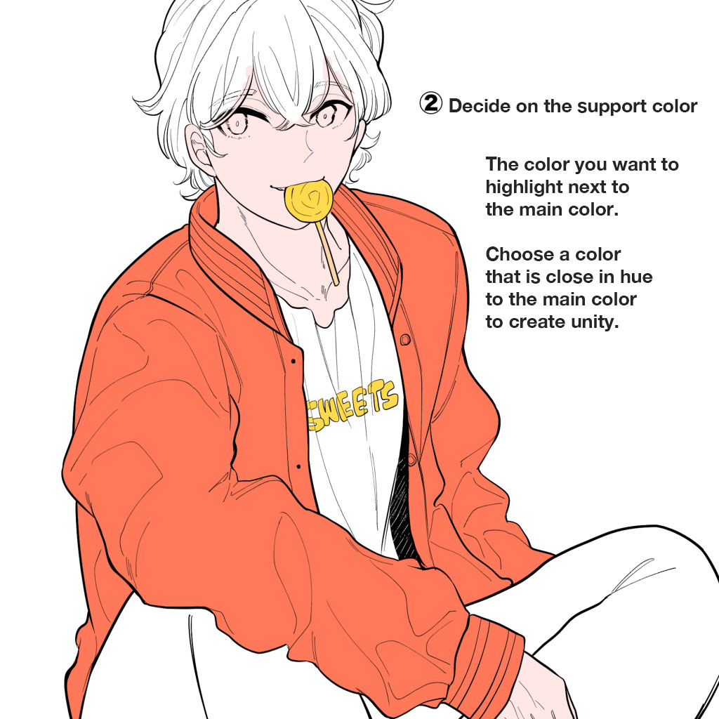
The support color is the color you want to highlight in a canvas other than the main color.
This time choose a yellow.
Apply yellow to the area of the shirt and lollipop to match the bright orange.
Look at the hue and be careful not to choose colors that are too far apart to create a solidarity between the main color and the support color.
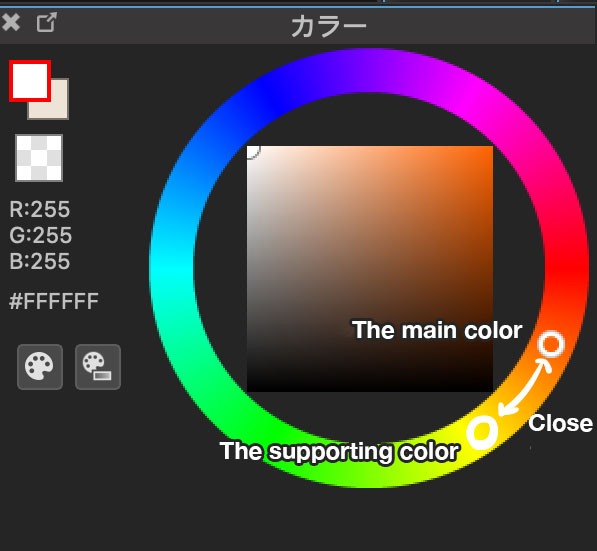
Think of these two colors as a foundation and add two or more colors to decide on the overall coloring.
③Make your work attractive by using complementary colors
Do you know what complementary colors are?
Thinking about them is one of the techniques to make illustrations more impressive.
Complementary colors are on opposite sides of each color in the color circle.
In this case the main color is orange.
Lighter blues are complementary to orange, so we will use light blue for some parts.

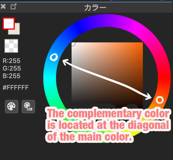
Think of this complementary color, light blue, as a color that makes the main color, orange, stand out more.
So try to add the complementary color to a smaller area than where the main color is added, so that the complementary color doesn’t stand out more than the main color.
There is another role for the light blue.
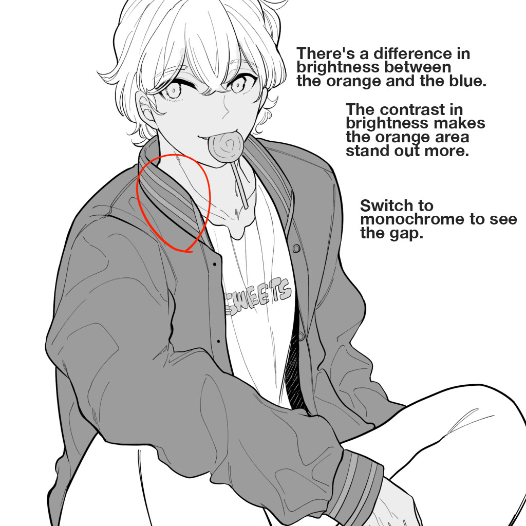
There is actually a gap in brightness between the orange and the blue.
You can easily see this when you switch the image to monochrome.
The light blue area is almost white, while the orange area is dark. This contrast in brightness makes the orange area stand out more.
④“Use the hue”: changing the hair color
I had planned to make the hair blue, but when you look at the whole picture with the orange clothes of the main color and the blue hair, it is kind of eye-straining. The colors don’t match.
So change the hair color to something close to the color of the jacket.
This time a beige-like yellow is chosen.

As beige-like yellow and orange are close in hue, they can create effective color solidarity.
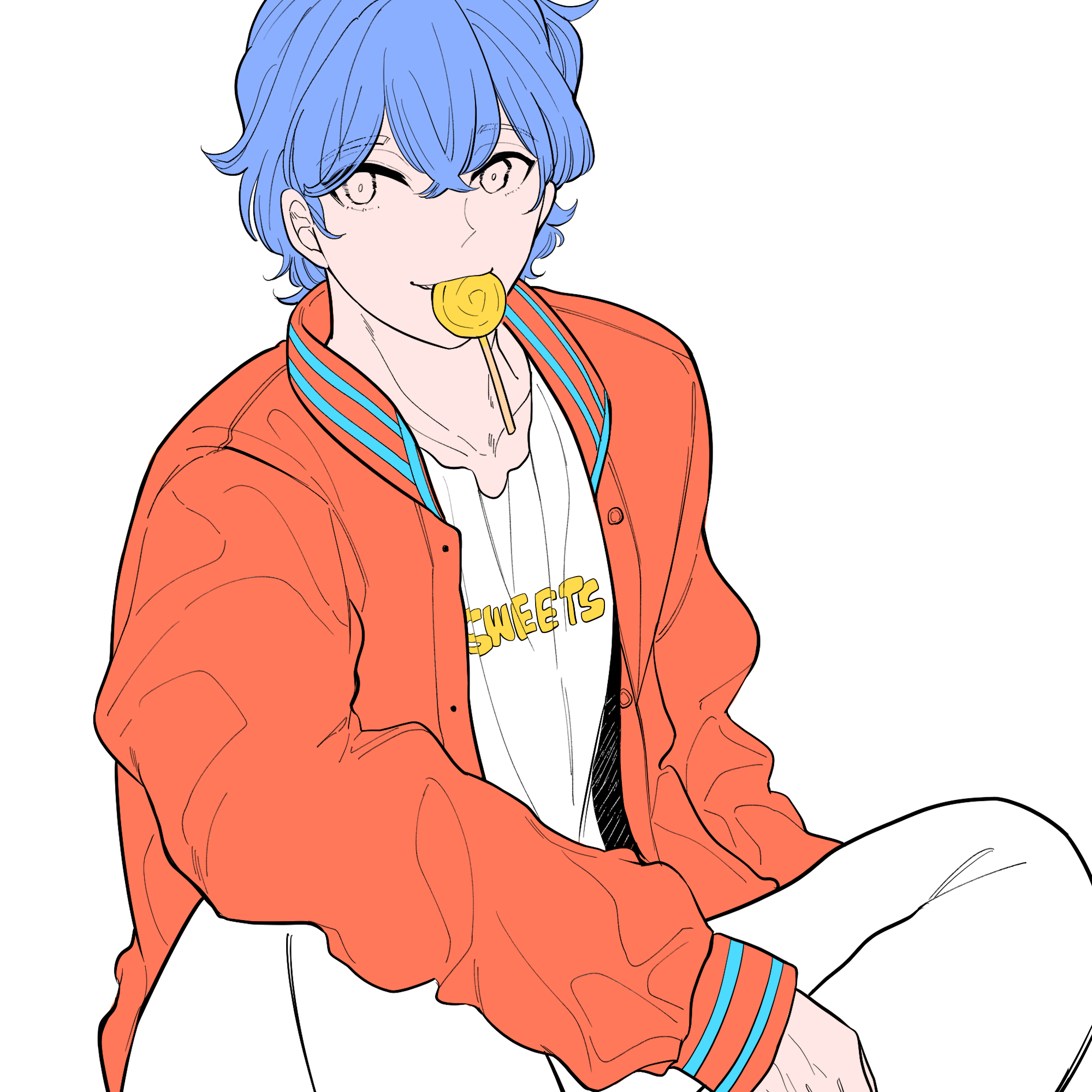
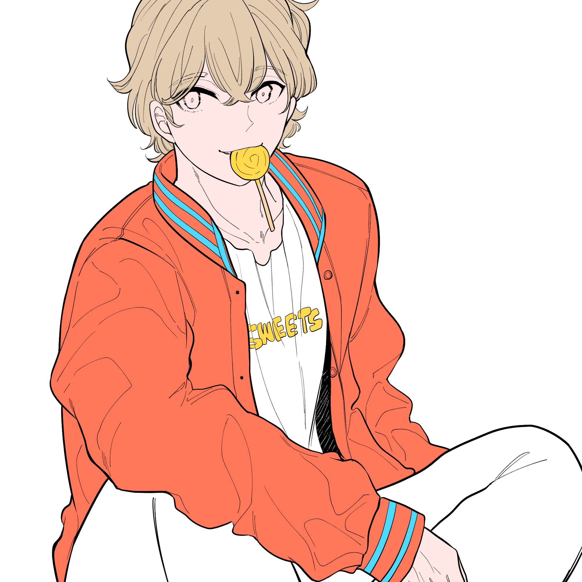
You can see that the beige hair matches the image better than the blue hair.
⑤“Use the brightness”: changing the trouser color
I had originally planned to paint the trousers a light navy blue.
However, it occurred to me that the contrast between navy and orange is not that impressive.
So I duplicated the folder with just the jacket, trousers and skin displayed and set the saturation to zero.
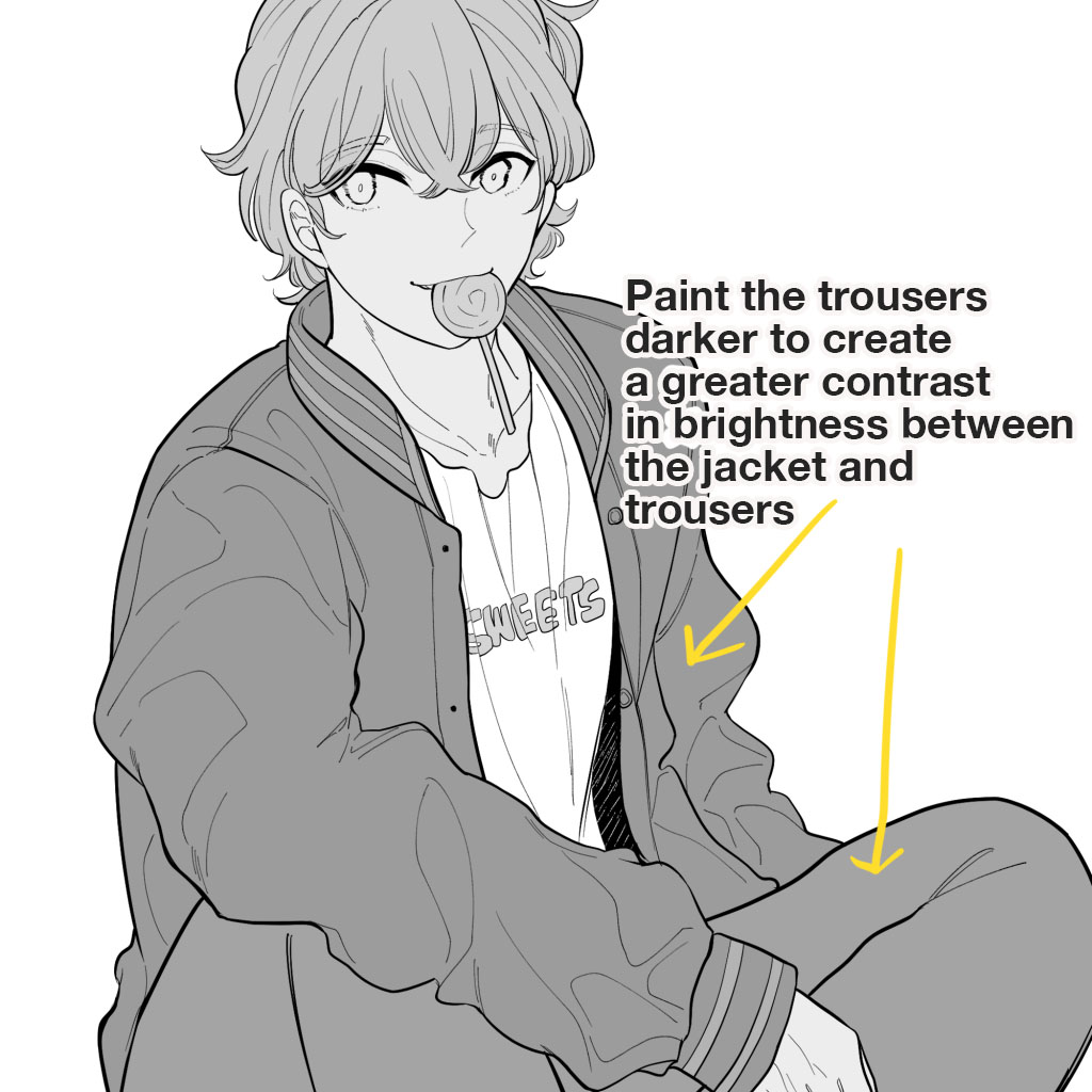
If you look at the image with zero saturation, you can see that there is no difference in brightness between the jacket and the trousers.
So make the trousers darker to create the brightness contrast.
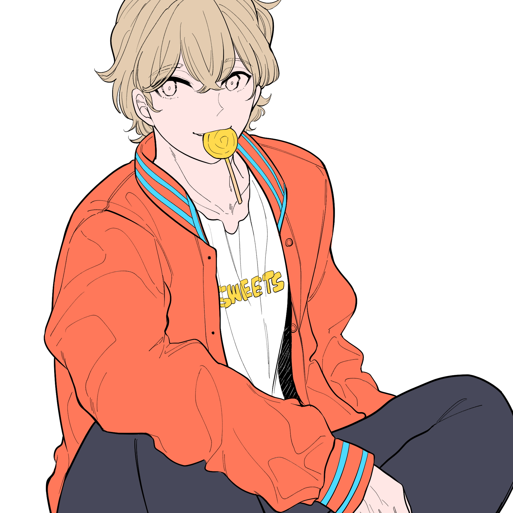
⑥“Do not add too many colors”: changing the shirt color
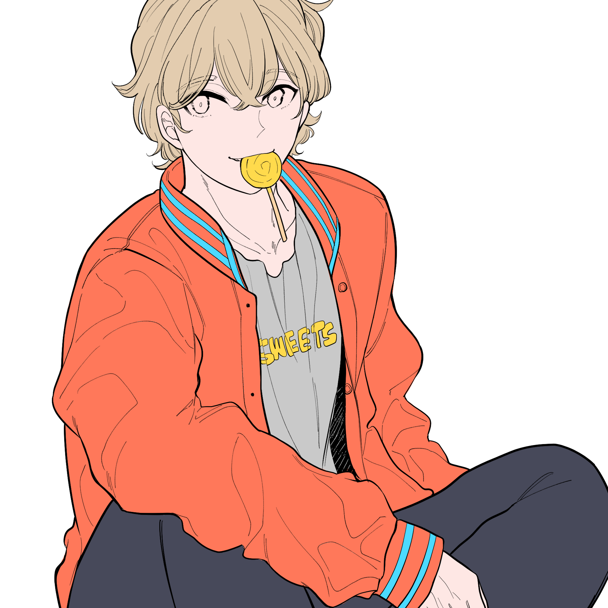
As the colors of orange, navy and yellow were chosen for the overall image, adding more color to large areas would make the overall image look chaotic.
So I added a colorless gray to the shirt.
Also, since something was missing for the background, the pattern was added with the support color yellow.
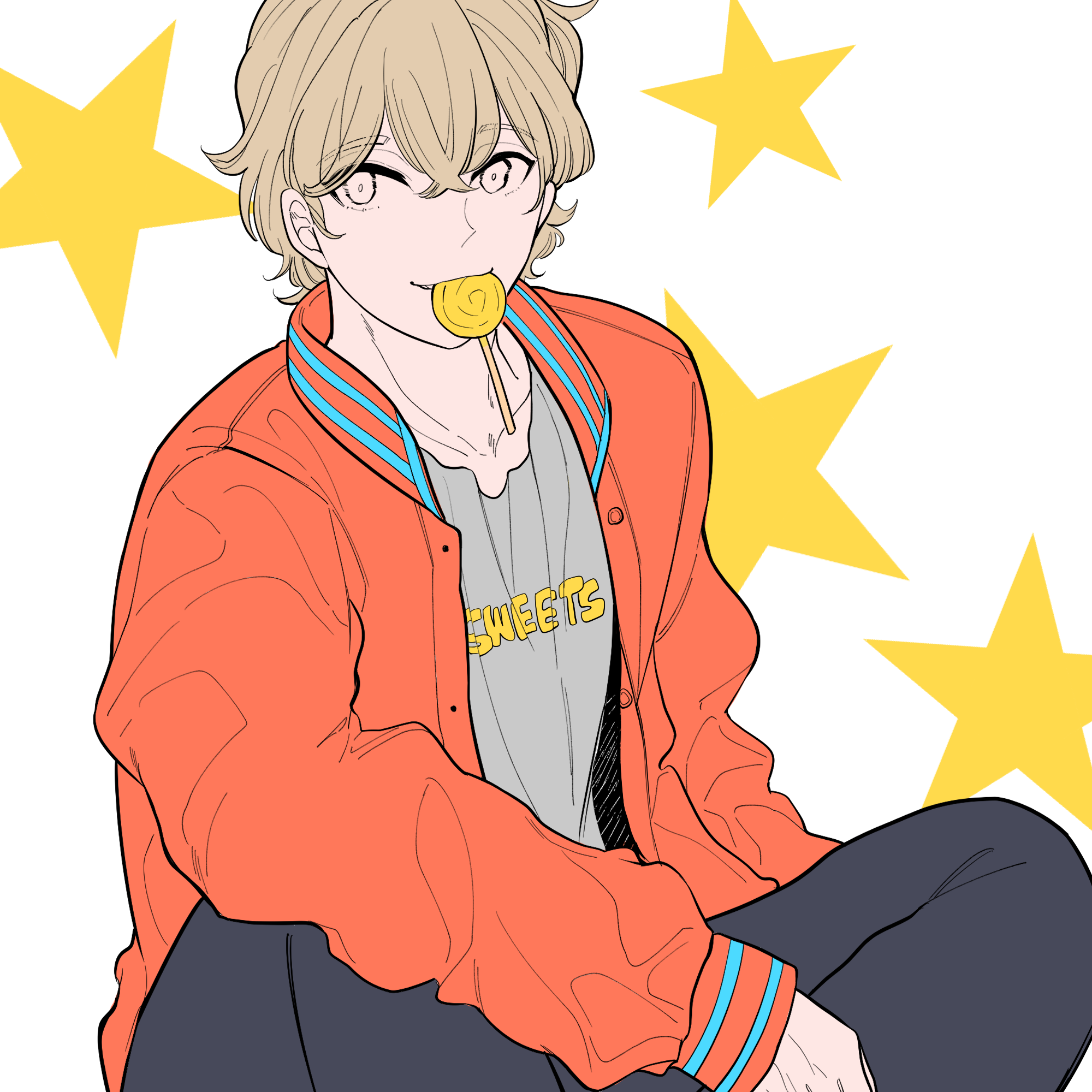
Now we’ve finished separating the colors!
⑦Checking the allover image
Duplicate the coloring folder and select “Hue” from the Filter menu to set the saturation to “-100”.
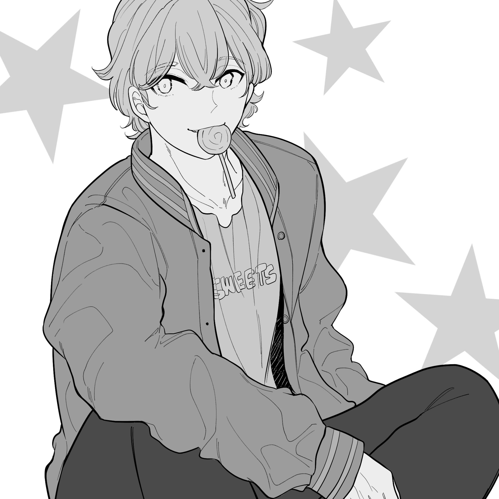
Can you see that the grays of each part are different?
The painted area has a good balance of brightness. There are neither too many pale grays nor too many dark grays.
These are the techniques to use when you can’t choose colors!
Conclusion: The base painting is a crucial point to solidify the finished image of illustrations.
Today, we have learnt the following, under this tile, [For Beginners] What should we do for the base painting? [The technique for coloring is explained as well!].
- Preparation for base painting
①Make sure there’s no gap between the lines
②Separating the folders
③Base painting for the skin
④Base painting for the hair
⑤Base painting for the clothes
⑥Changing the colors - Technique to adjust when you can’t choose colors
①Choosing the main color
②Choosing the supporting colors
③Make your work attractive by using complementary colors
④“Adjusting the hue”: changing the hair color
⑤“Adjusting the brightness”: changing the trouser color
⑥“Do not add too many colors”: change the shirt color
⑦Checking the overall image
The base painting is a crucial point to solidify the finished image of illustrations.
You can create several drafts of the base painting for a work to find a coloring you like.
I hope you enjoy coloring your illustrations.
(Texts・Illustrations/はらなおこ)
\ We are accepting requests for articles on how to use /

