2023.05.17
Adjust saturation to make your illustrations look better! 2 ways to create stunning art
Have you ever had the experience of looking at your painting after you’ve finished it and thinking, “Something seems to be missing…” or “It doesn’t look good when I look at it as a whole”?
If this is the case, you should pay attention to the “Saturation” setting. An illustration becomes attractive by adjusting its saturation.
Today we will learn 2 ways to adjust the saturation: one way using some tools and one way using the “Overlay” layer blend. Both ways are easy to do and can change the atmosphere of the illustration surprisingly. Try these ways if you want to become famous on social media!
Method 1: Adjust color saturation to create attractive illustrations
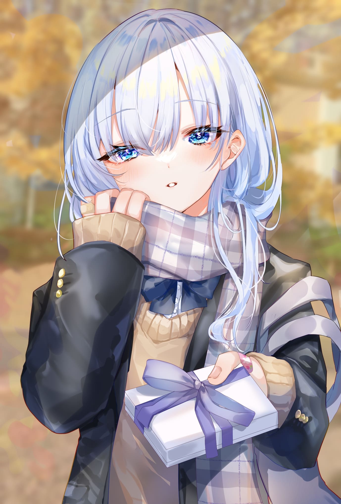
This is an illustration of a girl with a scarf giving a gift.
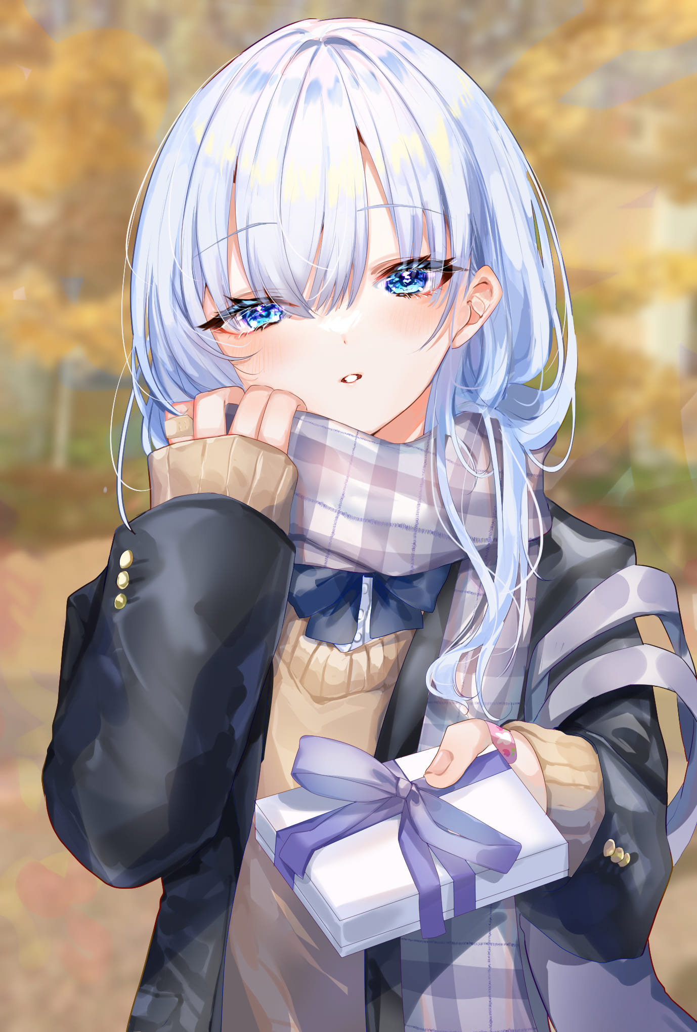
It looks like a good illustration at first, but it looks colorless because the hair is white and the school uniform is black and gray. That’s why the whole picture becomes monotonous when you look closer. If this illustration were on social media, people would think it is a good illustration, but it still needs more to get many likes or positive feedback.
Now, let’s spell magic to this illustration that needs one more step. It takes only 10 minutes.
The point is to use saturation in a smart way. Humans tend to concentrate their attention on highly saturated areas. Apply this habit and control saturation to create attractive illustrations.
Things to remember and techniques required
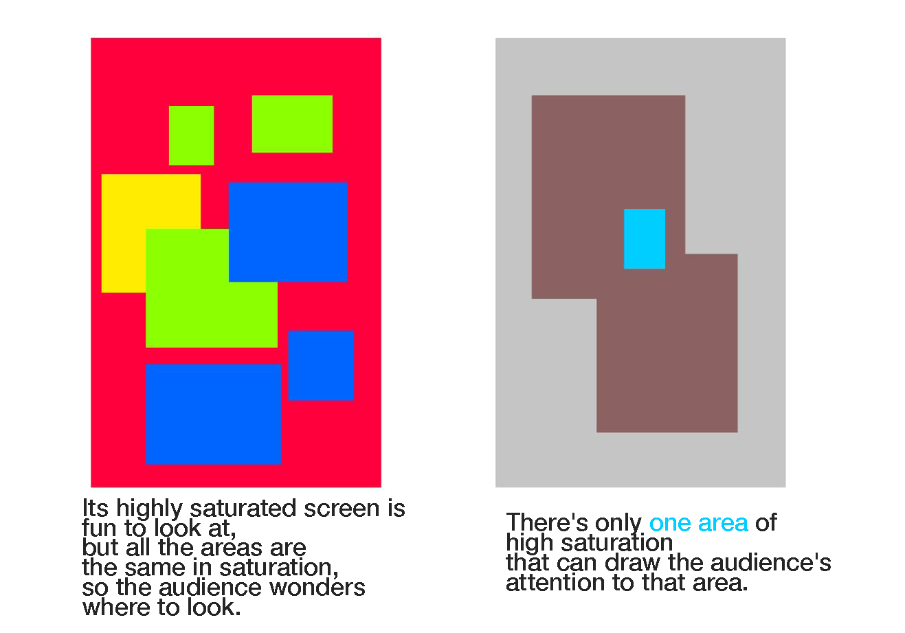
The key is to create a difference in saturation.
If you fill the entire screen with highly saturated colors, as in the image on the left, the first impression will be too vivid and people won’t know where to look. If you increase the saturation only in the area you want people to look at, they won’t be distracted by areas that draw their eyes and can focus on looking at the entire illustration.
For example, take a look at the image below. I think many of you have had the experience of highlighting the textbook with markers. When you use markers, you only put them on the important parts. The idea is to make it easier to remember those parts by highlighting them with color.
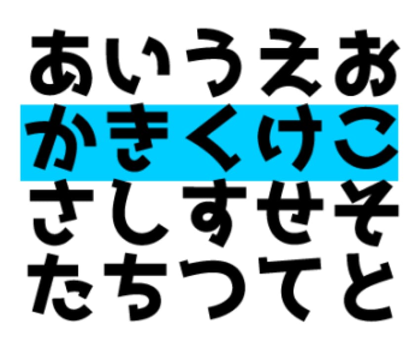
This is the same with illustrations.
You think it is easy to see only in the highlighted area above, don’t you? You can make your illustration easy to see applying this method!
How to adjust color saturation to create attractive illustrations
Now try this method on the illustration.
It is ideal if you can adjust the saturation at the stage of adding colors, but adjusting it in the last step is easier to capture the whole image than adjusting the saturation from the beginning, and it also makes the painting process easier.
Steps divided into four. Let’s look at each of them.
First, add a new layer and fill the canvas with gray.
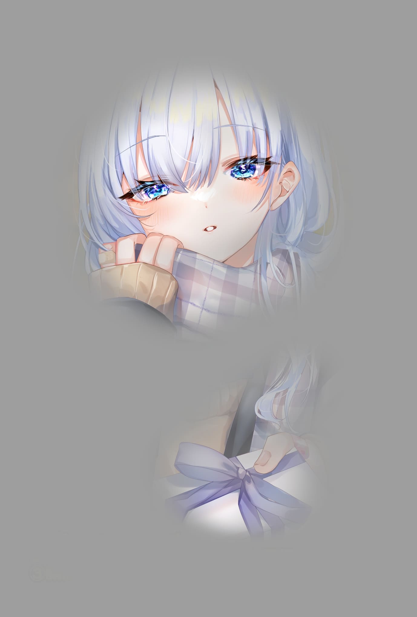
Next, use the Eraser tool or the Airbrush to erase the gray layer only around the character’s face.
This time I chose the transparent color of “the Airbrush (20% opacity)”. Erase the gray area where you want it to stand out. The image will look like the following.
As it is, the image looks very monochromatic. So change the layer blend from gray to saturation.
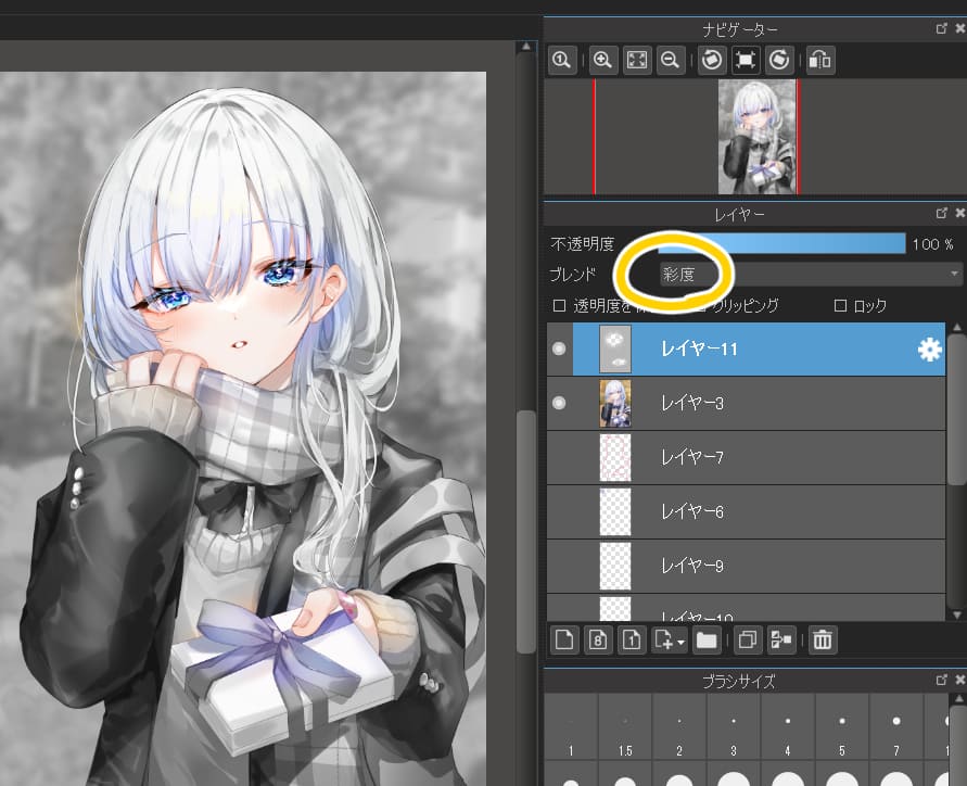
Set the layer opacity to 10 to 20% and now we are done.
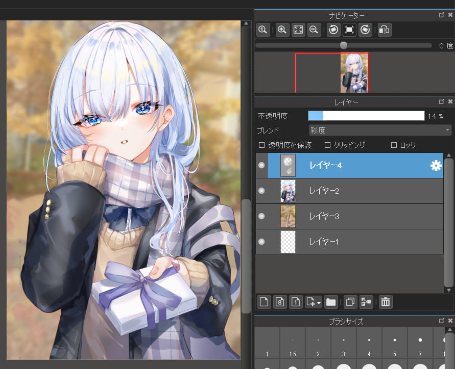
It may be difficult to find the difference in the illustration, since the character’s clothes are based on monochrome. But the yellow in the background is now softer, which makes it easier for the blue of the face to catch the eye. You can see the difference by comparing it to the initial version.
By increasing the saturation of the facial area, the character’s face is now impressive. You won’t need to process layers if you can manipulate the saturation, such as adding high saturation only to the eyes and adding deep colors.
With this method of saturation adjustment, you can quickly create impressive illustrations with little effort. However, some works may not be easy to see the difference, as is the case here. If you feel that your work doesn’t change that much, you can create it with the next step.
Method 2: Adjust color saturation with the Overlay to create attractive illustrations
Other than increasing the saturation, you can also use the overlay layer blending. The overlay makes the light color brighter and the dark color darker. The steps of using the overlay are slightly different from the previous method of saturation adjustment, so learn both methods to expand the range of your art.
How to use the Overlay to create attractive illustrations
This illustration of a girl gives a somewhat colorless impression, as the color tones are monotonous, centered on white, gray, and black, and the illustration also doesn’t have a wide variety of colors.

That’s why you should add colors to the colorless area using the overlay to make the illustration colorful. This effect is used to reduce the monotonous impression. We will not use the overlay for only one color, but we will use different colors for each area.
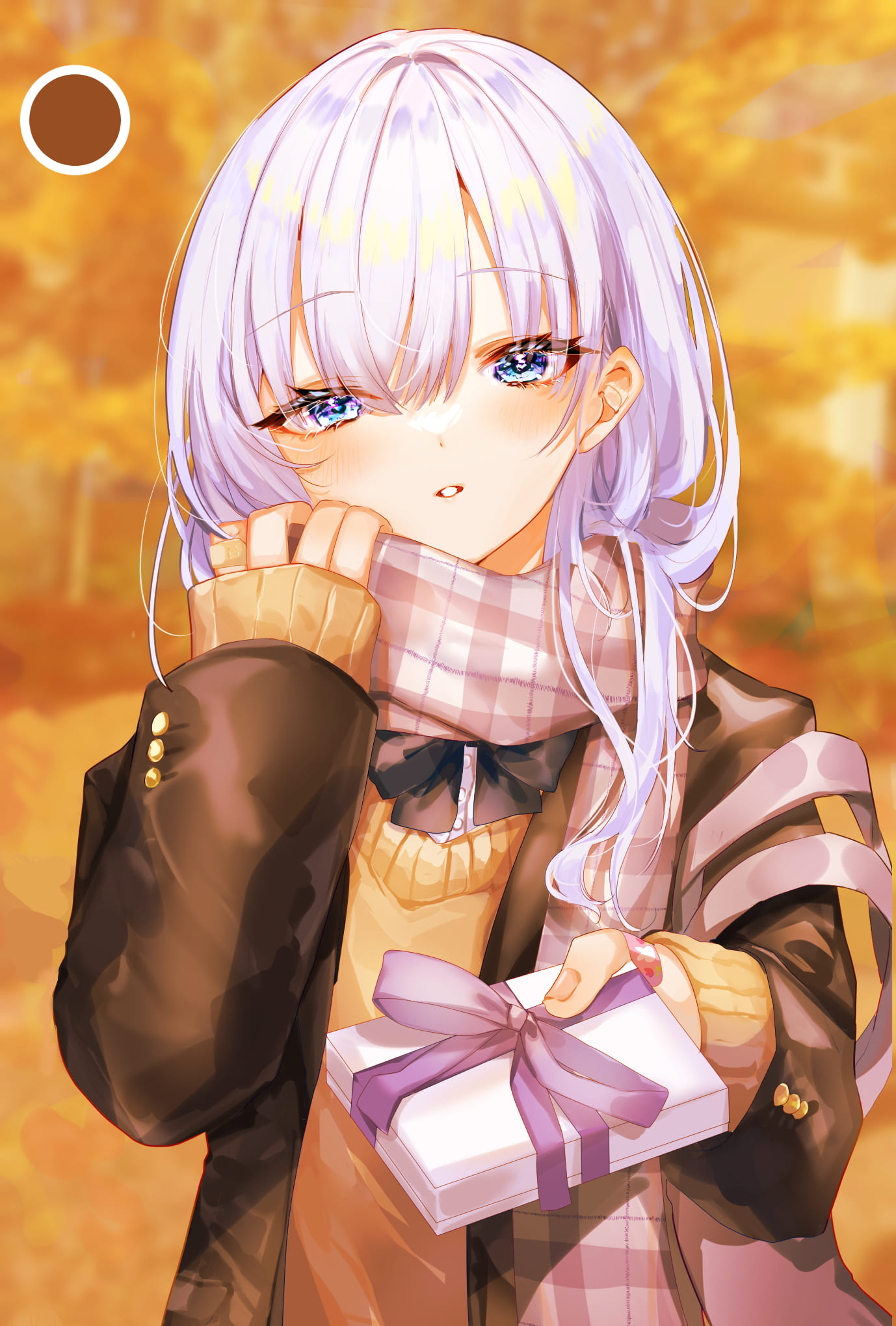
The image above is the illustration where I added the 100% overlay to a layer with a single color of brown. It looks cohesive, but still monotonous.
If that’s the case, use opposite colors. To the blue area, add the opposite color yellow as a highlight to create the width of colors and make both colors stand out.
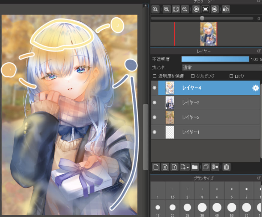
Keep the opacity of the overlay at 100% and adjust the colors with the pressure of the Airbrush.
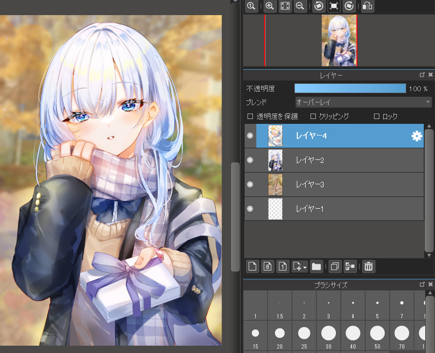
Now the colors are more detailed and the girl’s face and the gift box are clearly emphasized. By adjusting the saturation with the overlay, you can create works with the eye-catching coloring and sophisticated impressions. Unlike the simple saturation adjustment method, the overlay lets you flexibly change the brightness or colors, and you can turn your illustrations into impressive ones in an instant.
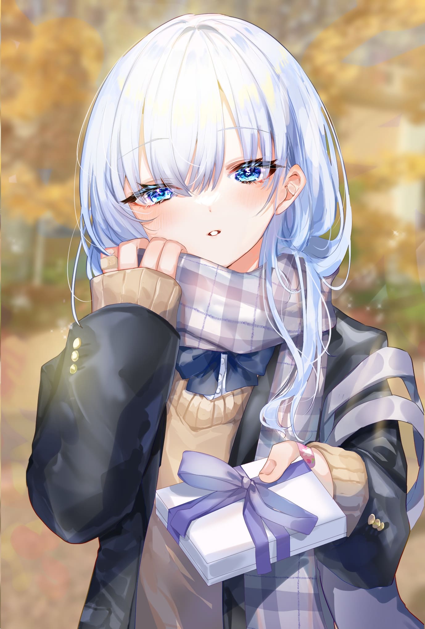
Two additional techniques
The illustration looks beautiful as it is, but let me show you two more ways to make it look even better.
■ Make the illustration backlit
Use the 50% Multiply layer blending to fill the inside of the character’s outline with the pale purple.
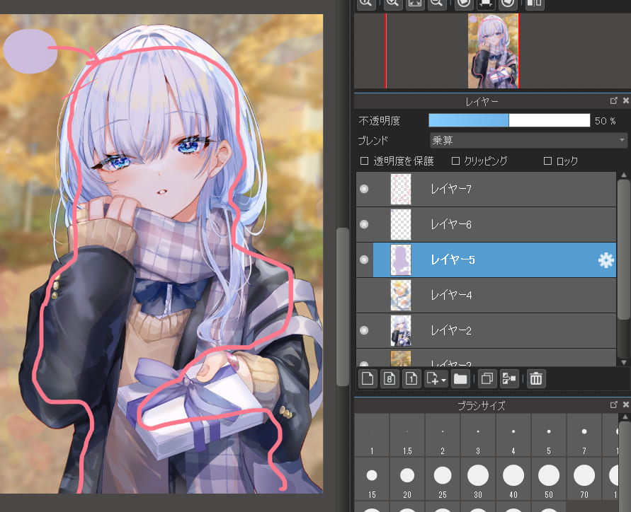
Set the pale yellow with the 40 to 50% screen layer, and use the Airbrush to add the color to the head or shoulders.
At this point, you can also use solid brushes to draw rays of light or white dots. Then you can describe the atmosphere.
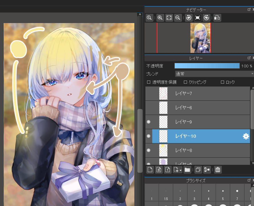
Now we are done! The overall tone of the image is now brighter and the areas you want to emphasize, such as the face or the gift, are now clearly visible. The subtle expression can be achieved by the overlay layer blending.

■ Add shadows with the multiplied layer blend
Backlighting is beautiful, but drawing it all the time lacks variety, and in some images, outlines may be blurred and characters may be unclear.
This is when you need to know this simple technique, the multiply technique. This is the method of increasing shadows to draw the audience’s attention to the lighter areas and emphasize the specific areas. Adding cast shadows of trees or any object you imagine will create more impressive art.
The steps are as follows.
① Use the Pen brush to fill in the red circle with the light purple.
② Use the Airbrush or Pen brush to draw the thin lines on the edges of the purple area with the pink or orange color that matches the skin shadows.
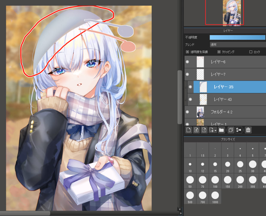
③ Change the layer blending of the painted layer to Multiply.
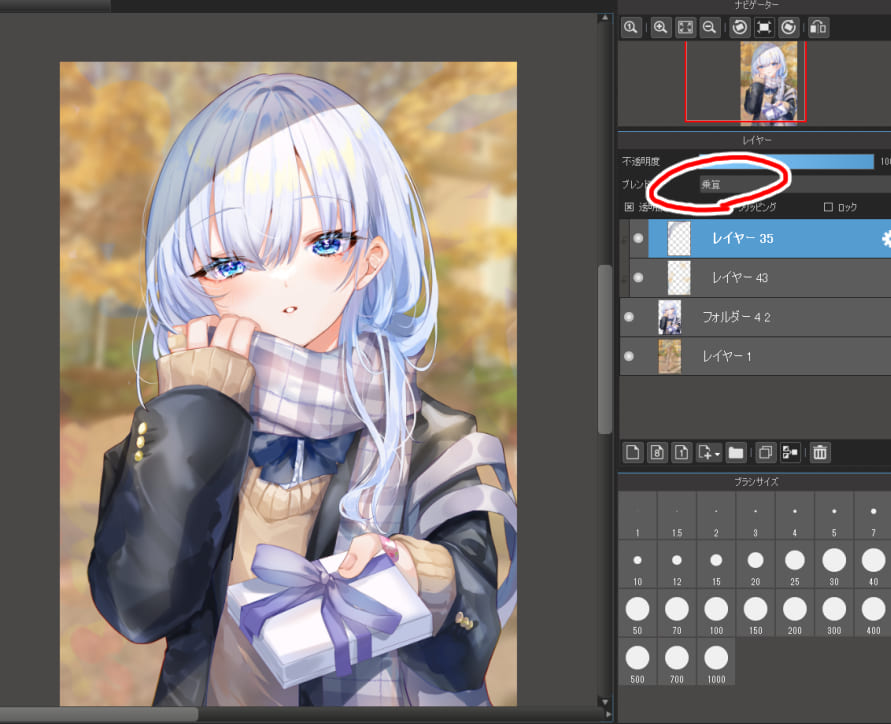
Now we’re done!
Cast shadows emphasize the outline of the character and the hair looks even more detailed. In addition, the audience’s attention is drawn not only to the shadows, but also to the area surrounding the face. The overlay allows you to freely manipulate the light and dark, creating a rich contrast to the overall illustration.
Conclusion
We’ve learned two methods of manipulating saturation.
The first method is the basic saturation adjustment, and the second is the overlay application. Use either method if you think your work looks monotonous and make it colorful and eye-catching. Also, if you use the additional techniques, your work will be even more impressive.
I hope you will try these methods to create vivid works on social media.
(Text・Illustrations / ももんが)
Twitter/https://twitter.com/momongapoketto
HP/https://momongapoketto.webnode.jp/
\ We are accepting requests for articles on how to use /

