2020.11.09
The basics of color schemes and tips on how to use color to attract
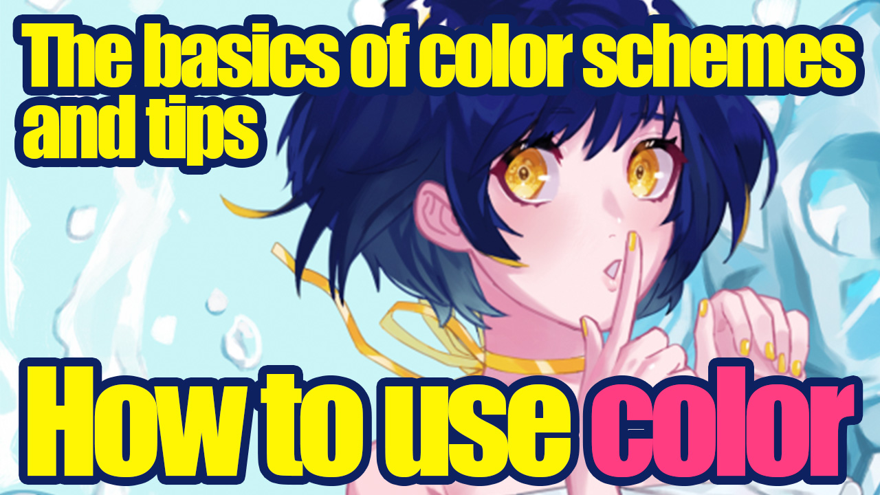
The choice of color is very important because it greatly affects the impression of the illustration.
If you’re worried about the colors floating around and losing a sense of unity, this article is for you! This article is recommended for those who say, “I don’t want my colors to look like one color.
Index
Basic knowledge of color

Saturation refers to the vibrancy of a color.
The higher the saturation, the more flamboyant the color.
The lower it is, the gentler or more subdued the color tone.

Luminosity refers to the brightness of a color.
The higher the brightness, the brighter the color, and the lower the brightness, the darker the color.

Hue is a term used to refer to the type of color, such as reddish, bluish or yellowish, regardless of saturation or lightness.
These three terms are the basics to remember when it comes to choosing colors for your illustrations!
Color Types
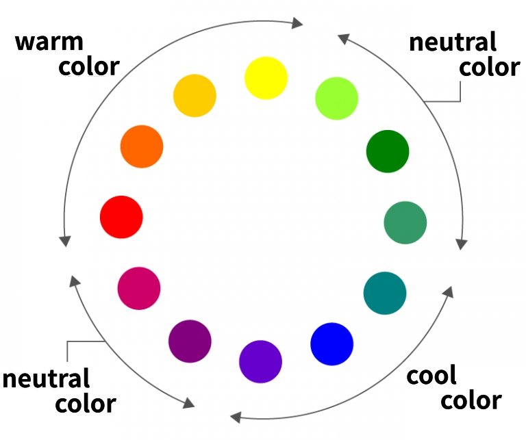
Colors are broadly divided into warm colors, which are reddish colors.
Blue colors are cold.
Colors in between red colors and blue colors (purple or green) are called neutral colors.
About the impressions that colors have
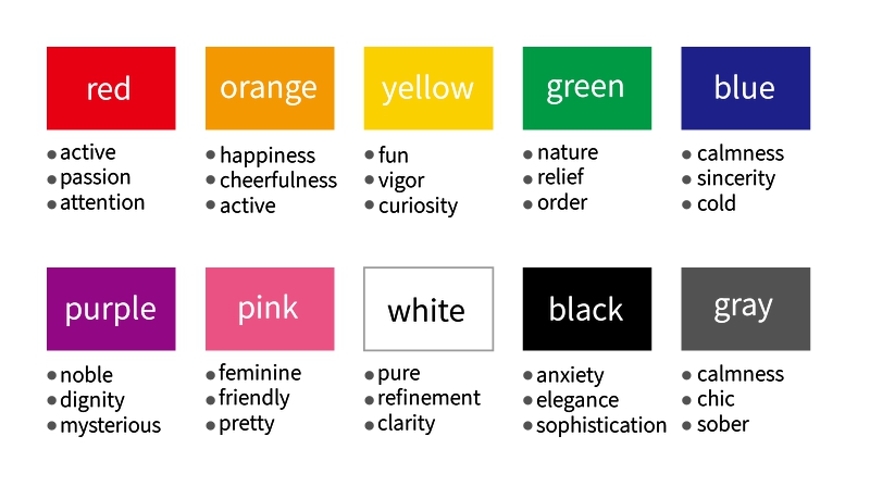
Each color has its own impression.
Red is “energetic, passionate and aggressive
Blue is “refreshing, cool, and cold.
The impression you give people will be different depending on the colors you use.
The quality of your illustration will be greatly improved if you think about the color scheme while keeping the impression you give in mind.
About the tone of the colors
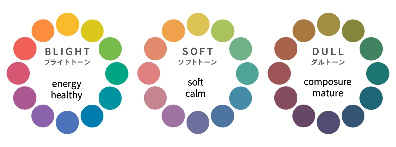
In addition to the impressions given by the colors themselves, the impressions given by the tones of the colors also change.
For example, if you want to give an energetic impression, use colors with high saturation and lightness, such as vivid and bright tones, and keep in mind that the impression you give will be different depending on the tone!
In light of the above, let’s take a look at the medivan’s color window!
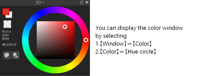
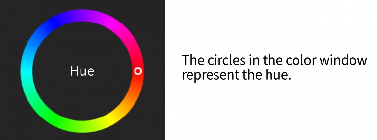
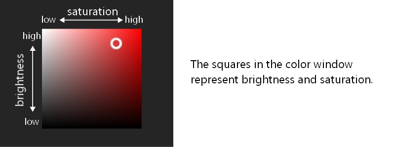
1. Let’s start with the mood of the picture you want to paint, then decide on the main color!
Decide on a main color as you imagine what mood you want to illustrate!
If you want to create a warm atmosphere, choose warm colors.
If you want to create a cold atmosphere, choose cool colors.
Think about the atmosphere you want to create while deciding!
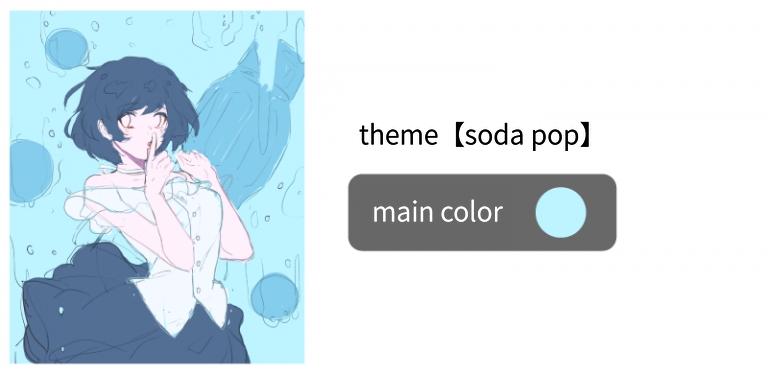
The illustration below is based on the theme of rumne.
I wanted to create a cool and cute atmosphere, so I used a low-saturation light blue as the main color.
2. Decide on a sub-color and an accent color!
Next, let’s decide on the sub-color and accent colors.
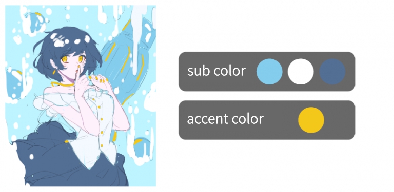
Sub-colors can be used in a similar way to the main color to give a cohesive look, and different colors can be used to give movement to the entire illustration.
Accent colors serve to tighten up the entire illustration and draw the eye to the illustration.
The key to choosing a color!
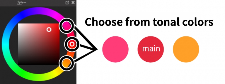
1. Choose from similar colors
When viewed in color circle hues, choosing a color that is adjacent to the main color can help create a cohesive color scheme.
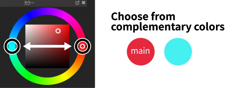
2. Choose from complementary colors
A complementary color is a color that is the exact opposite of the color circle hue when viewed in the color circle.
Choosing a complementary color helps to highlight the main color and tighten up the entire illustration.
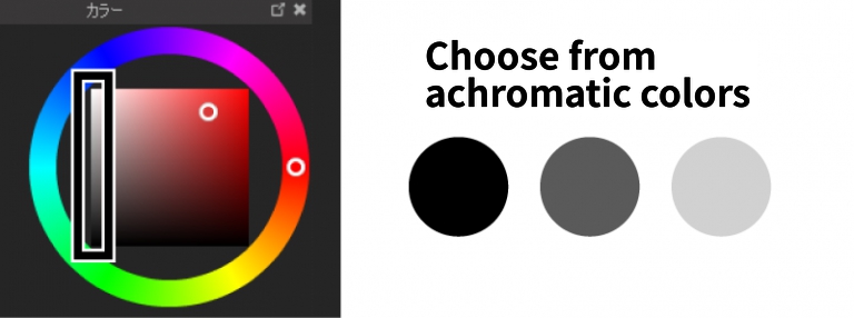
3. Choose from achromatic colors
Achromatic colors are black, white and gray without color.
White calms the entire illustration and black tightens the entire illustration.
Color scheme notes
1. About three colors are used
Keep the colors you use to a minimum of three (five at most)!
If you use too many colors with high saturation, it will be difficult to see what you want to show, and if you use too many colors, the illustration will not be coherent and it will be difficult to manage the colors.
Once you’ve decided on three colors to use, it’s time to choose a color scheme that resembles the main color, subrackers, and accent colors, or a color with a lower saturation level!
2. Consider the proportion of main colors, sub colors and accent colors in your color scheme!
The color ratio is 70% main color, 25% sub-color and 5% accent color to create a cohesive illustration.

If you have two subcolors, divide the subcolors as follows

3. Actual color scheme!
In this case, I tried to create a cool and cute illustration with the theme of “Ramune”.
For the main color, I used a light blue with high brightness and low saturation, because I wanted to create a cool and cute atmosphere.
For the sub-color, I used a similar blue and white to give it a cool, refreshing feel.
For the accent color, I will use yellow, which is almost a complementary color.

The main color, light blue, is used for the background because I wanted to use it for the widest part of the picture.
The sub-color, darker light blue, is used for the soda bottle, and white is used for the bubbles and the clothes.
I used a similar color, dark blue, for the people and the skirt.
I think the light background draws the eye to the people.
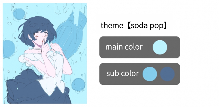
I wanted to use the accent color yellow to make a point, so I used it for the eyes, nails, lining of clothes and other small details.
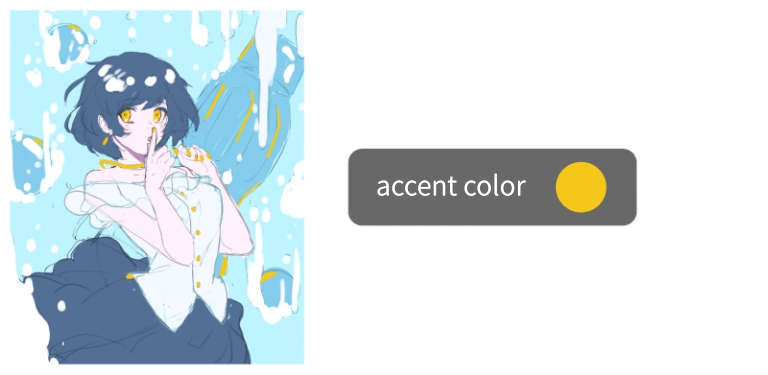
With the general color scheme done, all we need to do is draw in the shadows and such and we’re done!
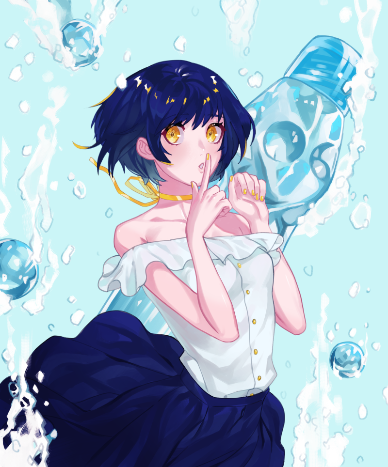
By paying attention to the color scheme, you can draw a cohesive illustration.
It also has other roles in conveying the mood of the theme of the illustration, which makes the quality much better!
Be sure to pay attention to your color scheme and illustrate it!
(Text/Artwork/Shigehiro)
HP https://shigehiros.com
pixiv https://www.pixiv.net/ users/49461898
Twitter https://twitter.com/_ shigehiro
YouTube https://www.youtube.com/channel/UCJCtsSFtfMTdikDSDNJQtgA
\ We are accepting requests for articles on how to use /

