2021.06.02
[Eyedropper Tool] How to Pick Attractive Colors


When creating illustrations, it is difficult to choose colors.
Especially when it comes to landscapes, I think we sometimes rely too much on “green” for trees and “blue” for the ocean.
In this article, I’ll show you how to choose colors with convincing power using a reference tool!
1 Explanation of Reference Tools
First of all, I’ll explain the reference tools.
When you draw an illustration, the quality of the illustration will change if you have photos and documents instead of just drawing the image in your mind.
MediBang Paint has a tool that allows you to display documents, so let’s use it proactively.
Let’s open the reference.
Select “Window” -> “Reference”.
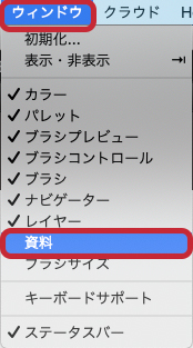
This will open the reference tool.
Here is what the icon looks like.
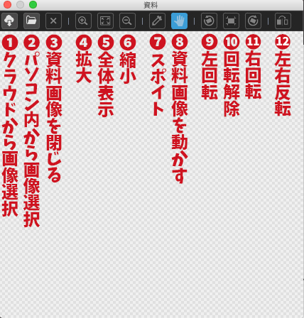
2 How to display images
Next, open the photo or image you want to display.
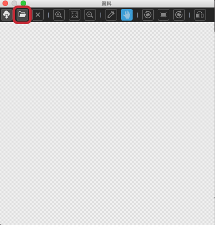
Click on the second icon from the left.
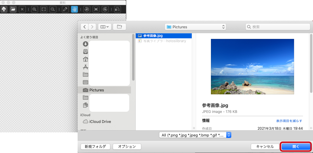
Click on the second icon from the left to display the data on your PC. Select the image you want to use this time from the picture or desktop, and click “Open”.
Then the image will be displayed as shown here.
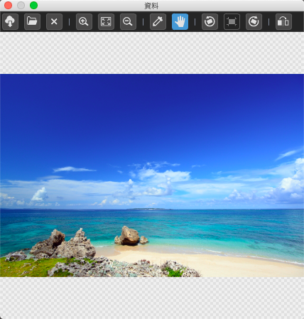
There is one point to note here.
In order to make it easier to work with, we recommend that you use images that you have taken yourself or that are free for personal use.
To make it easier to work with, I moved the separate documents to the tool line.
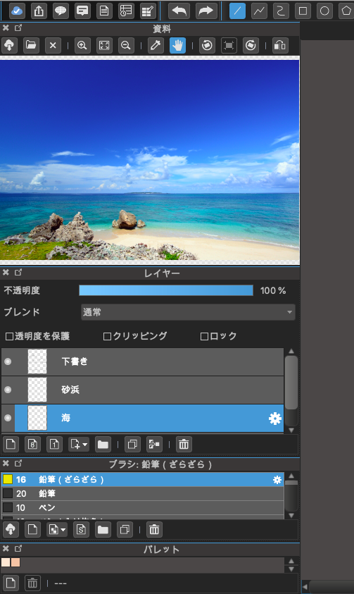
3 Let’s use an eyedropper
The next step is to create an illustration.
Here is an illustration of the ocean created mainly in light blue and blue without using any materials.
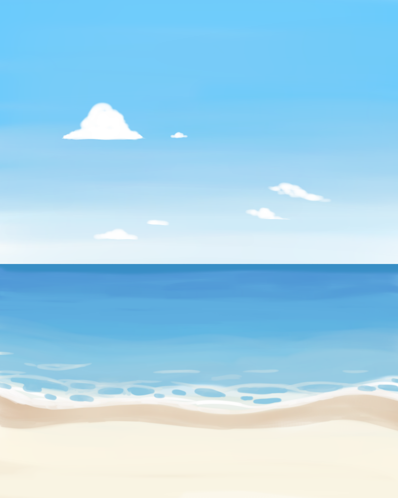
It’s a bland, flat ocean.
There are many things that could be changed, such as making the sky more vivid and changing the color of the flat sea.
Let’s start by changing the colors in the document.
First, let’s eyedropper the darkest sky color.
Select “Eyedropper” in the Document tool and touch the darkest part of the sky.
Let’s paint the sky with that color.
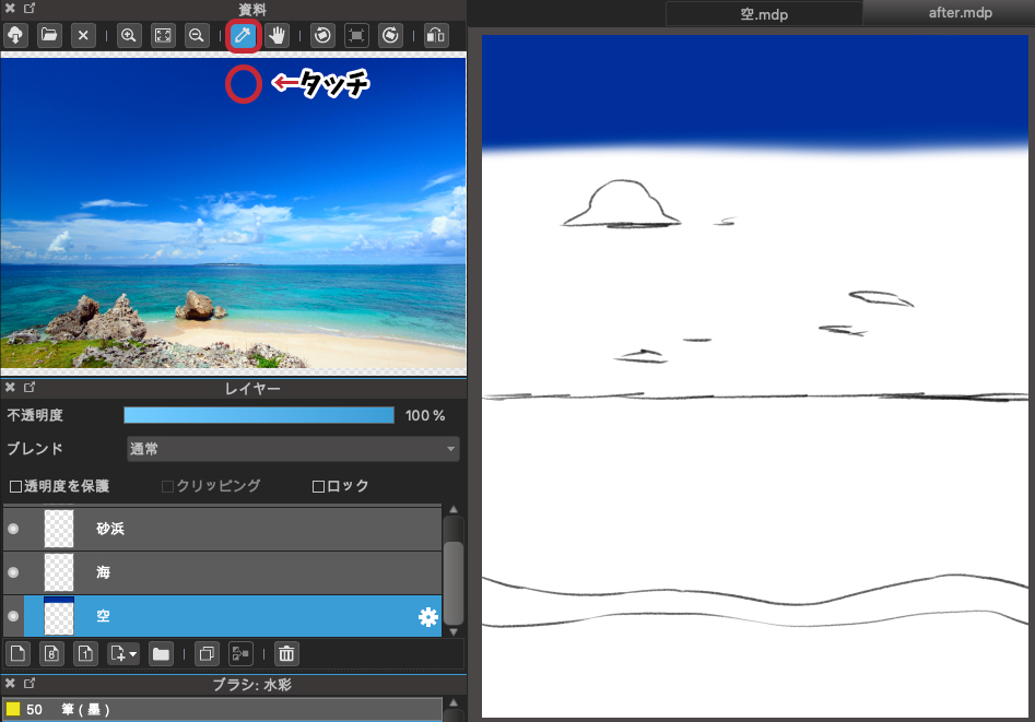
Then, take the eyedropper and paint the middle color and the bright color between the sky and the sea.
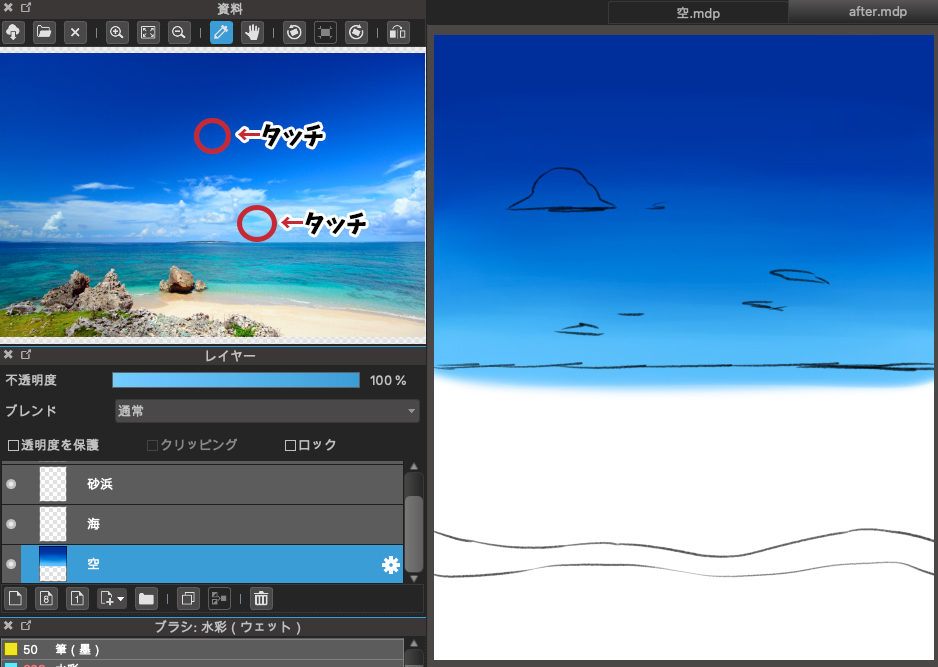
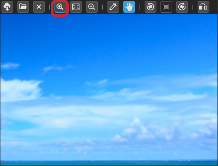
If you want to get a color from a detailed area, you can use the magnifying glass mark to zoom in for easy color selection.
In the same way, let’s dropper and paint the ocean/sand beach.
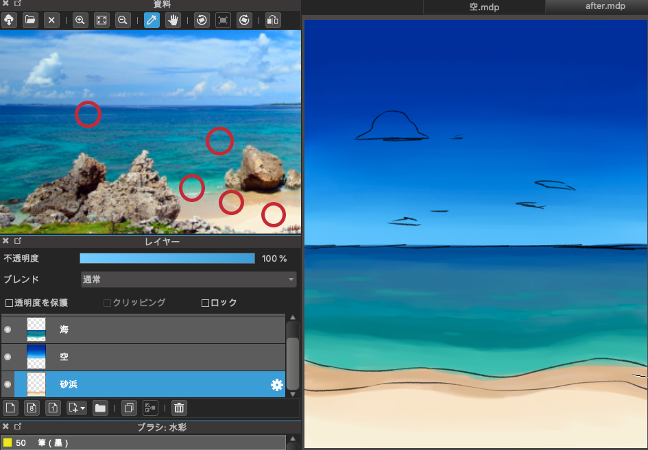
I selected a few colors that I thought would be characteristic of the ocean, such as the darkest color of the ocean, the middle color, and the bright color of the lapping waves.
Next, the frothy white parts of the waves and clouds are also colored according to the draft.
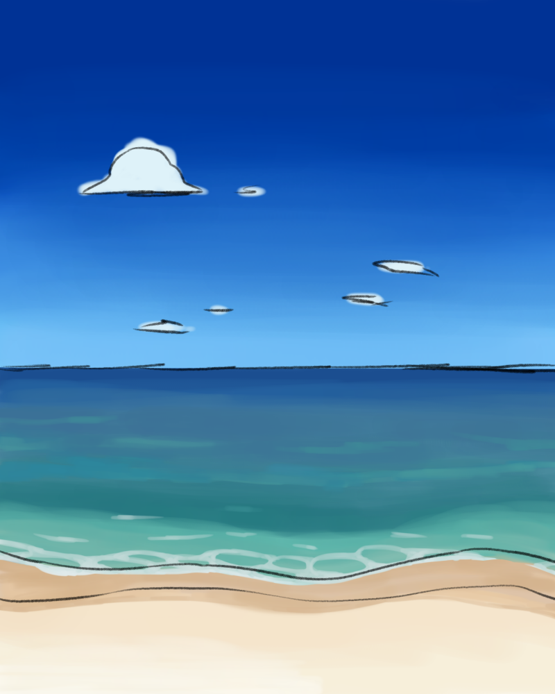
4 Finished illustrations
Finally, let’s hide the previous draft and shape it.
The horizon line should be straightened so that it is not distorted, and the shape of the clouds should be adjusted.
And here is the finished product.
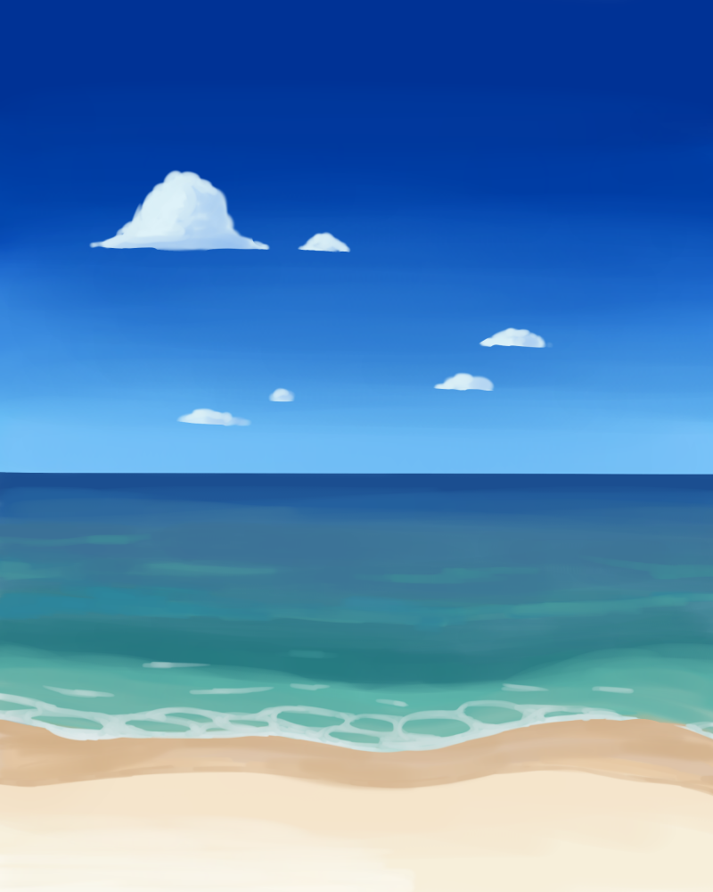
Compared to the first one, the sky is now a bright summery blue, and the ocean is not only blue, but also green, giving it more depth.
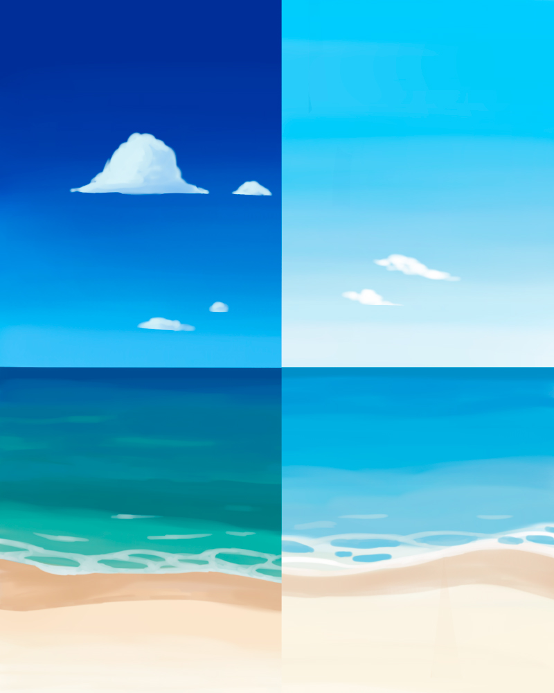
You can see the difference in color when you look at them side by side.
By taking colors from real photos, you can learn that the ocean is not only blue, and that the sky is much darker blue than the image.
There may not be a right answer, but if you want to make it better but don’t know how to do it, this tool is very useful.
Please give it a try!
(Text and pictures by Hiromi Arakane)
\ We are accepting requests for articles on how to use /

