2021.07.14
[For beginners] Who should turn off the anti-aliasing function?
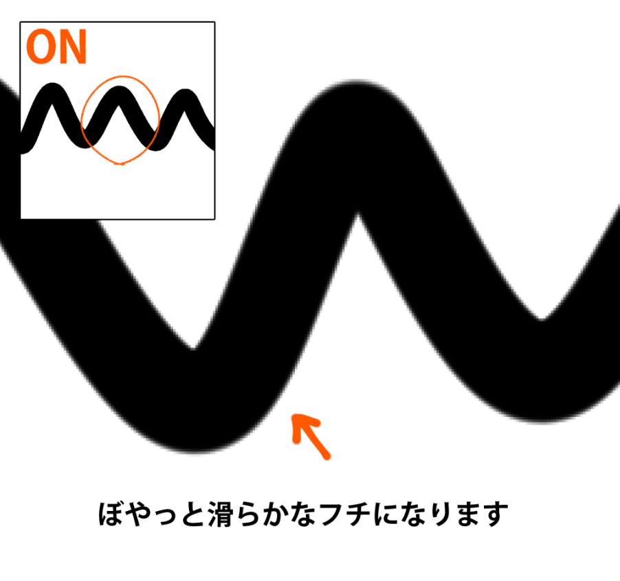
The “anti-aliasing” feature can be added to any drawing tool, such as pen, shape, selection, etc., to slightly blur the edge of the drawn line and make it look smoother.
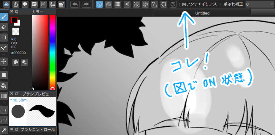
Now let’s compare and see what changes when we use this.
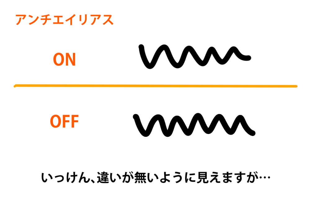
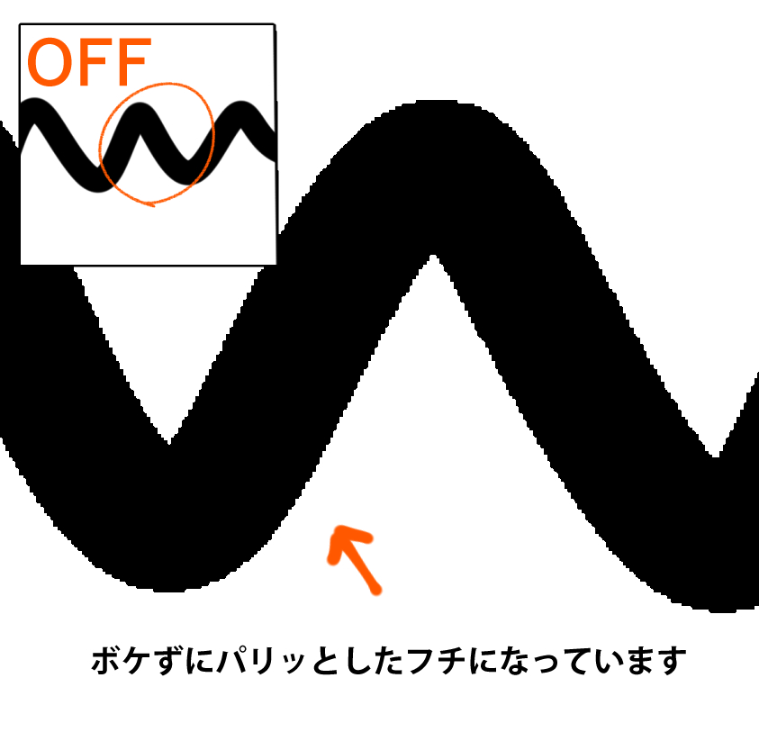
There are those who should use this feature and those who should turn it off.
Do you know what the difference is between the two?
“People who should turn it off” are people who publish illustrations and cartoons in monochrome two tone in paper media (such as doujinshi).
“People who should use it” can be roughly divided into almost everyone else.
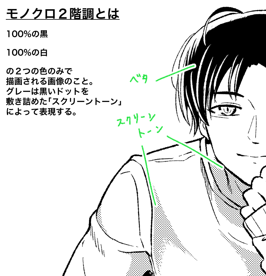
In MediBang Paint, the “anti-aliasing” function is turned on by default for all drawing tools, but I guess that’s because it should only be turned off for such limited use as monochrome bi-tonal.
This is because it should be turned off only for such limited use as “monochrome bi-tonal”. Let me explain why it should be turned off for monochrome bi-tonal pictures.
Most of the reasons come from the fact that the picture will be printed on paper.
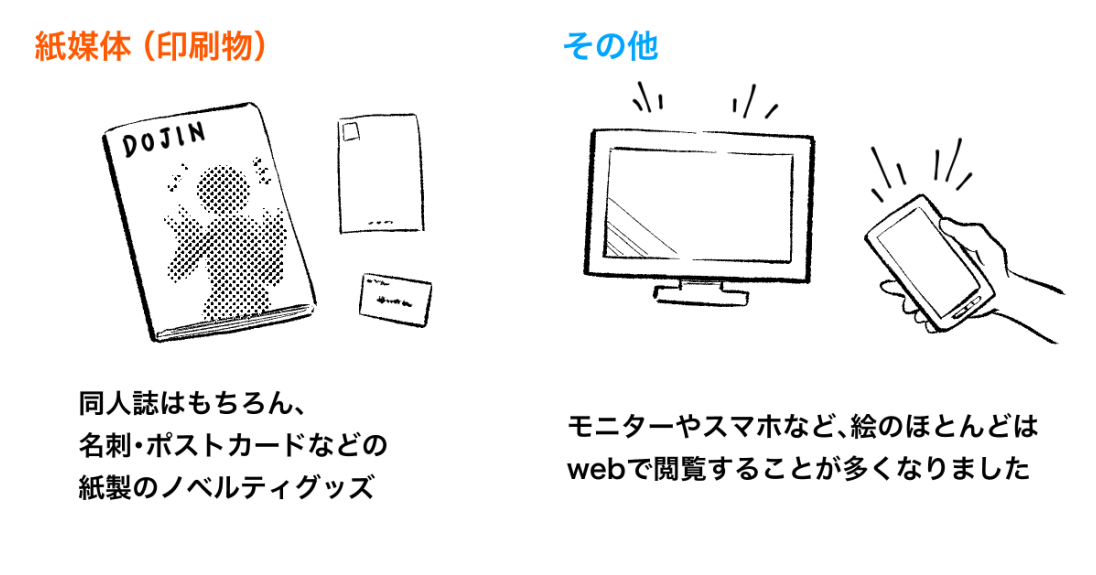
Anti-aliasing smoothes out the lines and blurs the edges a bit, but that gray “blur” is a big problem for two tone printing.
This is because the concept of “gray” does not exist in printed materials that are output in two colors, black and white.
Even if the image looks correct on the monitor at the production stage, when it actually appears on the paper, unexpected lines are drawn or disappear.
There are two main types of problems.
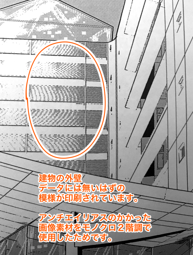
● Moire occurs.
When anti-aliased lines are mixed with screen tones, concentrated lines, or other dense areas of fine dots and lines, geometric patterns like ↓ occur in printed materials.
Sometimes it is intentionally created as a special expression, but in many cases it is considered undesirable.
● Thinner than the imagined line, disappearing line.
The light and dark grays created by anti-aliasing may not be reflected in the print as uncertain data.
This will result in a picture that differs from the actual data, as shown in ↓.
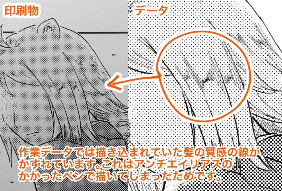
What’s more, anti-aliasing is an irreversible feature, so if you forget to turn it off beforehand and finish your work, and then you are faced with this kind of problem, it’s tough to deal with it easily.
Therefore, when drawing a work to be published in monochrome two tone, make sure that all tools are in the anti-aliased off state.
Who should turn off the anti-aliasing function? What do you think?
This article was literally written for people who should turn off the anti-aliasing function.
However, even for those who draw mainly color illustrations, there is a difference between knowing and using the anti-aliasing function and using it without knowing.
I hope you will keep this in mind in order to avoid problems like the ones mentioned above.
Thank you for reading to the end.
(Text and pictures by Ame-no-yama)
\ We are accepting requests for articles on how to use /

