2021.10.08
【For Beginners】Let’s make our own child! Part 2 【Original Character】
Everyone wants to draw their own original character at least once.
Your characters is the embodiment of your fantasy filled with many ideals, personalities, and haircuts!
There’s no right answer, just draw as you wish, and create your own best partner!
Don’t wait! Start drawing!
That’s what you think until you pick up your pen ……, and don’t you hate it when your hype and brain simmers down quietly as if all of that were a dream? It happens to me all the time.
This article will help you break free from that frustration of not being able to draw even though you want to, and give you the freedom to create whatever you want, however you want, whenever you want.
In the first part I’ll explained the process of character design as a “hobby”. Now in the second part, I’ll explain how to create simple icons in a way that’s as easy to understand as possible!
In the second part of this article, we will create icons that can be used in social media, etc. and also I will show you how to arrange the icons in a relatively easy and beautiful way, so start reading below!
Now, it’s time to create your own child! Your own original character!
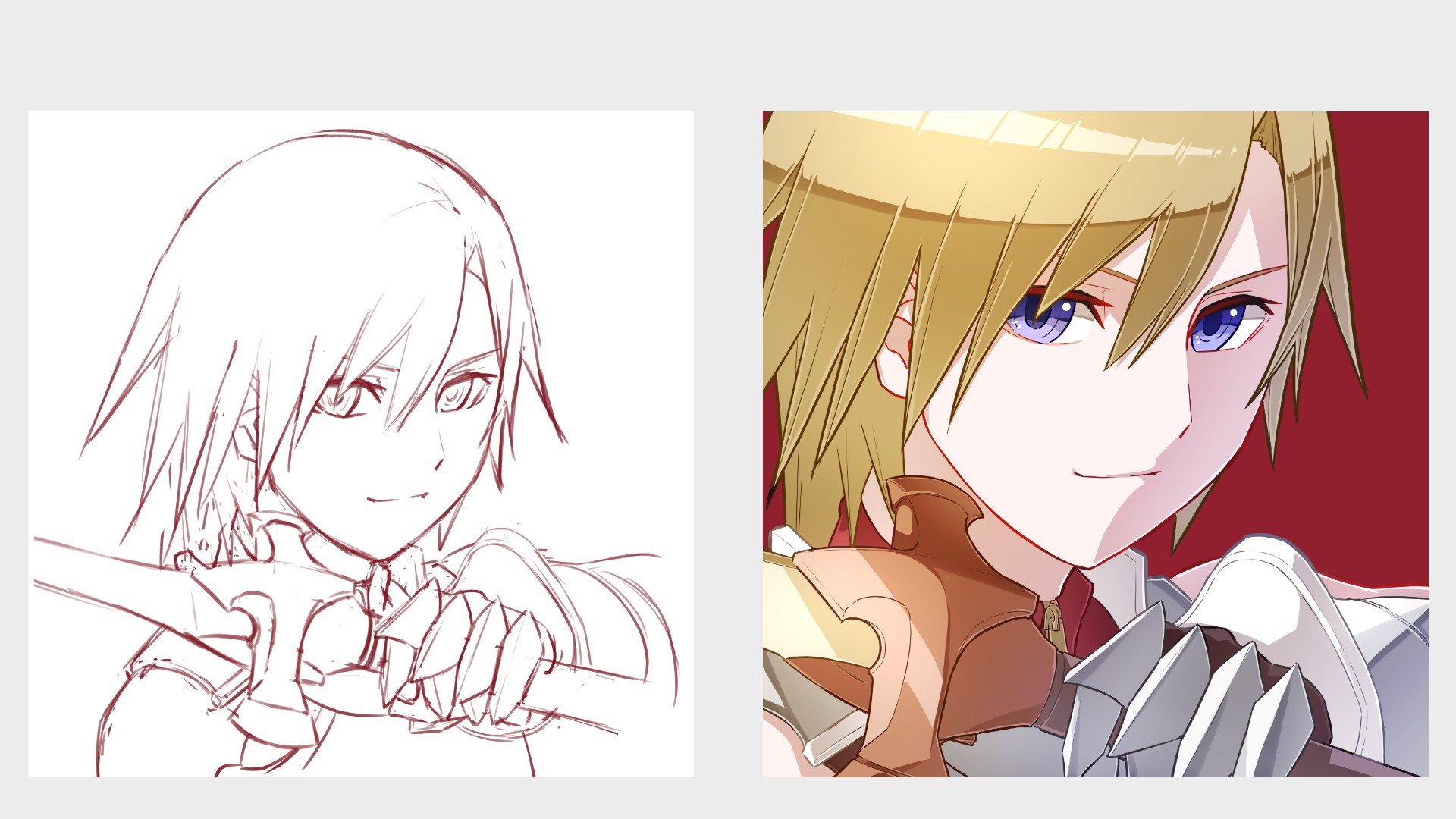
1. Prepare your characters
First decide which character you want to use as your icon.
I’m going to use the unnamed swordsman I made in part 1 of this article for my icon.
If you don’t have a particular character in mind, and/or you haven’t seen the first part yet, please click the link below!
▼ Part 1
【For Beginners】Let’s make our own child!【Original Character】PART 1
2. Getting Started
After deciding on a character, open MediBang Paint.
Select [File] and then [New].
Click the link below on creating a new artwork.
In this setting, the width is 1350px and the height is also 1350px.
If you are going to draw an icon, a perfect square is recommended.
If you want to use a part of your drawing as an icon, you can use any size you like.
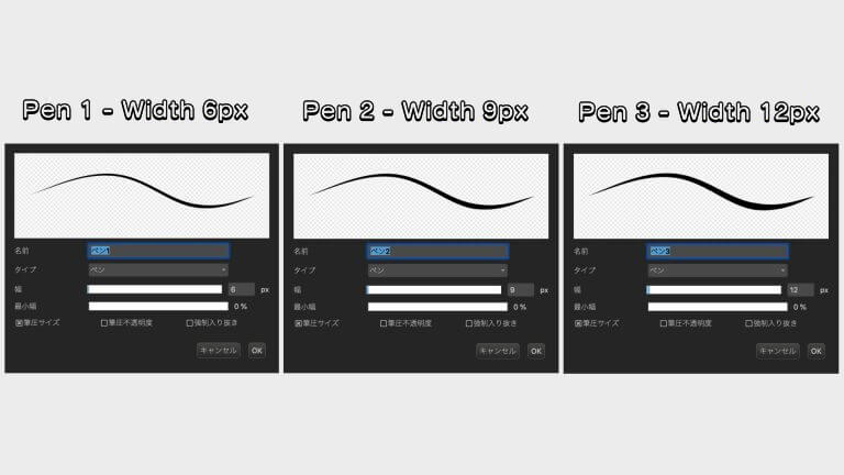
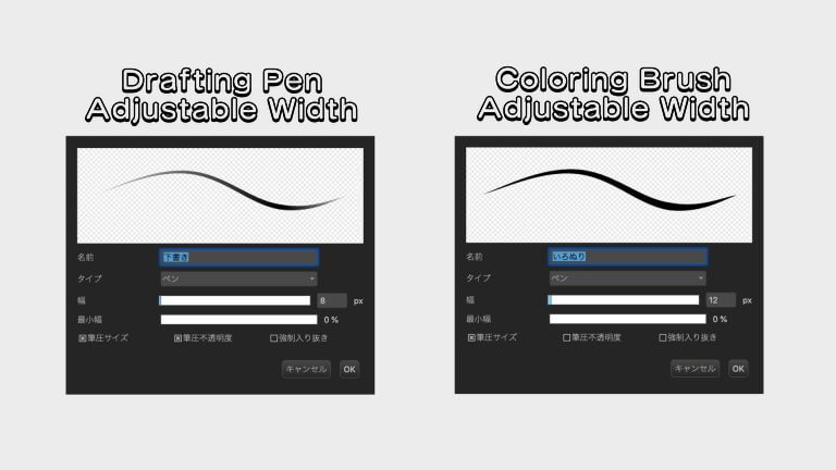
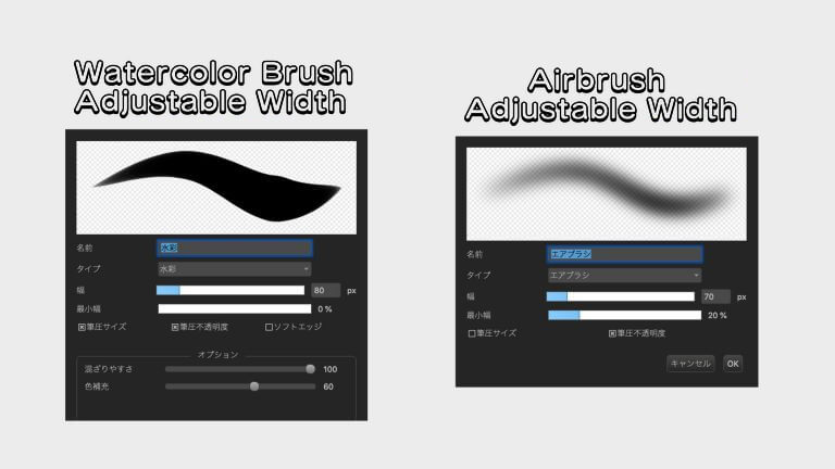
Here are the seven types of pens we will be using.
・[Pen Type] pens in large, medium, and small sizes (3), along with the drafting free size pens and [Pen Pressure Opacity] coloring pen which makes 5 in total.
・One [watercolor type] pen.
・One [airbrush type] pen.
If you are not particular about the size of the image or the pen, you can use the same settings to create a similar image.
3. Draw the draft
When you are ready, start drafting your image.
Make sure it’s not too big or too small, so that you can fit the part you desire into the icon!
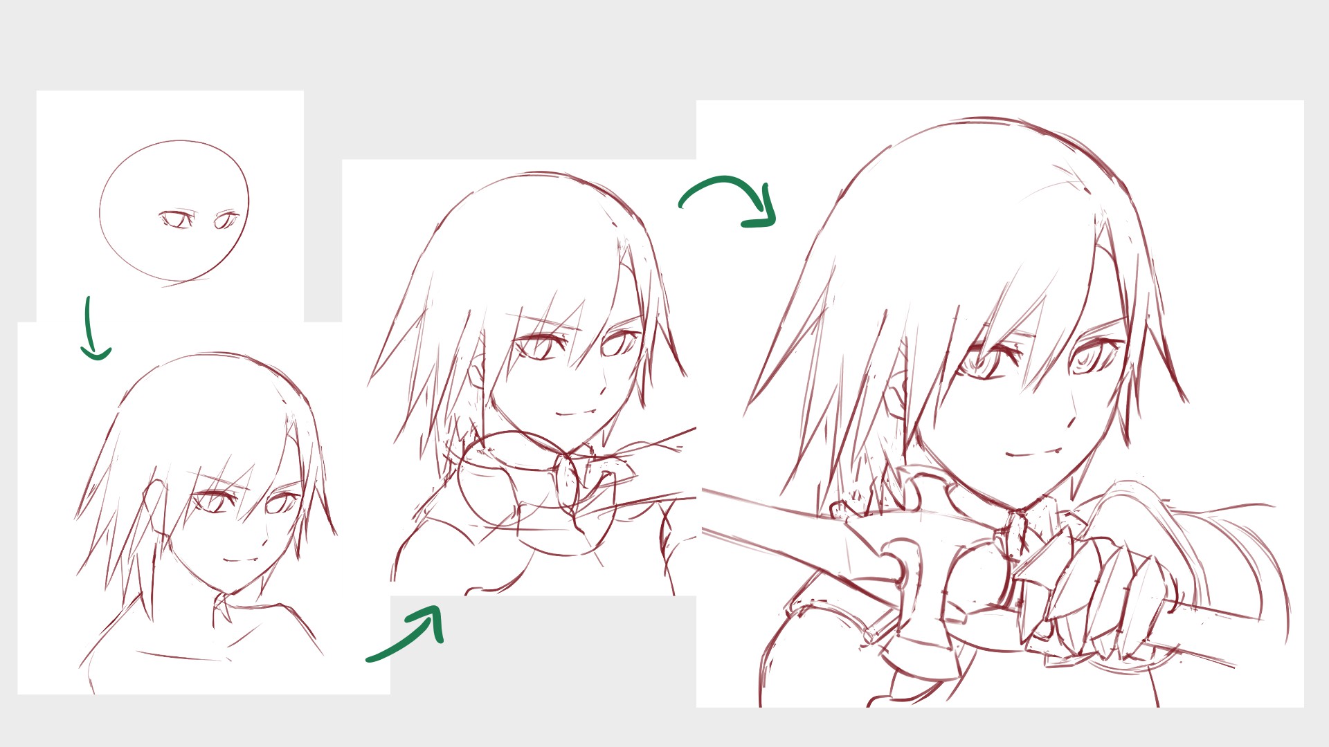
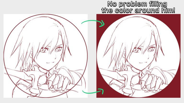
Once the draft is done, create a new [Layer] and roughly draw the area that will become the icon.
Since most of the icons will be round, use the [Shape Brush].
If you draw it as big as possible, it will be noticeable on social media. (No need to fine-tune after selecting the image!
▼About【Layers】
Let’s use the layer function
You could call this complete, but don’t you think there are always room to improve?
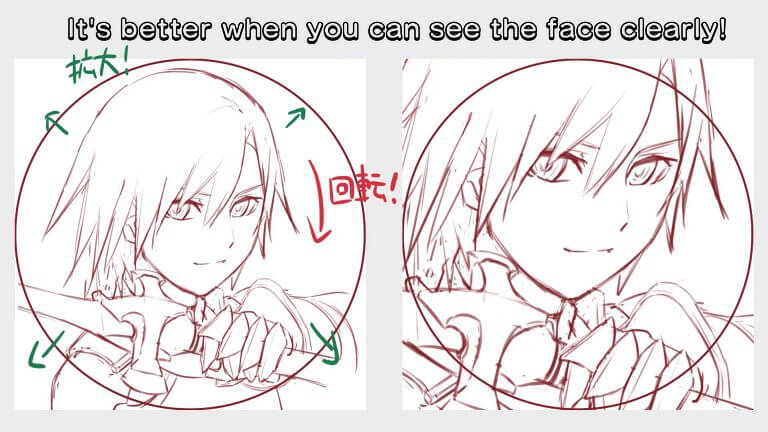
So let’s try using the [Transform tool] on the draft and make it bigger.
Go bold!
Icons are usually small, so make your profile easy to discern.
If you make zoom into the face, it will look more powerful and iconic!
You can also change the angle if necessary.
▼About selection tools
Let’s use the selection tool
▼About Transform tools
【For Beginners】Easy with the Transform Tool! Face and Body Balancing Techniques【For Smartphones】
4. Draw the line works
Next, let’s draw the lines.
You can draw the lines better by pressing on your pen r brush, but of course this is difficult to control…
So I alter the pen and brush sizes each time before drawing to be forcibly accurate.
It’s a little different from the way I draw with just one pen, but it can turn out pretty cute!
So here, I’ll show you how to draw in this way.
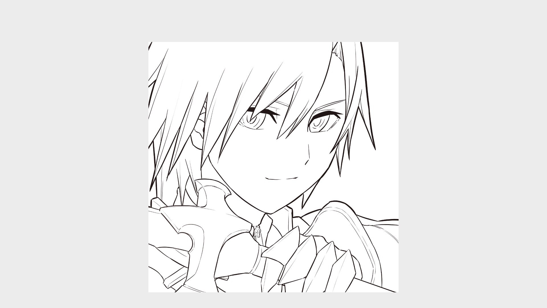
The first step is to draw the outline of the character.
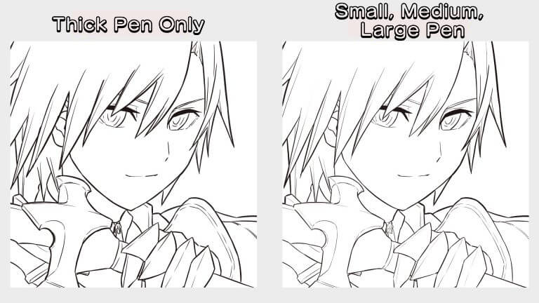
Use a thick pen to trace the outermost part.
I separate the layers for hair, body, and face parts, but you guys can draw whatever you want!
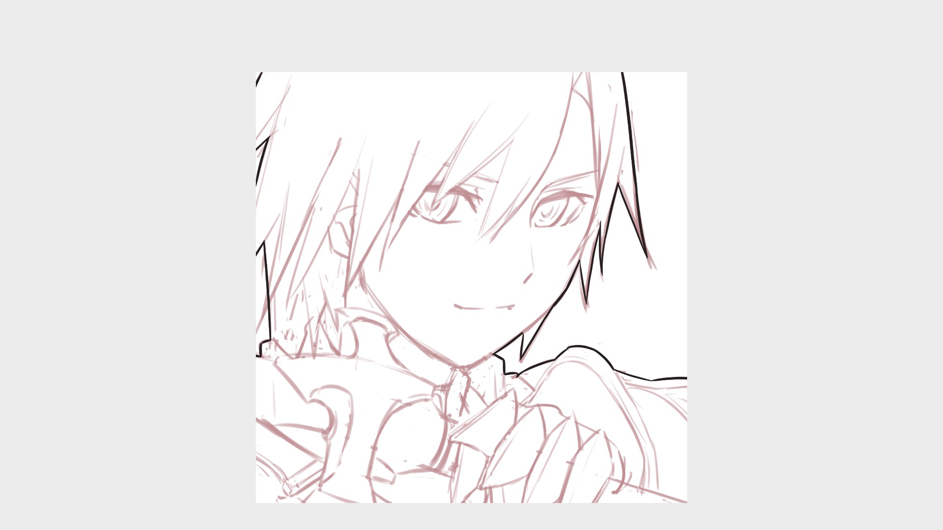
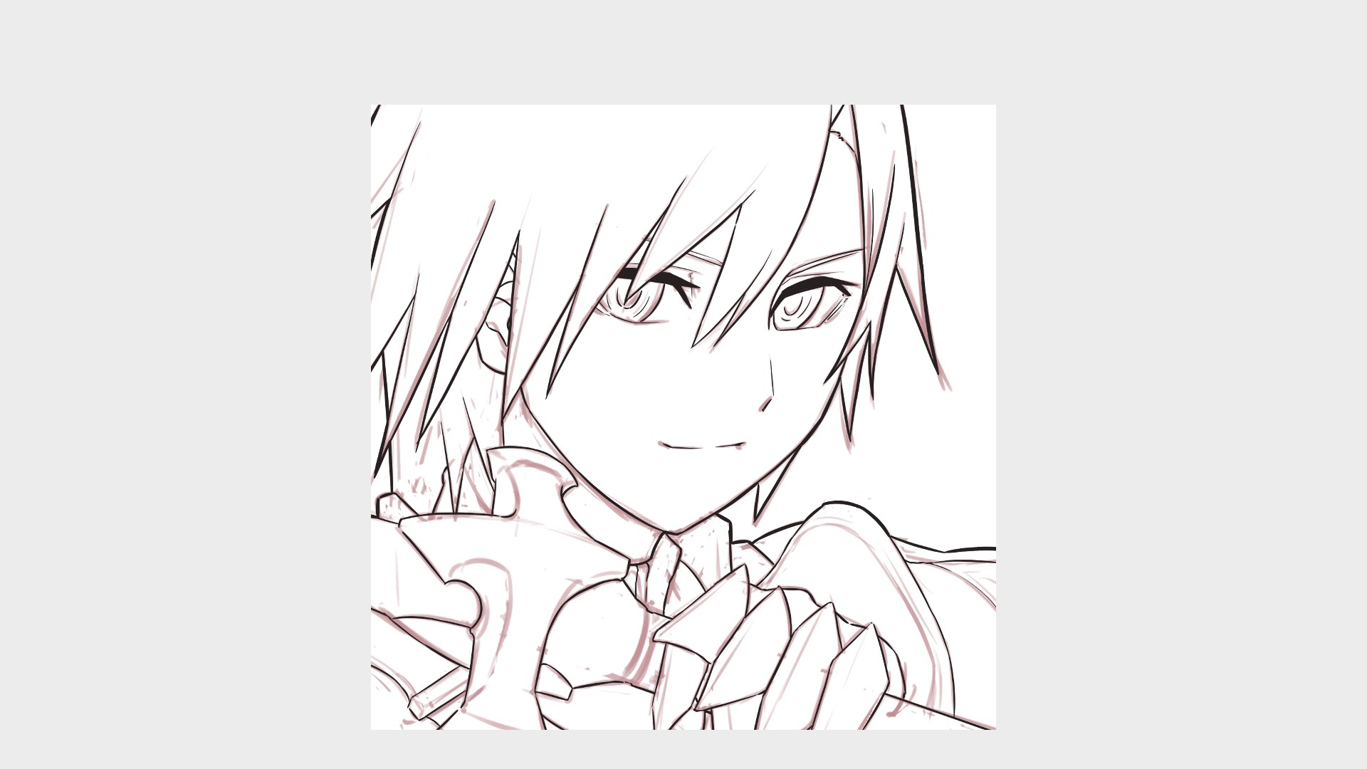
Once the outline is drawn, use the middle size pen to draw the inside parts.
Use a smaller pen to draw the details (hair lines, wrinkles, etc.), and trace the outline of each part.
The eyes and mouth can also be drawn with this pen.
The inside of the eyes and eyelids can be drawn with the next thin line.

Finally, draw the remaining areas with a thin pen.
The pen is small in size, but if you don’t put too much pressure on it, you can create a beautiful difference from the other lines.
For comparison, I drew the same picture with the thicker pen I used this time.
It’s just a matter of changing between several pens, but do you notice the difference?
It’s maybe a lot of work, but frequently changing the tools can make things much better.。
Please try it out!
5.Paint the colors (Skin、Clothes、Hairs)
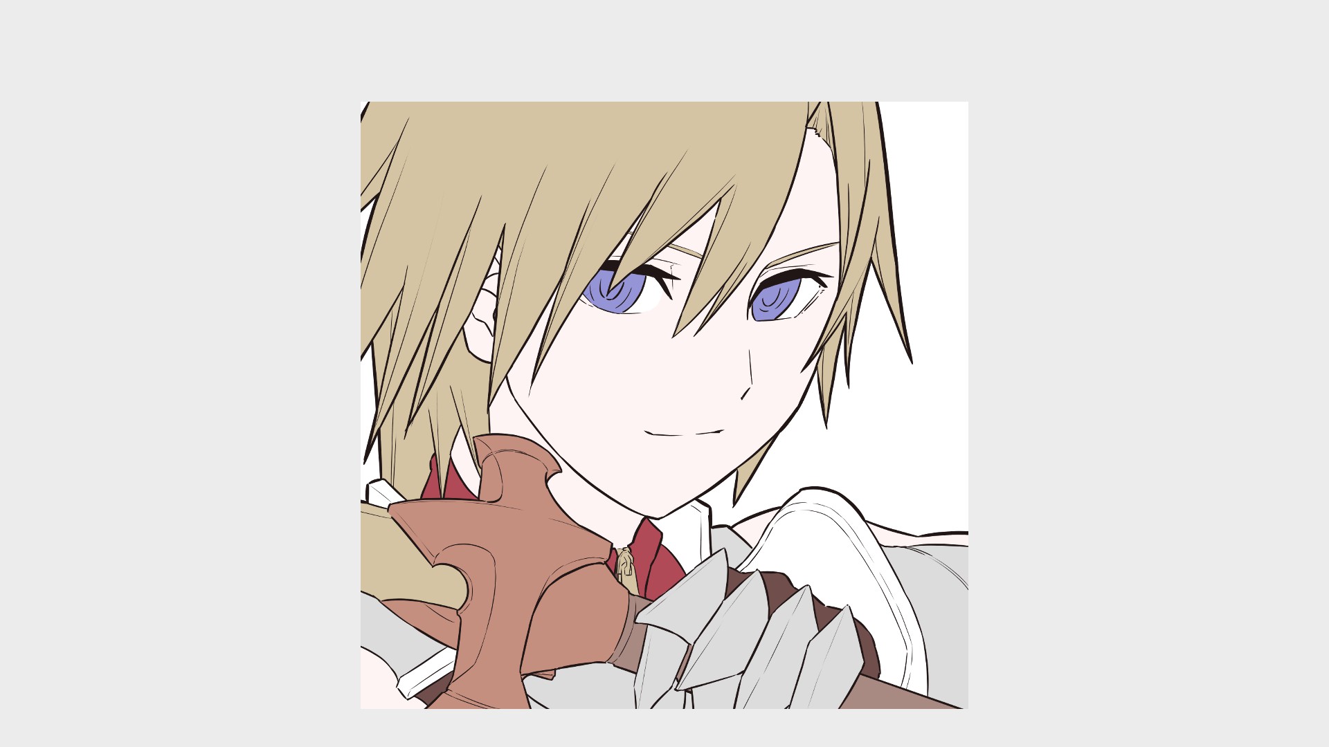
Once the line drawing is done, it’s time to paint the colors.
I’m going to do what is called “anime painting”, but I’ll also show you a slightly modified arrangement later.
First, let’s paint a solid color.
Use a pen for coloring.
If the lines are clean and closed, you can make it easy with a bucket tool!
You can use any layer for coloring, but I recommend separating the layers by parts, as it will give you more room for arrangement.
The next step is to paint the shadows.
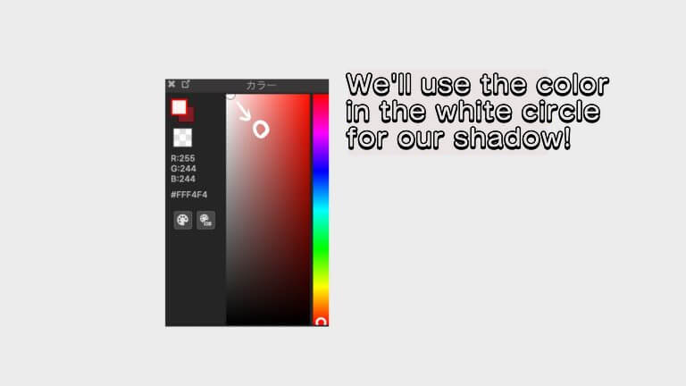
It’s difficult to paint with many colors, so let’s try with two colors for the base and the shadow!
The color of the shadow should be diagonally to the right of the base color. the impression changes with the light and atmosphere, but beginners shouldn’t worry too much from the start
Create a new layer and [Clip] the layer you want to paint and start painting.
The hair and eyes need to be painted differently, so we’ll start with the skin and clothes.
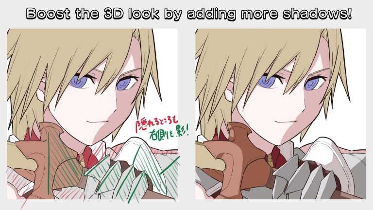
When you paint, usually you worry about where the light hits, for beginner try drawing the shadow on either the character’s left half face or right half face. You can also cover the entire face with shadows with the nose at the center. Try also drawing shadows into caved in facial features like underneath eyebrows.
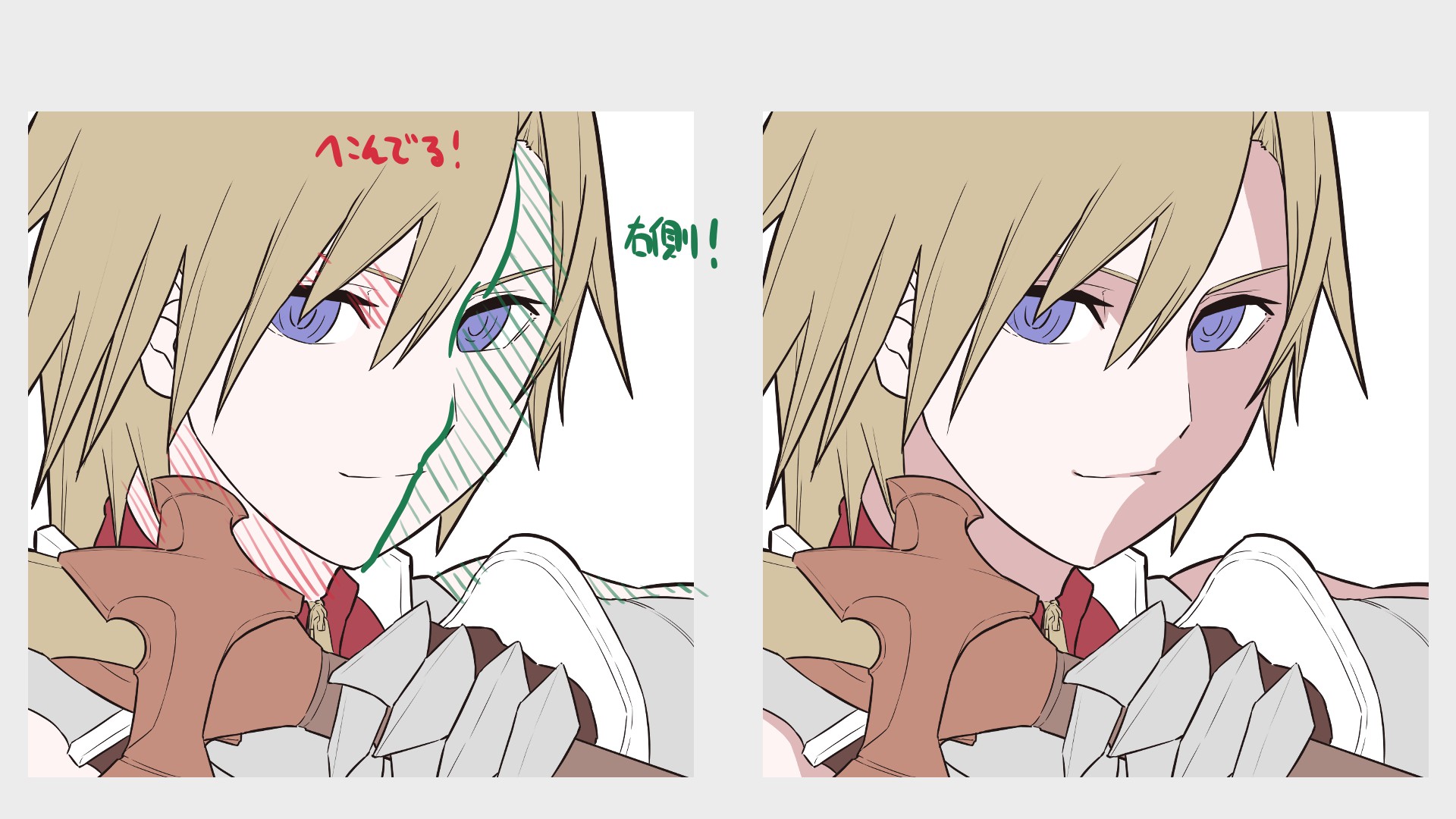
Paint the parts that are hidden by the hair.
If you’re drawing the right half as a shadow, paint the bottom right corner of the overlapping parts!
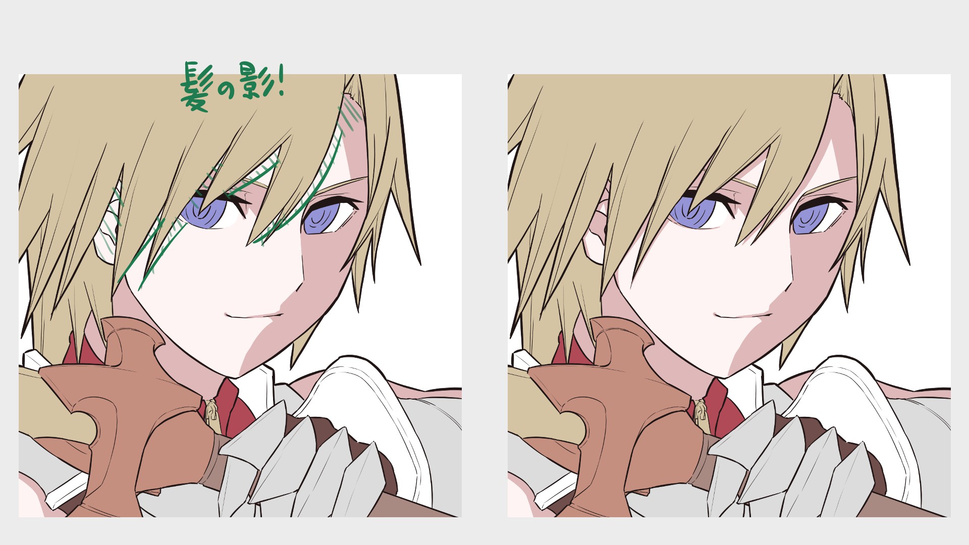
Paint the clothes in the same way.
Since the hands and sword are in the front, let’s paint the neck and chest in shadow.
If you paint more shadows, it will give a 3D effect and make you look better.
If you think something is lacking in your illustration, try adding more shadows?
The last step is to draw the light on something that might reflect it. The color of the light should be the opposite of the shadow, starting from the upper left side.
Again, if the shadow is on the right, draw the light on the opposite left.
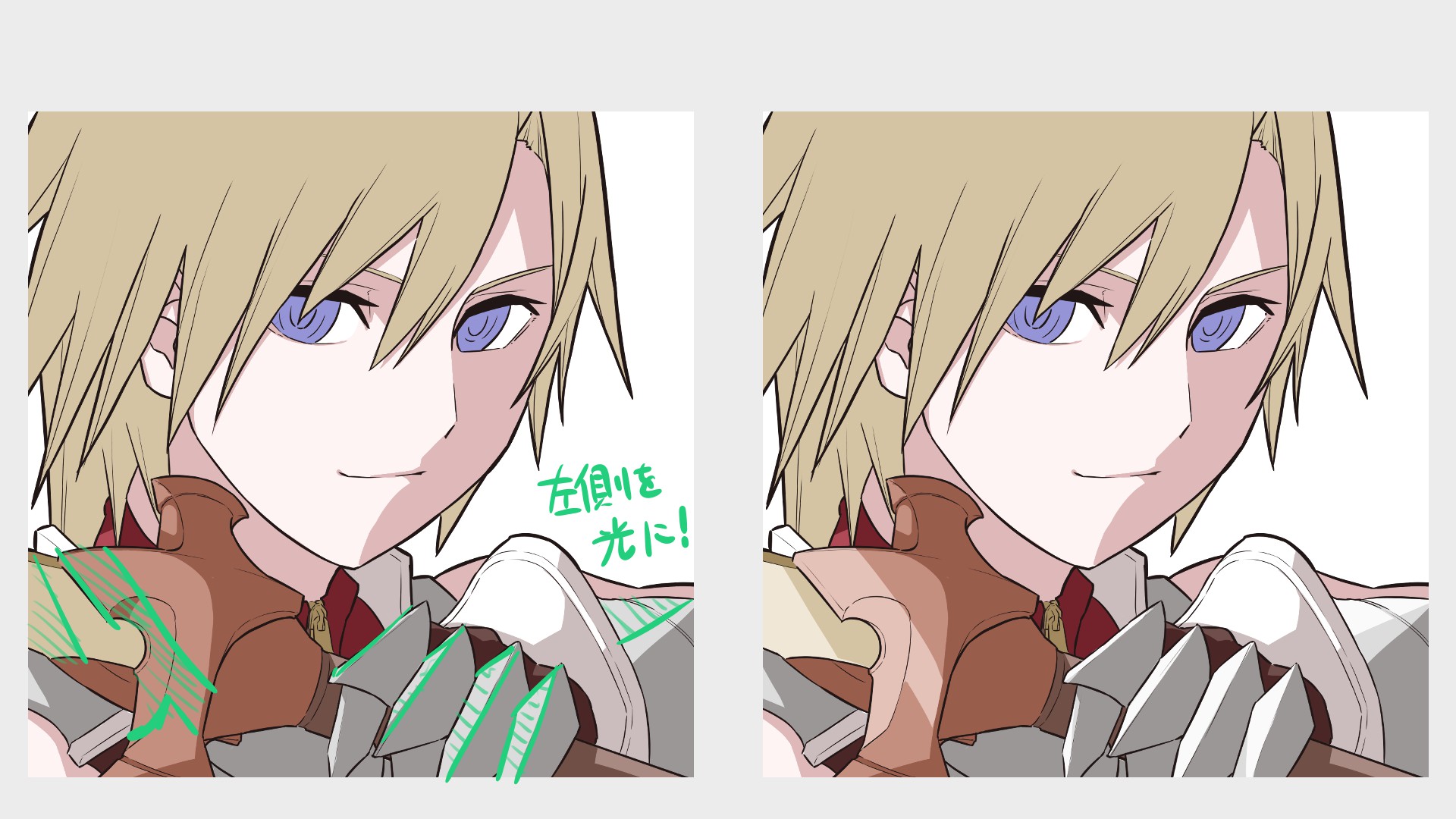
Next is the hair, which is slightly different from the clothes in that the underside is in shadow.
This is to make the reflection of the hair more visible, although this may not be realistic!
What matters is making your character attractive.
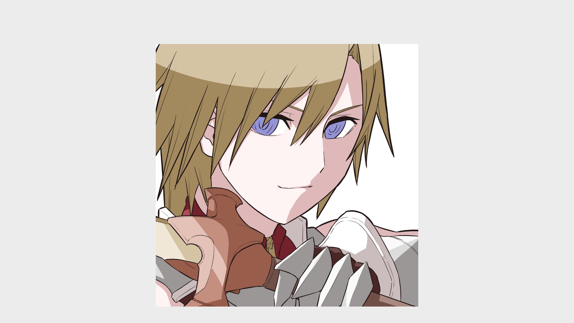
Draw light on the hair as well.
Start from the left side and gradually make it thinner.
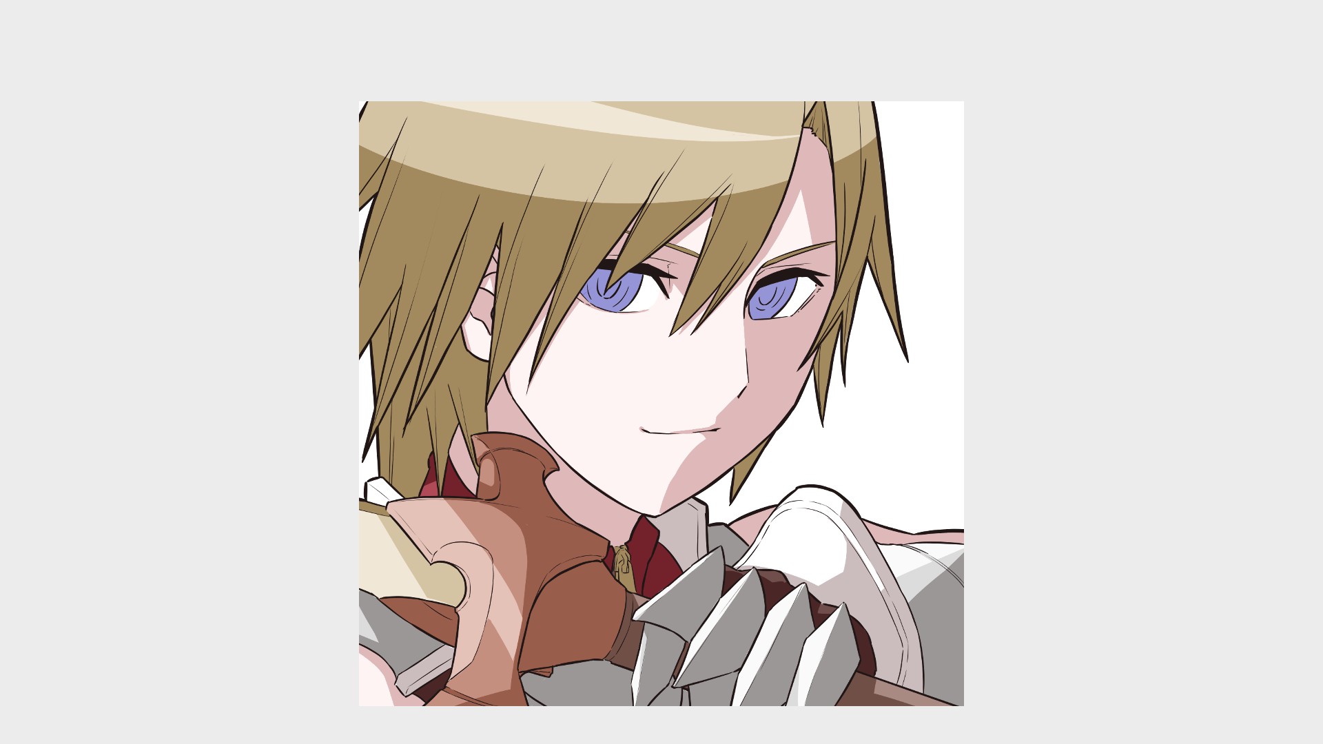
6.Paint the colors (Eyes)
There’s also a shadow on the white areas of your eyes.
Perhaps it is the shadow of the eyelid?
I confirmed it when looked myself in the mirror, so I’ll try to draw it the same way.
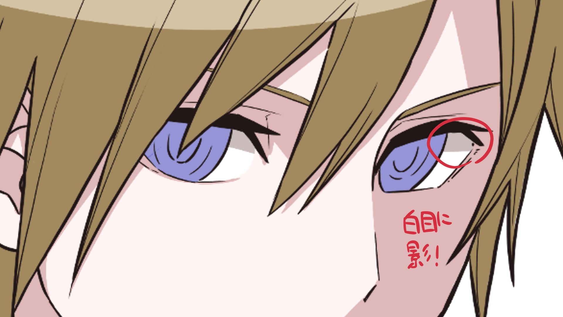
Paint the upper side with a slightly darker color, just as you did when you created the shadow color.
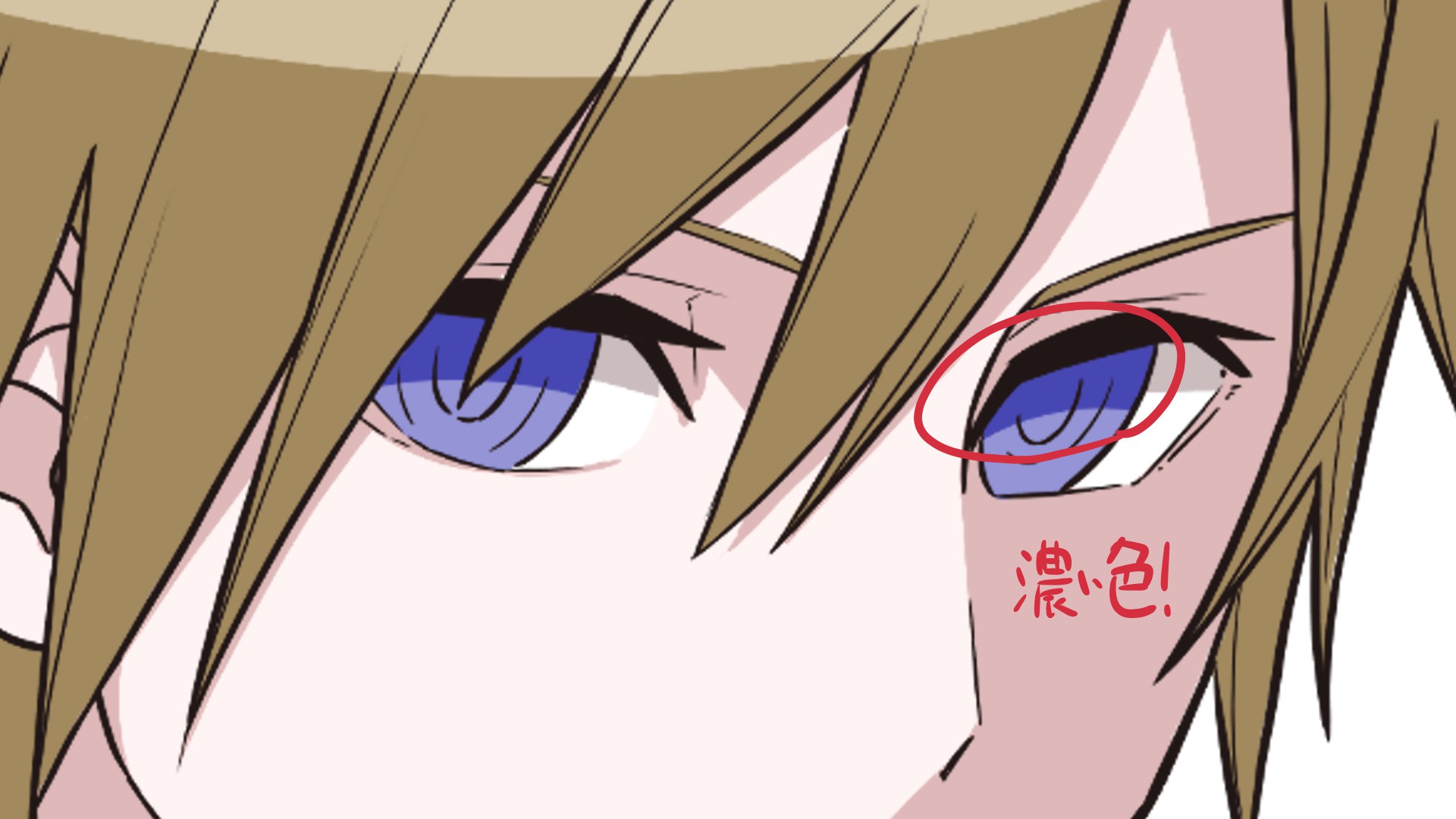
For the pupils, color an even darker shade!
Paint the border between the pupil and the color you just painted.
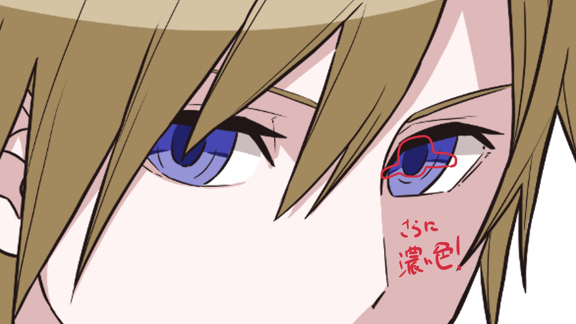
Once you get this far, clip a new layer and set the [Blend] of the layer to [Multiply].
To Multiply means to make the layer darker and darker by the amount of color layered on it.
Let’s darken the upper half of the eye softly with the airbrush and the dark color that we painted the pupil with.

The next layer blend is called “Add and Emit”.
As the name suggests, this tool makes parts glow.
This is useful when you want to add some sparkle!
Use a pen with pressure opacity on, such as the one used for drafting, and paint lightly.
Use the same color as the first solid color.

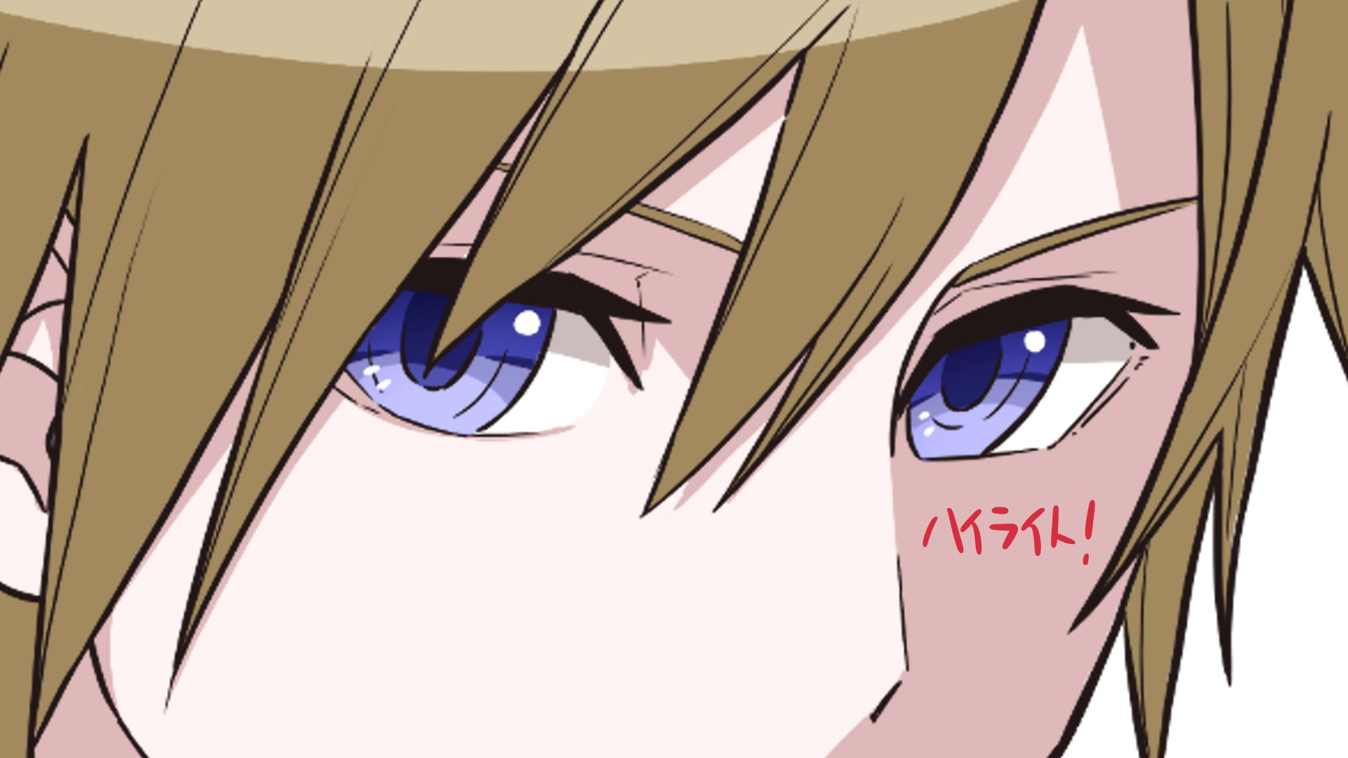
Finally we use highlights to bring him to life.
Usually you apply them to the eyeballs and eyelids depending on the position of the light, but there is a recent trend that you can put it anywhere and in any way you want.
Try putting a little one in the upper right corner.
And a small one on the other side!
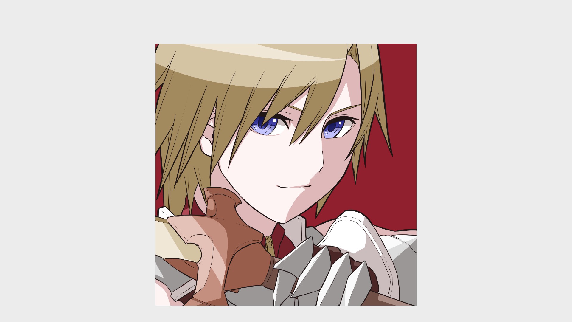
Since this will be used solely as an icon, I’d like to make him colorful and less attention to backgrounds.
We have to think carefully about what color fits him, but I like red, so I’ll go with that!
You guys can paint the background in any color you like.
The icon is now complete!
7. Painting Arrangements
From here, I will show you several ways to arrange your painting based on your illustration.
They all take only a few steps, so if you like what you see, try it out on your own artworks!
There is an arrangement for layering blends, but it may not work well as is.
Combine your drawings into a single sheet or folder, set the folder blend to [Normal], create a new layer, and change the clipping and layer blend.
Arrangement 1: Make it glow
The layer blend used to paint the eyes is added and emitted to make them glow.
I used an airbrush to apply the same color as the light.
It’s pretty low key, but it can be used in all sorts of ways to make it glow!
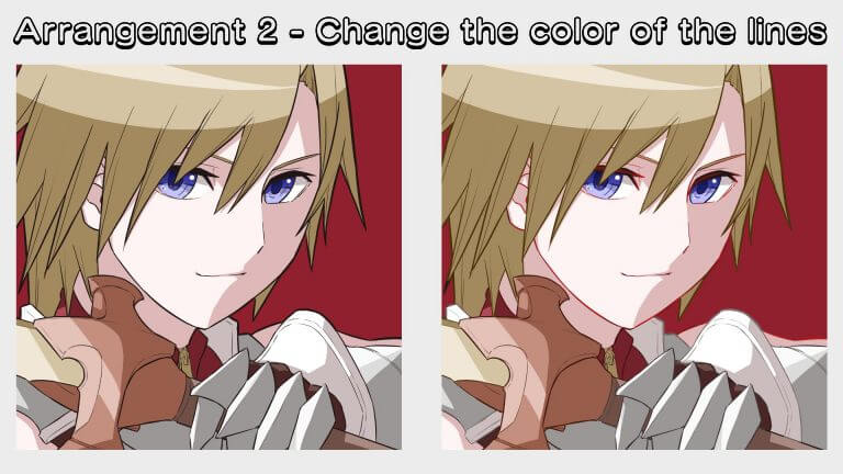
Arrangement 2: Change the color of the line drawing
Turn on [Protect Opacity] on the layer of the line drawing, and use a watercolor brush to paint it in a color similar to the adjacent parts.
This will make the lines look more blended than a black-only drawing.
There is no deep reason behind using the light red color for the skin.
Daring to paint in a different color may lead you to an interesting discovery.
Arrangement 3: Make the border darker.
Now protect the transparency of the shadow layer and use a watercolor brush to paint the boundaries of the shadow with a dark color.
You can do this to all of them, but I tend to do it only to the parts where I’ve painted the reflected light.
It seems to make the picture a little clearer, don’t you think?
Arrangement 4: Shading Part 1
Again, apply opacity protection of the shadow layer, and then use the airbrush to paint over it with the base color.
It works best when applied on the inside or the opposite side of the border.
It’ll be fluffier, lighter, and more transparent!
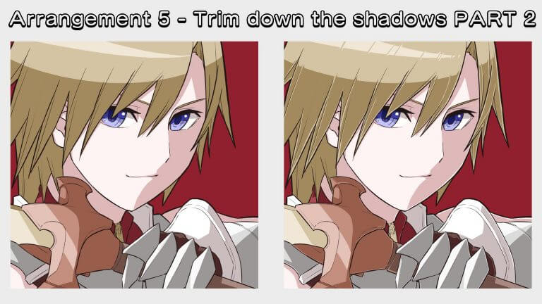
Arrangement 5: Shading Part 2
Shave a little bit of the area adjacent to the shadow line drawing.
A little more light will give it a shiny look.
You can make the hair look more like hair by making it jagged along the flow, or by even removing the light!
Arrangement 6: Layering with Overlays
This is an arrangement using a layer blend called “overlay”.
I think it’s simple to imagine it as helpful for “adding to the atmosphere”.
I used an airbrush to apply orange to the areas with lots of light and blue to the areas with lots of shadows.
It’s a great way to use colored light, because you’re bringing out the color underneath while layering the color on top!
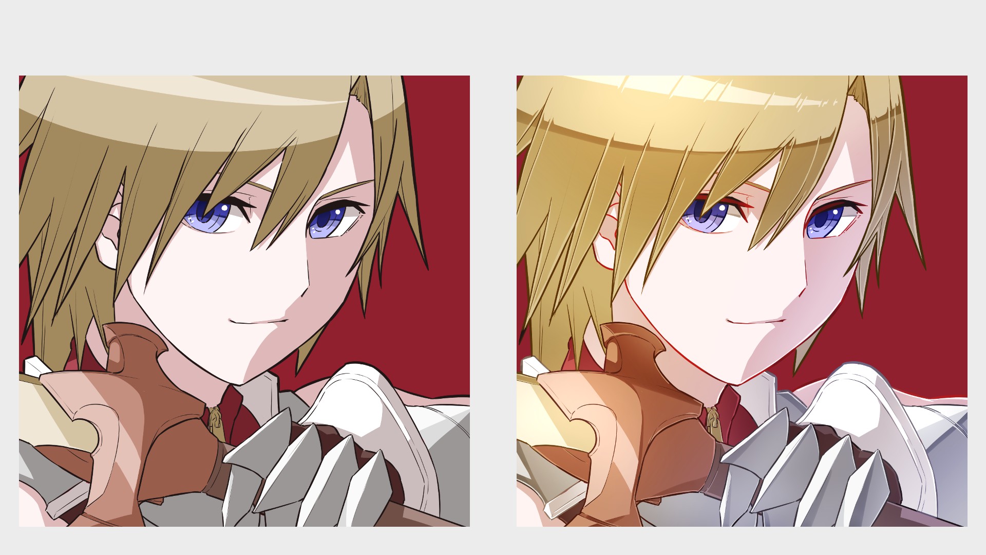
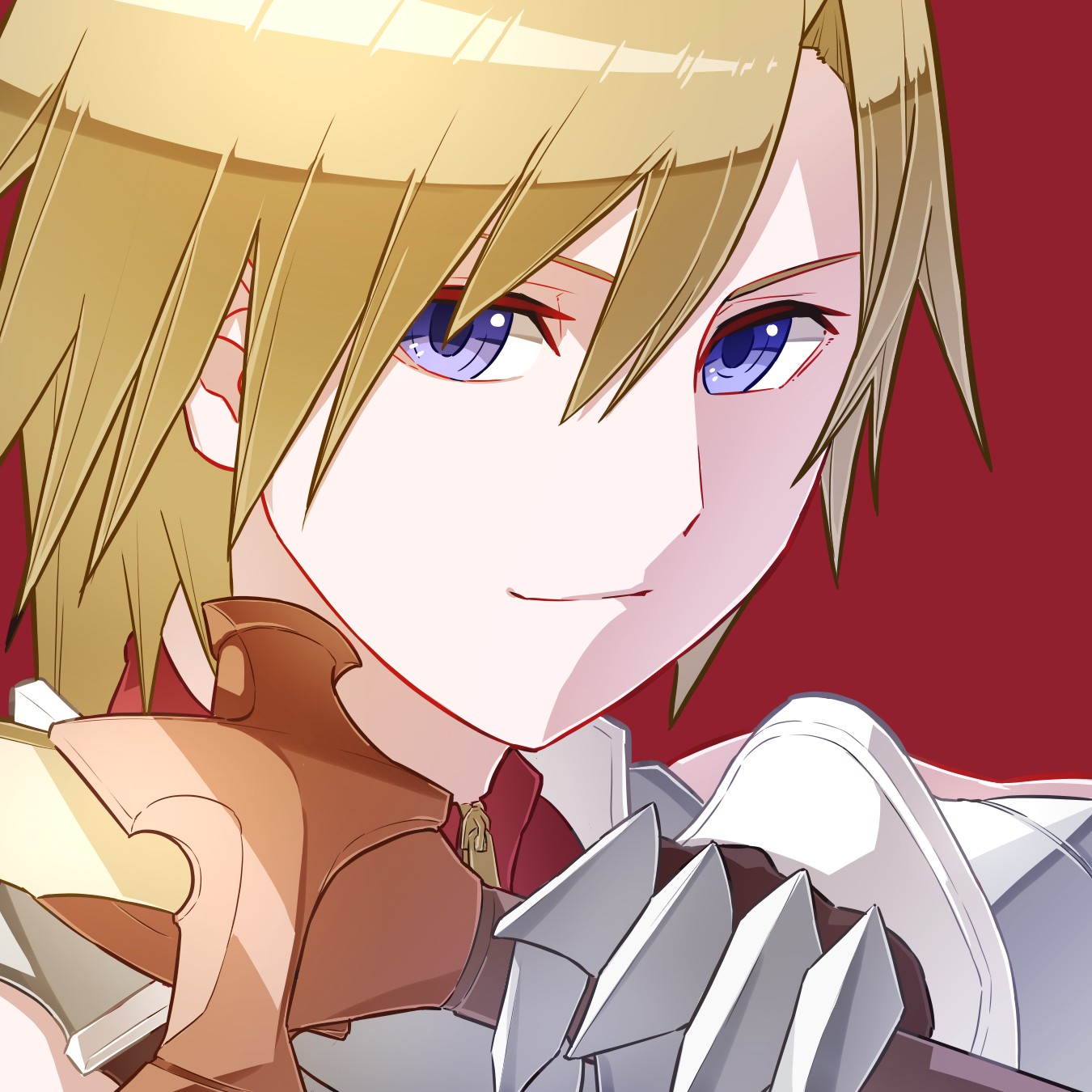
Lastly, the drawing below is the product of using all the arrangements I introduced above.
Compared to the picture on the left, the right looks much more beautiful, don’t you think?
Some people may think it’s too much, but you don’t have to use all of them, so I hope you enjoy drawing them the way you like!
How did you like it?
I hope you enjoyed the first part, where I created my character, and the second part, where I created an icon with him.
I think one of the best parts of drawing is being able to create your own character, and having a visible record of its appearance and personality.
I hope you all have a rich drawing life, creating whatever you like, however you like!
So thank you for watching!
(Text and pictures/Clock)
Twitter https://twitter.com/Clock1231
\ We are accepting requests for articles on how to use /

