2022.10.06
Manga Frame Layout for Beginners

Frame layout is a centerpiece of manga creation.
What I want to show you today is “useful techniques and tips for drawing frame layout”.
The optimal layout may differ depending on a creator’s end, but I hope this article will help you.
Index
Frames
Frames in manga refer to a single picture depicting a flow of time.
As it’s shown below, it’s common to surround pictures with lines.
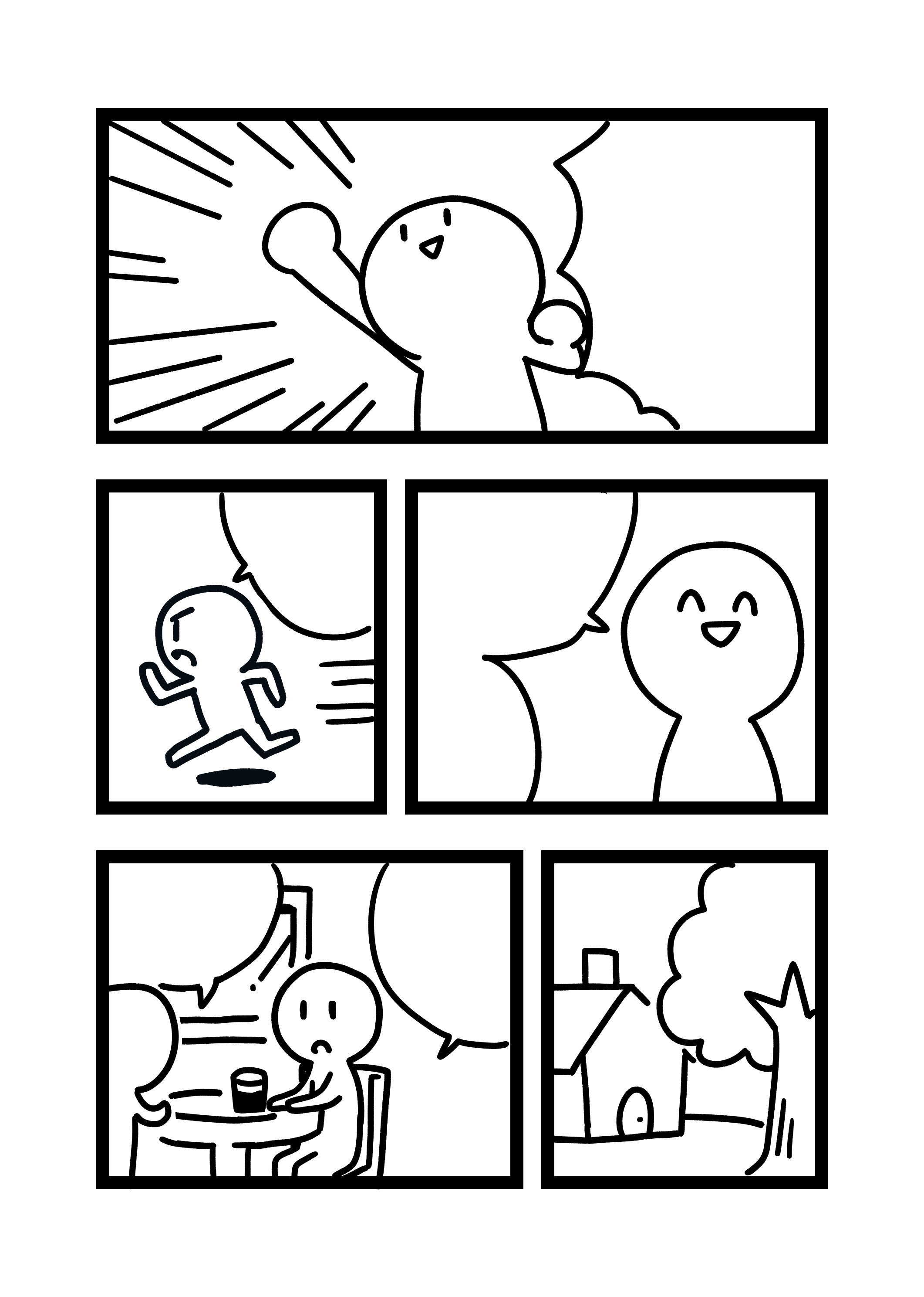
Most manga works are composed of frames.
Frame Layout
It is necessary to ponder how the frames can be placed in order to create well-composed frames.
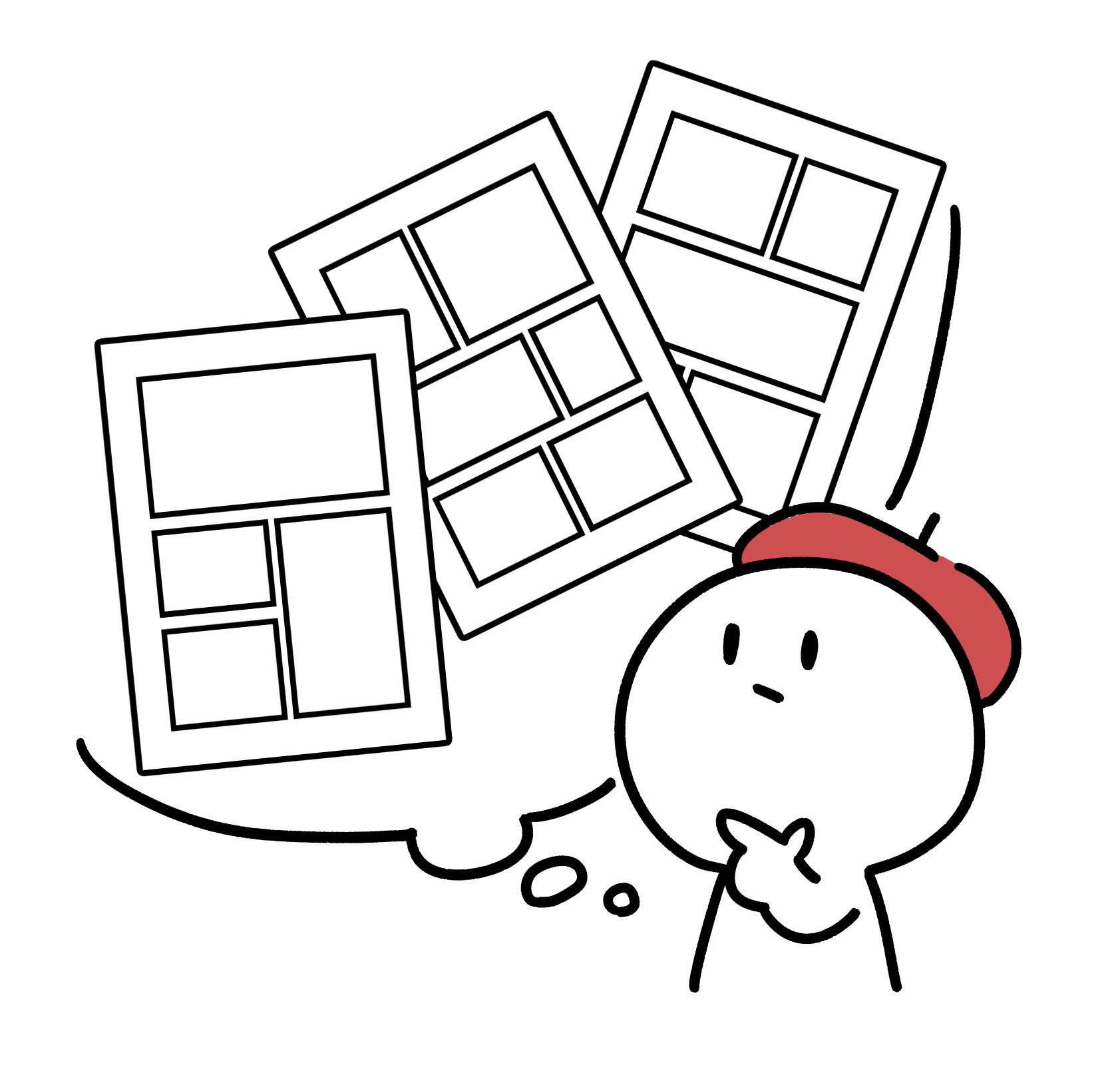
The Number of Frames: Readability Comes First
Basically, “3-6 frames for one page” is the best frame layout, since it allows big pictures and rooms for speech bubbles (The first image has 5 frames, for example).
And see what it looks like when there are 10 frames in one page↓
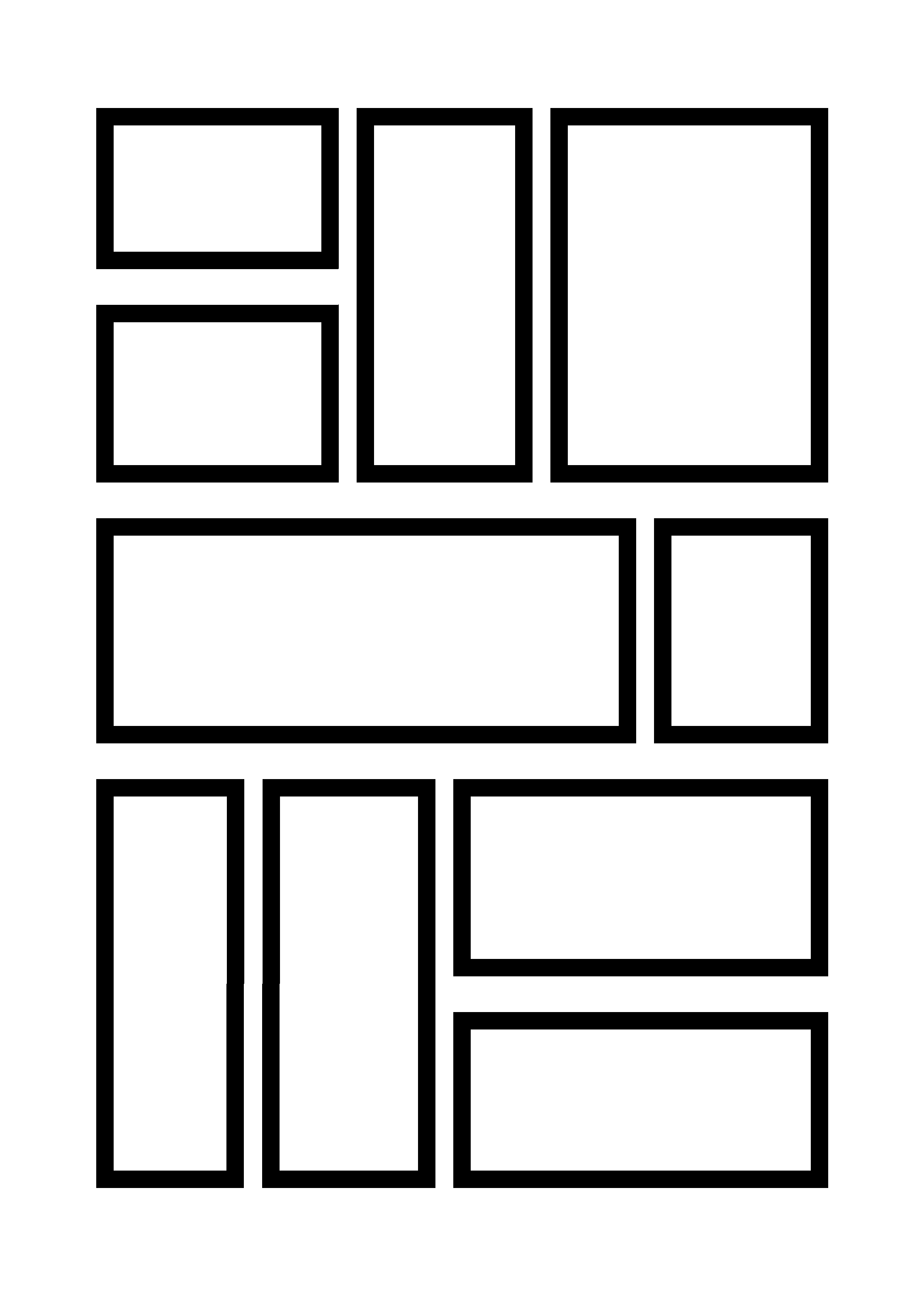
Small frames will diminish readability.
I know your feeling to want to put many contents in one page,
but we should rather “cut unnecessary frames” or “add more pages and divide frames”.
Careful Not to Make Your Readers Confused
Common Japanese style manga is designed to be read from right to left, from the top down.
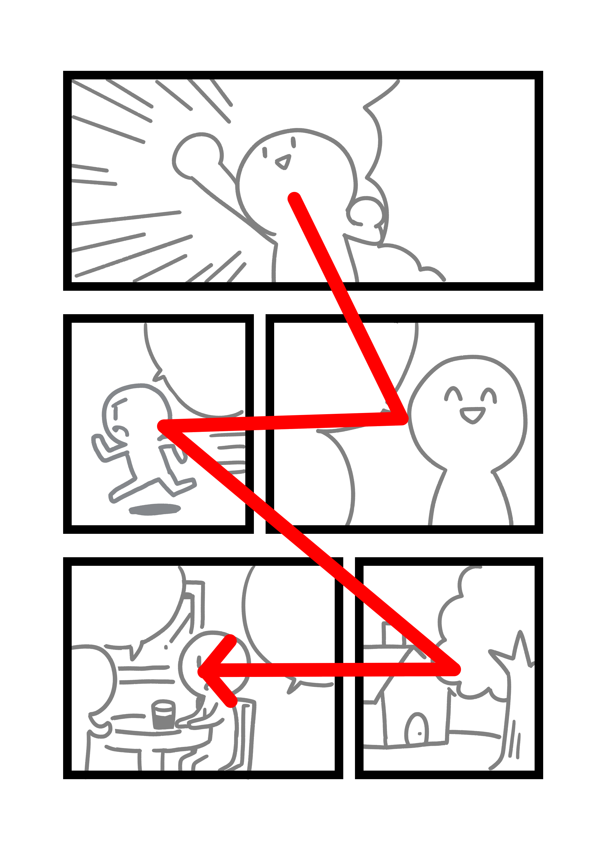
Frame layout like this is hard for readers to distinguish its read order.
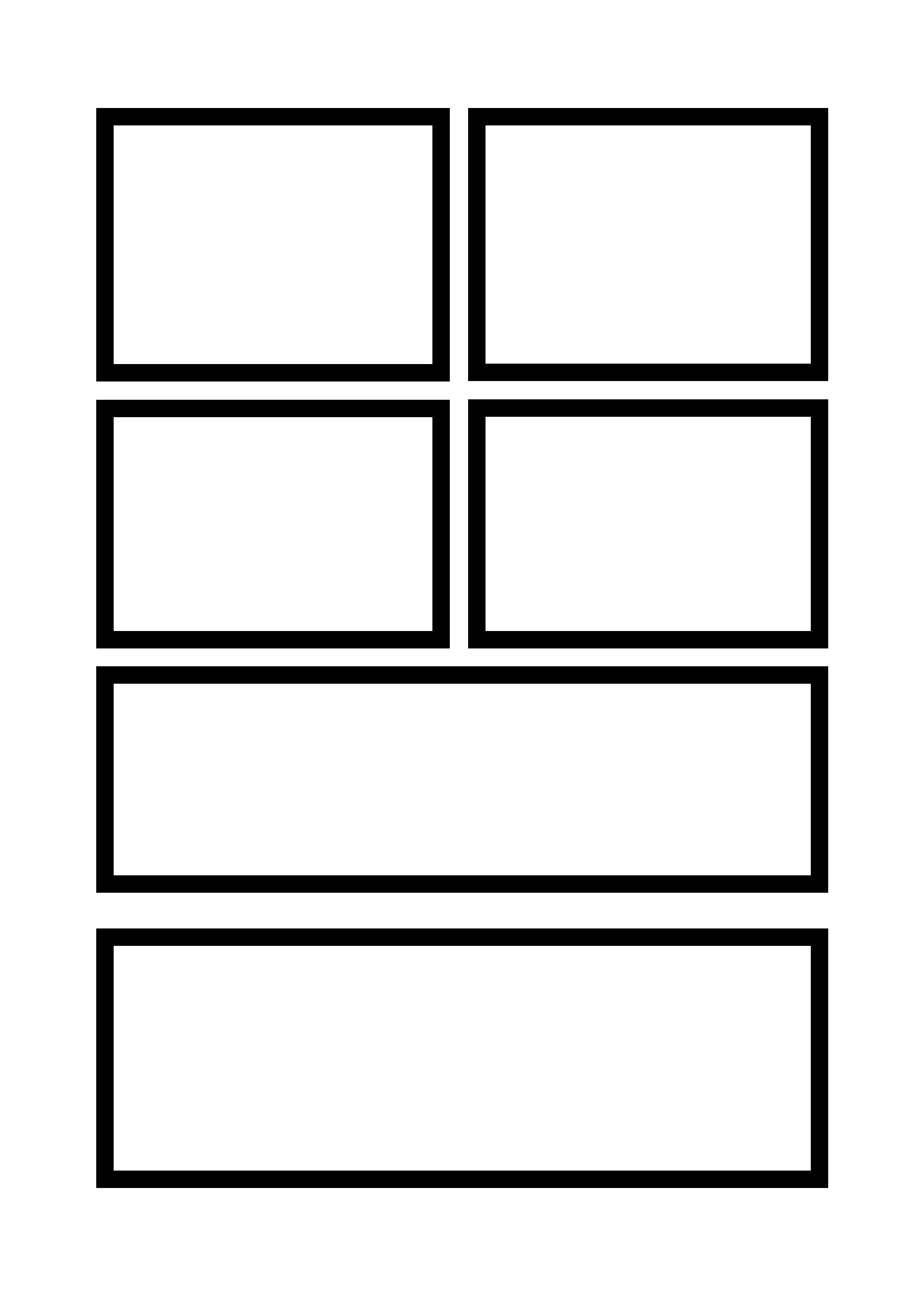
This layout is seemingly ubiquitous, however…
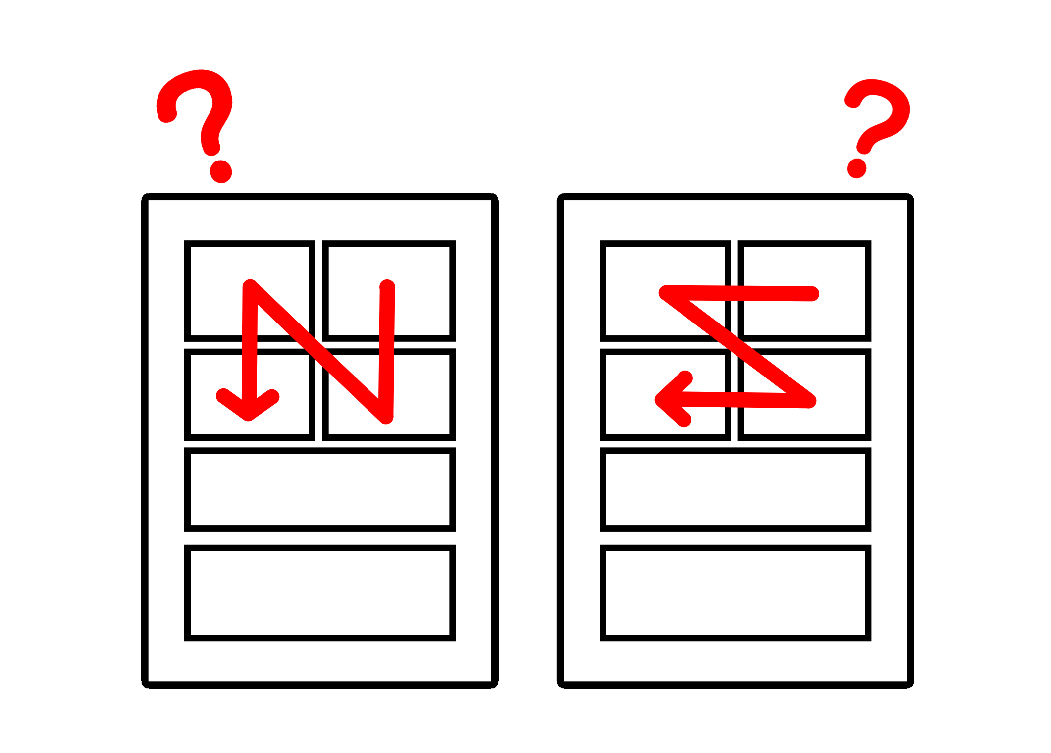
Just by looking at it, It’s hard to tell whether it is to be read vertically or horizontally.
Unless you had some special intentions, you would do well not to do a layout like this.
Displace dividing lines or change width of frames as shown below, and the read order will be much more recognizable.
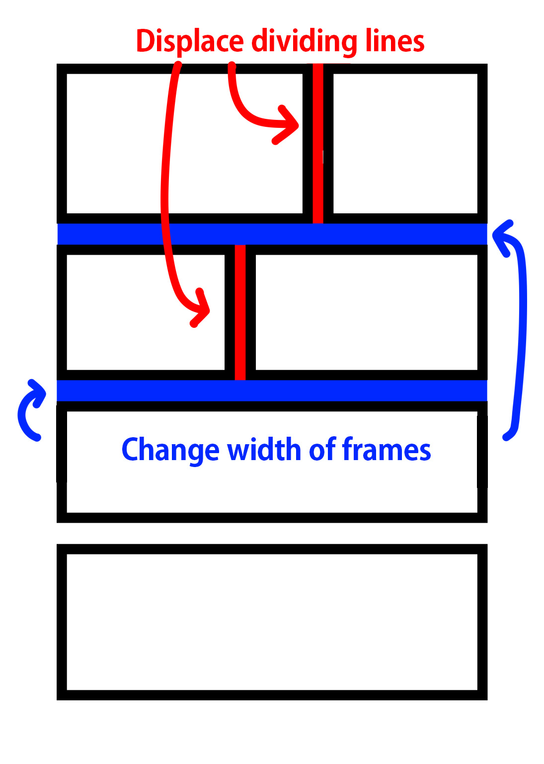
Just by being aware of this technique will create readable mangas.
Techniques for Frame Layout
From now, we will learn 6 techniques useful for frame layout.
- Shape of Frame
- Huge Frame
- Frame Breaking
- Scene Change
- Time Passage
- Turning Page
Shape of Frame
The basic shape of frames is square.
However, in some manga works, we can see frames with slanted sides.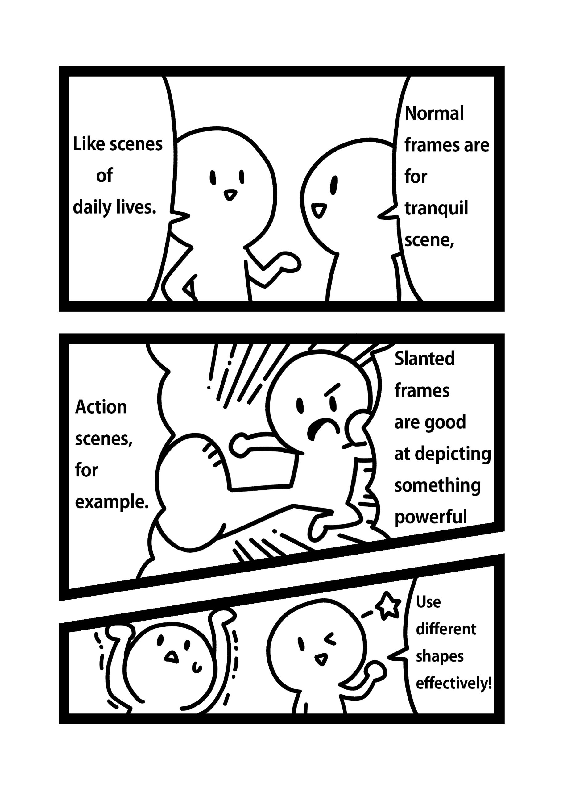
Therefore, the optimal frame shape differs depending on scenes.
Read your favorite manga works carefully, and see what shape of frames are used for what kind of scenes.
If you use different shapes properly, it will work really well!
Let’s see other techniques with manga explanations.
Huge Frame
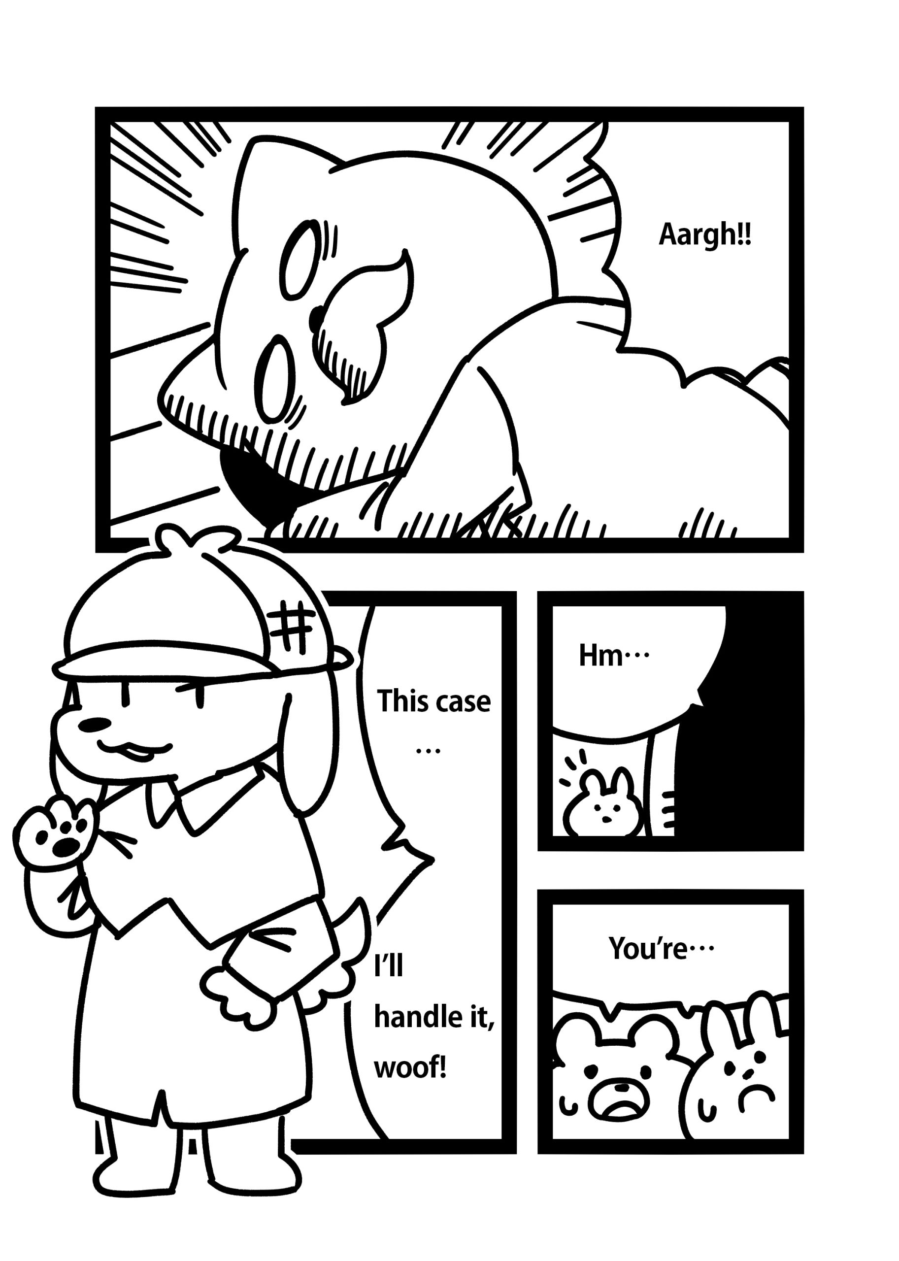
In this scene, a huge frame is used.
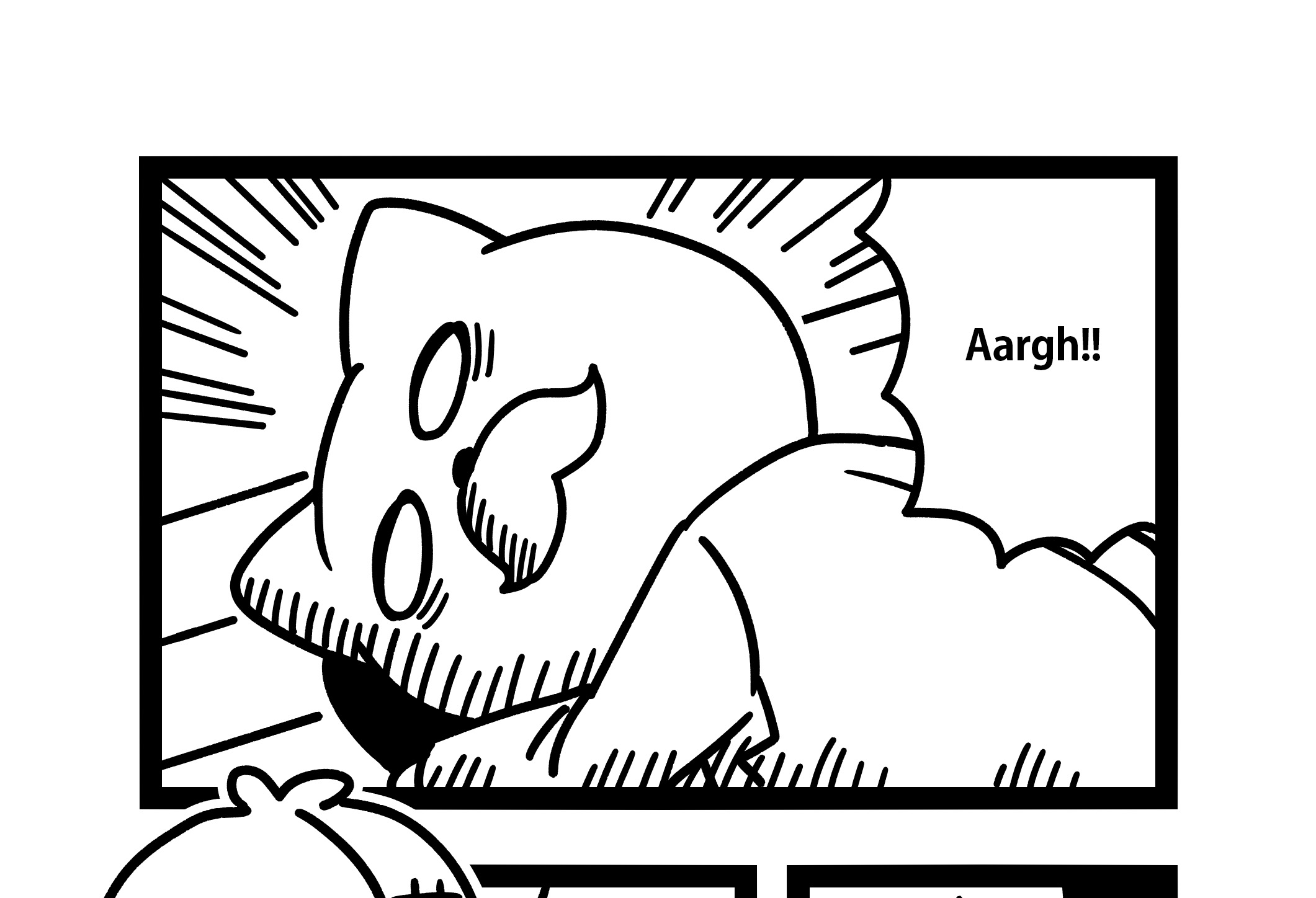
Make a frame bigger for crucial scenes you want to gather attention.
Frame Breaking
Draw characters so that it extends beyond frames.
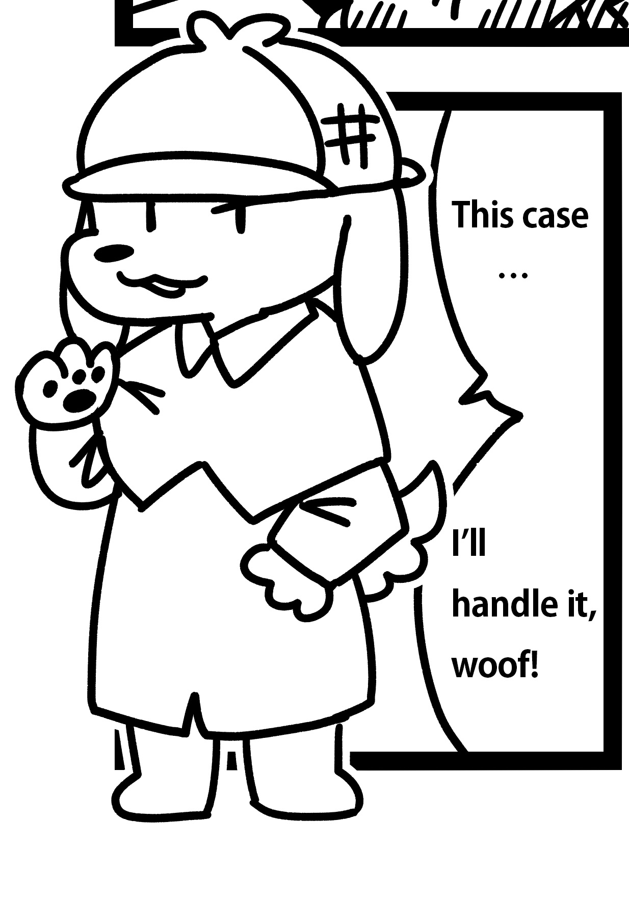
For depiction of a character’s whole body or scenes of an important person’s first appearance. Use this technique when you want readers to see your characters.
Scene Change
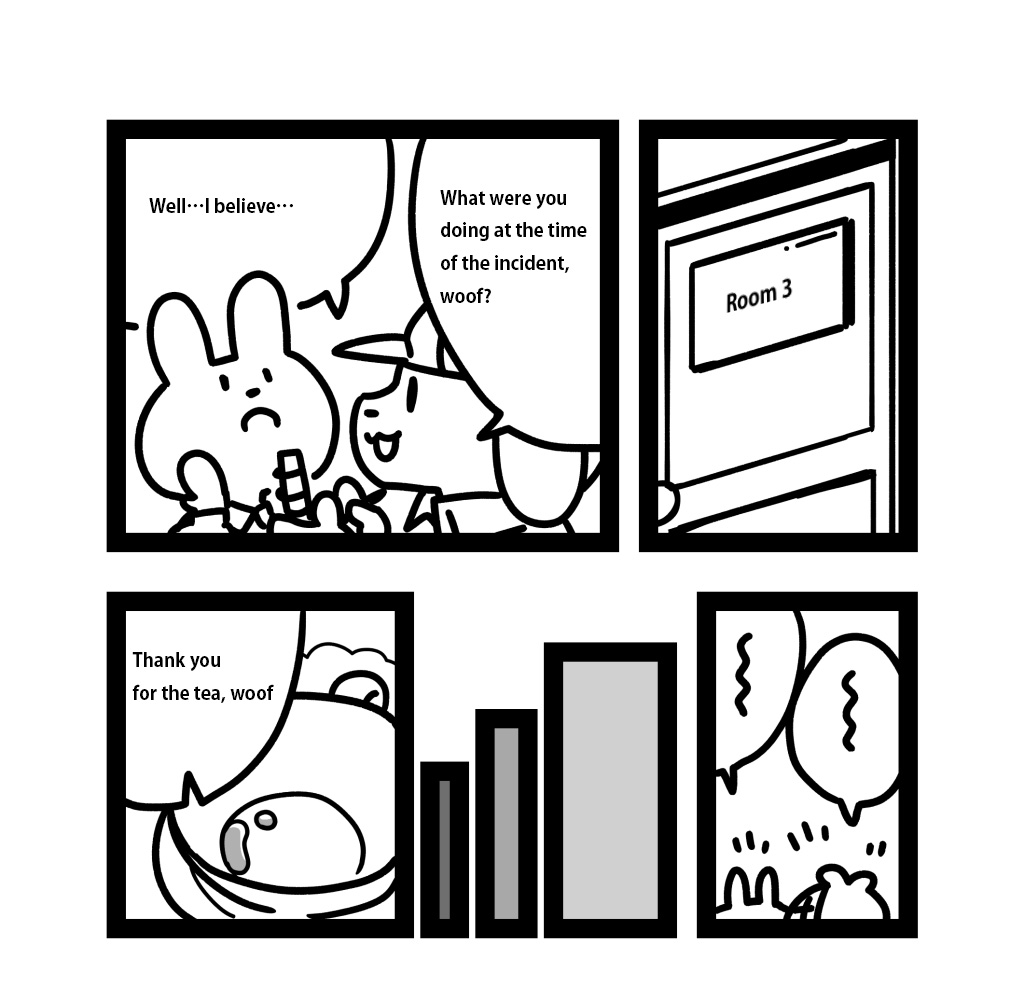
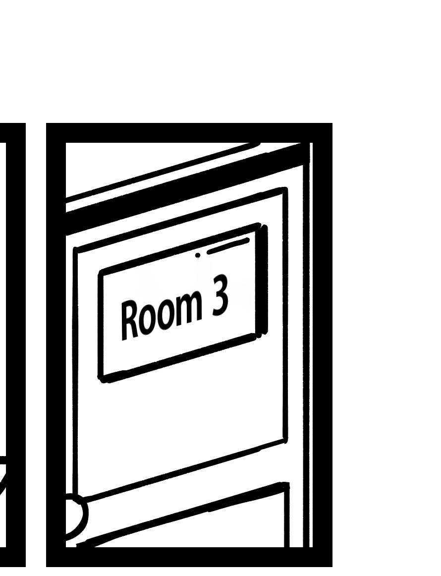
When you want to show that place has changed or to explain where your characters are, insert a frame with a picture of the place first. This makes it way easier for readers to understand the settings.
Time Passage
Here are two methods commonly used for showing time.
In this manga, two methods are used at the same time, but usually it’s fine to be either one.
Insert several blank frames
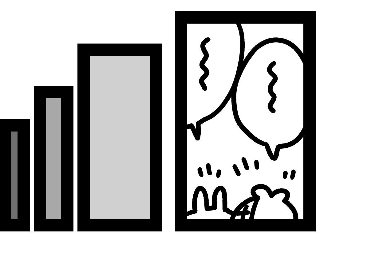
By making them smaller or darker by the tone gradient, show time passage.
Show a clock or something to be gone
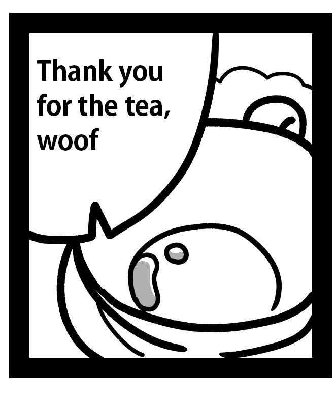
This is a method to show time passage by drawing something that has been empty, say, foods or drinks.
Showing a clock is straightforward and also recommended!
Turning Page
This is the last and most important technique which is essential for creating enchanting manga works.
Place a frame of the climax scene to the next page.
In doing so, your readers may feel like turning the page.
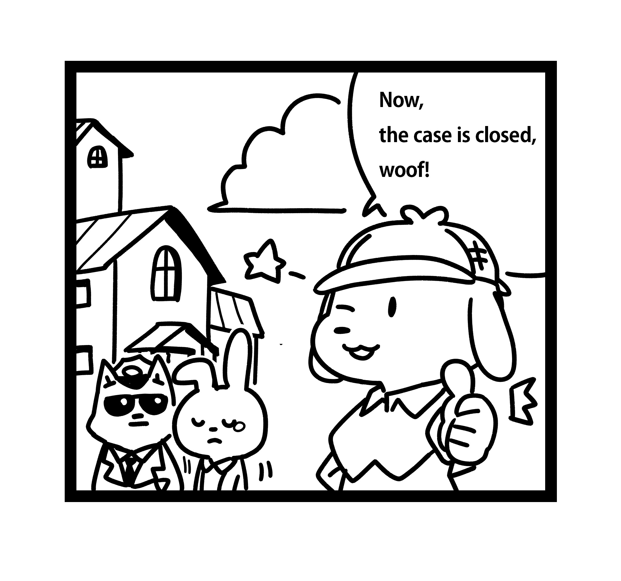
See, for example, the manga below. It places two frames on one page, one for “the scene that is about to show the culprit” and one for “the scene that reveals who the culprit is”.
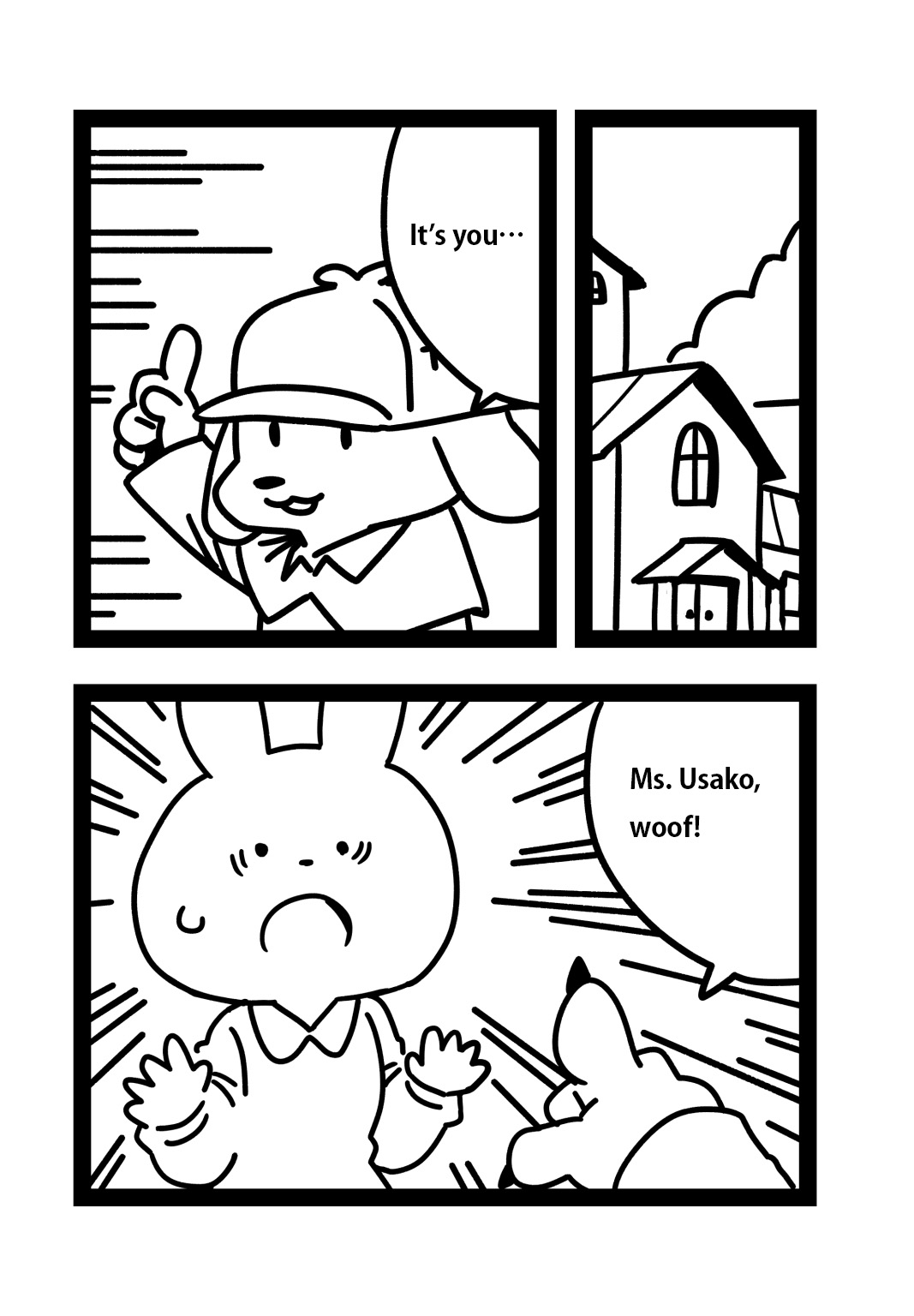
It’s not that bad, however…
The sequence for the climax finishes on this single page and readers won’t experience the suspense of “who is the criminal?”
You may want your readers to guess with the detective, and to be thrilled until turning to the next page.
That’s why we will put the frame for ”the scene that reveals who the culprit is” on the next page.
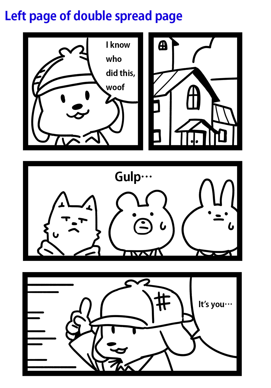
Then turn to the next page↓
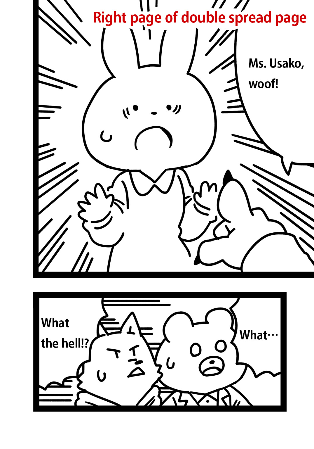
This raises readers’ expectations like “who did this”, and makes them turn to the next page.
The aim of creators is to make their readers feel “I want to read the next page!”.
Attract readers!
Conclusion: Frame layout is such a complicated work, but vital for manga creation
How do you like this article?
- Frames
- Frame Layout
The Number of Frames: Readability Comes First
Careful Not to Make Your Readers Confused - Techniques for Frame Layout
Shape of Frame
Huge Frame
Frame Breaking
Scene Change
Time Passage
Turning Page
Frame layout is difficult, but it can’t be omitted for creating manga works!
The techniques introduced in this article are just the tip of the iceberg, so I hope you keep creating and find your only techniques!
(Text・Illustrations/ つかさん)
\ We are accepting requests for articles on how to use /


