2021.03.29
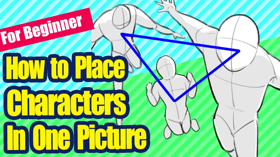
[For Beginners] How to Place Characters in One Picture
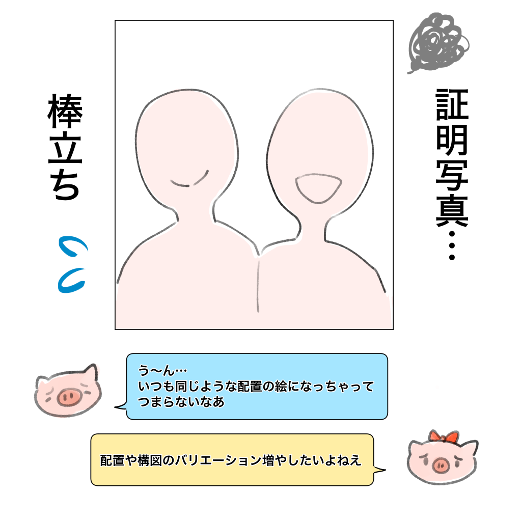
When you get used to drawing illustrations, you may think, “I want to try a different composition! However, when you want to place several people in one picture, you may be confused about how to draw them.
Good friends, twins, couples, rivalries, idol groups… each of them has a different relationship with the other, and each has something they want to express, but it’s boring to just put their faces together.
In this article, I’d like to introduce some ideas for composition & placement when drawing multiple people.
I’ll give you some real-life examples, so if there’s something you like, be sure to incorporate it!
● Placement ideas for two people
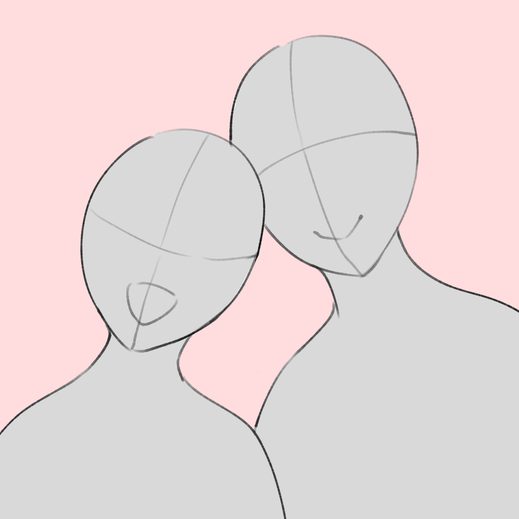
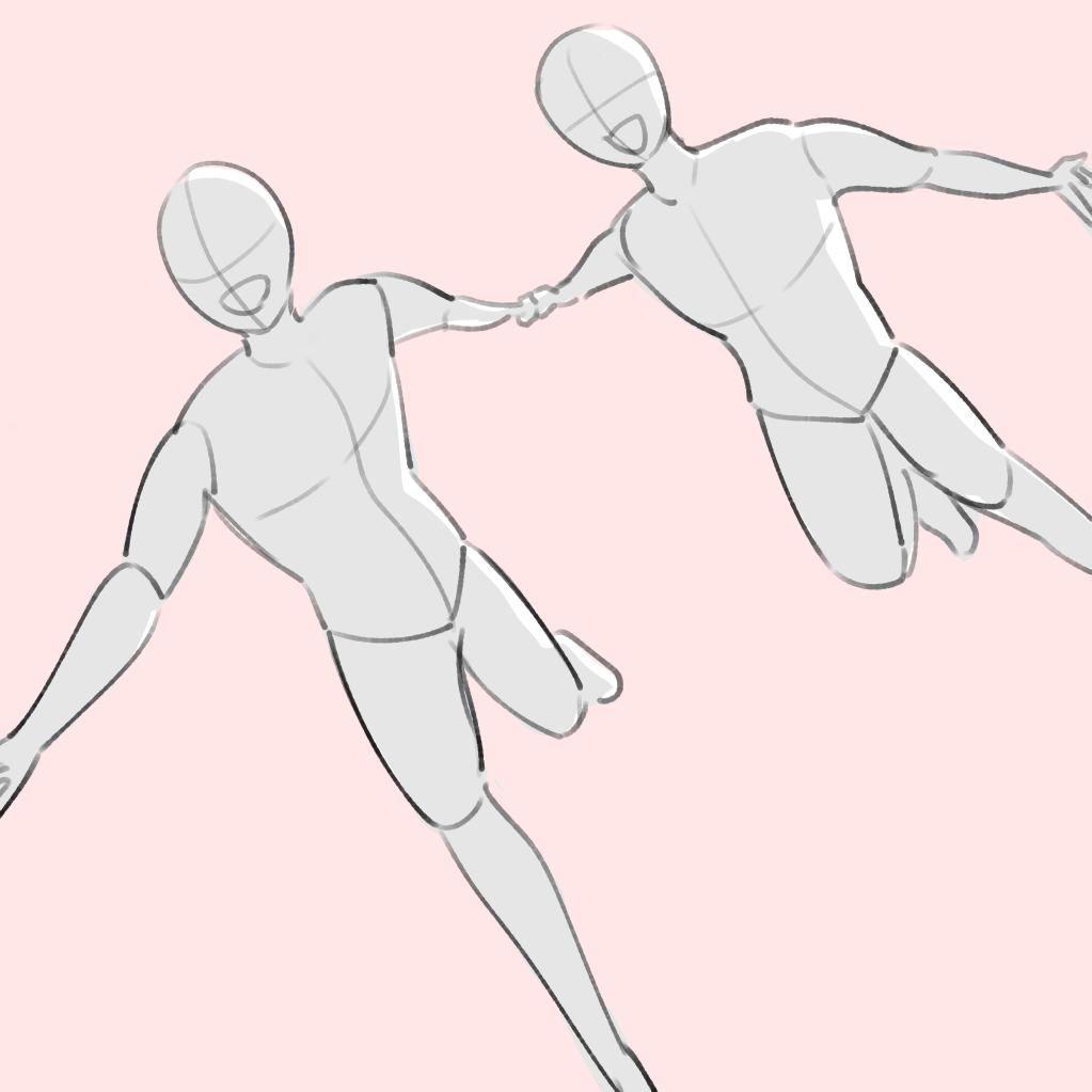
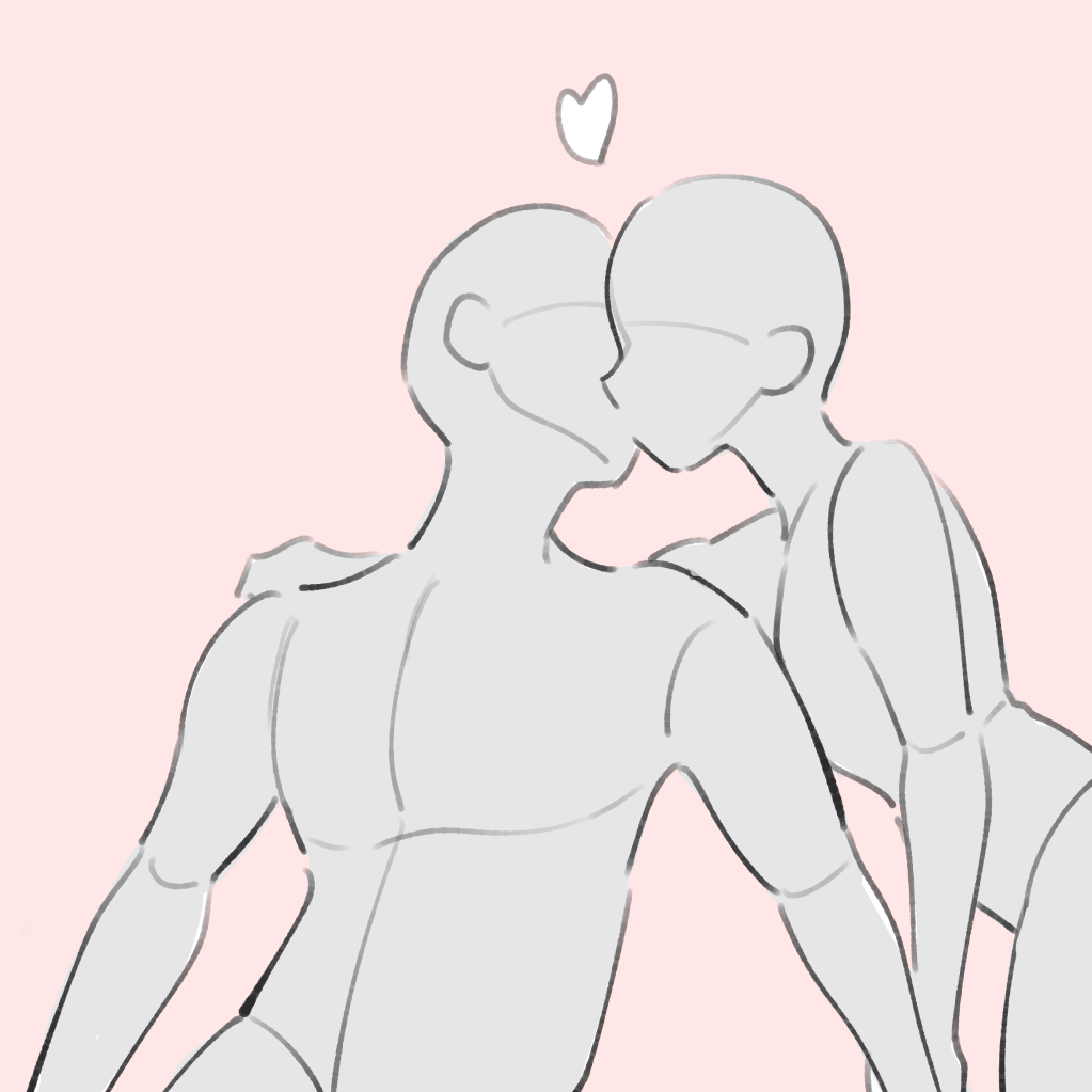
・Parallel (about the same size and side by side)…Recommended for showing how close they are.
If you put them in parallel and add contact (hugging, holding hands, kissing), they become even more intimate.
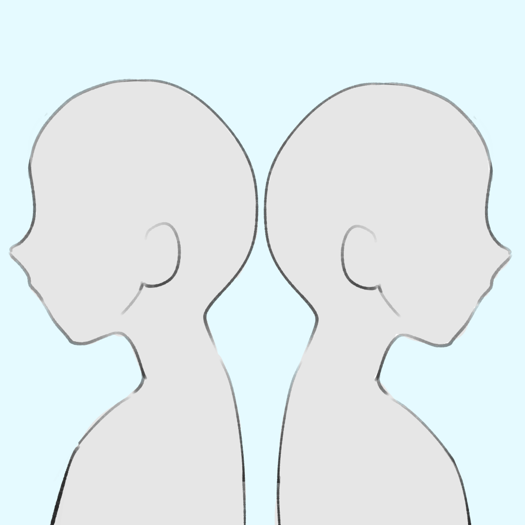
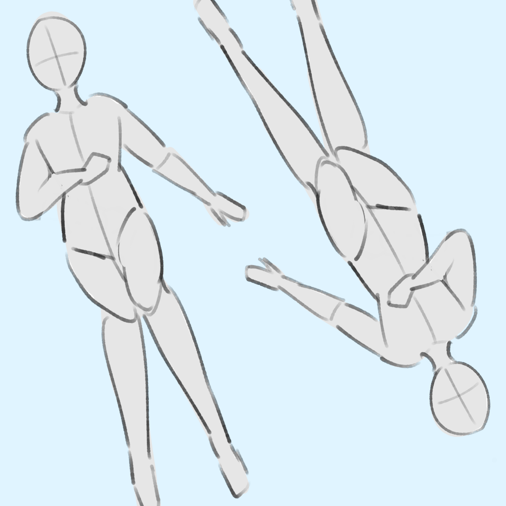
・Symmetry…for when you want to show the presence of opposites. It can also be used for twins.
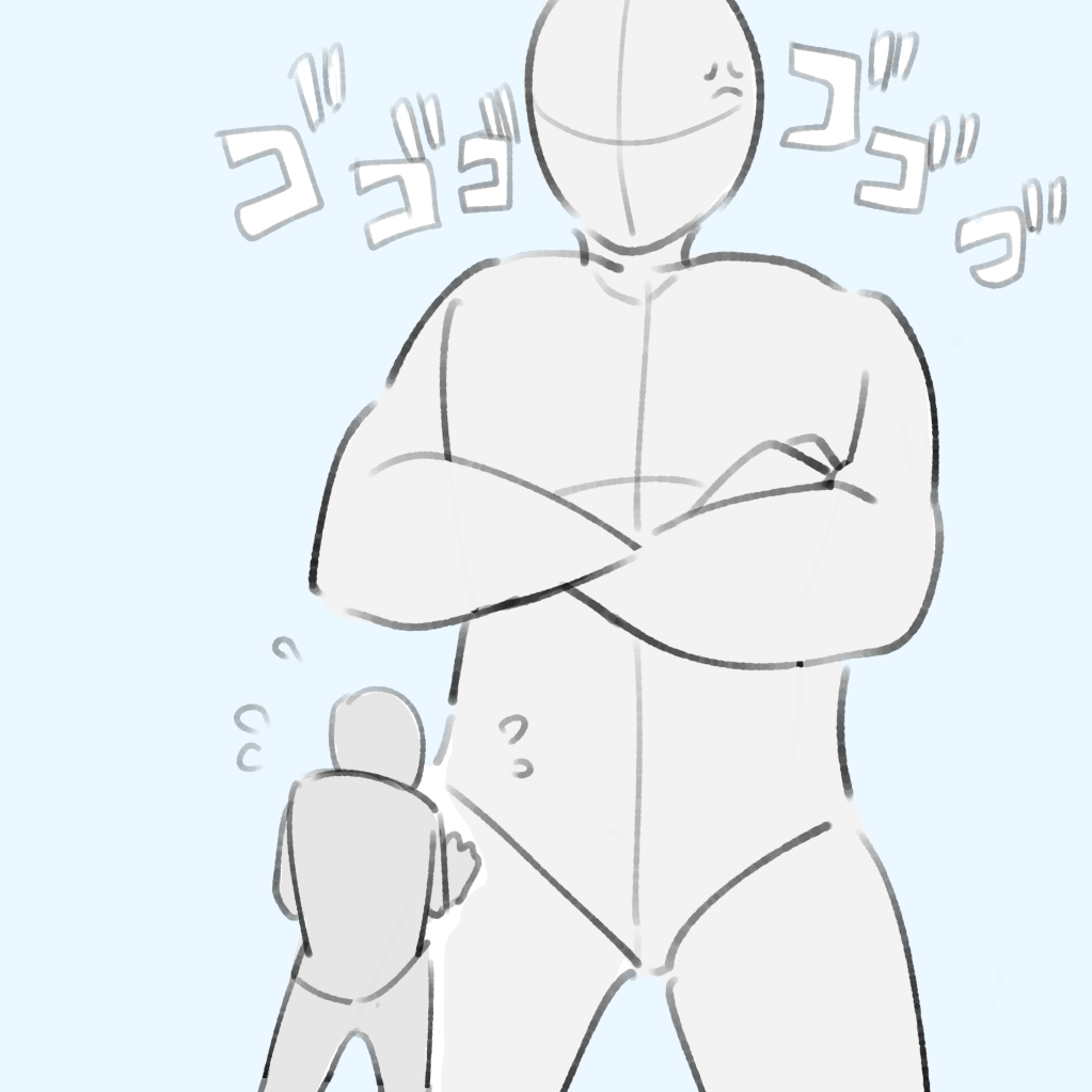
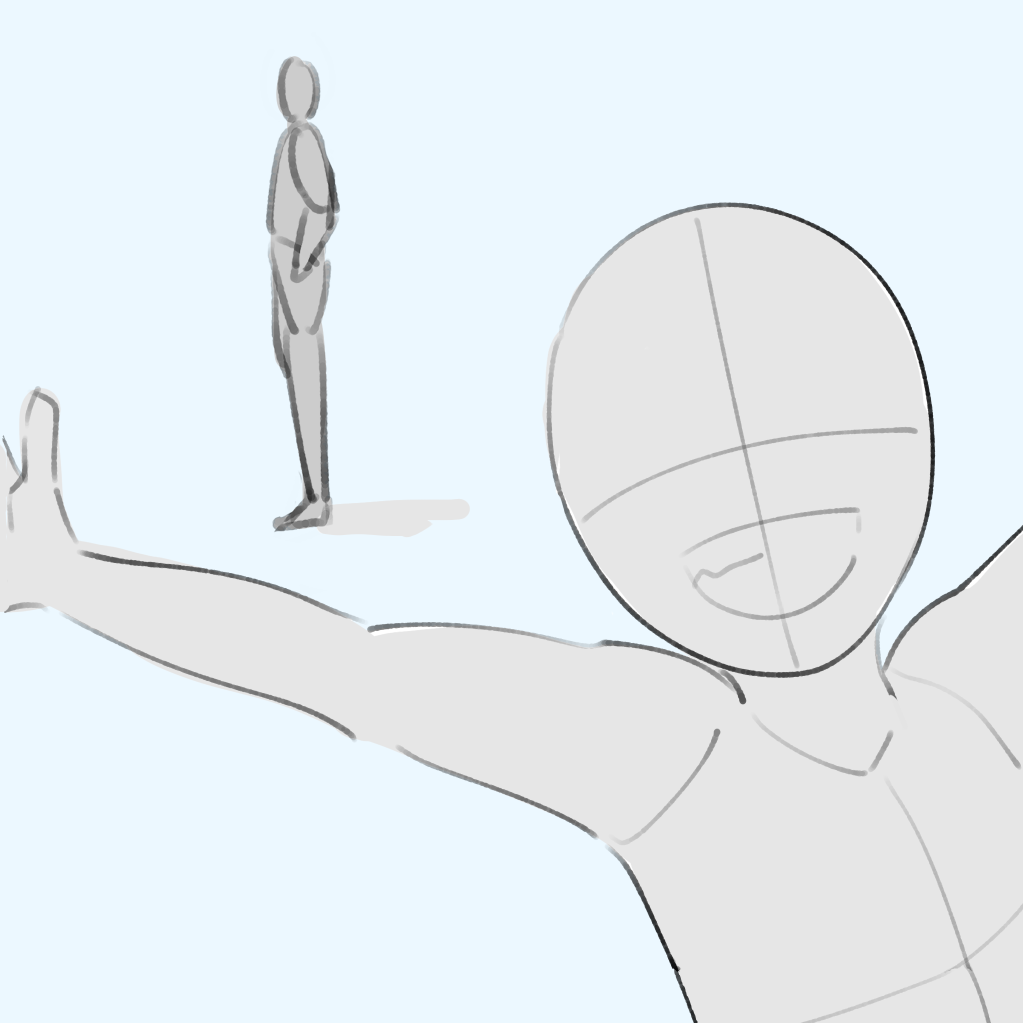
・Strengthen or weaken the size…when you want to show power relations or differences in personality.
●Three person composition idea
★Take advantage of the “triangle” in a three-person composition!
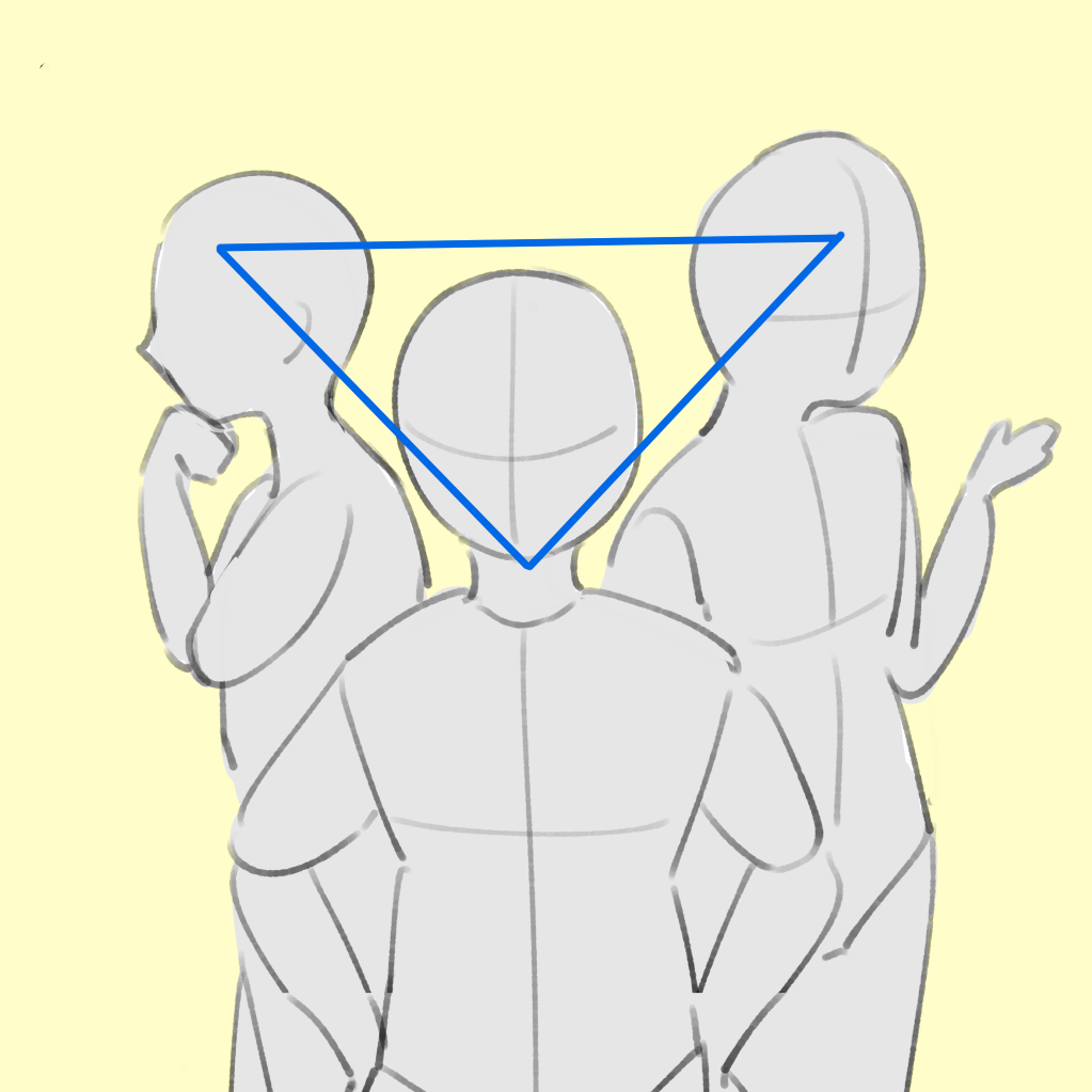
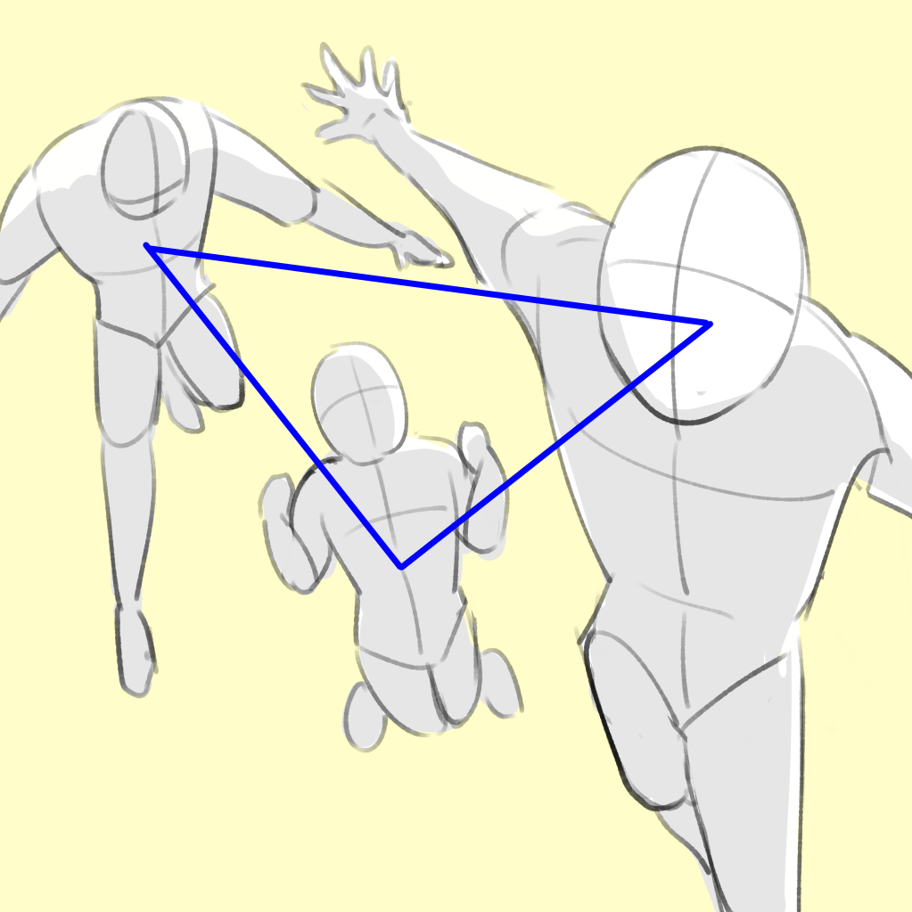
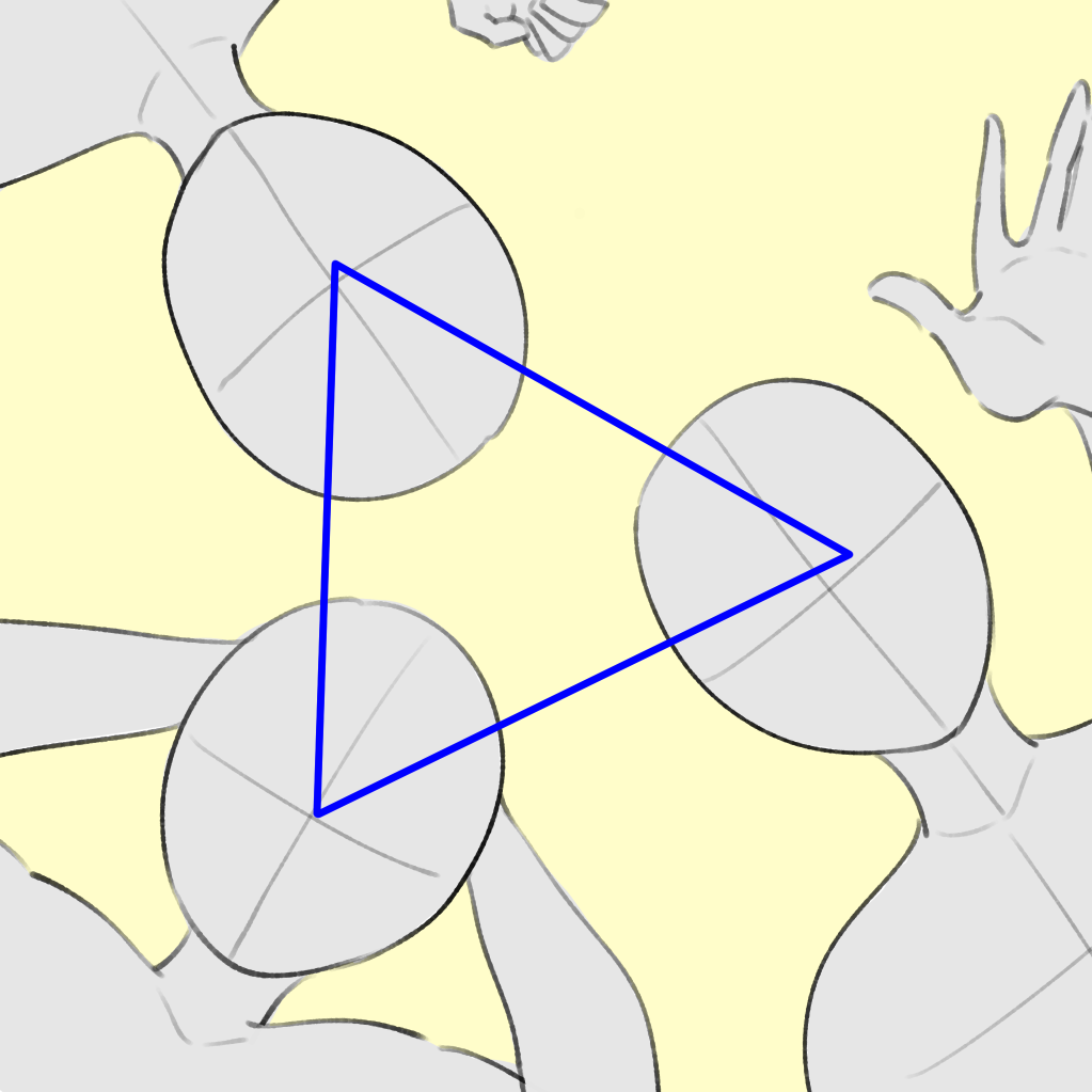
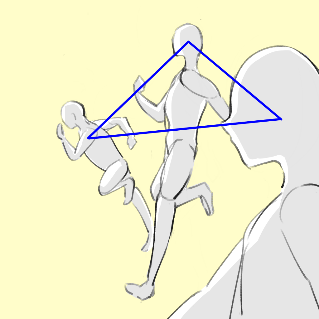
Placing a person along a triangle is called a “Triangular Composition”.
By following this rule, you can create a well-balanced image no matter where you place them.
This is especially recommended for illustrations of three people.
● Placement ideas for four or more people
As the number of people increases, the space allocated to each person becomes smaller, so if you arrange them in a normal parallel manner, none of them will leave a lasting impression.
Use creative composition to create an eye-catching picture.
In addition to the Triangular Composition, we also recommend the Circular Composition, which is arranged along a circle.
Use it when you want to draw the whole body.
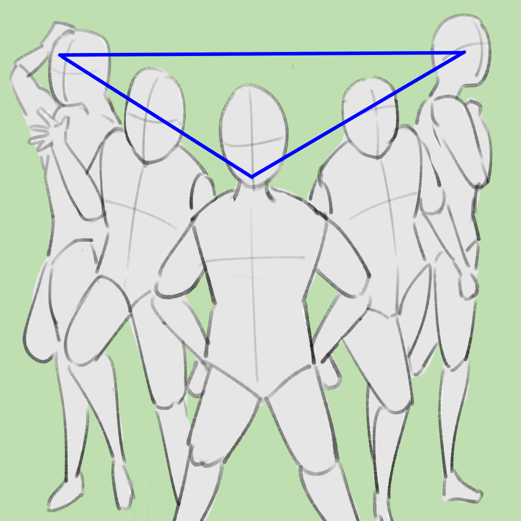
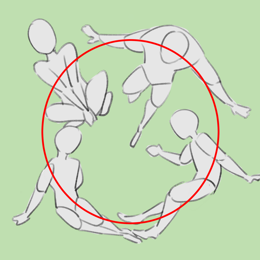
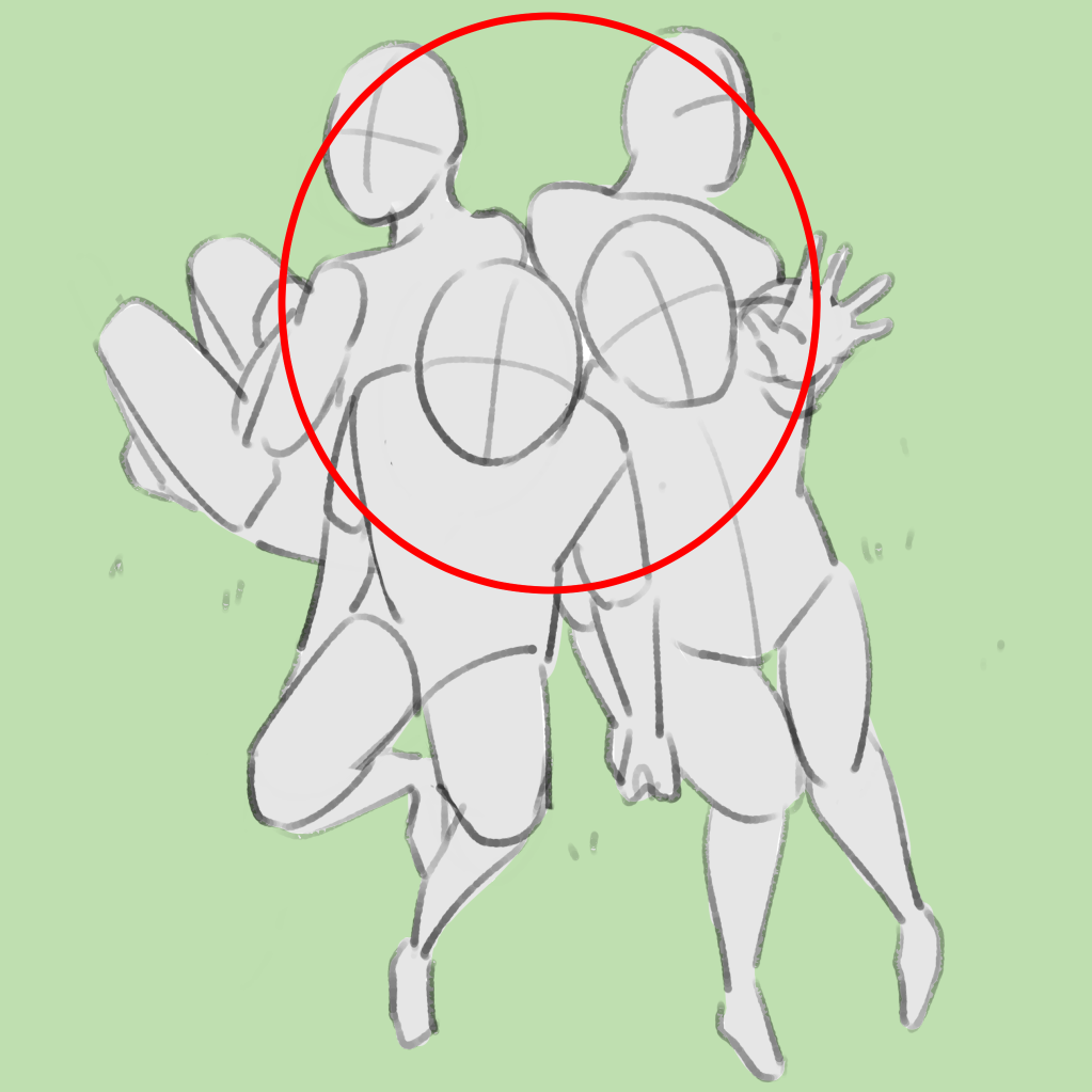
You can also create a different impression by aligning or not aligning your gaze and body direction.
When they are aligned, everyone seems to be focused on a single goal, which gives a sense of unity.
If they are not aligned, a good sense of distance is created and the impression is stylish. Depending on the expression, it can also look serious.
・Strengthen the size of the image.
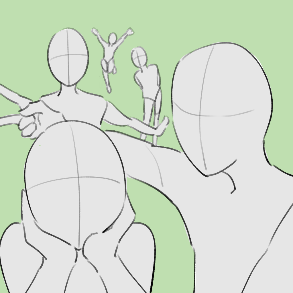
Select one or two people from a group of people and place only those people in a larger size.
In addition to creating a sense of depth, you can also show the character’s personality by, for example, placing the energetic character in the foreground and the quiet character in the background.
★A picture of a “posed face” is not the only picture that can be used as a single picture! .
For beginners, when they think of a single picture, they tend to imagine a picture in which the eyes meet ours (the person looking at the illustration) and the pose is perfectly set.
Instead, try to imagine the scene as if you were capturing the character’s daily life.
This will give you an infinite number of variations.
Once you have an idea of the scene you want to depict, apply it to the composition examples mentioned above.
These are just a few examples of composition.
There is no limit to the number of composition ideas you can come up with.
In addition to looking at other people’s illustrations, you can also get ideas from magazine covers and professional photographs, so keep your eyes open for things other than illustrations.
(Text and pictures by Naoko Hara)
\ We are accepting requests for articles on how to use /


