2021.11.06
Manga Tutorial for Beginners 07 Considerations when setting up the canvas.
Hello, this is ГФ.
Now that we have the outline of the manga, I imagine that everyone is anxious to start drawing the work. However, before that, I think it is necessary to corroborate some very important points, because if we leave them aside, it is possible that we will spoil the work we have done with so much effort.
Additionally, I will refer to two aspects of special importance when making manga in an application or digital program: the “grayscale” and the “monochrome mode”.
Click Here for Previous Tutorials.
Manga Tutorial for Beginners 01 Process of Manga Making
Manga Tutorial for Beginners 02 Let’s Make Outline (Part 1)
Manga Tutorial for Beginners 03 Let’s Make Outline (Part 2)
Manga Tutorial for Beginners 04 Get Ready to Draw Manga with MediBang Paint!
Manga Tutorial for Beginners 05 Let’s Make Name(outline)
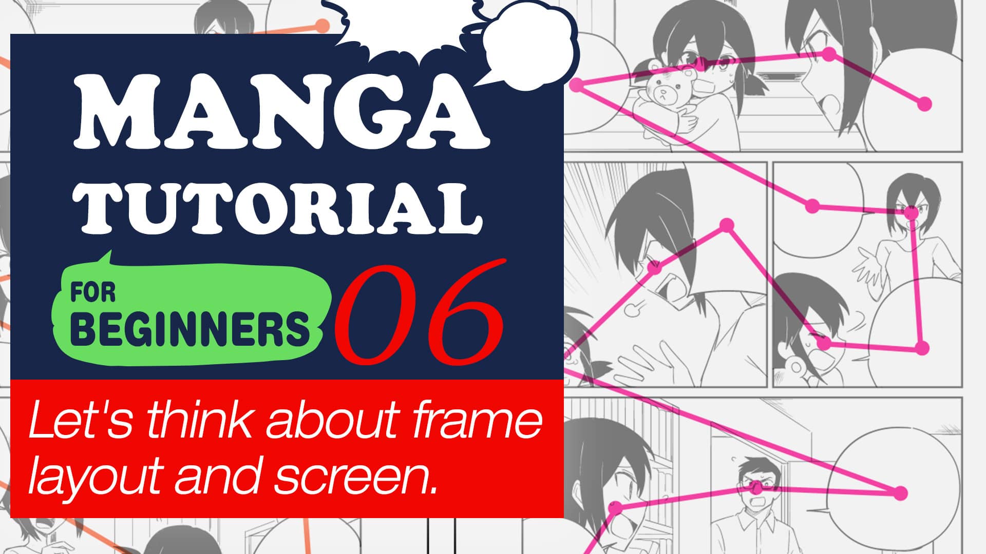
Manga Tutorial for Beginners 06 Let’s think about frame layout and screen.
Manga Tutorial for Beginners 07 Considerations when setting up the canvas.
When it comes to manga to be shared only on the web, there are no rules to follow regarding the size or margins of the paper or canvas. However, in the case of contests or doujinshi, there are requirements regarding the size of the canvas. Likewise, there are rules regarding the margins and spaces to be left blank. So, let’s see what the general rules are.
Before I start with the explanation, I just want to clarify that I will mention here the rules that apply in Japan.
1. Paper or canvas size
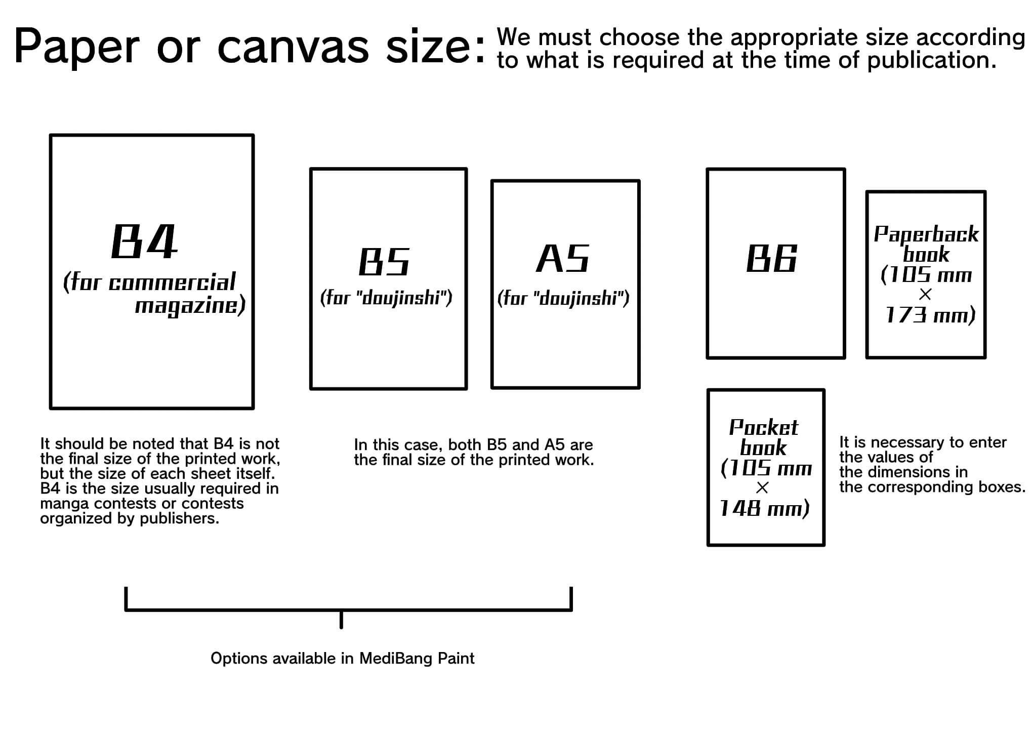
“In manga contests organized by publishers, a B4 size is usually required, while in the case of a “doujinshi”, the paper size will vary according to the publisher’s requirements.
In the MediBang Paint application, when setting up a new project (in the “”Create New Image”” window), it is possible to choose between different template options: B4 (for trade magazine), B5 (for “”doujinshi””) and A5 (for “”doujinshi””), in addition to other options such as for “”American Comic””. ”
In case you need a canvas of a size not available in MediBang Paint (such as B6, paperback format, etc.), it will be necessary to enter the values of the required dimensions on the screen. Another option would be to make the manga with a preset size among the options available within the application, and then, at the time of publishing it, modify the size (either enlarging or reducing it), but this is not very advisable, since when altering the size it is possible that the quality of the image is affected. To be on the safe side, it is best to configure the canvas from the beginning with the required dimensions.
However, if you need to make modifications to a canvas on which a screen tone has been applied, you will have to be careful with some aspects, which I will explain later.
2. About guide lines
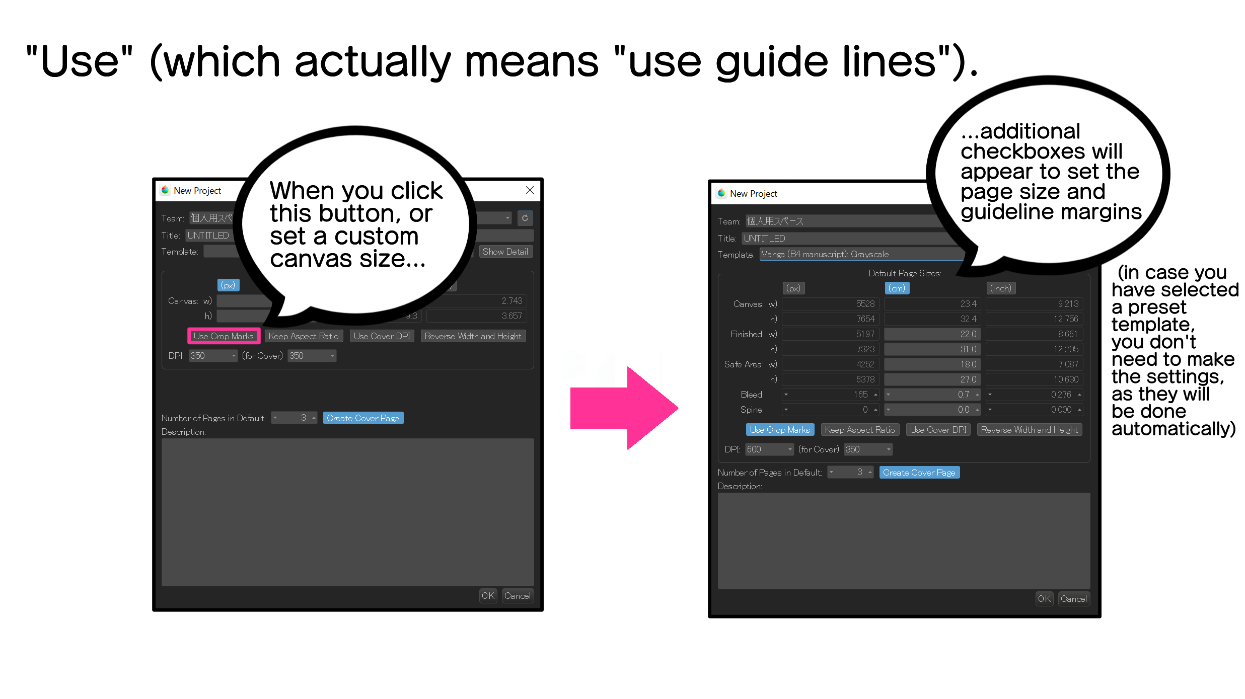
When you open the “New project in the cloud” window in MediBang Paint, you will see that there is a button that says “Use” (which actually means “use guide lines”). When you click on this button, additional boxes will appear on the screen where you can enter the values to set the margins of the guide lines that are indicated on the canvas. Now, even if we do not press the “use” button, if we select a preset template, preset guide lines will automatically appear on the canvas. So, in the exercise we are doing here, let’s choose not to press the “use” button, in order to take advantage of the preset guide lines. However, in case you do not want to use any template but a canvas with custom dimensions, then you will have to set the page size and the margins of the guidelines yourself.
So, let’s open the “New Project” window, select in the “Template” list box the option “Japanese Manga (B4/professional)”(600dpi), and disable the “creating page cover” button.
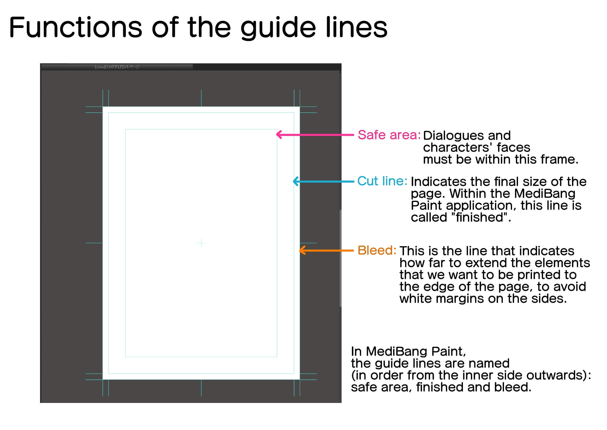
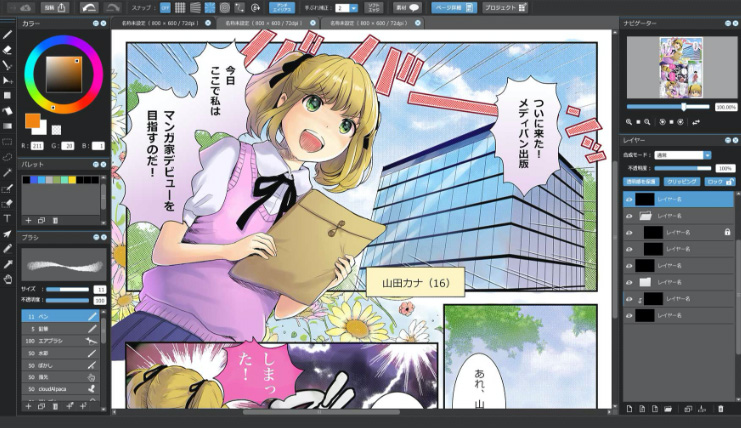
When you open page 1, you will see that on the canvas there are some light blue guide lines, as shown in the image. These lines have the same function as the guide lines that are printed on the specialized sheets for manga in analog format.
Let’s see what the functions of each of the lines are.
The line further in is the “safe area” line, within which dialogue and character faces should go.
The line next to the “safe area” line is the “cut line” (in Medibang Paint it is called “finished”), which indicates the “cut line”. (in Medibang Paint it is called “finalized”) which indicates the final size of the page. This means that whatever is drawn outside the “cut line” will not be printed. However, we see that there is one more line on the outside edge of the page. This is because, although, in principle, the printed page will only include what is inside the “”cut line”” (“finished”). (“finished”), sometimes, due to some misadjustment either at the time of printing or when cutting the paper, it is likely that the page will include a portion of the margin that is outside of the “cut line” (“finished”). In other words, there may be some empty spaces left on the edges of the page. To avoid this, there is the “bleed” line. By drawing up to the “bleed” line, we make sure that there are no unwanted blank spaces.
(Actually, outside the “bleed” there are other lines called “crop marks”, which must be taken into account when printing. However, for the time being it is not necessary to think about it, so we will leave them aside).
If the manga we are going to produce will be published only in digital format, there is no need to worry about mismatches at the time of printing, so it will be more than enough that we fill the page up to the “cut line”.
However, if there is a possibility that our work will be printed on paper, we must draw up to the bleed line. The size of the “bleed” margin may vary depending on whether it is a commercial magazine or a “doujinshi”. When participating in a contest or call for entries, it is necessary that we duly corroborate the requirements regarding the size and format of the pages.
3. About the binding margin.
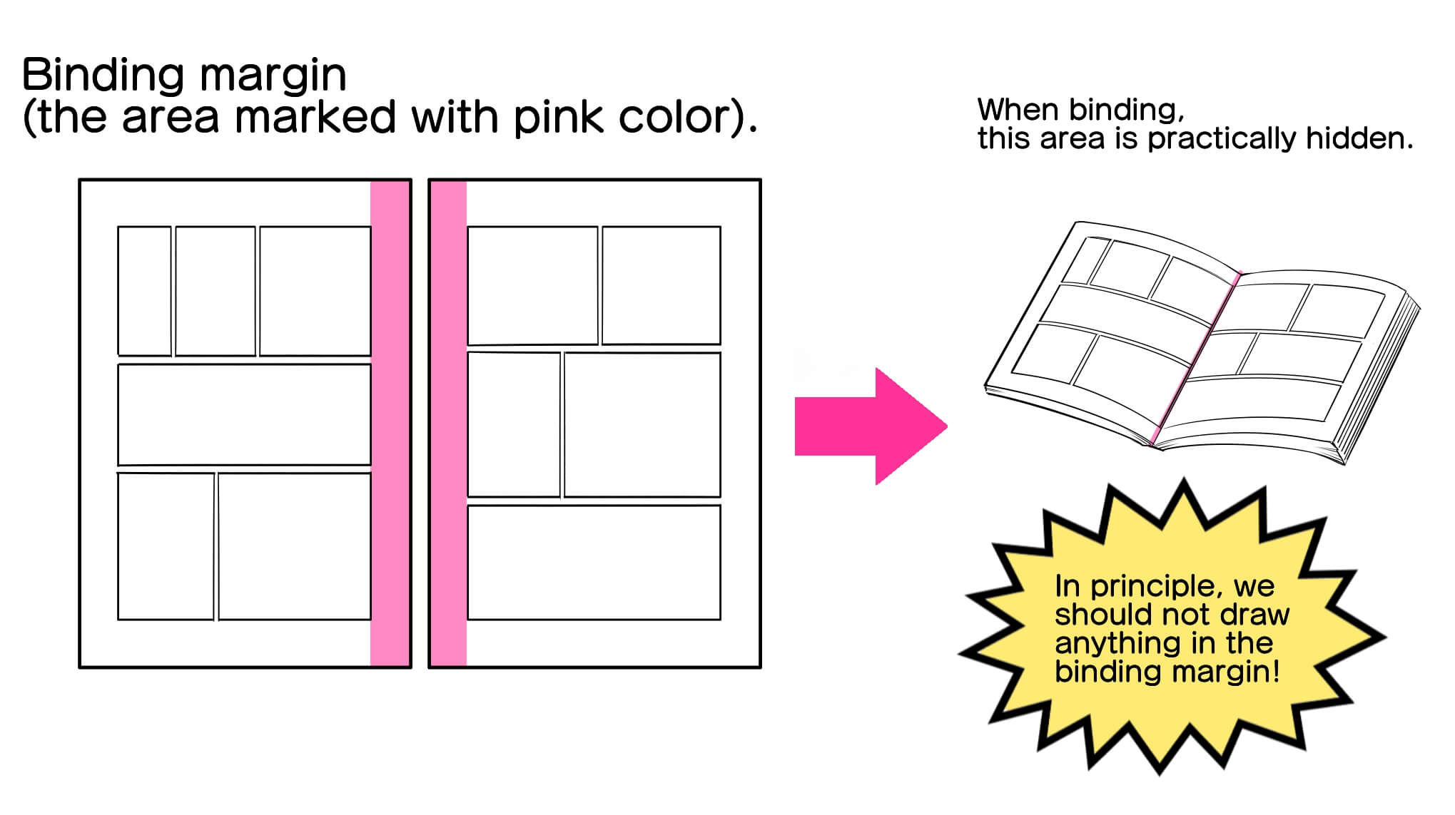
The margin that is outside the “safe area” and is hidden when a document is bound is called the “binding margin”.
If you look at a manga book or magazine, you can see that what is drawn in the binding margin is hardly visible. That is why we should avoid drawing in the area corresponding to the binding margin.
In the basic Japanese manga format, odd-numbered pages go to the right, and even-numbered pages go to the left. This means that the “binding margin” is located at the left end of odd-numbered pages, and at the right end of even-numbered pages.
In case you are going to publish your work only in digital format, there will be no problem in drawing even in the area corresponding to the binding margin. However, if there is a possibility that your work will be printed on paper, then you must keep in mind that what is drawn in the “binding margin” will not be appreciated by the readers.
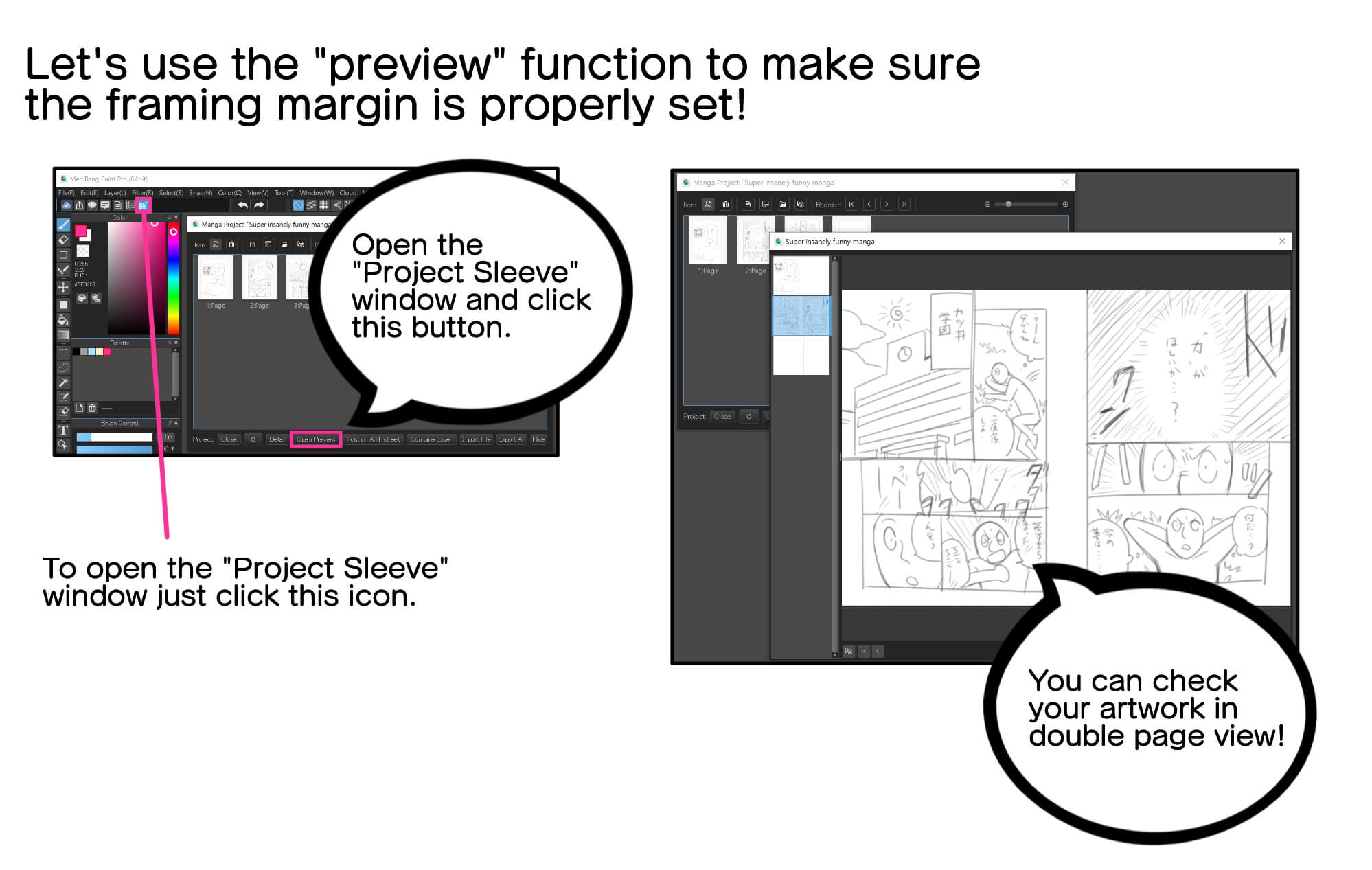
To make sure that the “binding margin” is properly set, the “preview” function is very useful.
In the “Manga Project” window, by clicking on the “Open in preview” button, you will be able to view your manga as a double page spread (facing pages).
Now, making corrections in the final stage of the elaboration is too complicated. So I recommend that at the drafting stage you check your work well using the “preview” function, so that you make the necessary corrections early on.
4. Grayscale and monochrome mode
So far I have explained the rules or requirements that we must take into account when configuring the paper or canvas to create a manga work.
Now, in case of drawing a manga in digital format, we must also be careful with the color mode.
The most commonly used color modes are the following four: RGB (primary light colors), CMYK (colors used in dyes for printing), grayscale and monochrome mode.
In case of drawing a color manga to be published only on the web, we can use the RGB color mode. However, if the color work is to be printed on paper, then it will be necessary to use CMYK color mode (some printers do support digital data in RGB color mode).
In case the manga is to be drawn in black and white, the mode called “girses scale” or the “monochrome mode” should be used.
Let’s see below the difference between these two modes.
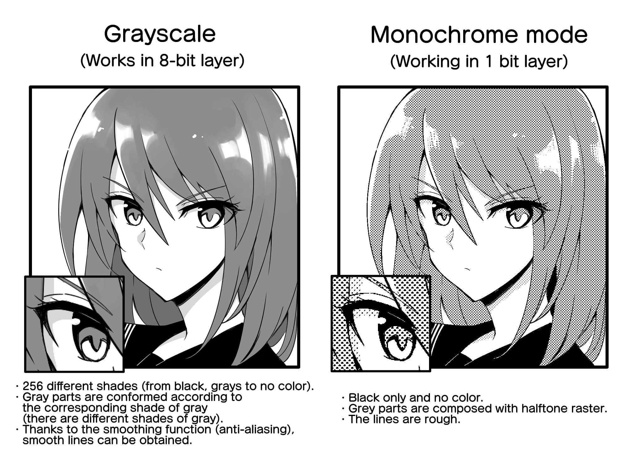
Grayscale is made up of a gradation of 256 shades ranging from black, through various grays, to no color (do not confuse “aunsence of color” with “white”). When drawing in grayscale, we work in 8-bit layers. The gray parts are shaped according to the corresponding shade of gray, since there are many different shades of gray. On the other hand, it is possible to use the anti-aliasing function to make the lines look smooth.
The monochrome mode consists only of black and no color, and works in 1-bit layers. The gray parts are composited with halftone raster. Since it is not possible to use the anti-aliasing function, when enlarging the screen image you may notice that the lines are rough.
Some may be concerned that in monochrome mode the lines look rough when the image is enlarged. However, by simply setting a high resolution level, it is possible to achieve good image quality when printing. However, this requires that the digital file to be printed has a minimum of 600 dpi. (For this reason, when I explained earlier how to open a new project in the application, I recommended setting the file to 600 dpi).
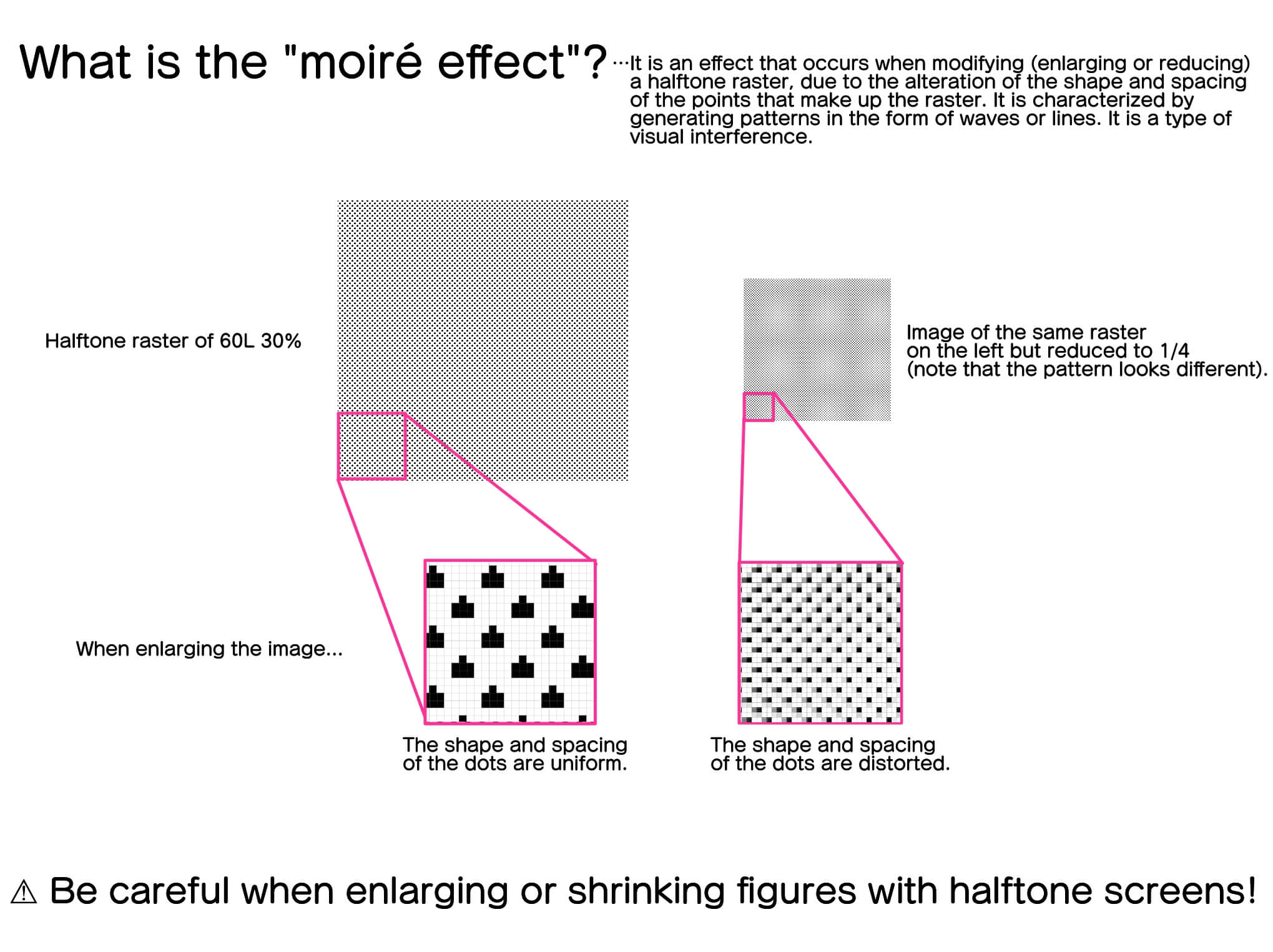
One aspect where we must be especially careful is the use of halftone screens. Halftone rasters are composed of evenly spaced dots of a specific size. Depending on the size of the dots and the degree of spacing between them, different shades of gray are achieved, either darker or lighter.
Now, if we modify the shape of a figure in which a halftone raster has been applied, the dots that co-form the raster are also altered, so the image will acquire a different appearance from what we had initially thought. In other words, what is called “moiré effect (moiré)” occurs.
The “moiré effect” may also occur when superimposing two halftone screens, or when placing a halftone screen on top of a part colored with a gray tone of the grayscale.
Even if the image looks good on the screen, if the dots that make up the halftone screen are distorted, when the image is printed it will generate the “moiré” effect. To avoid this, try from the beginning to set up the canvas according to the final print size, and try not to enlarge or shrink the images where we have applied raster.
From the next lesson, we will begin to enter fully into the process of drawing manga in monochrome mode.
The topic of the next lesson will be “vignette frames and text balloons” See you!”
Click Here for Previous Tutorials.
Manga Tutorial for Beginners 01 Process of Manga Making
Manga Tutorial for Beginners 02 Let’s Make Outline (Part 1)
Manga Tutorial for Beginners 03 Let’s Make Outline (Part 2)
Manga Tutorial for Beginners 04 Get Ready to Draw Manga with MediBang Paint!
Manga Tutorial for Beginners 05 Let’s Make Name(outline)
Manga Tutorial for Beginners 06 Let’s think about frame layout and screen.
Manga Tutorial for Beginners 07 Considerations when setting up the canvas.
「ГФ」
ART street
Click here for the collection: https://medibang.com/u/seledkapodshboi/
You can read my manga here → https://medibang.com/book/0c2101280307258390018866367/
This is also a manga that I draw under a different name. → https://medibang.com/comics/official/dobs340000005872400000000000a/
twitter: https://twitter.com/seledkapodshboi
\ We are accepting requests for articles on how to use /

