2021.08.07
Manga Tutorial for Beginners 05 Let’s Make Name(outline)
Hello! I’m ГФ.
In this tutorial, I will explain the name, which is the main basis of the manga.
Click Here for Previous Tutorials.
Manga Tutorial for Beginners 01 Process of Manga Making
Manga Tutorial for Beginners 02 Let’s Make Outline (Part 1)
Manga Tutorial for Beginners 03 Let’s Make Outline (Part 2)
Manga Tutorial for Beginners 04 Get Ready to Draw Manga with MediBang Paint!
Manga Tutorial for Beginners 05 Let’s Make Name(outline)
The “name” is the blueprint of the manga.
At this point, the frame layout and dialogues are decided, and the basic flow of the manga is completed.
This is a very important process, but since it is relatively easy to redraw, it is common to spend a lot of time here to develop the concept.
The way a story is drawn varies from person to person. Some people draw only speech balloons and dialogue, some draw characters in a simple stick figure style, and some draw characters with specific expressions and background composition.
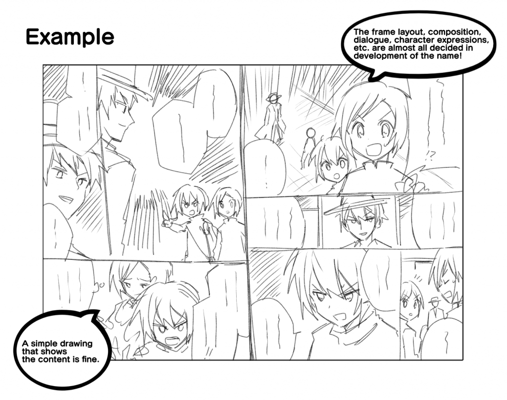
When drawing a name, you can use unwanted paper or notebooks, or you can use commercial or handmade name paper. If you are drawing manga digitally, you can draw your name directly in the same position as the finished manuscript.
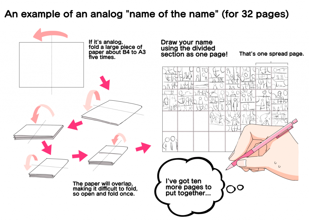
Another method is to create a name for the name, which is a blueprint for more of the same before creating the name.
If you want to make a “name of the name”, fold a large piece of paper (B4, A3, etc.) and divide it into 32 equal parts, and draw panel divisions, speech balloons, characters, etc. on each part of the paper.
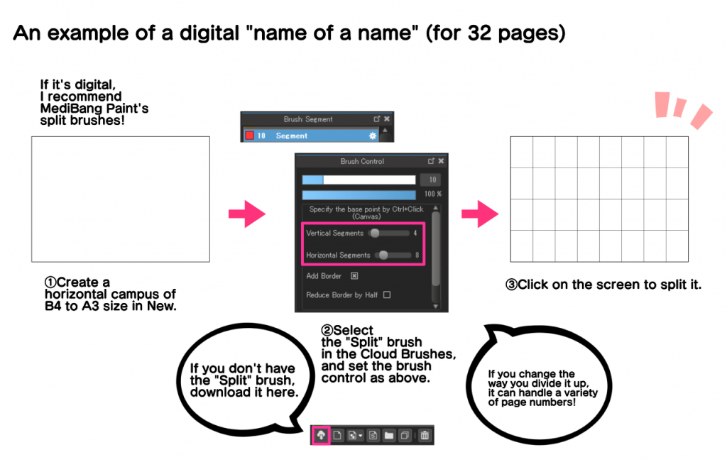
The “name of the name” can also be created digitally. In this case, you can use the Cloud Brush’s “Split Brush” for convenience.
The “Name of the Name” allows you to check all the pages in a spread, which makes it easier to pay attention to compositional overlaps and monotony. It is also effective in that you can visually recognize the number of pages remaining, and since it is easy to redraw, you can easily adjust the pages. I think it’s a good idea to practice this, especially if you don’t have a good sense of the number of pages.
Now that you have a plan and plot, it’s time to start drawing your name.
Start a new cloud project using the method explained in the previous lecture. Select [Commercial (B4 paper or equivalent): Grayscale] for a manuscript for submission, or a grayscale template of the size you want for a doujinshi(fanzine). Click on the first page to open it.
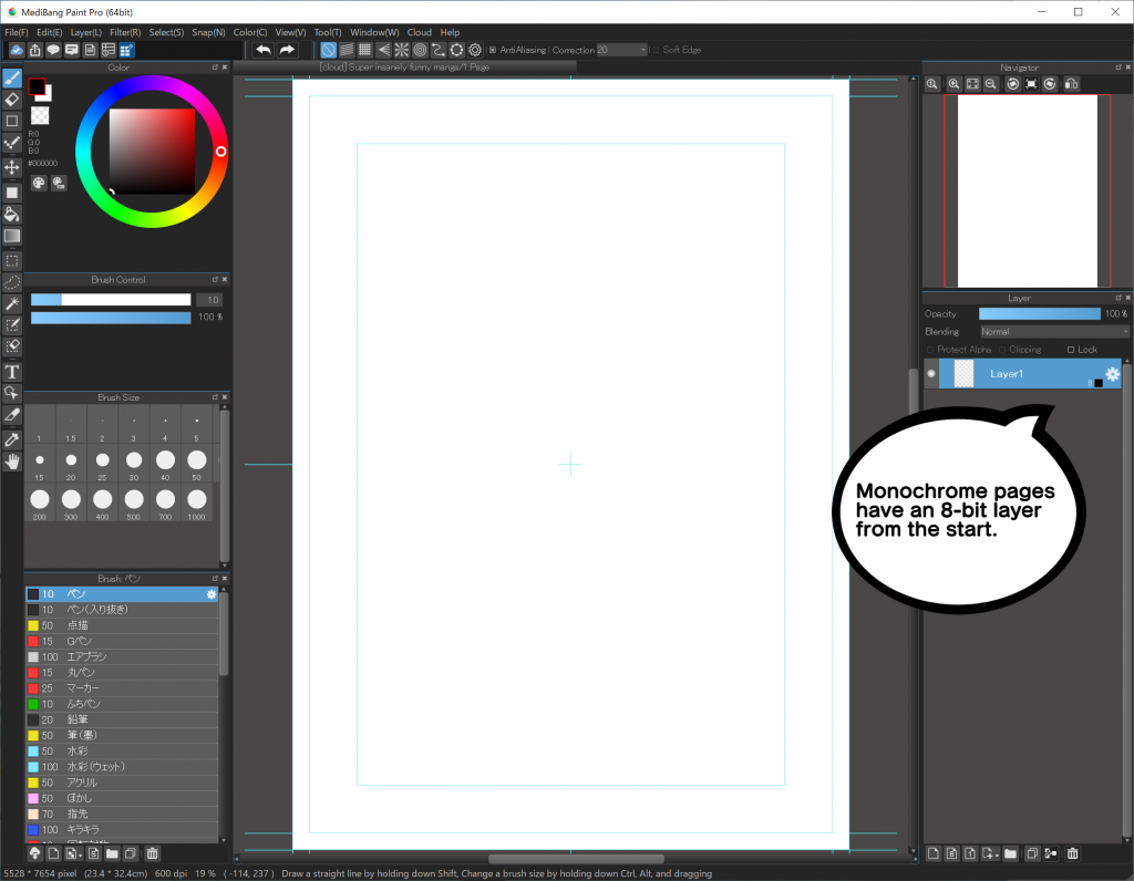
When you open it, you will see that one 8-bit layer has been created. This 8-bit layer is a layer that allows you to use a gradient of colors from black to gray to colorless. You can use this as a layer for your name.
You can also change the 8-bit layer to any color you want. If you want to change the color, click the gear icon on the right side of the layer. If you want to change the name of the layer, you can also do so here. For example, if you want to draw a name on a layer, you can name it “Name” to make it easier to check later.

There is a blue line on the canvas, but this is a guide and will not be reflected in the actual painting. Basically, draw the image so that it fits into the innermost frame.
The guide lines and panel layout will be explained later in the course, so don’t think too hard at first. You can also use the frame layout of your favorite manga as a reference. You can also use your favorite manga panel layout as a guide. At the time of drawing, you can use freehand lines for all the frames and postcards.
In the case of digital, you can type the lines from the beginning, so you can type them in at the time of the name. Click on the “T” icon in the text, then click where you want to put the text to open the [Edit Text] window. To add vertical lines, check the [Vertical writing] box. It is convenient to put the text layers together in a folder.

There are no rules about font type or size, but it is easier to read if the font is as large as possible and the lines are spaced out. If this is your first time and you don’t know what to use, use “Antique Cezanne” for Japanese, “CC-WildWords” for European text, “Noto Sans SC” for simplified Chinese, and “Noto Sans TC” for traditional Chinese, all in 14pt size with 6pt line spacing. These fonts are included in MediBang Paint’s “Cloud Text” and can be used for free. If you can’t find the font, check the [Use Cloud Text] checkbox to find it.
Try to keep the lines in a single illustration as short as possible. It’s important to keep it short, and to keep in mind that you’re not explaining everything with lines, but with pictures.
Now, as an example, let’s actually name the following plot.
Plot: You come to a fast food restaurant, order a hamburger, and find your uncle stuck between the buns.
I made three patterns of names using the left page as the first page of the spread.
Pattern 1: Example of a two-page drawing
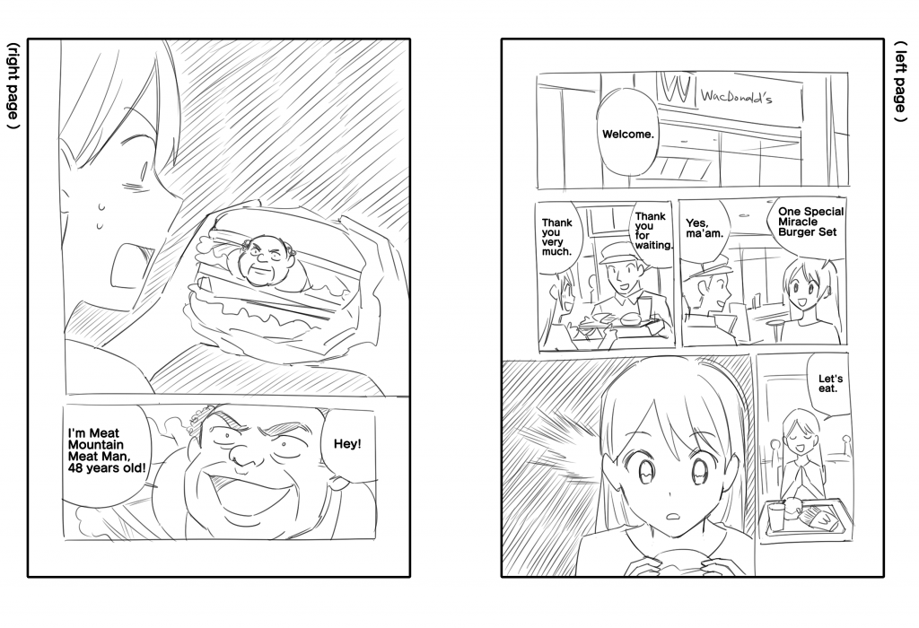
Pattern 2: Example of a single page drawing
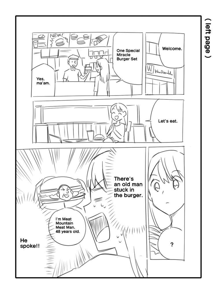
Pattern 3: An example of a one-page drawing in the style of an essay manga
In pattern 1, the first panel shows a large fast food restaurant, which makes it easier for the reader to understand where the story is going. In the fourth panel, the protagonist decides to eat a hamburger, but in the fifth panel, he notices something. In the fifth panel, the main character, who was about to eat a hamburger in the fourth panel, realizes something, and that something is his uncle, which is revealed in the next page.
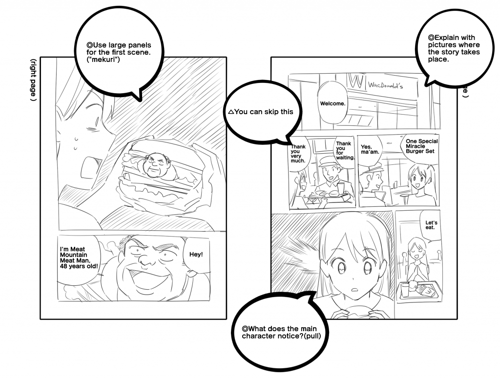
The fifth panel on the first page is a “pull” and the first panel on the second page is a “mekuri”. The “pull” is a technique of adding an effect to the last panel of a spread to draw the reader’s attention to the next page, and the “turn” is a technique of adding an impactful content to the first panel that the reader sees when turning the page. By using both “pull” and “mekuri” effectively, you can keep the reader interested in the story.
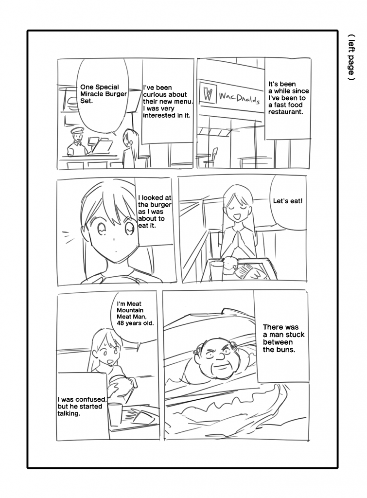
In pattern 2, the first panel is smaller than in 1) and the location is a little more confusing, but it is explained with the line “Welcome” and a larger second panel depicting the restaurant. The interaction with the waitress is done in the first panel, the protagonist takes a seat in the third panel, the protagonist notices something when he is about to eat the hamburger in the fourth panel, and the uncle comes out in the fifth panel.

Compared to (1), the impact of the uncle’s appearance is weaker, and if you want to make this the highlight of the story, it is quite a waste. Also, by not consuming panels, the reading experience is faster than in (1), so if you value tempo, this may be a better choice. In addition, since two pages were used for the same content in ①, but only one page is needed in this case, this type of panel layout is also a candidate when the number of pages is limited and the name must be drawn.
In pattern 3, all the panels are of similar size, and the story unfolds in an unhurried or, at worst, monotonous manner. The fast food restaurant in panel 1 is drawn in a fairly large size, so the location is easily conveyed, and the interaction with the waitress is only in panel 2, so the tempo is not bad. In the third panel, the protagonist decides to eat a hamburger, notices something in the fourth panel, and finds his uncle in the fifth panel. In the fifth panel, the protagonist notices something in the fourth panel, and in the fifth panel, he finds his uncle, and without any special excitement, the uncle starts talking in the sixth panel.
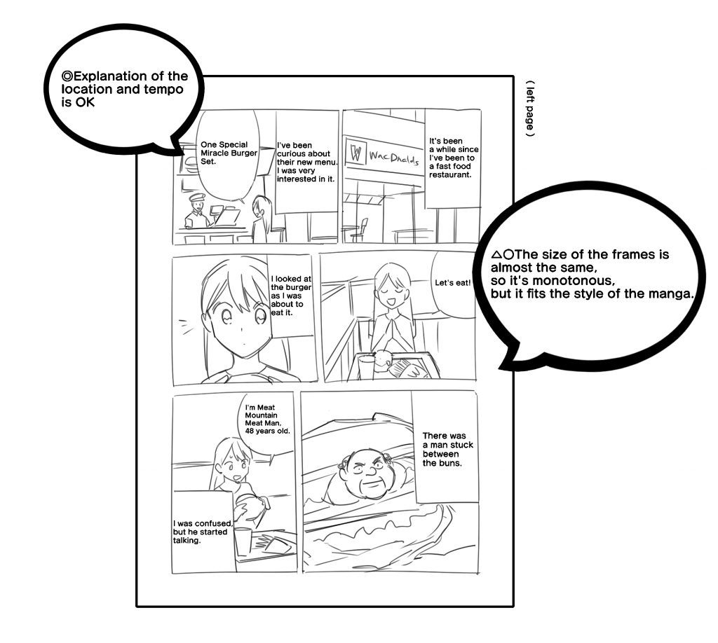
Compared to patterns (1) and (2), the atmosphere is much more relaxed, and the development is more likely to elicit a chuckle than a laugh or shock. If you want to draw a manga that is relaxed and not full of shocking twists and turns, this is the name for you.
The size of the frames is almost the same, so it’s monotonous, but it fits the style of the manga.
As mentioned above, even if the plot is the same, depending on the name, how the reader feels about it and how the manga will be read will differ. In order to create a manga that readers find the most interesting, or that will be read in the way you intend, the process of making a name is a trial and error process of frame layout, composition, and dialogue, while trying to keep the manga within a predetermined number of pages.
It is very effective to have someone else read your work, because it is difficult to know how you will feel when you actually read it. By having someone else read your work, you will be able to notice things that are difficult to understand that you didn’t notice yourself, as well as gaps in your sense of humor, such as “I thought something was serious, but others saw it as a gag.
How was it?
In the next tutorial, I will explain about “frame layout and screen creation.
Click Here for Previous Tutorials.
Manga Tutorial for Beginners 01 Process of Manga Making
Manga Tutorial for Beginners 02 Let’s Make Outline (Part 1)
Manga Tutorial for Beginners 03 Let’s Make Outline (Part 2)
Manga Tutorial for Beginners 04 Get Ready to Draw Manga with MediBang Paint!
Manga Tutorial for Beginners 05 Let’s Make Name(outline)
「ГФ」
ART street
Click here for the collection: https://medibang.com/u/seledkapodshboi/
You can read my manga here → https://medibang.com/book/0c2101280307258390018866367/
This is also a manga that I draw under a different name. → https://medibang.com/comics/official/dobs340000005872400000000000a/
twitter: https://twitter.com/seledkapodshboi
\ We are accepting requests for articles on how to use /

