2021.11.19
【Easy Tip】Critical Hit!Special Effects Basic Manual for Beginners~Flashy Lights~
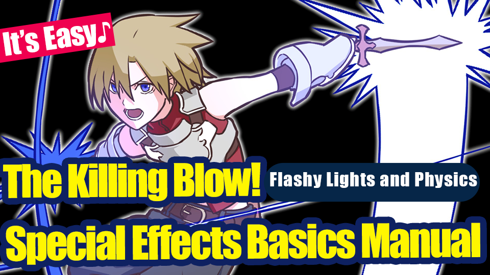
The best part about fantasy worlds is that they are filled with swords and magic.
You run into unrealistic encounters with supernatural beings and mysterious events. Truly, a genre filled with all our dreams and romance.
If you are reading this, could you be struggling trying to create your dream world in your illustrations ?
Let’s draw using effects and make your illustration more fantasy-like !
In this article, I will be introducing how to draw the special effects on action packed attacks !
Let’s try drawing an illustration of a killing blow attack that score critical points in online mobile games.
In this article of special effects, I will explain how to draw the flashing lights that appear with strong hits and slashing attacks.
Why would swords glow anyway? Isn’t that more sorcery than sword skills?
Come on, this world is a fantasy! Don’t ask those questions, we’ll be stuck here all day!
1. Be prepared
First, open MediBang Paint.
New features and tools will be noted as 【Features, Tool Name (Windows Shortcut Key)】.
I will list the shortcut key articles below so read these for more details!
▼【Shortcut Keys List】
Shortcut Keys List【Windows】
Shortcut Keys List【Mac】
From【File】tab, select【New…(Ctrl + N)】
▼【Making a New Artwork】
Let’s make an artwork
In this article, the width and height are both set to 1350px.
I will be mainly using these 3 brushes.
12px Pen
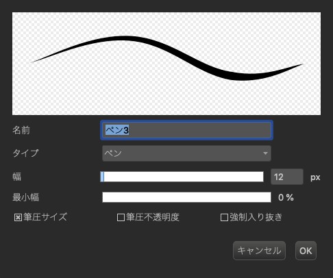
Free Size Pen
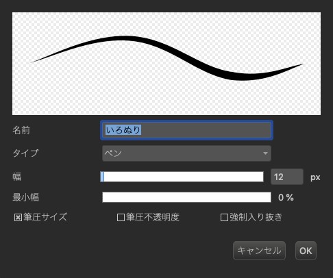
Free Size Airbrush
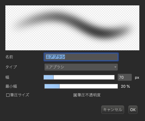
The size of the canvas and pen do not matter, but if you do not have a certain preference or you are unsure on what size to decide, you can do the same as I did and create a similar image as a start.
2. Draw the draft
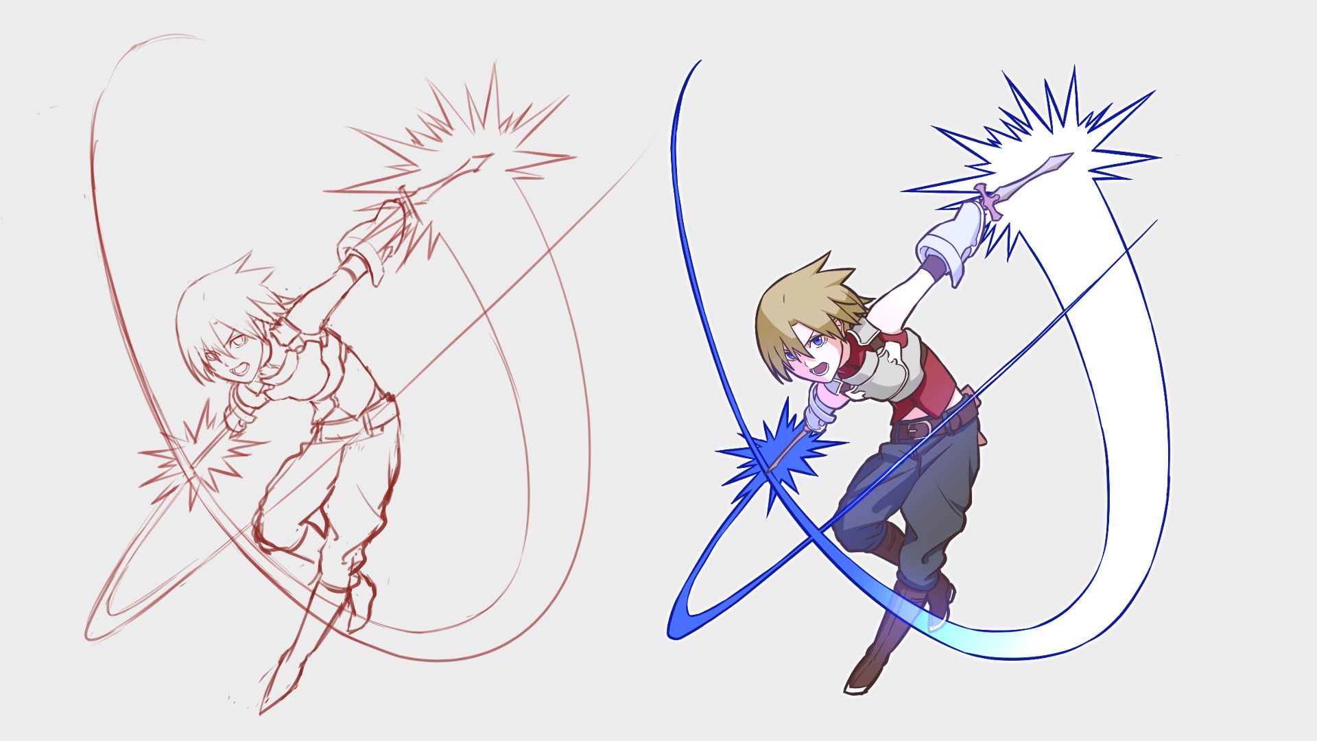
The main focus for this article is “effects”, but I will draw a character here to get started right away.
If you want to add the effects to a drawing you already have, skip this step and start from drafting the illustration.
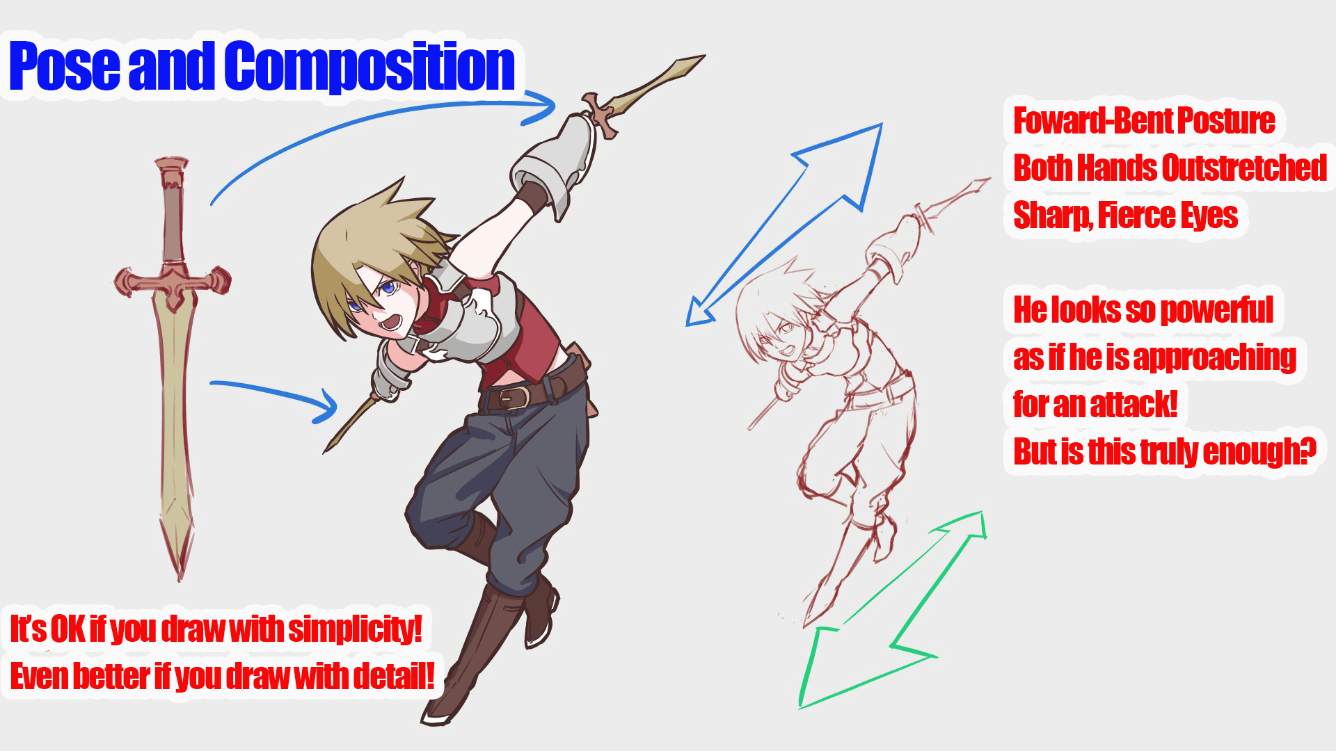
Since this character has two swords, let’s set his pose to cross slashing.
It is always the best to decide on the pose while imagining where the swords trace.
To make him look more cool like an online game character, I’ll draw his entire body.
It takes a little bit more time and effort but this saves you from not having to draw all the tiny details.
This is how it looks !
The body is leaning forward and both arms are spread out to add some depth. This character’s posture is also decided to spread and shrink the hands and swords size to save time from drawing small details.
To add some impact and action, there is a technique to layer the body parts or the objects.
Since there is no overlaps when characters face straight, layering like such will add natural movement on their own.
By making use of this technique, you can draw body parts while hiding areas you are not good at drawing without your illustration looking awkward ! Two birds with one stone !
It’s true that the path to a professional artist opens once you overcome your weakness, but knowing and using these tricks will make you more flexible.
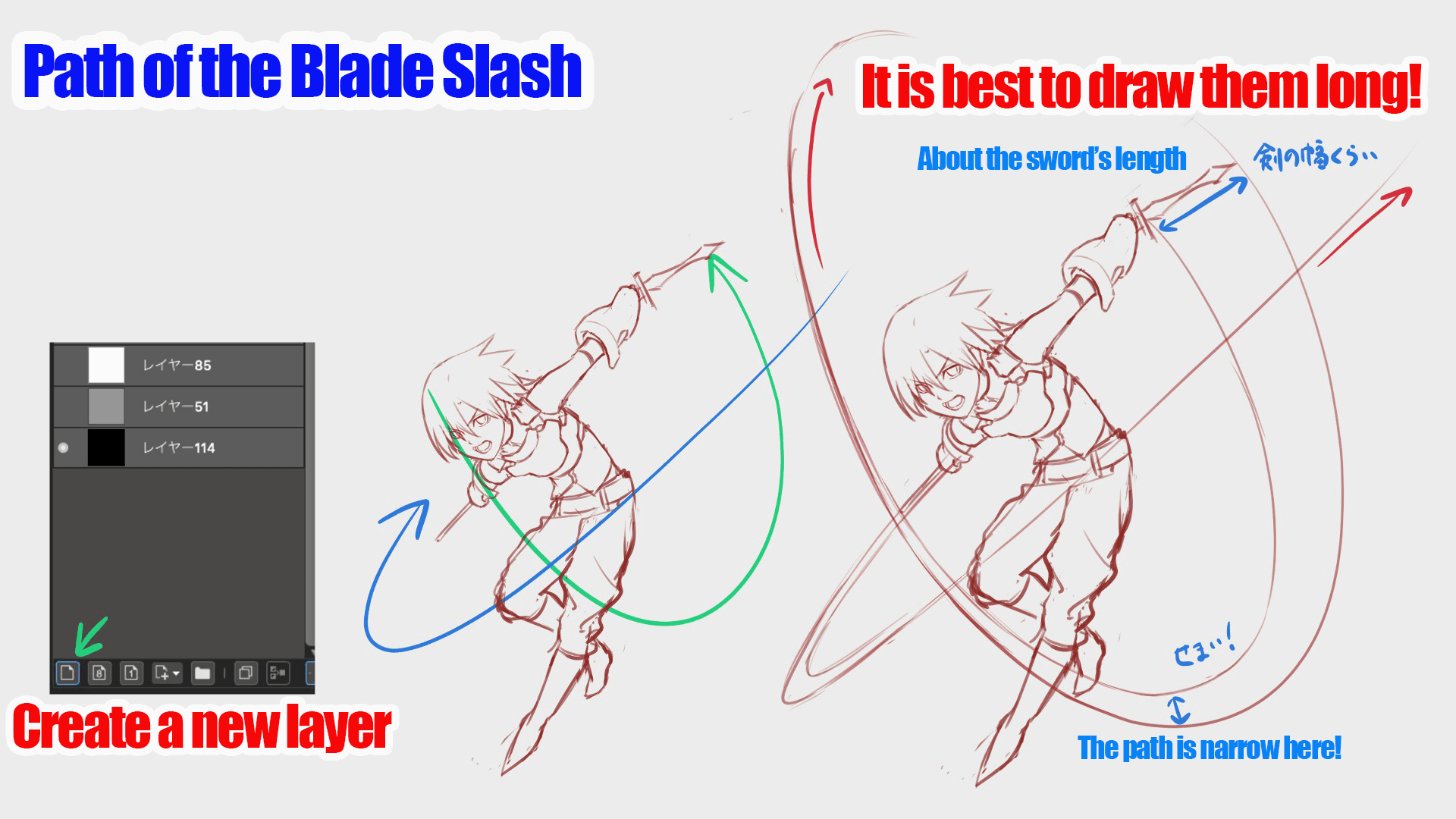
Once you have the character, let’s draw the special attack’s sword slash.
From【Layer】, make a new layer and add the attack.
▼ How to use【Layers】
Let’s use the layer function
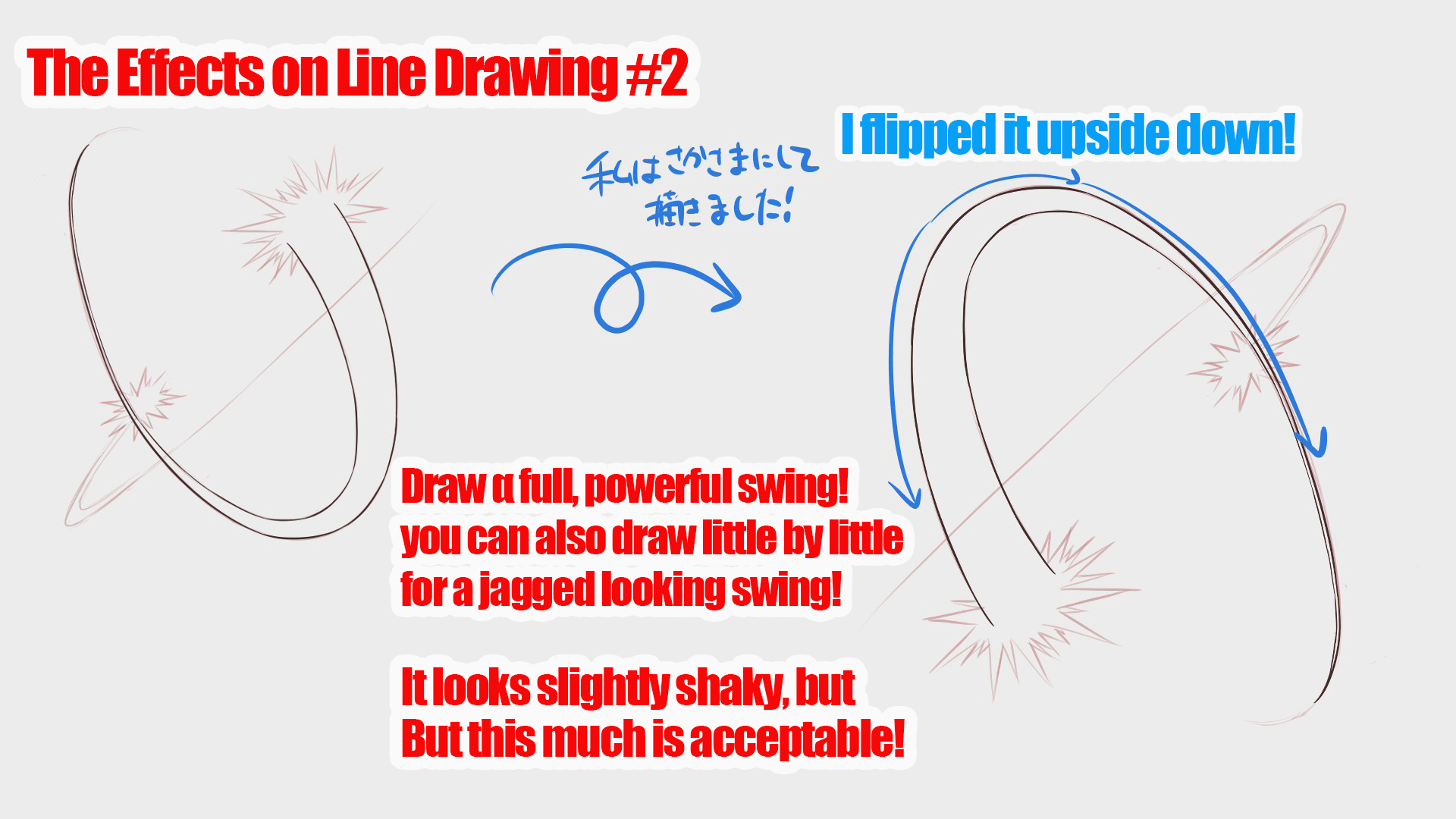
It’s best to draw the lines starting from the sword, narrowing the lines from the dagger’s width to a single thin line.
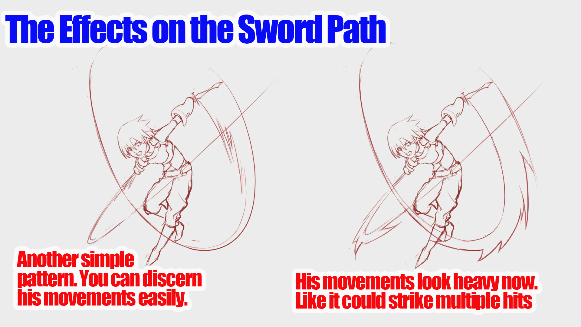
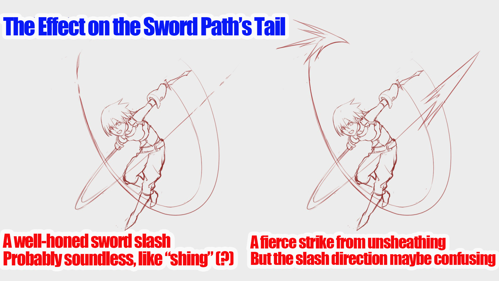
This looks good but we there is always room for improvement. How about we make it a little fancier. Let’s put variations to the slash strengths.
Separate the wave into 3 levels, corresponding to the strength of the light.
Indicate where the highest power focuses on the slash, usually right at the dagger, and the energy dissipating at the end of the dagger slash.
Combining and customizing these are really fun.
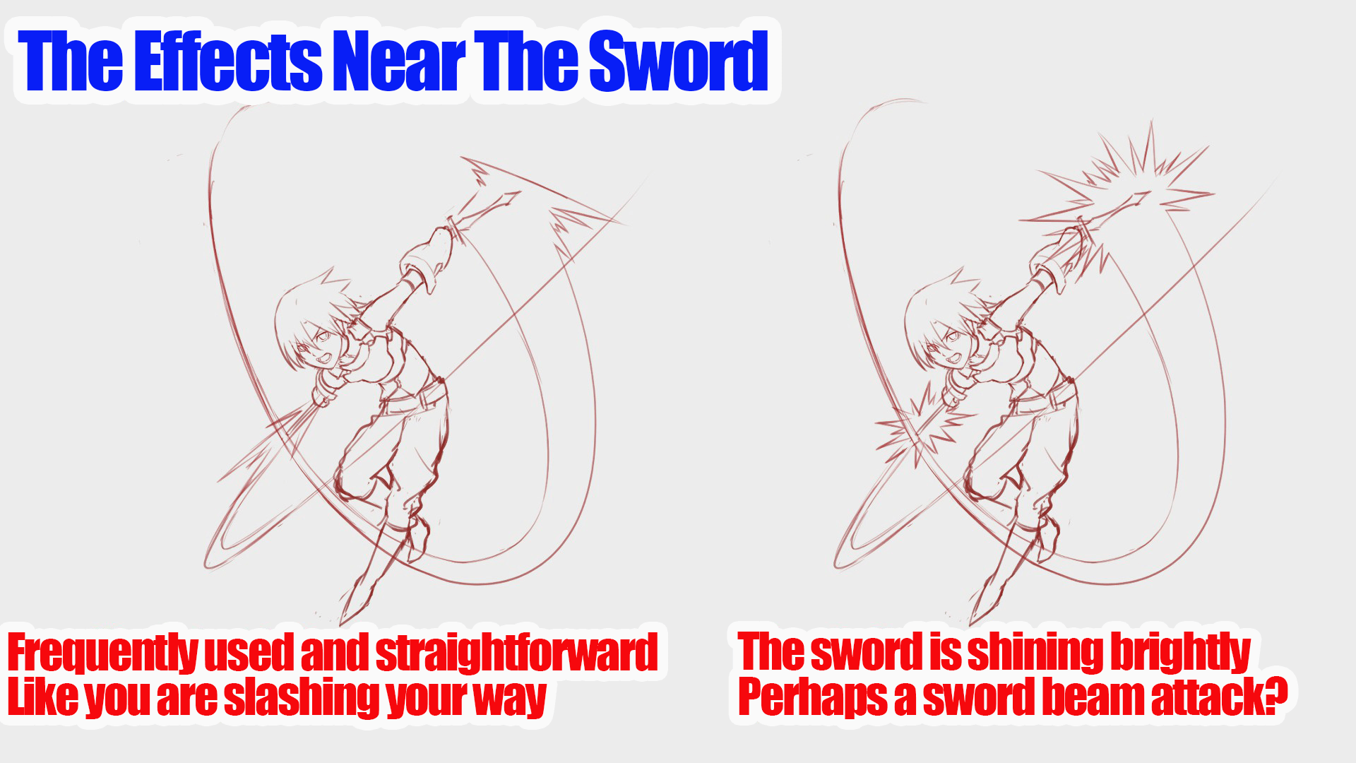
You can also change the shape of the slash attack effect near the swords to for different attack types.
It’s hard to explain, but changing how the weapon glows can either make it seem physical or magical.
The shape of the effect changes the impression of the attack.
It really does feel like you’re making a game as you can feel the change in its force and damage level.
Perhaps you call these the attack styles’ characteristics? Water breathing? Anyone?
You can, but you don’t have to make the path of the sword or its tail perfect.
Perhaps this is your chance to practice a lot and test some drawing styles to see how uniquely it will appear?
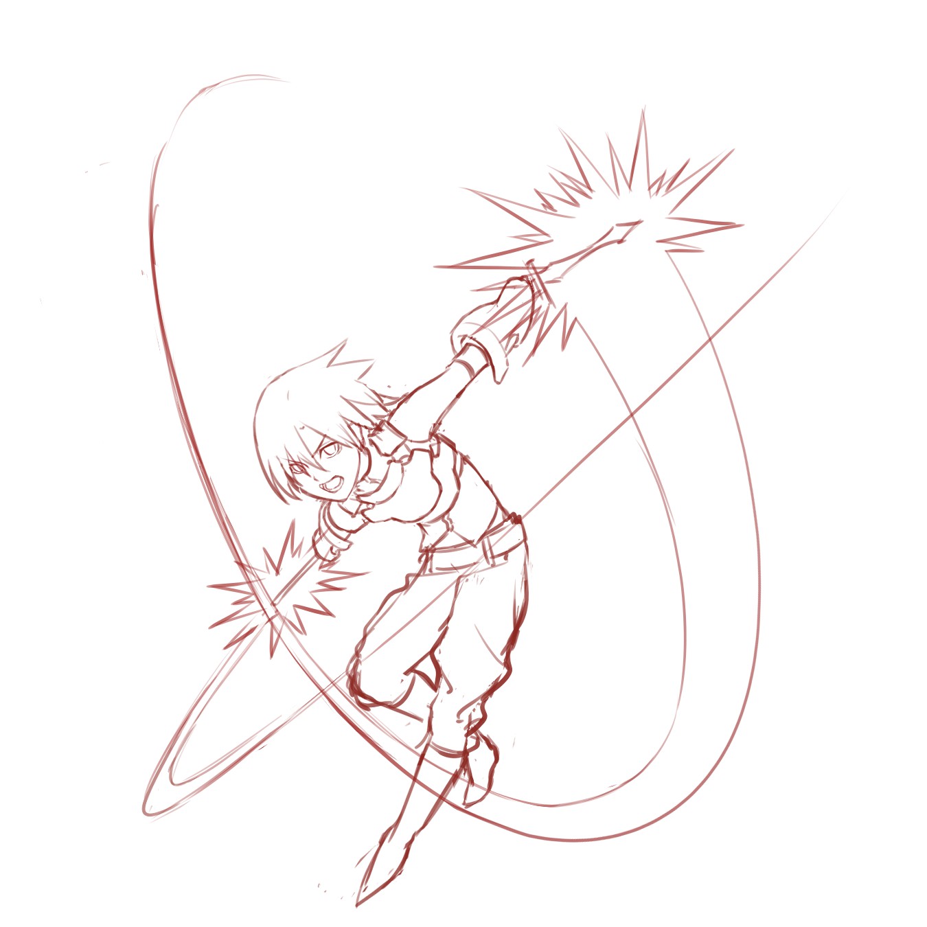
Here I drew various patterns but this time I’m choosing the one with flashy and spiky effects.
It’s simple yet has the feel of a blinding light.
3. Line drawing
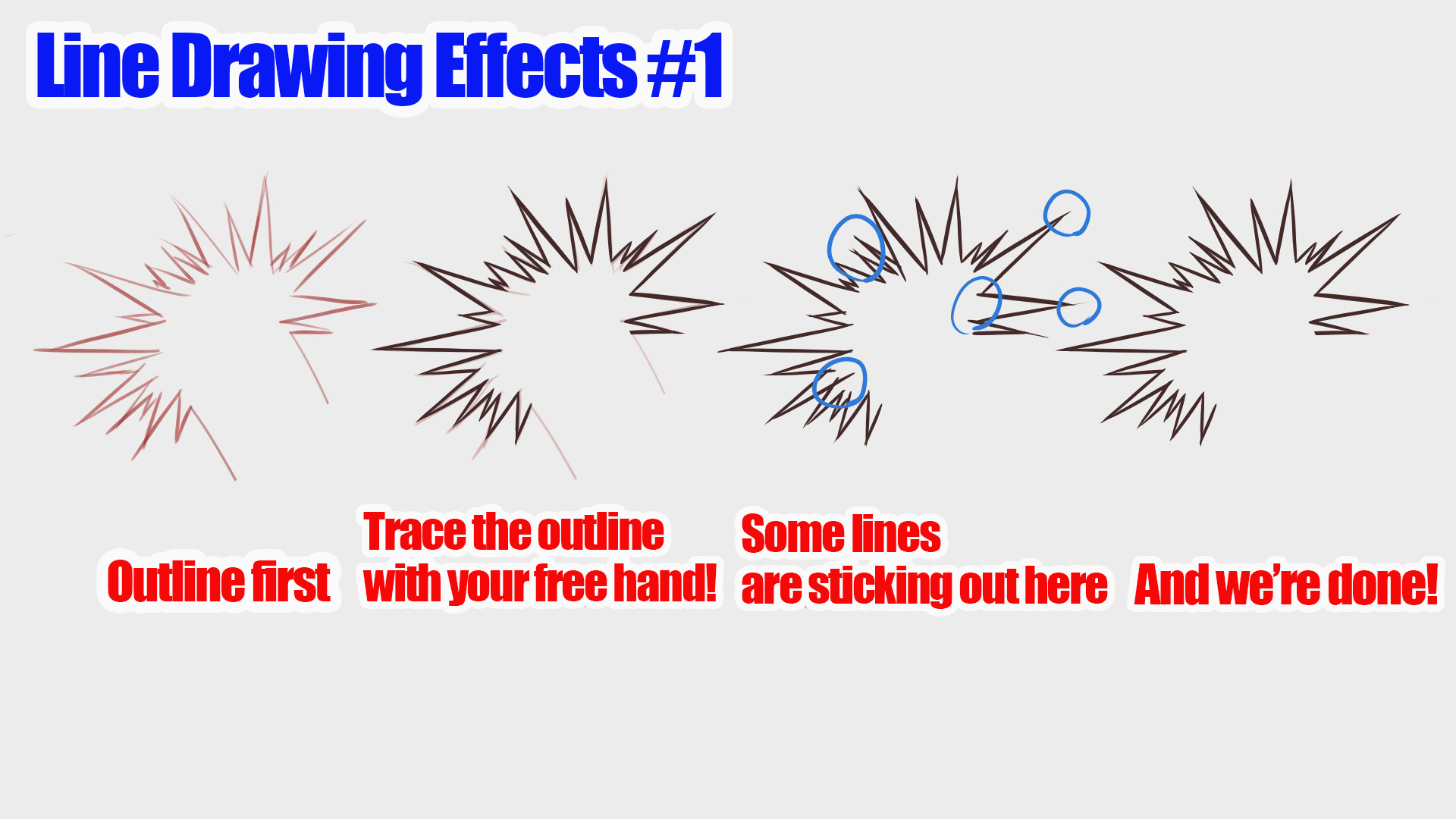
There are effects you can do without line drawing, but for now lets draw simple outlines and trace them.
I’ve described line drawing for characters and coloring in the past articles so if you are interested, please read those !
I think it will work perfectly for effects explained in this article too !
▼ Click here below!
【For Beginners】Let’s make our own child! Part 2 【Original Character】
Once you are done with the line drawing for your character, create a new layer.
As a side note, I used 12px for the outline and 9px for the inside so I will use the same 12px pen for the effect outline too.
You can start wherever you like, but try the easy looking spiked area.
You might feel obligated to draw them perfectly, but you can erase and add some stuff later so go ahead and draw them roughly by hand !
If you are a perfectionist, try using the【Snap】tool.
Moving【Parallel (2)】little by little, you can make the serrated pattern.
Next is the middle part, the tracing of the sword path.
Draw this part roughly in free-hand style as well.
However this gets more and more difficult with the longer lines.
If you can’t draw them well, use【Correction】for stabilization.
I hope this is the right method for you !
4. Coloring
With the line drawing complete, you can move on to coloring.
Make a new layer and paint your drawing using different sizes of the free size pen.
Oh right! You can also use【Bucket (G)】!
But sometimes it might not paint the spiked area properly so be careful there.
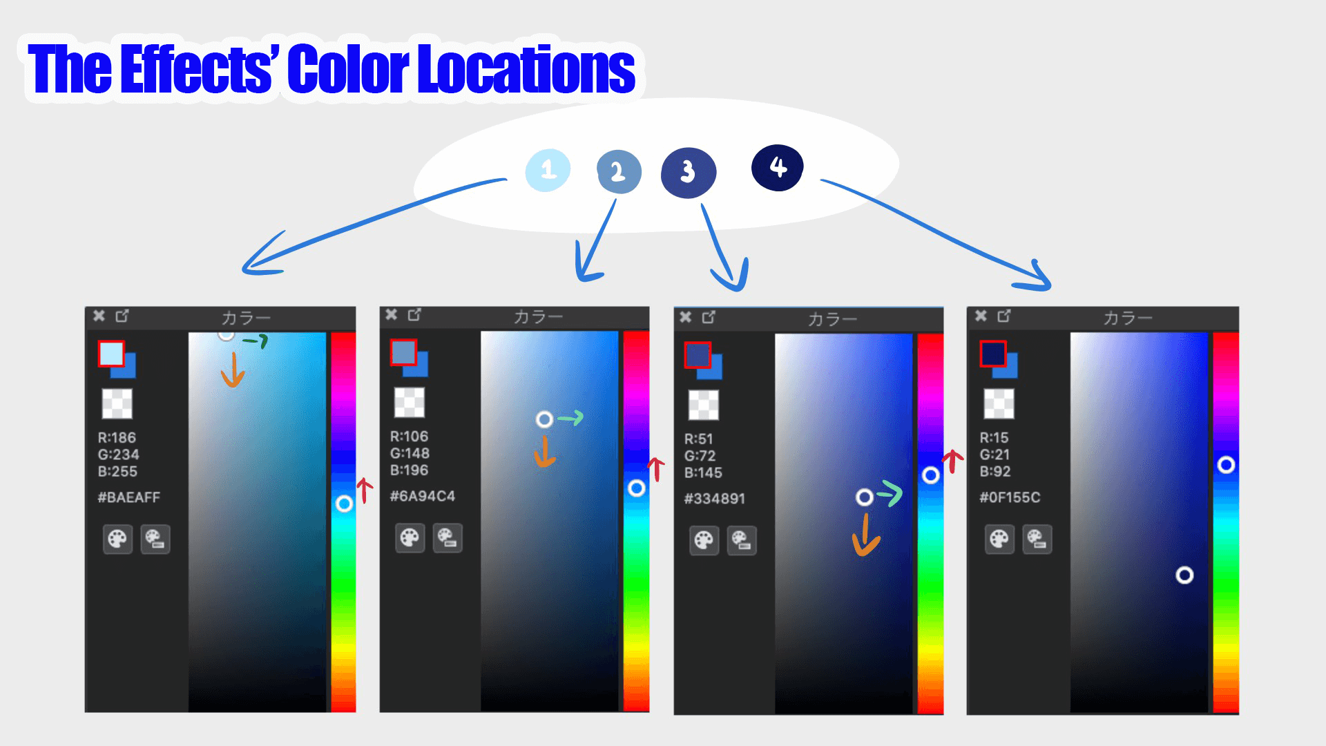
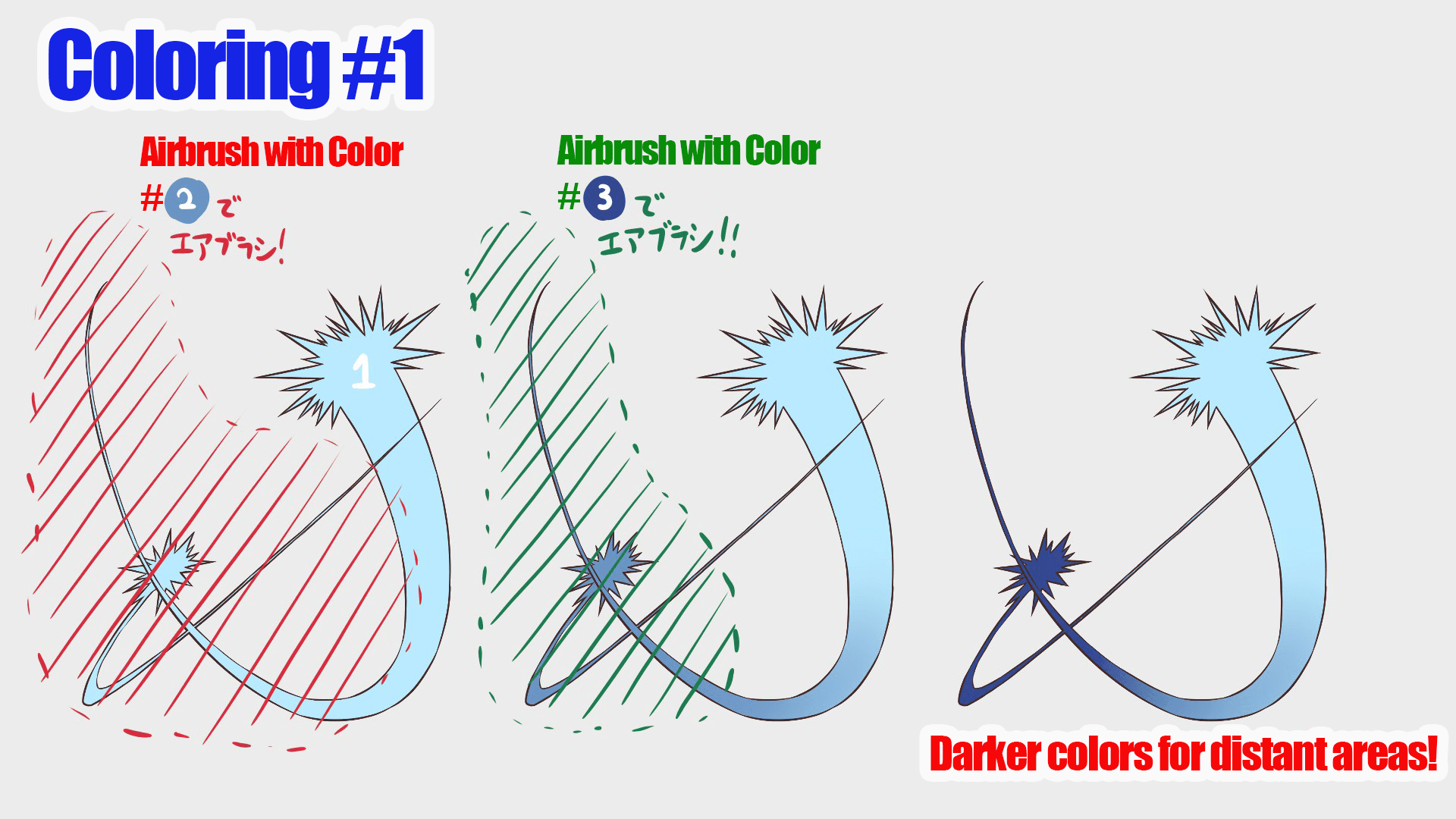
You only need two colors (base and shade) for the character but the effect needs four colors.
From bright to dark, thicker and adjusting the color adds depth to the gradation !
Once you have the colors prepared, paint the entire effect with the brightest color.
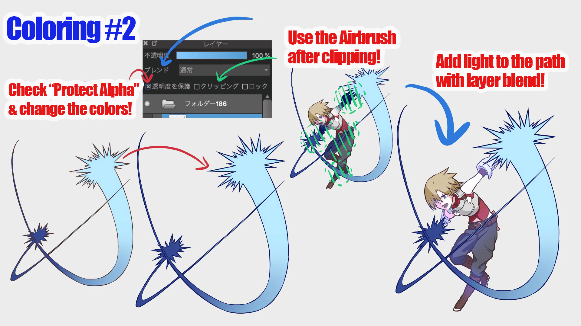
Then check【Protect Alpha】from the layer and make a gradation by painting it in the order of brightness.
Using this method, the paint will not go beyond the target object.
It looks cooler to make it darker in the back and if you are drawing two attacks, you can make one of them dark like mine !
For the darkest color, you will use it to outline the attack effect.
Set【Protect Alpha】 for the line drawing layer you created earlier and paint the darkest color all over it.
Since I used Airbrush, I will also add the light that hits the character.
To do so, merge the line drawing layer and color layer.
I recommend either copy-pasting (Command + C, Command + V) or duplicating (Command + J) before merging them.
Then, add a new layer to the character’s layer and set the layer’s [Blend] to [Add/Flash].
It’s a little different, but clipping is like protecting the transparency on a separate layer.
As the name implies, add and emit will make the image glow.
Now let’s use the effect’s darkest color to add a hazy color to the overlapping area!
5, Overlap The Layers
Now it’s time to finish up!
This is a different process than drawing or painting, but it’s important because everything will look different depending on how you finish it.
Merge the characters and effects you have drawn so far into one layer.
As always, keep a copy of your work so you can start over if you make a mistake.
Put only the ones you will use into a [folder] and proceed in the folder from here.
Also, create three layers with white, gray, and black fill as backgrounds.
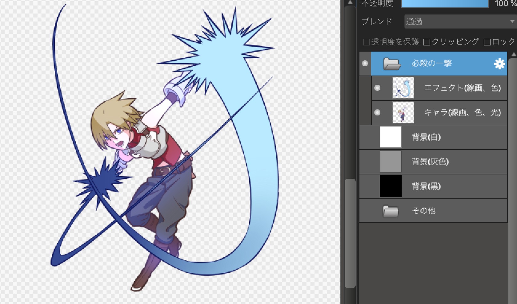
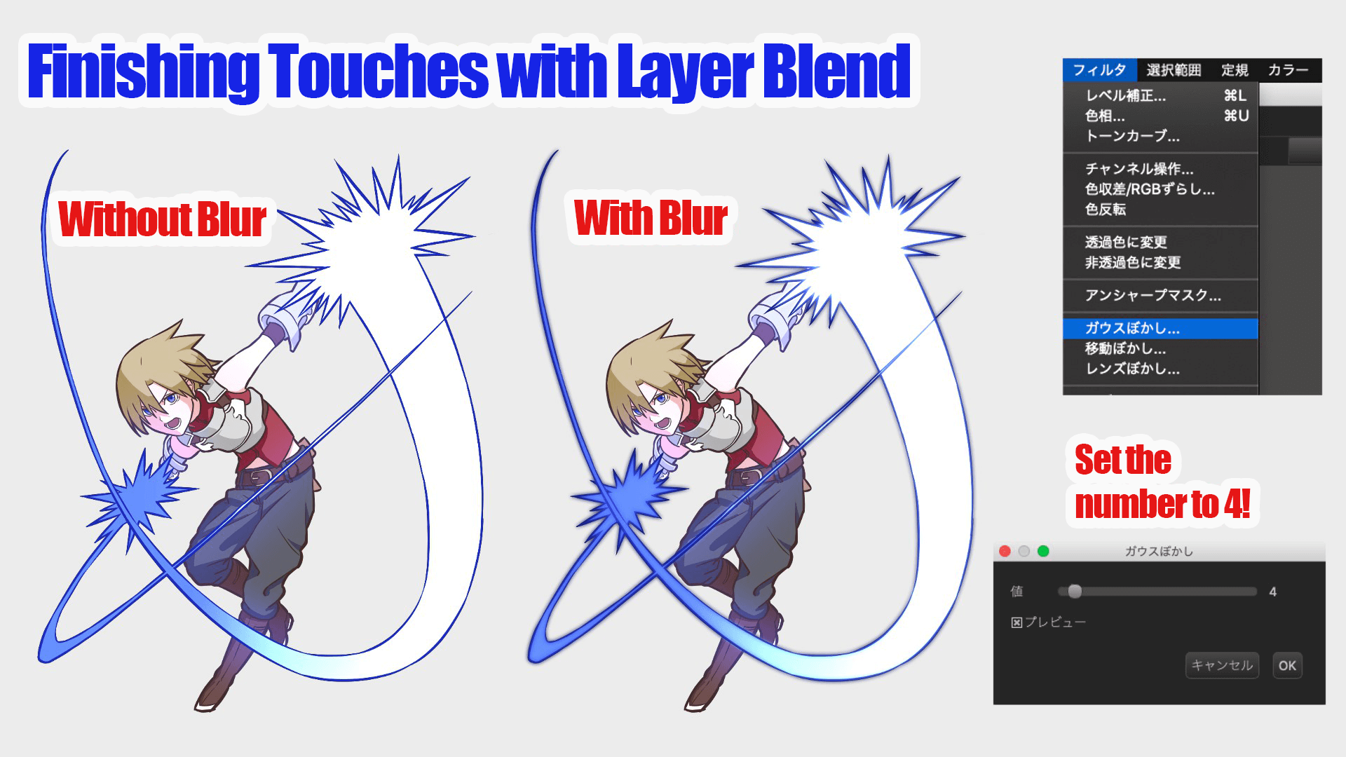
First, duplicate the effect and set the blend of the layer on top to Add and Emit.
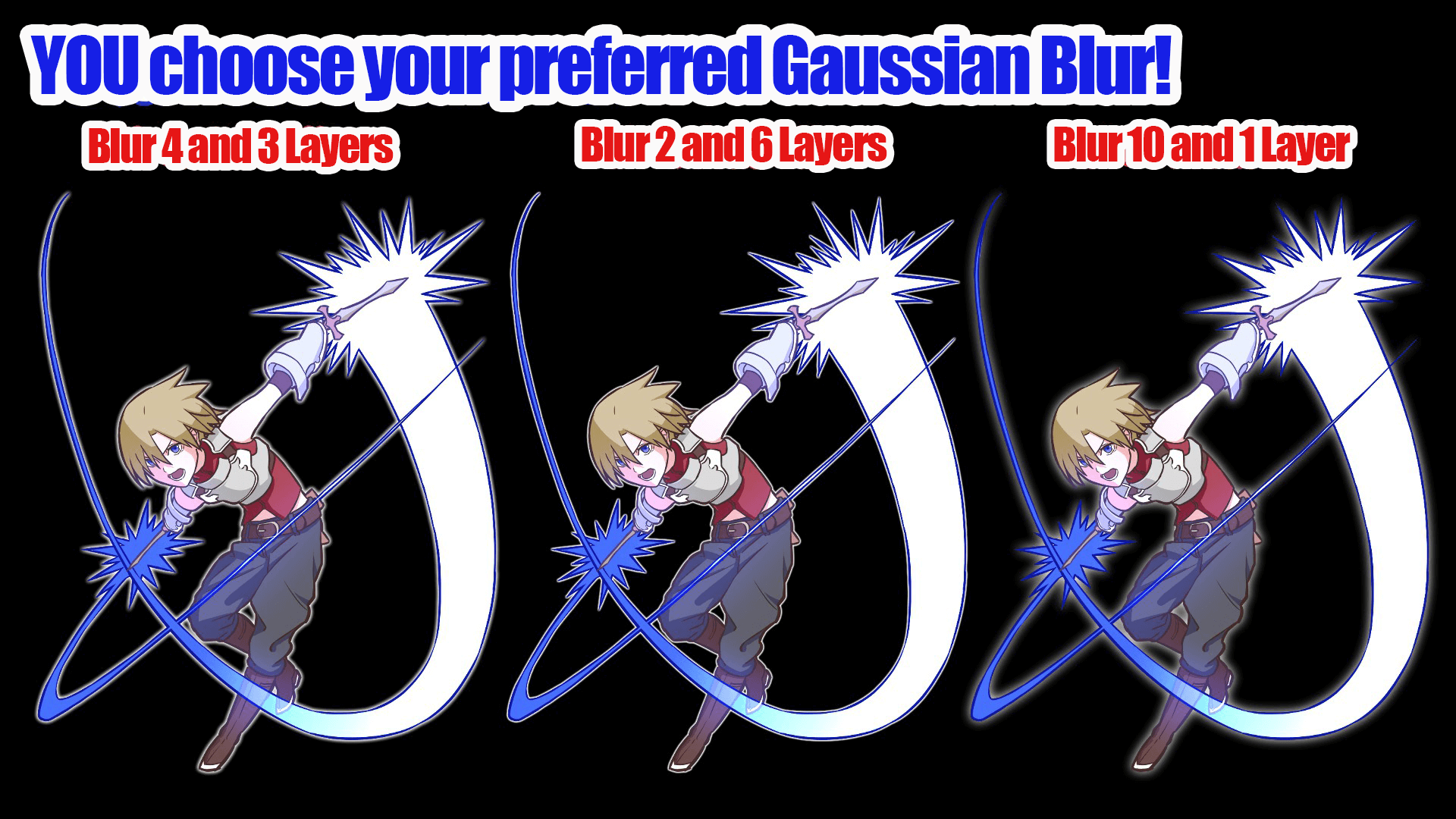
Apply [Gaussian Blur] to enhance the luminous effect.
It’s your choice!
▼Two links on how to use【Gaussian Blur】below!
・Use the Gaussian Blur!
・Blur the background with Gaussian Blur to make the people stand out!
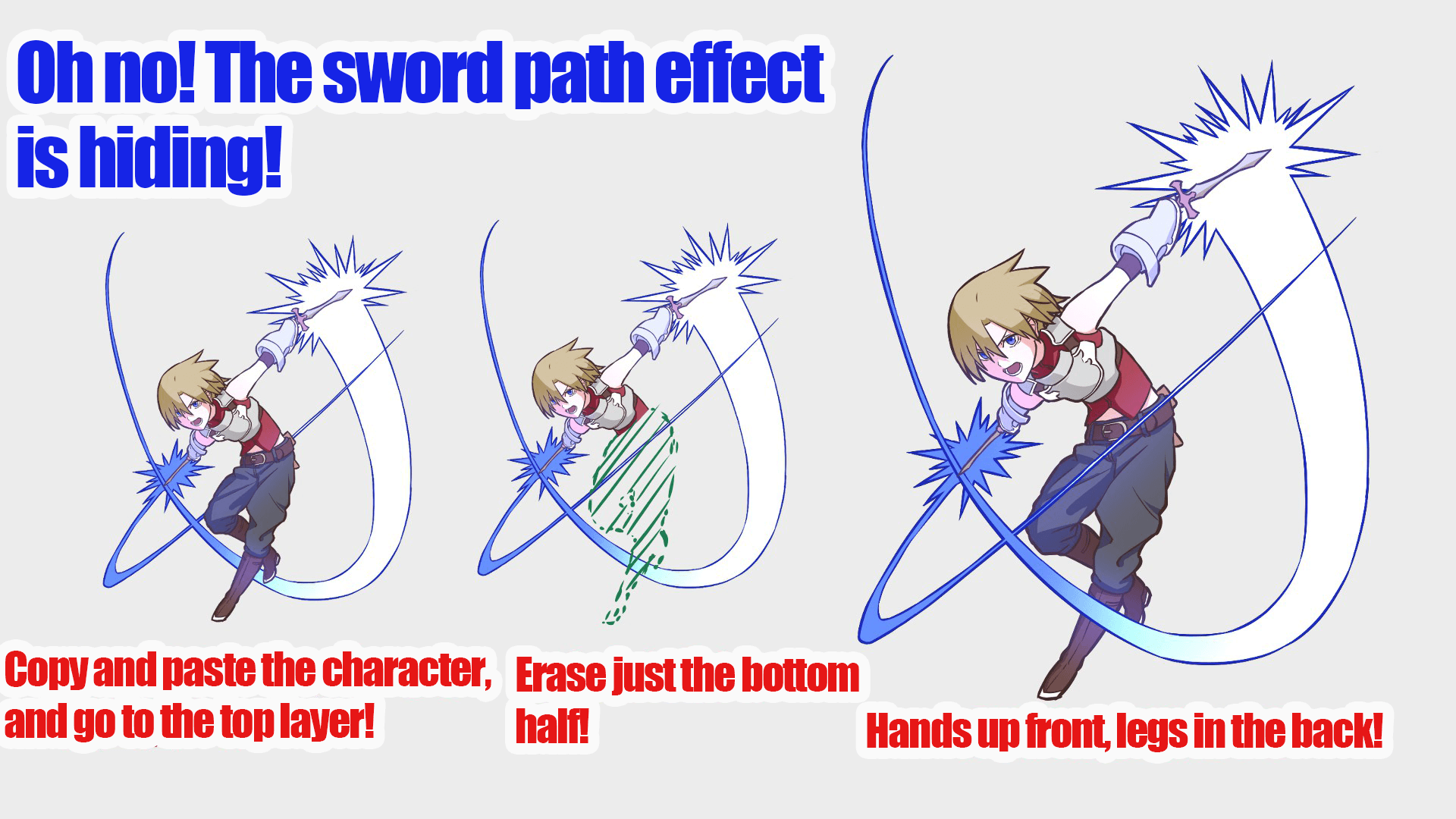
The character is attacking the front, so I guess it’s natural that the effects overlap, but the sword I drew is hidden.
This is not good, even though I drew it with great difficulty.
Let’s copy the character’s layer and paste it at the top, and the sword will be visible!
But I still want the legs to be hidden, so I’ll delete the bottom half of the layer on top.
What do you think? It looks good.
I’ve already mentioned that overlapping gives the picture more power, and it certainly seems to have a three-dimensional effect.
We want a little more of an effect look, so let’s make it more transparent.
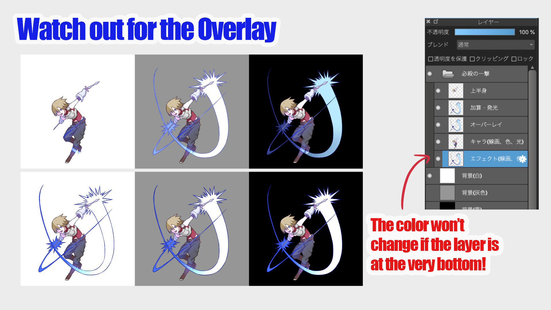
Set the blend of the effect layer to [Overlay].
It’s a little different, but it’s supposed to make the layer vivid and transparent.
Looks good! But don’t forget the background.
If you change the color of the background, you will notice that the color of the effect will also change.
It’s not a big problem since it won’t change once you export the image, but we’ll fix it.
Copy the effects layer and paste it behind the character.
Finally, for the last time, I’m going to make my whole body glow dimly, like a special move!
Select a folder and copy it, which will copy everything in the folder together.
Paste this at the very back, then copy and paste a few pictures with transparency protected, white fill, and Gaussian blur applied.
I set the Gaussian Blur to 4 and copied and pasted about 3 layers.
It’s totally your preference, so experiment until you find your best one!
Now it’s finished!
I love the gap between the brightly shining figure and the smooth slashing figure, so much that I’d give a pat to my shoulder.
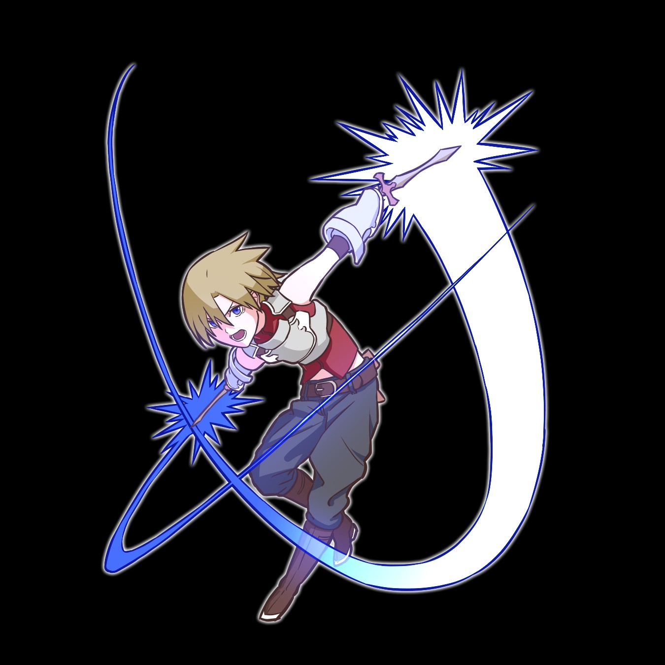
How did you like it?
I hope you were able to draw some cool effects.
This time it was just a plain sword / dagger slash, but you may or may not be able to create a different effect with a magic attack.
The possibilities for effects are endless, from scattering stars and hearts to drawing a magic circle.
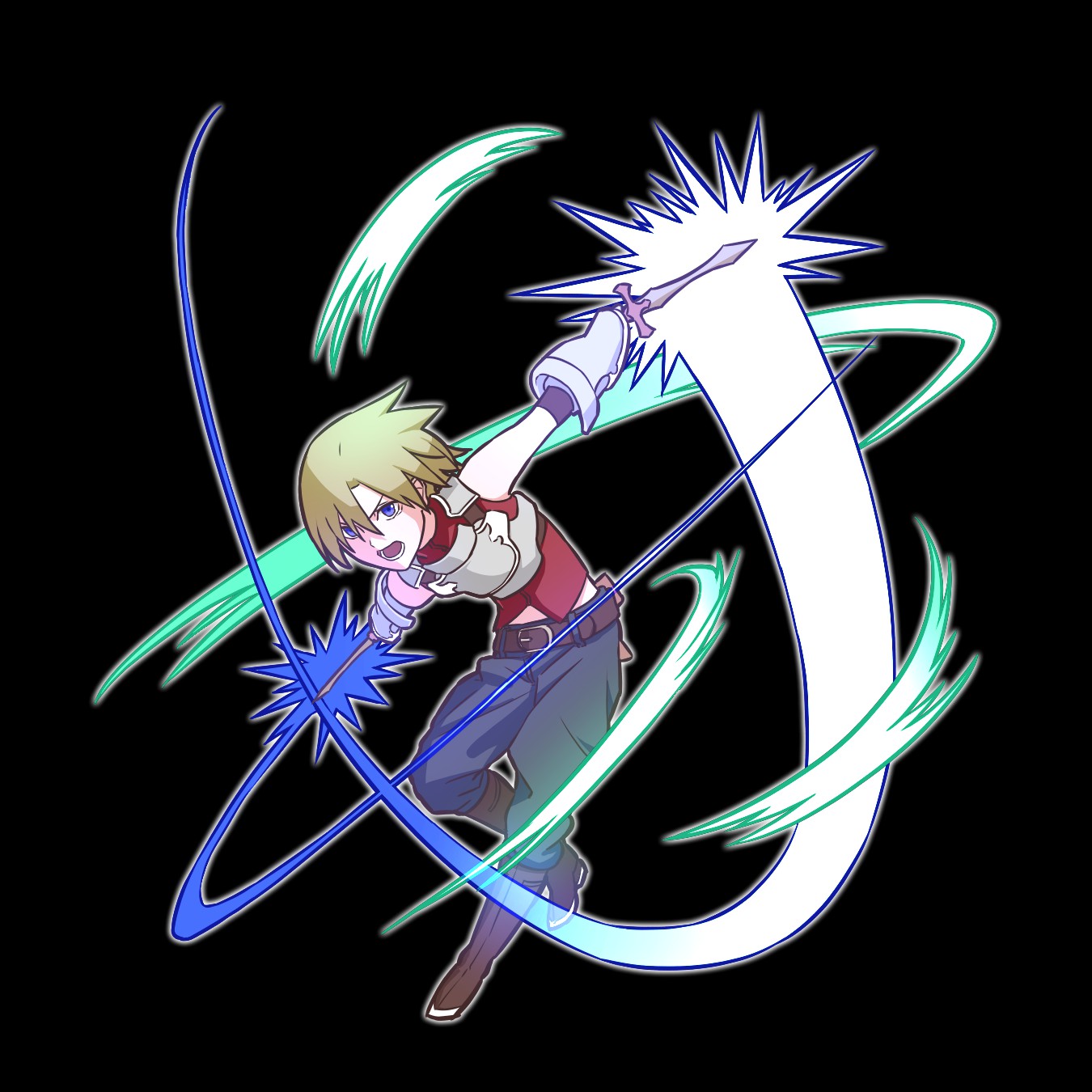
As an added bonus, I tried drawing different effects in the same way.
Even simply increasing the number of effects will change the power.
I’m sure you can arrange other effects as well, so please try to create your own special moves.
It’s fantasy after all, you can try adding elemental attributes and so on!
▼Unleash Elemental Attacks!
・How to draw cool effects! 【Fire】
Thank you for reading!
(Texts・Picture/Clock)
Twitter https://twitter.com/Clock1231
\ We are accepting requests for articles on how to use /

