2021.03.15
[For beginners] It will look better! Easy composition & illustration placement techniques
You’ve done your best to draw an illustration.
The illustration itself is well done, but it looks flat and lacking in movement, or it always ends up looking like a stick figure.
In this article, I’d like to introduce you to some composition & placement techniques that will take your usual illustrations to the next level!
All of these techniques can be quickly adopted by beginners, so please take a look at them!
1) Use the “margins”!
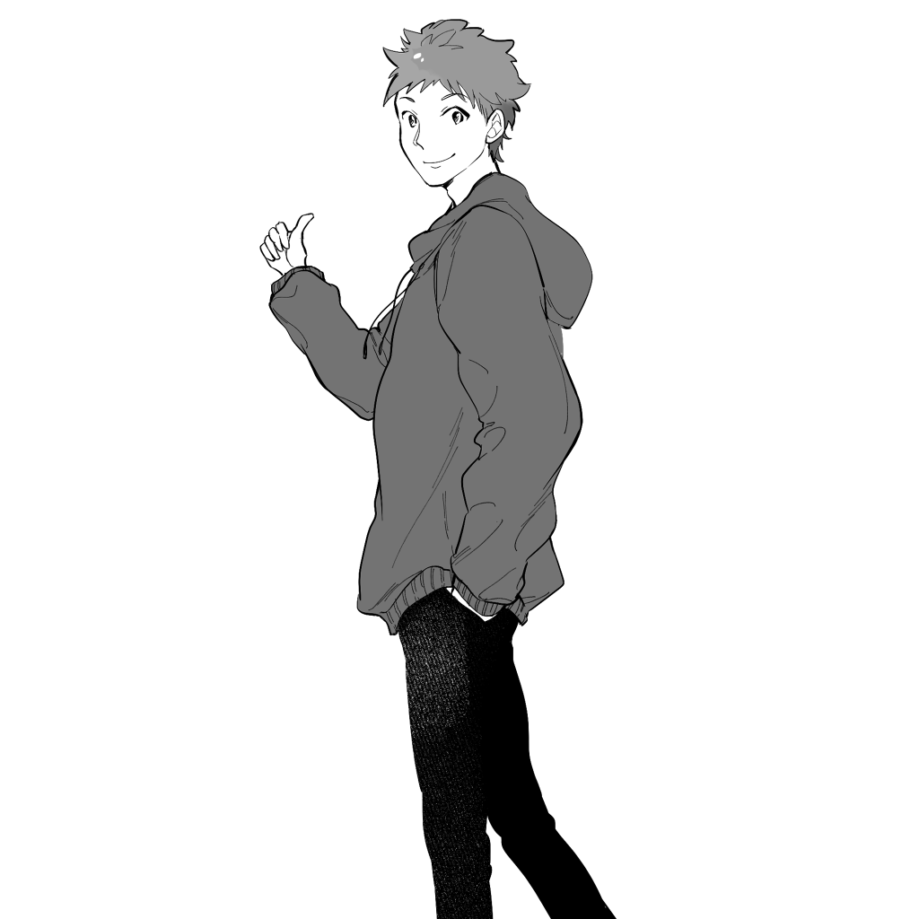
First, take a look at this picture.
The person is placed in the middle of the picture, making it look like a stick figure, which is a waste of space.
In such a case, let’s use “margins” to give it some direction!
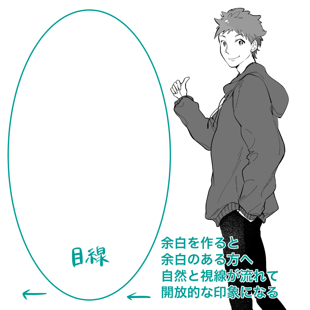
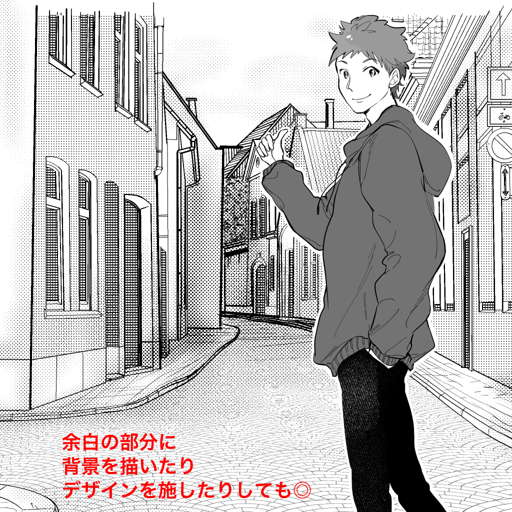
I purposely created a blank space on the left side.
The human eye is naturally drawn to areas with margins.
In this case, the large margin next to the figure naturally draws the eye from the figure to the margin, creating an open image.
You can also add a sky or background to the margin.
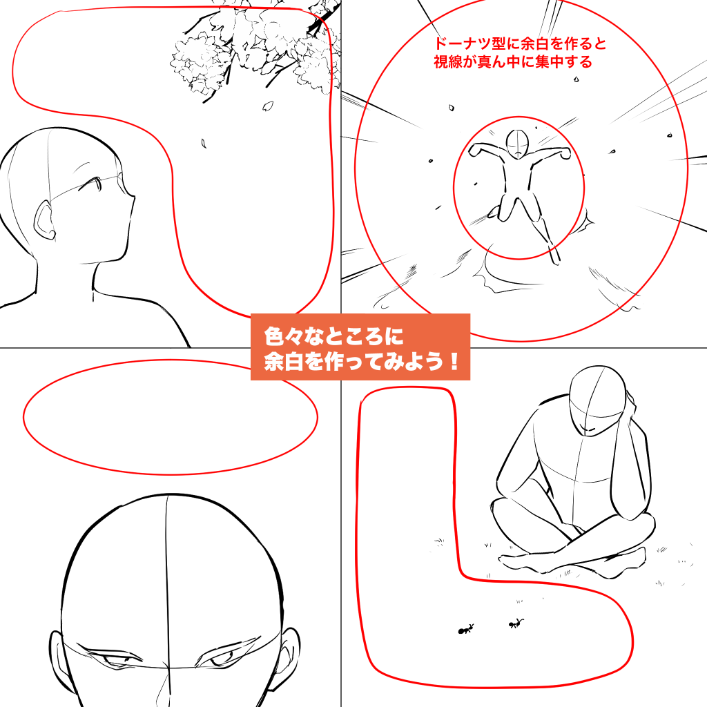
Depending on where you place the blank space in your picture, you can create many variations in composition.
Let’s try it out.
2) Let’s stick out from the screen!
“I want to draw a powerful picture! “I want to draw a powerful picture!” “I want to make a striking picture!
“I want to draw a powerful picture!
There is no rule that says it has to be exactly inside the campus.
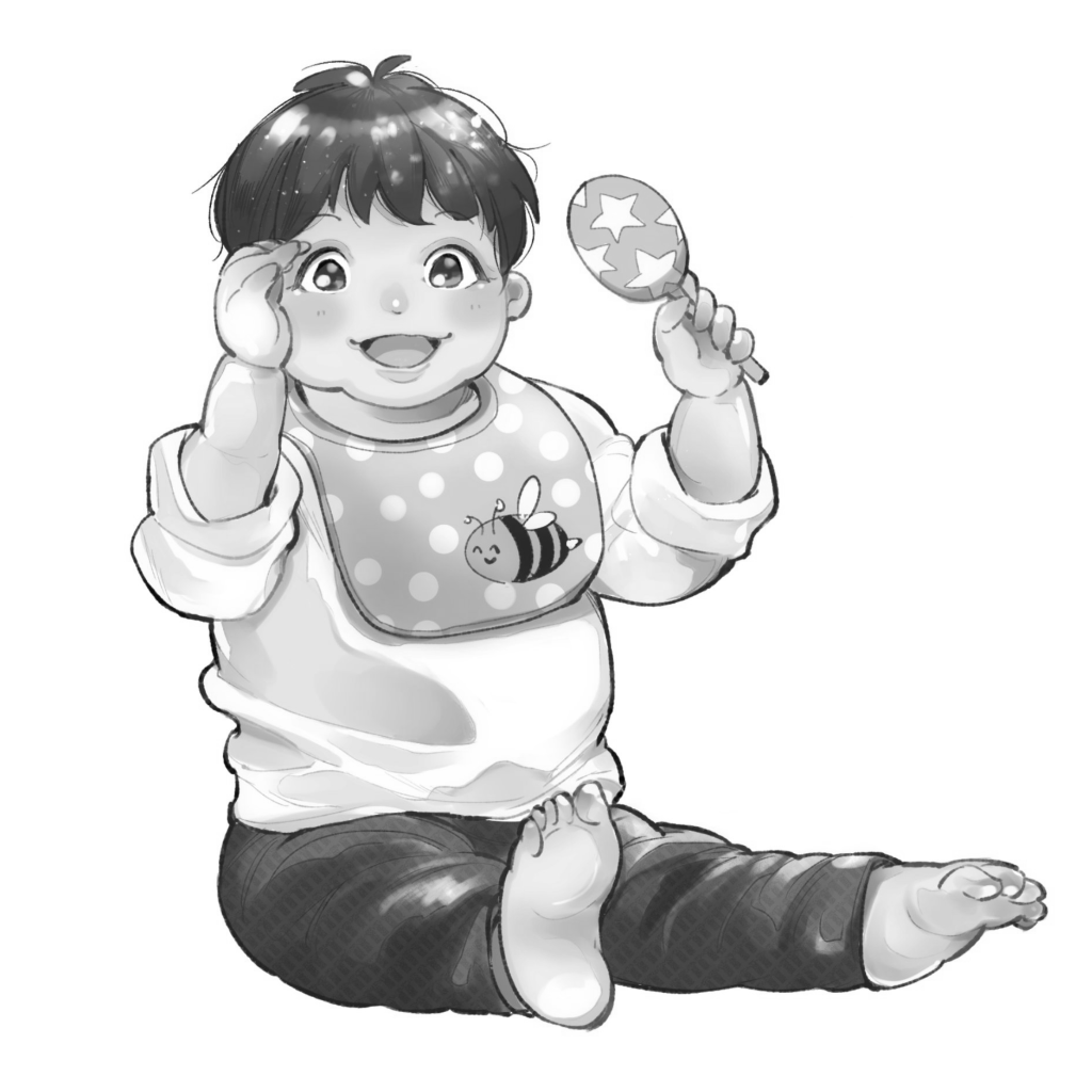
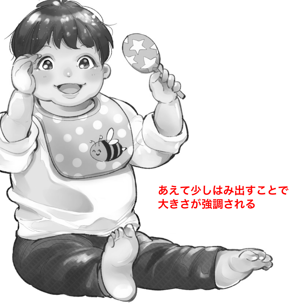
By protruding, you can make the motif look larger than it would have if it had fit on the screen.
The overhang also makes the viewer’s imagination run wild, wondering, “What’s beyond this hidden part? It can also stimulate the viewer’s imagination.
It is also a great way to create a mysterious picture.
3) Let’s make it slanted!
When you want to create a picture with movement, we recommend compositions that make use of diagonal lines.
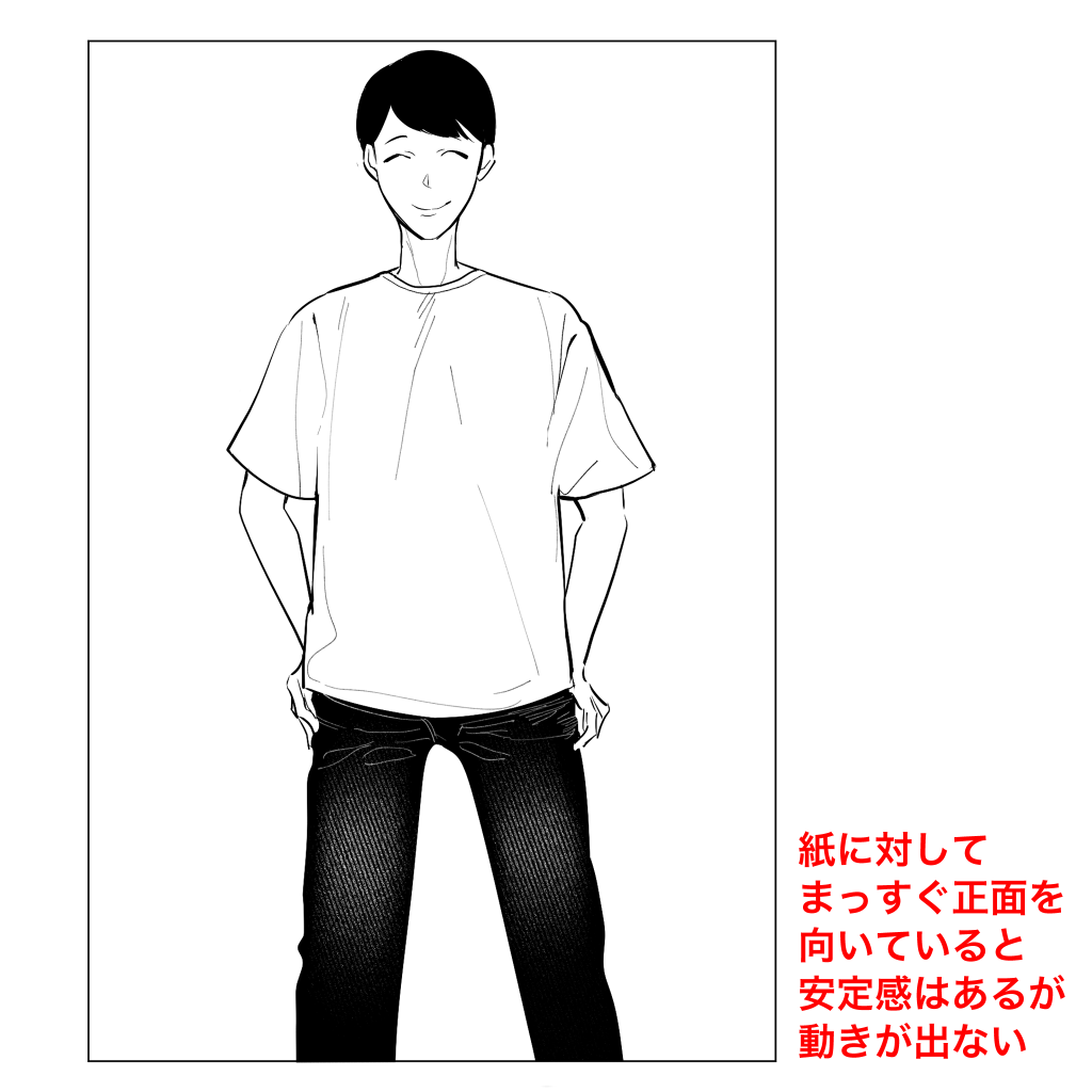
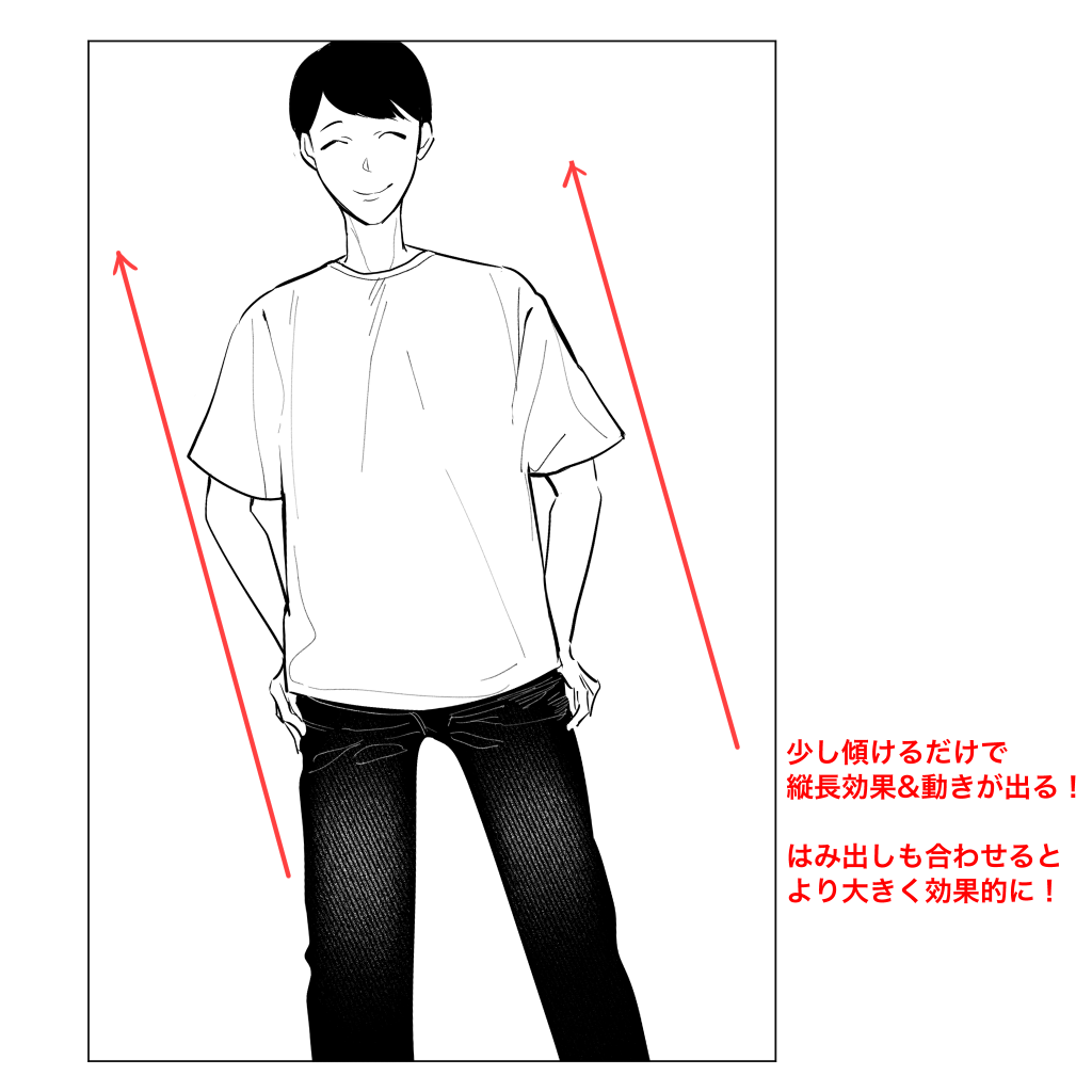
While a front-facing picture gives an image of stability and quietness, an oblique picture emphasizes a slight instability and movement.
Also, in the case of portraits, the slanted position creates a vertical effect.
It’s a very standard composition and many people use it, but if you’ve done your best to draw the whole body and you just want people to see it! I want to emphasize it! If you want to emphasize it, this is the way to go.
4) Emphasize the part you want to show!
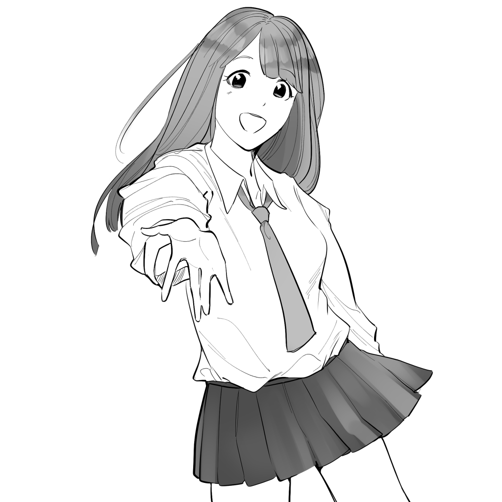
I drew a girl in a pose holding out her palm.
It’s cute on its own, but it’s too tidy and not very memorable.
When drawing an illustration, first think about “What do I want people to see most in this picture? .
I want to make the hand I hold out look the biggest! .
I want people to see the embarrassed face when I hold out my hand! .
…Even with just these two patterns, the points you want people to see are different, aren’t they?
If the point you want to show changes, the composition will naturally change as well.
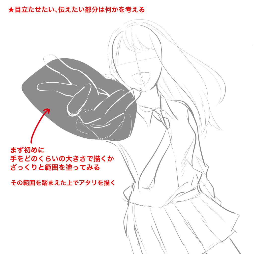
The recommended method is to decide the placement of the part you want to look the biggest first.
Before making an Atari, use a solid color pen such as a marker to fill in the position and area where you want to draw a large image.
In this way, you can emphasize the parts you want to emphasize to the fullest and adjust the other elements conservatively to get a good balance.
In this case, I wanted to draw a large palm, so I used this area of the screen as the palm space.
Then, draw the other parts of the body and face.
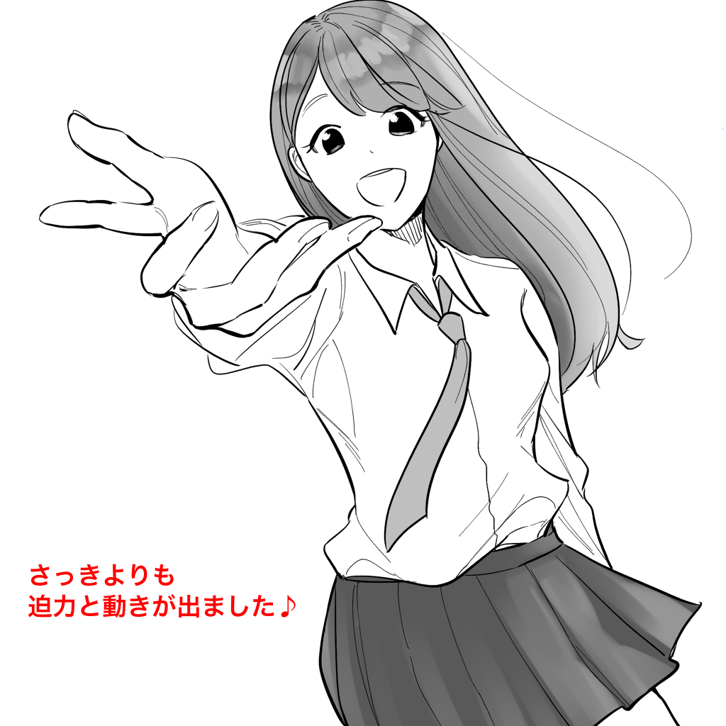
You can apply this technique not only to the palm of your hand, but also to any part of your face, legs, arms, and accessories.
The drawing may be a little off, but the momentum of the emphasis is more important than the discomfort of the drawing, so minor deviations are not a problem.
This can be applied not only to body parts but also to emphasize clothing and accessories.
Above all, “This is what I want you to see! I like this part of the character! These feelings can be conveyed directly from the screen to the viewers.
This is a technique that I personally use a lot when drawing fan art.
5) Let’s place multiple people!
Now let’s take a look at a technique for placing multiple people in a single drawing.
I’ll give you a few examples so you can try to incorporate them!
Parallel images of the same size.
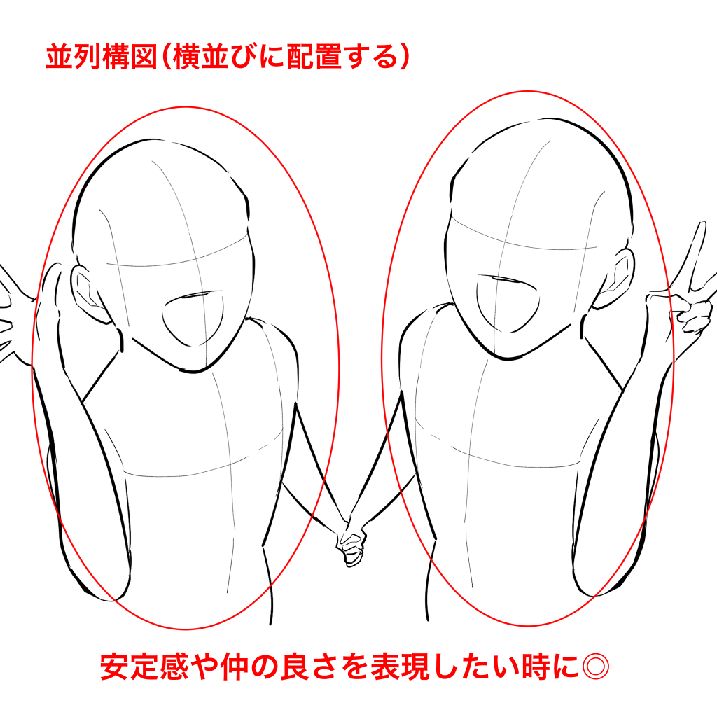
It is a good way to fit in and show friendliness and stability.
Make one of them bigger and one of them smaller.
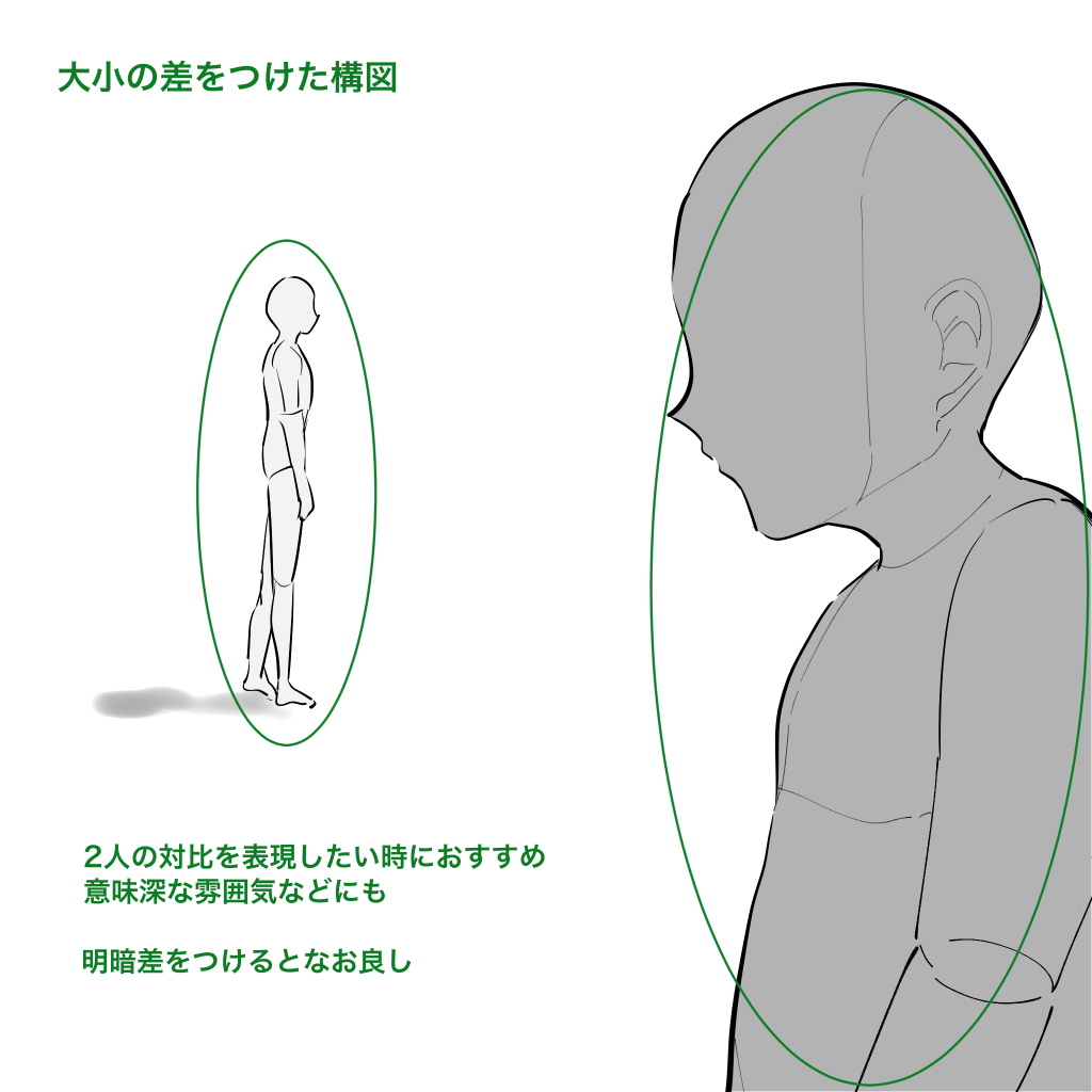
You can emphasize the person placed large in the foreground.
For example, when you want to show the contrast between two people’s relationship.
Triangle composition.
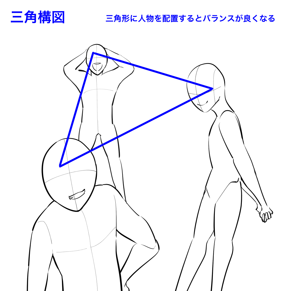
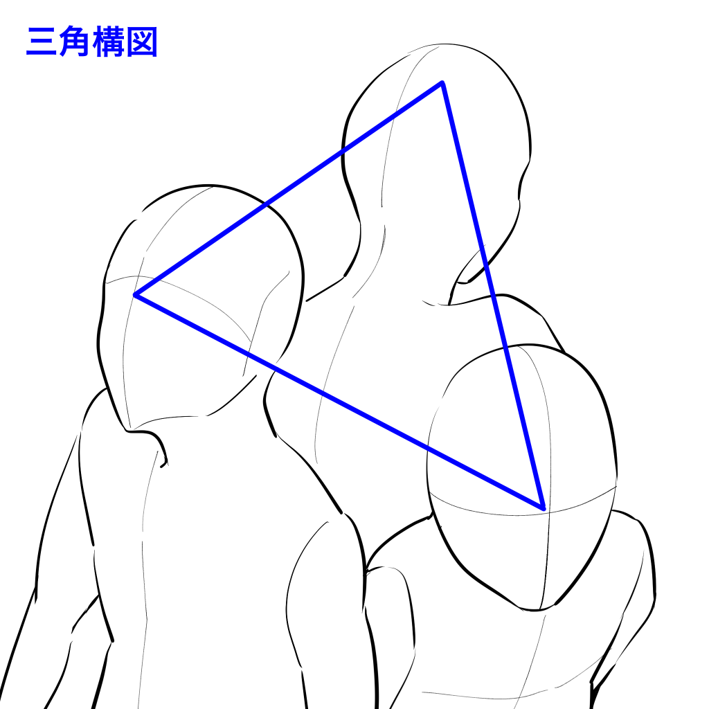
The triangular composition is recommended when placing three people.
By placing each person in a triangle, you will be able to fit them neatly.
This is just one example of a composition technique.
…There are many more compositional ideas that I can’t cover here.
I recommend that you take a photo and stock it!
It can be a selfie, a family member, or a friend.
You can take selfies, family members, friends, etc. Think of the camera as a campus, and take pictures with different angles, angles, and sizes, and get ideas from them.
Anyone can easily do this with a smartphone, and it can broaden your range of expression, so please give it a try!
(Text and pictures by Naoko Hara)
\ We are accepting requests for articles on how to use /


