2021.09.11
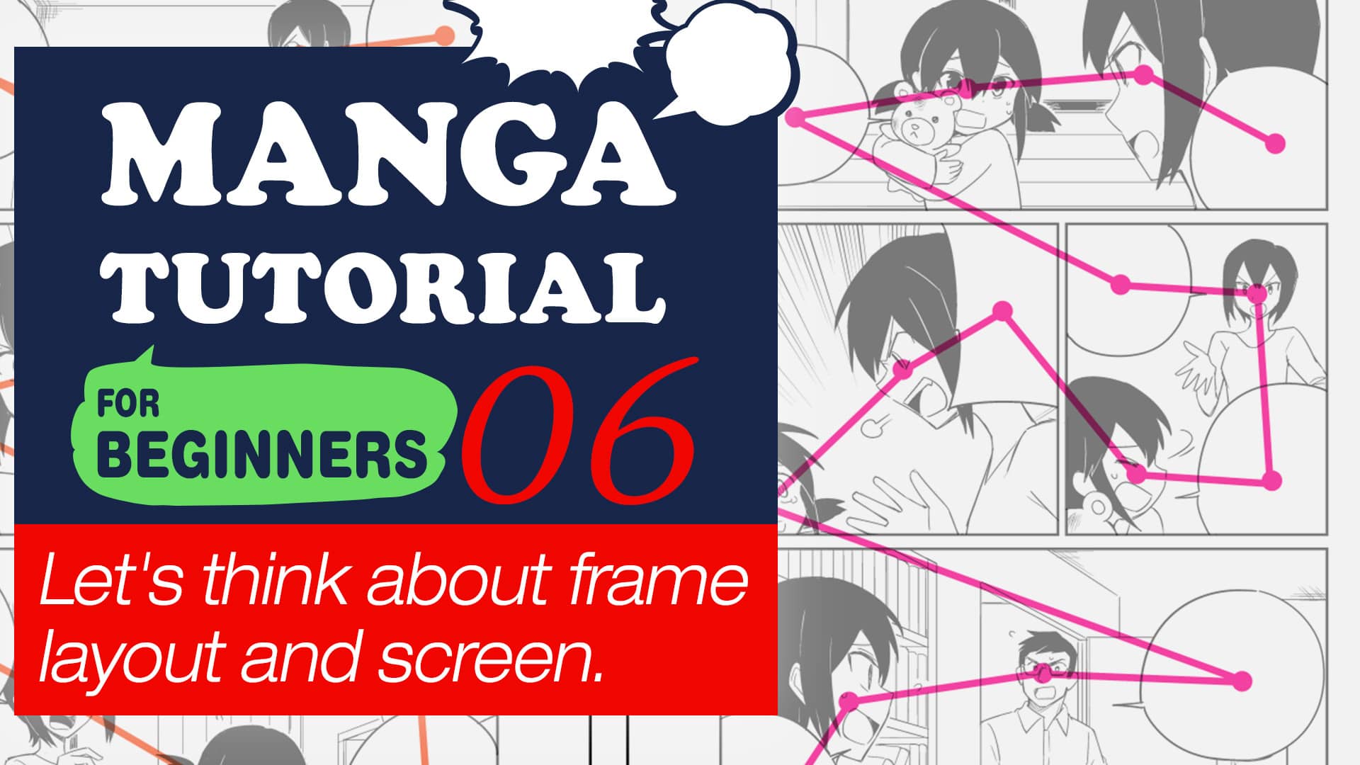
Manga Tutorial for Beginners 06 Let’s think about frame layout and screen.
Hello! I’m ГФ.
In this lesson I will explain on panel division, screen making (visual guidance, composition).
While the “name” is the working stage where you can read into the story while building it, it is also where you create the scenes in a manga. I hope this lecture can help you improve in brainstorming.
First I will explain on panel division.
Click Here for Previous Tutorials.
Manga Tutorial for Beginners 01 Process of Manga Making
Manga Tutorial for Beginners 02 Let’s Make Outline (Part 1)
Manga Tutorial for Beginners 03 Let’s Make Outline (Part 2)
Manga Tutorial for Beginners 04 Get Ready to Draw Manga with MediBang Paint!
Manga Tutorial for Beginners 05 Let’s Make Name(outline)
Manga Tutorial for Beginners 06 Let’s think about frame layout and screen.
1. Panel Allocation
For common Japanese mangas that read from right to left, you would read from the top right to the bottom left. You will divide the panels following this rule. For mangas that read from left to right, you will follow the panels from the top left to bottom right.
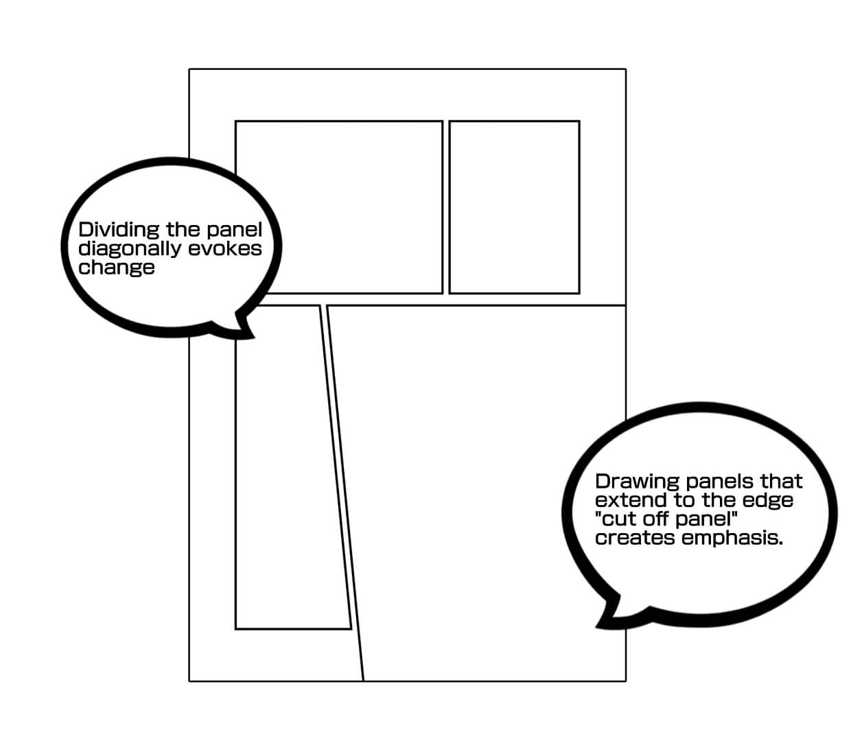
Manga panels are usually divided into rectangular shapes, but you can also divide them diagonally to illustrate action or tension effectively. For panels you want to emphasize the most, you can make it extend to the edge (This is called cut off panel or “Tachi-kiri”.
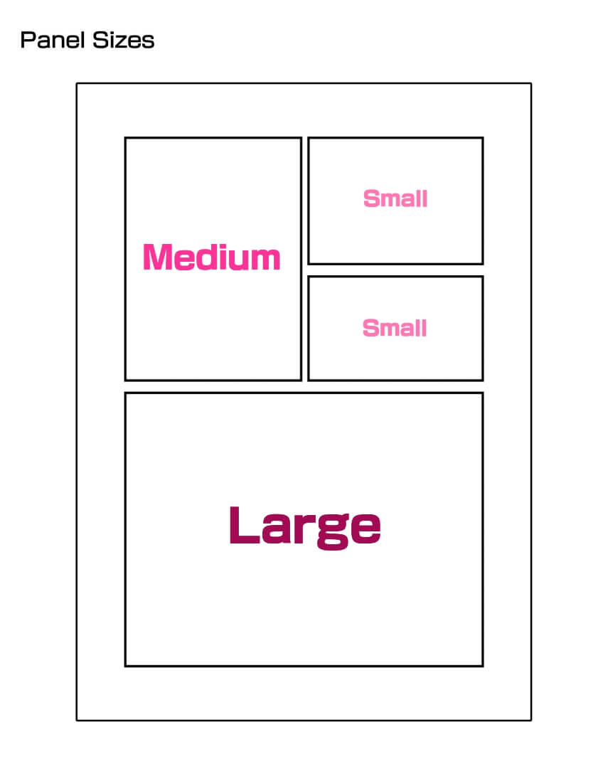
The manga panel sizes are relatively standardized in 4-Koma and essay mangas, but story mangas require many panel size variations so the story telling would not become stale.
It is important to give clarity in changing the panel sizes. Small panels should be small, and large panels should be obviously large. (The standard size of the largest panel will cover half of one page and will be easily recognizable. Make big panels to emphasize new character’s arrivals and climax scenes.
The number of panels on a page should be about five or six, and the number of columns should be three or four. If you have a page with a large, captivating frame (a frame that you want to make a big impact on), it’s okay to have two or three frames or even one frame. For pages with a lot of explanations, you may end up with eight to ten panels, but try to avoid making it hard to read by varying the size and composition of the panels.
You can also eliminate the frame of a panel, or punch out a panel and place a character, sound effects, or a text balloon. You may want to use this technique for scenes where you want to show off your characters.
Here are some examples of panel division
①Panel division for everyday scenes
This is an everyday scene before the start of a journey. The panel number is just right with five total, and the panel shapes are square because there are no shocking scenes.
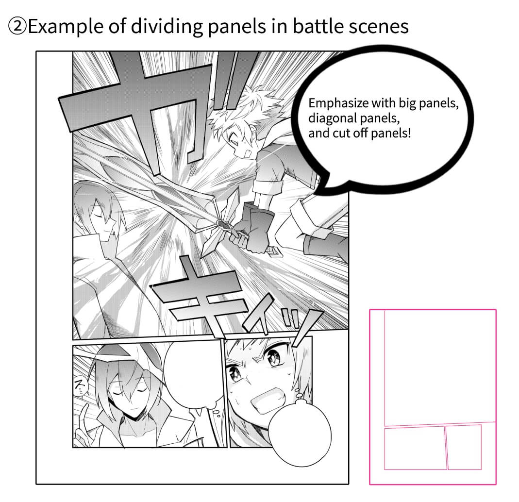
②Panel division in battle scenes
Here the panel is cut off and covers half of a page to make the protagonist’s attack scene stand out.The panel is also cut diagonally to illustrate action.
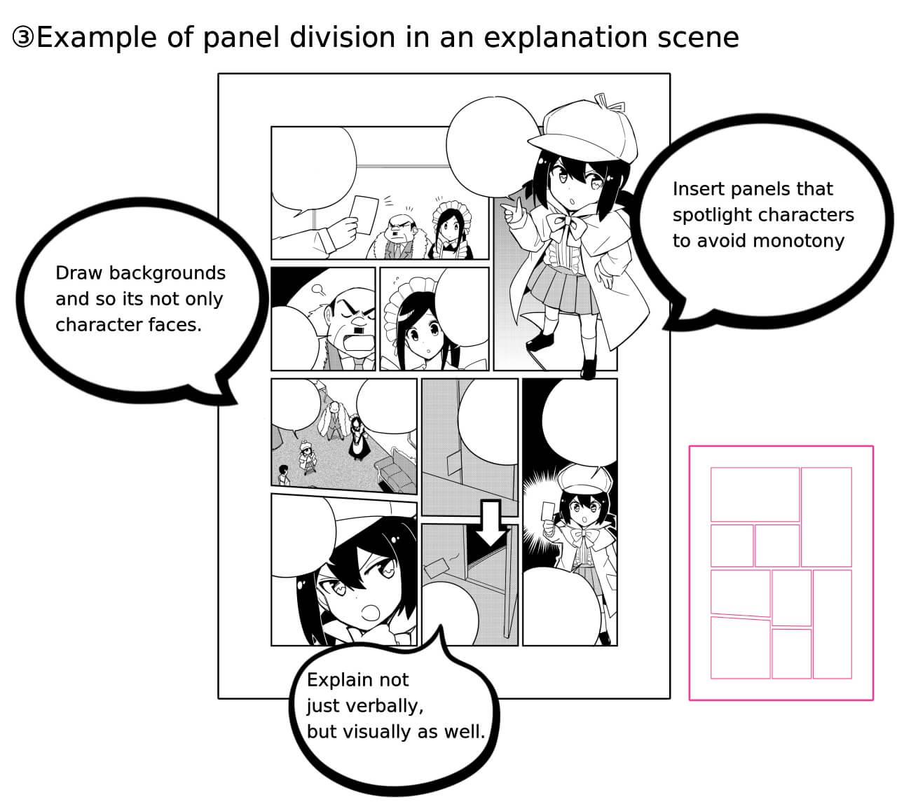
③Panel division for explanation scenes
Explanations for detective deductions can become long. Even 9 panels are a lot. Avoid monotony by giving fresh changes by explaining visually, changing composition, and making characters step out of panels.
2 Visual Guidance
You cannot forget text balloon, character location, linework, and drawning composition along with panel division to create readable manga.
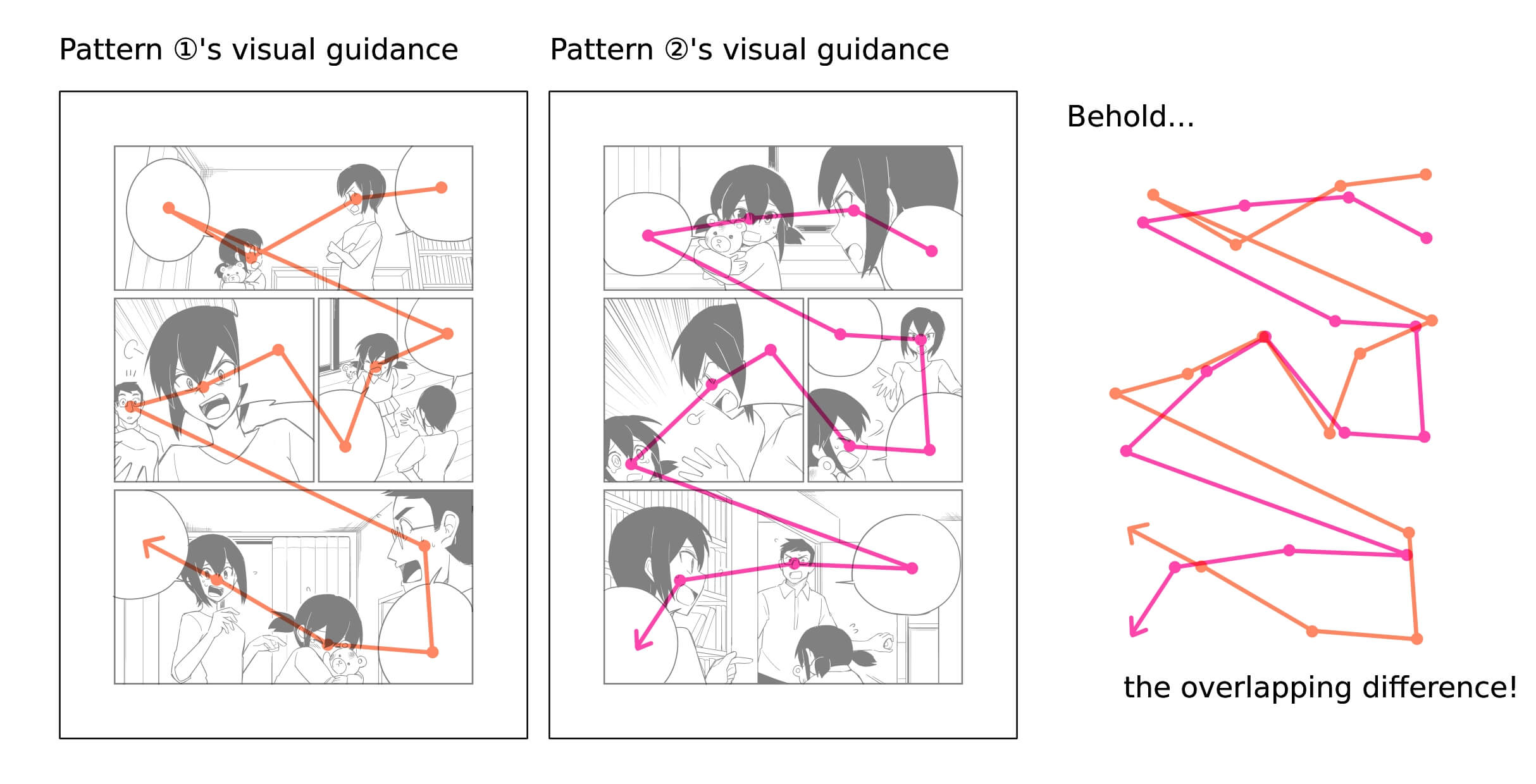
Even when you are reading manga casually, the readers’ line of sight tends to focus onto certain elements. The text balloons and characters’ faces catches the readers’ eyes. You can learn from this that you can control the readers’ eyes to a certain extent if you place these elements skillfully (this is called visual guidance).
Conspicuous for readers… text balloons, character faces, center linework, drawing texts Inconspicuous for readers… backgrounds, faceless characters
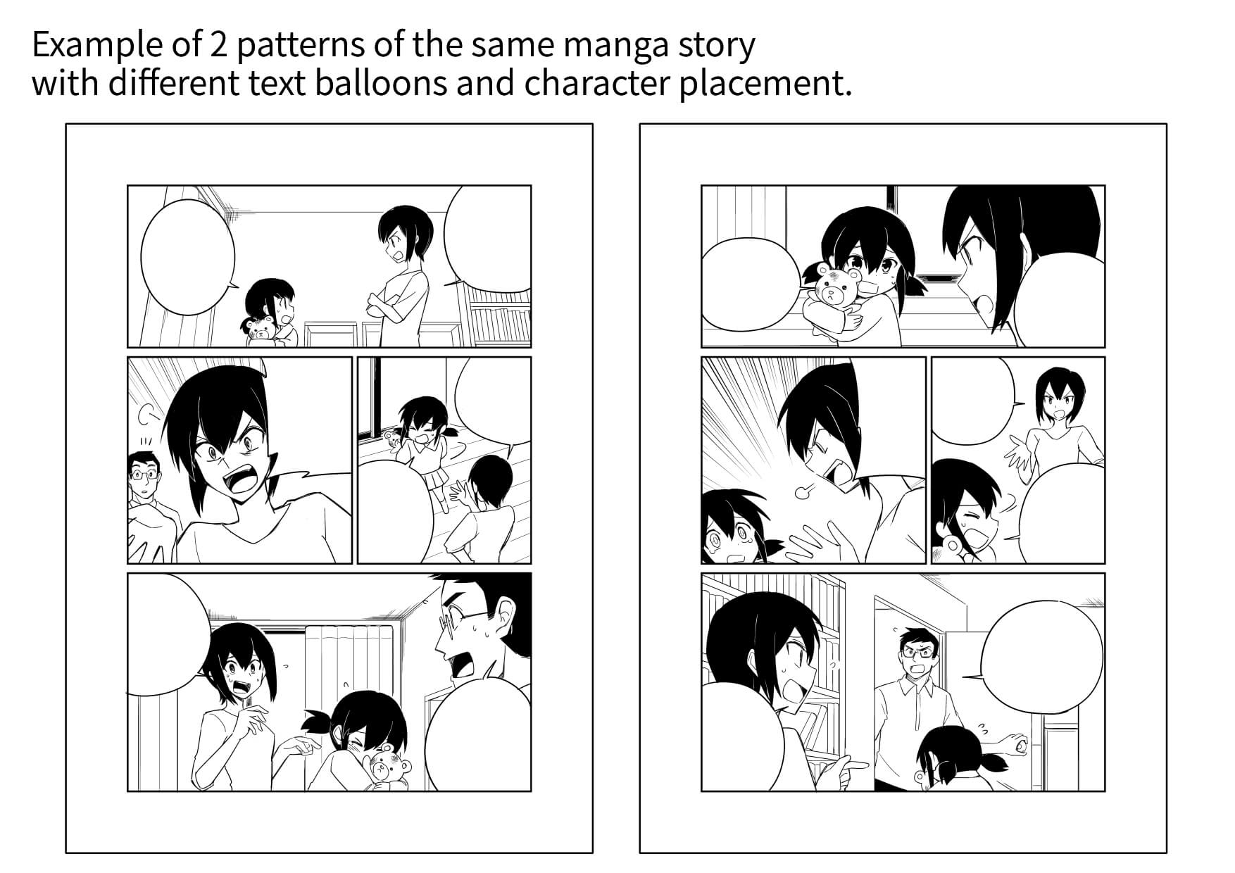
For example, even in the same panel layout, the way the readers’ eyes move will change depending on how the elements are arranged.
The trick for visual guidance is to first lay out the basic route for the readers’ eyes by placing the text balloons and the character’s faces, and then place another layer of informations on top of that, so you can decide what you want to show naturally (you will be able to draw while keeping in mind of the readers’ eyes after many practice).
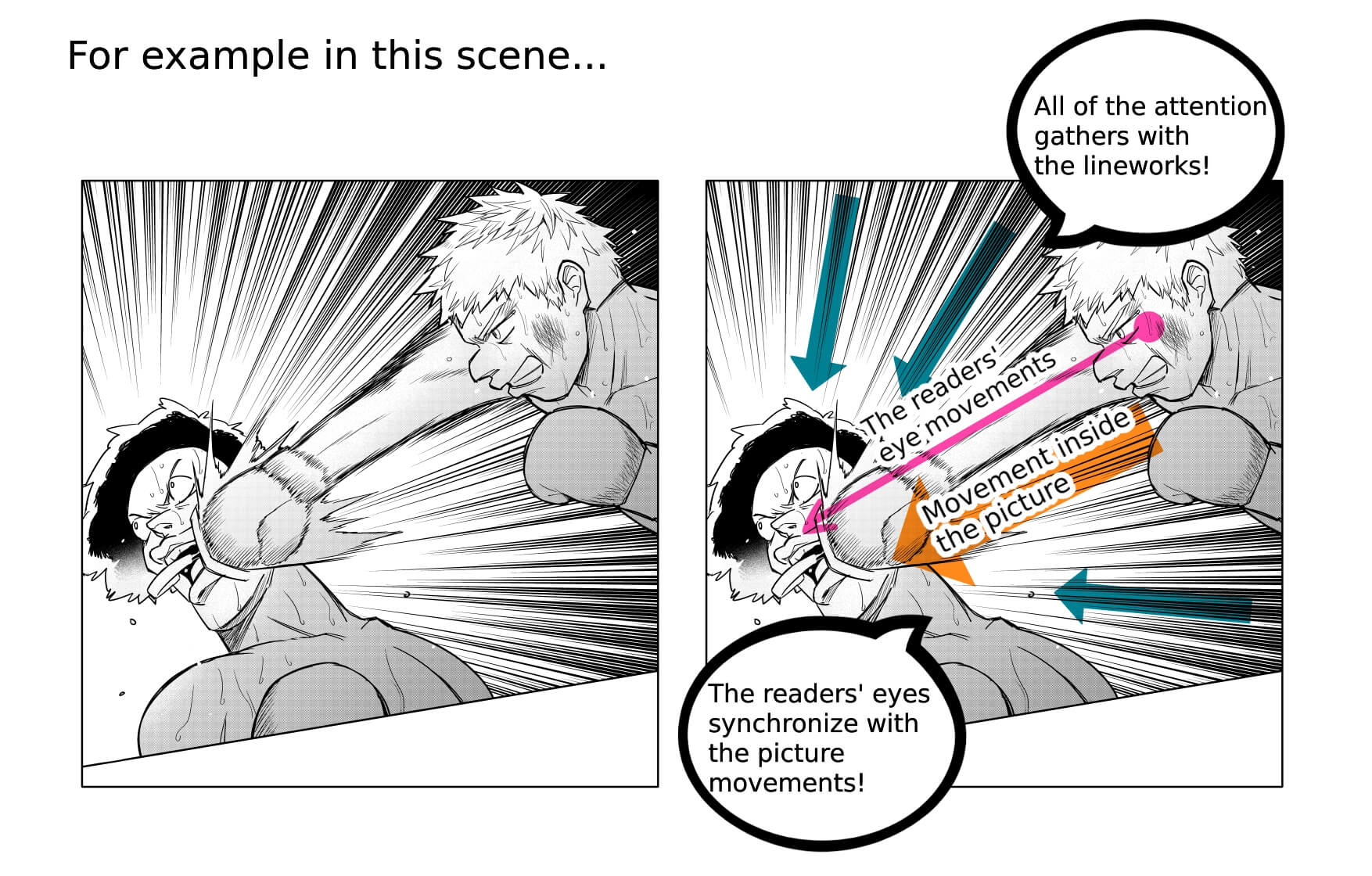
When expressing movement, if you draw the lineworks as if it is moving in the same direction as the action, it will synchronize with the reader’s eye movement and add a sense of dynamism to the picture. The trick is to draw the line in the same direction as the eye movement.
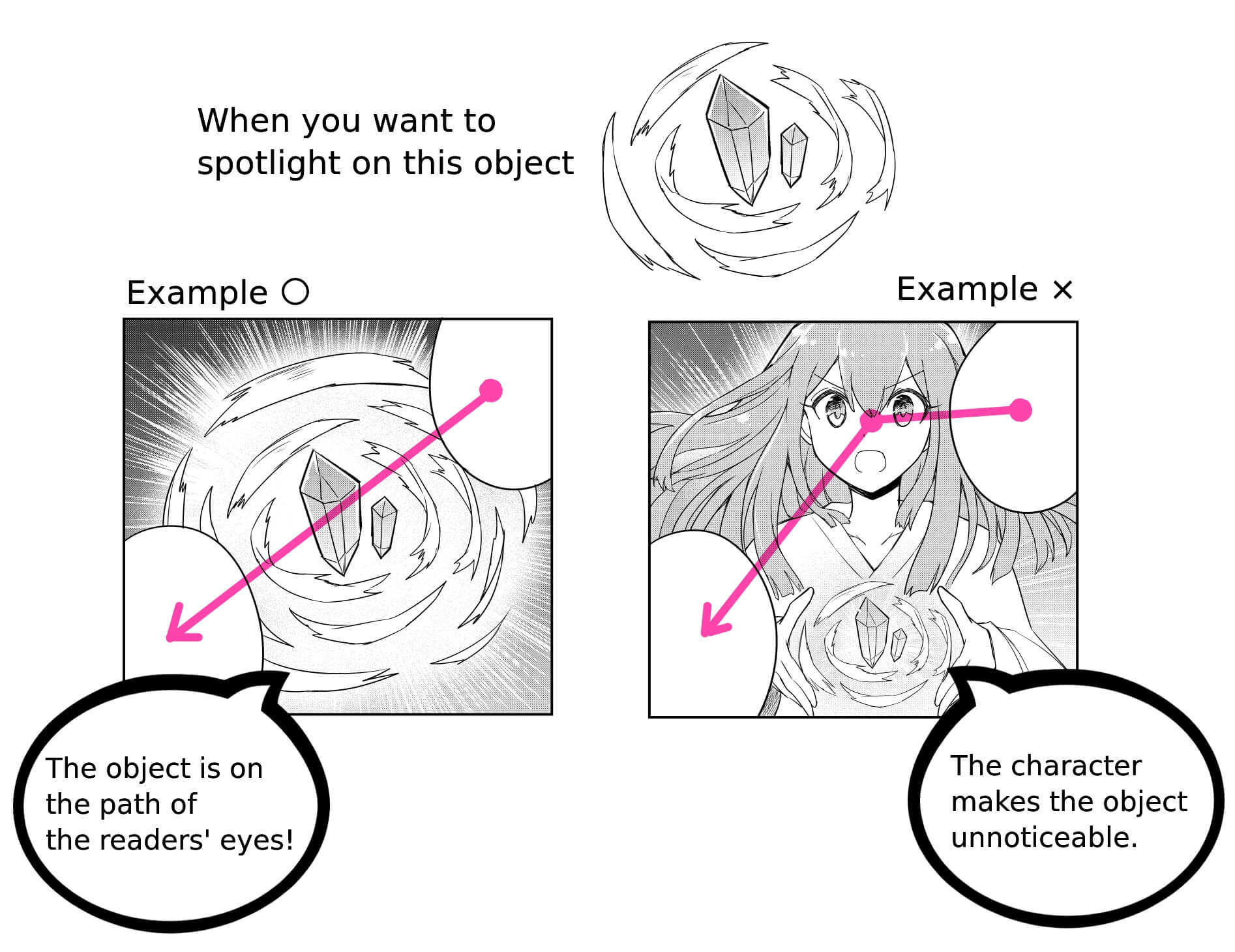
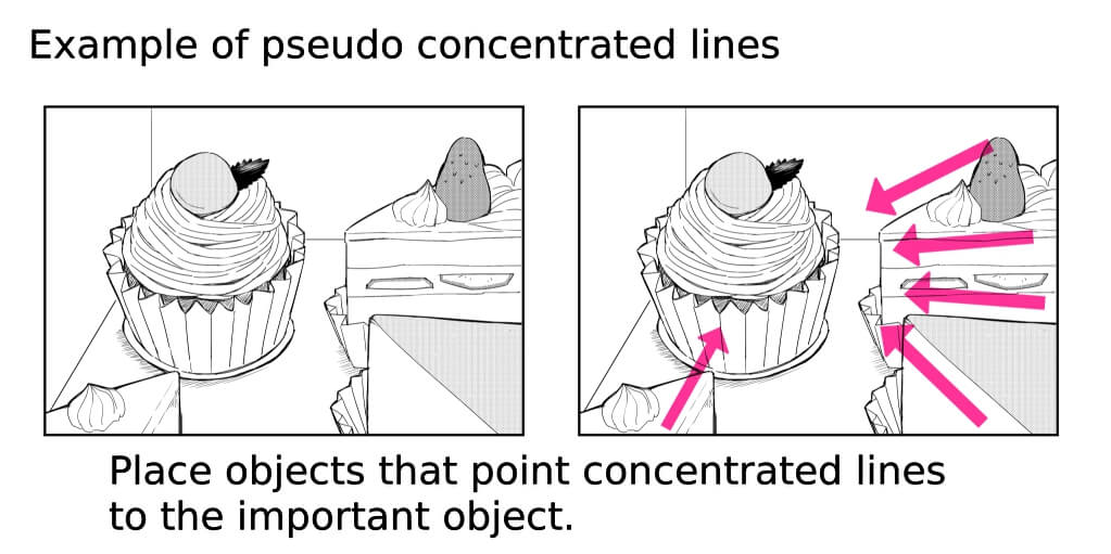
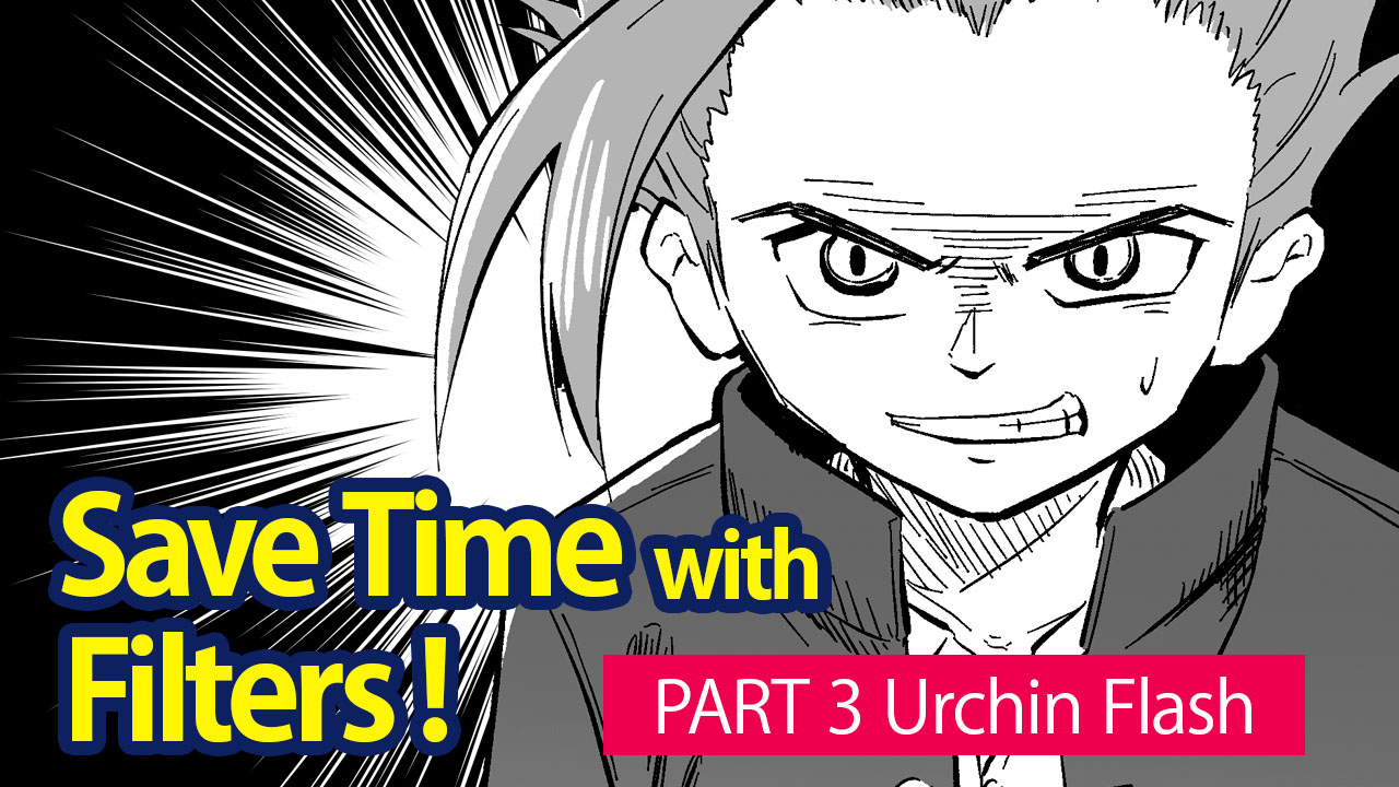
Concentrated lines and flashes direct the eye to the object at the lines’ center. Even if the panel doesn’t have concentrated lines, you can create a pseudo-concentration line by arranging objects to direct the readers’ attention to the center object.
3. Composition
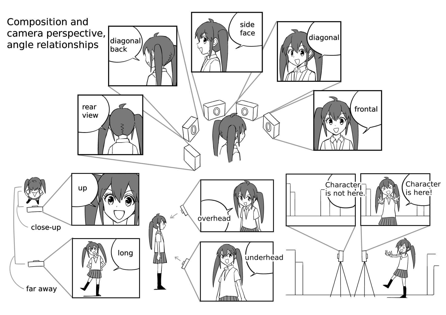
As for composition, it is similar to the panel layout. It will look monotonous if you keep using the same angles and the same characters. So avoid using the same composition repeatedly (but you can still use a monotonous composition to illustrate the passage of time).
By effectively switching between frontal, diagonal, side face, diagonal back, and rear views of the character, close-up and long, overhead (top angle), underhead (bottom angle), and in-between, you can create wide changes in prespective.
Bust shots and long panels depict the surrounding background and can explain the story stage and the character locations. If all you see are close-ups of the characters’ faces, it will be difficult to understand the situation of the story, so try to use long angles moderately to show where and when the characters are.
How was this lesson?
The examples shown here are just a few. When you read comics drawn by other people, you may discover something new if you pay attention to how they divide the panels and how they use visual guidance and composition.
In the next lesson, we will go over the points to keep in mind when creating the manuscript before beginning the illustration.
Click Here for Previous Tutorials.
Manga Tutorial for Beginners 01 Process of Manga Making
Manga Tutorial for Beginners 02 Let’s Make Outline (Part 1)
Manga Tutorial for Beginners 03 Let’s Make Outline (Part 2)
Manga Tutorial for Beginners 04 Get Ready to Draw Manga with MediBang Paint!
Manga Tutorial for Beginners 05 Let’s Make Name(outline)
Manga Tutorial for Beginners 06 Let’s think about frame layout and screen.
「ГФ」
ART street
Click here for the collection: https://medibang.com/u/seledkapodshboi/
You can read my manga here → https://medibang.com/book/0c2101280307258390018866367/
This is also a manga that I draw under a different name. → https://medibang.com/comics/official/dobs340000005872400000000000a/
twitter: https://twitter.com/seledkapodshboi
\ We are accepting requests for articles on how to use /


