2023.03.22
Manga Tutorial for Beginners Vol.15: Add tones

Hi, this is “ГФ”.
Today I’m going to show you how to add manga tones in MediBang Paint.
What is “tone” in the first place?
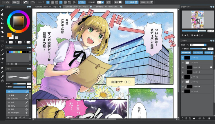
If you’re a manga reader, you’ve probably noticed that some manga drawings are painted with tiny dots.

These are the tones (screen tones).
Screen tones in analogue manga creation are transparent sheets printed with dots as above or various patterns. These are used to be pasted onto manga manuscript paper.
By using them, you can avoid having to draw all the patterns yourself, and the process of creating manga becomes a lot easier.
Analogue screen tones are the consumables and you have to buy them when you run out (and each tone is a bit expensive!). They also produce a lot of waste in the process of trimming the tones, and they are difficult to modify once they have been glued to the manuscript. So analogue tones are cumbersome.
With digital painting, you don’t have to worry about tones, waste paper and modifications. You can use tones much more freely.
Basic things to know about tones
Screen tones are divided into two categories: Halftones, which are made up of regular, lined up dots, and Pattern tones, which have patterns or illustrations.

The appearance of net dots are defined by the values of its “Lines (L)” and “Density (%)”.
For example, the setting “Lines: 60L, Density: 10%” means that “60 dots in a length of 1 inch (25.4mm), arranged for 10% of an inch (25.4×0.1=2.54mm, 2.54÷60=0.0423mm for the size of each dot)”.

The side length of the orange square in the image above is 1 inch, and the number of dots it contains is 60, as you can see below.

If you only change the value of the lines to “Lines: 30L, Density: 10%”, this means “30 dots in a length of 1 inch (25.4mm), arranged for 10% of an inch (25.4×0.1=2.54mm, 2.54÷30=0.0846mm for the size of each dot)”. The number of dots is reduced by half and the size of the dots is doubled. It looks as if the setting “Lines: 60L, Density: 10%” was enlarged two times, yet its density remains the same.


Next, If you only change the value of the density to “Lines: 60L, Density: 20%”, this means “60 dots in a length of 1 inch (25.4mm), arranged for 20% of an inch (25.4×0.2=5.08mm, 5.08÷60=0.0846mm for the size of each dot)”. In other words, the number of dots doesn’t change, but the size of the dots doubles. It looks as if the setting “Lines: 60L, Density: 10%” has become two times darker.


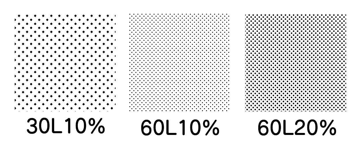
From the above, you can understand the following:
・If you set the density (%) and only change the lines (L), the number and size of the dots will change (the apparent scale size changes, but the density remains the same).
・If you set the lines (L) and only change the density (%) , only the size of the dots will change (the apparent scale size remains the same, but the density changes).
So in the actual creation scenes, you can think of the value of the lines (L) as indicating “the scale size of the tone” and the density (%) as indicating “the density of the dots (tone depth)”.
As the value of the lines (L) increases the tone appears to have been zoomed out, and the smaller the line value, the larger the tone appears.
As the density value (%) increases the tone becomes darker, and as the density value decreases, the tone becomes fainter and paler.
In most Japanese manga, the line value is set to 60L, so if you have trouble deciding, set it to your tones.
You can also use the settings in different ways, such as “the smaller line value for objects in close proximity or with a rough texture” and “the larger line value for objects in far distance or with a smooth texture”.
About “moiré pattern”
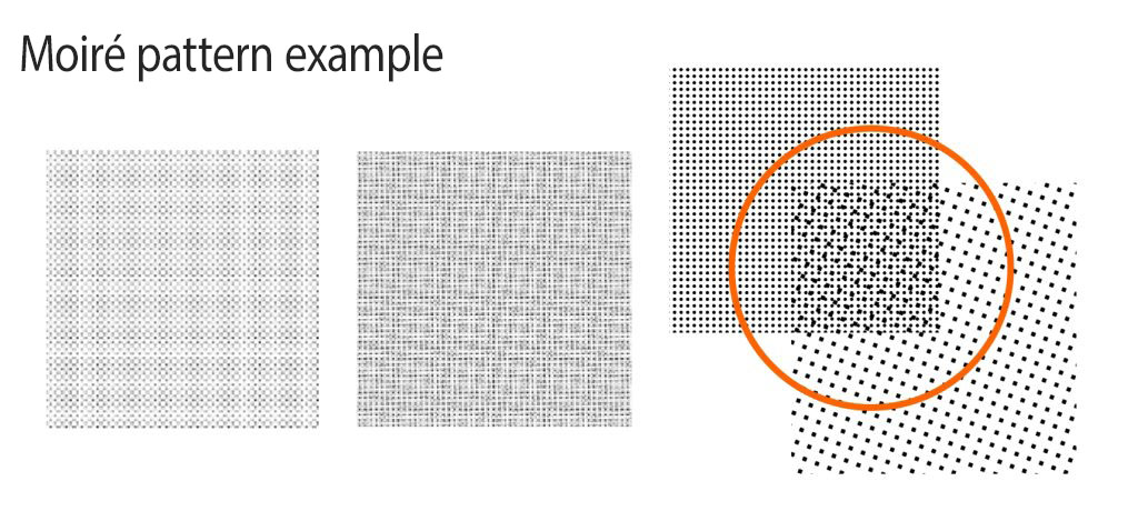
As you zoom in and out halftones, the arrangement or shape of the dots can change, creating unintended patterns. This pattern is called moiré. Moiré can also occur in digital painting when the rasterized halftones are zoomed in and out, or when they overlap with other halftones or areas painted in grayscale.
▼Read the previous article to learn more about moiré patterns.
Manga Tutorial for Beginners 07 Considerations when setting up the canvas.
Now that you have a basic knowledge of tones, let’s move on to see how you can add tones to your works in MediBang Paint!
Adding net dot tones: How to use halftone layers
On the “halftone layer”, you can add tones as if you were painting in colors.
For adding halftones in MediBang Paint, this layer is very useful.
I will show you how to add halftones neatly on the halftone layer.
First, add a new halftone layer under the line drawing layer.
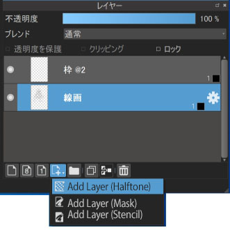
When you click on “Add Layer (Halftone)”, a window will appear. Enter the desired line tones and density values.
I have set “Lines: 60, Density: 10%” this time.
※If you are creating on a 600 dpi canvas, “set tone depth” is automatically checked. If it is not, you should check the box.
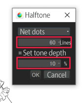
You have now created a halftone layer. By painting over the areas where you want to add tones with the bucket or brush tool, you can add halftones as if you were painting colors.

Once you have done adding the tone, press the cog icon on the right of the layer name to open the “Layer property” window, then select “Don’t halftone” and choose the random color.
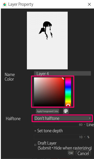

Now the areas where the halftone is added will become the 8 bpp layer in a color of your choice. You can check to see if you’ve missed any areas.
After confirming, set the layer back to the previous black halftone (as for me, I start painting on 8 bpp layers and switch to halftones later).


Switch to the 1 bpp layer if you want to see the final look of your work, or if you want to erase the area where the halftone was added. Remember that once you have changed the layer to 1 bpp, the only way to change it back to the halftone layer is to use the Undo command.
If you want to paint more after switching the layer to 1 bpp, you can create a new halftone layer with the same line and density values, paint the additional area, switch the layer to 1 bpp and merge the layers. This method allows you to overlap the layers without any dot gaps (unfortunately, if you have changed the tone placements, you will have to create the layer again).
Scraping tones

If you want to blur the edges of the halftones after adding them, you can blur them with the transparent color brush.
This cannot be done on the halftone layer, so convert it to 1 bpp.

This time I used the “Airbrush” with the transparent color, but you can try other brushes as the appearance of the blurred tones can vary depending on the type of brush.


▼Read this article to see the difference brush types make.
Highlighting Hair in MediBang Paint
Adding pattern tones: from the material list
Pattern tones or gradient tones can be added from the material list.
Add a new 1 bpp layer for the tones and use the select tools to select the area where you want to add the tones.
Use the Magic Wand tool for the broad area and the Selection Pen or Selection Eraser tool for the detailed area.
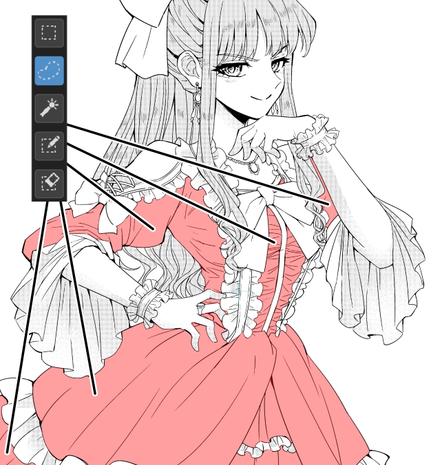
Press the material icon ![]() in the top left to open the material window. Select the tone you want to add and drag it onto the canvas.
in the top left to open the material window. Select the tone you want to add and drag it onto the canvas.
This time I’ve chosen the “60L 70% gradation” (to avoid moiré, don’t change the scale and paste as is).
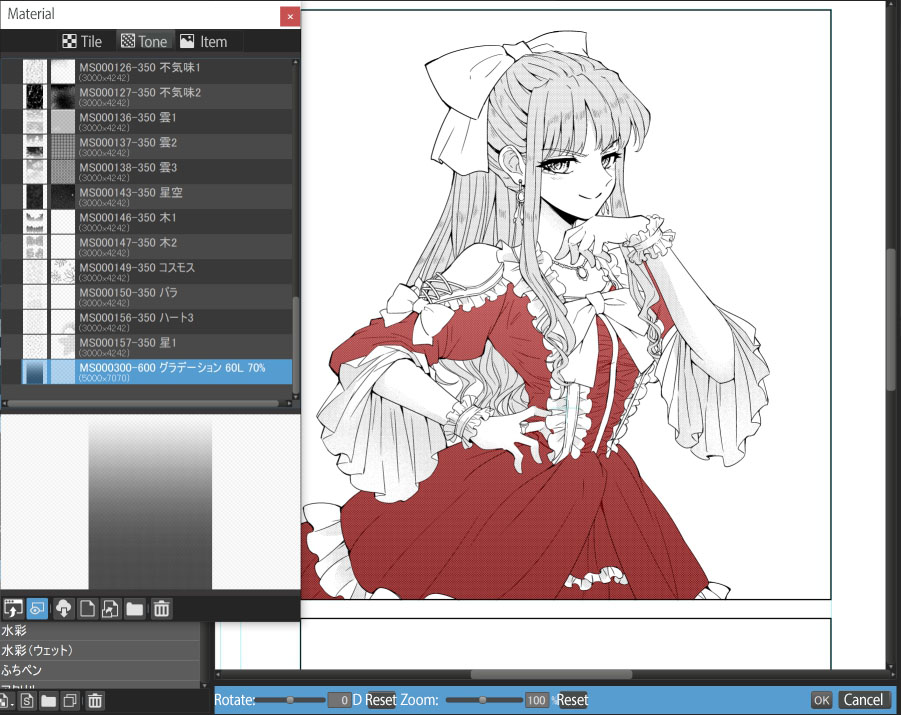

As well as the pre-installed materials, you can also choose tones to suit your needs or preferences from the Cloud materials, where you can find different types of pattern or gradient tones. The gradient tone I used in the article was also downloaded from the cloud.
▼Read this article to learn more about downloading materials from the cloud.
Just so you know, the cloud materials in MediBang Paint are open for commercial use.
※See this article to learn more about the scope of use of MediBang Paint content.
Especially FAQ #04 Regarding the range of authority of the use of MediBang Paint Contents
Using the Stencil layer to adjust the position of tones with patterns or gradients
After adding pattern or gradient tones, you may find yourself thinking “I should have added it a little higher” or “I should have added that pattern tone…”.
Re-selecting areas for tones from scratch can be exhausting, especially if the shapes of the selected areas are detailed.
That’s why I recommend you to use the Stencil layer when you add pattern or gradient tones to detailed areas.
The Stencil layer, unlike the Mask layer, allows you to make illustrations drawn under the layer visible by drawing the Stencil layer in black.
So you can adjust the position of pattern or gradient tones.
First, add a new 1 bpp layer and add a pattern/gradient tone from the material window. You don’t have to select an area for the tones if you’re using the Stencil layer.

Then, click on the “Add Layer (Stencil)” with the tone layer selected to create the stencil layer on top of the tone layer. At this point, the tone layer will be invisible on the screen.
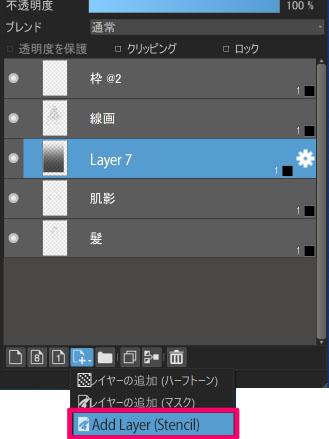

On the stencil layer, paint the area where you want to add the tone in black. You will see the tone under the stencil layer where you painted. Now all you need to do is paint the area where you want to add the tone.
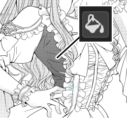

Use the Move tool to move the tone layer after painting to adjust the tone position.

Even if you feel like adding other tones, you can share the painted stencil area with other layers, by adding a new layer and tone, and dragging the stencil layer over the tone layer.
If you have added tones by selecting areas, you can turn the selected area into the stencil by adding a new 1 bpp layer, painting the selected area, and merging the layer with the stencil layer. But you can do this only if you can go back to the stage where you were selecting areas by “Undo” (if you can’t go back, that’s too bad you have to accept the circumstances).
Creating your own gradient tones
If there are no gradient tones in the material list that you want to use, you can create your own.
You can create gradient tones with 60 lines by applying the gradient tool to a 1 bpp layer.
And also you can create circular gradient tones by setting the gradient shapes to “Circular”.
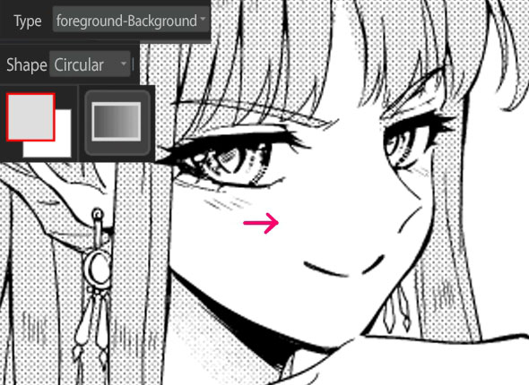

If you want to create gradient tones with lines other than 60, use the Halftone layer.
Add a new halftone layer and set the line values to your liking.
Deselect the “Set tone depth” check box.
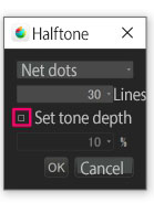
Apply the gradient tool to the created halftone layer and create a gradient tone with the lines you’ve selected.
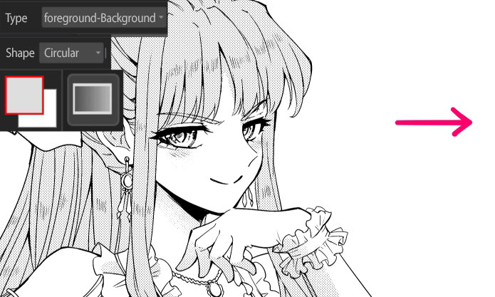

Convert the layer to 1 bpp if you want to see what the canvas really looks like, or erase the area where you’ve added the halftone.
Converting color layer brushes to tones
There are a variety of brushes available in the app cloud, and many of them are so cute that you might want to add them to your manga. However, most of the brushes are not capable of being added to 1 bpp layers in their original settings.
Using the halftone layer makes it possible to turn brushes into tones.
Add a new halftone layer and choose the tone lines, then uncheck the “set tone depth”.

Paint on the halftone layer with a brush of your choice (I use the “Hand drawn sparkle U1” brush with a slightly adjusted parameter).

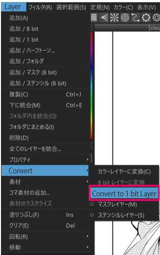
After the painting, open the “Layer” menu, select the “Convert” and convert the layer to a 1 bit layer. Now the area where you’ve painted with the brush turns into the tone with the selected lines.

In the same way, you can turn photos into tones by opening the photo in the other canvas or layer and copying and pasting the tone onto the halftone layer.
I have added the tones also to the ribbons or eyes and decorated the background with the “Rose U” brush. Now we’ve done.

Add tones to each panel in this way, and after you have added them to every page, your manga is almost finished.
Make the process efficient by thinking creatively; for example, if there are panels that need the same tone, you can add the tone to all the panels on a page at once.
This is the end of today’s tutorial.
Read these articles to learn more about tones.
Express your character’s emotions with tones!
So far, we’ve looked through all the processes of manga creation. The end of this tutorial series is near.
The next tutorial will be about “Exporting and Publishing”!
Click Here for Previous Tutorials.
Manga Tutorial for Beginners Vol. 01: Process of Manga Making
Manga Tutorial for Beginners Vol. 02: Let’s Make Outline (Part 1)
Manga Tutorial for Beginners Vol. 03: Let’s Make Outline (Part 2)
Manga Tutorial for Beginners Vol. 04: Get Ready to Draw Manga with MediBang Paint!
Manga Tutorial for Beginners Vol. 05: Let’s Make Name(outline)
Manga Tutorial for Beginners Vol. 06: Let’s think about frame layout and screen.
Manga Tutorial for Beginners Vol. 07: Considerations when setting up the canvas.
Manga Tutorial for Beginners Vol. 08: Let’s draw frames and speech bubbles.
Manga Tutorial for Beginners Vol. 09: Let’s draw people and natural objects
Manga Tutorial for Beginners Vol. 10: Let’s get the most out of brushes and materials
Manga Tutorial for Beginners Vol. 11: Let’s draw easy artifacts. (Not in perspective)
Manga Tutorial for Beginners Vol. 12: Let’s Draw a Room Interior in Perspective!
Manga Tutorial for Beginners Vol. 13: Let’s Draw Focus/Effect Lines and Letterings
Manga Tutorial for Beginners Vol. 14: Fill in with black
「ГФ」
ART street
Click here for the collection: https://medibang.com/u/seledkapodshboi/
You can read my manga here → https://medibang.com/book/0c2101280307258390018866367/
This is also a manga that I draw under a different name. → https://medibang.com/comics/official/dobs340000005872400000000000a/
twitter: https://twitter.com/seledkapodshboi
\ We are accepting requests for articles on how to use /


