2021.07.16
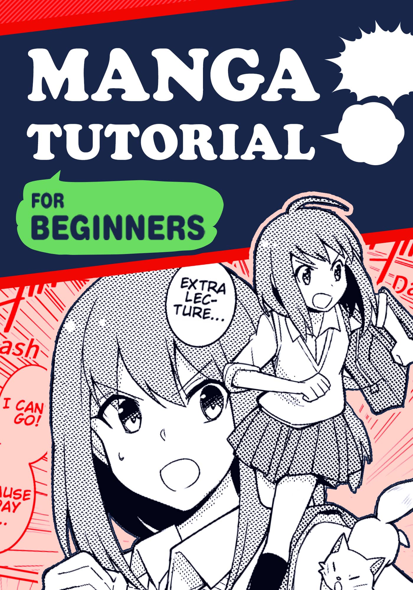
[For Beginners] Advertising Manga Artist’s Tips! How To Draw Reader-Friendly Manga.
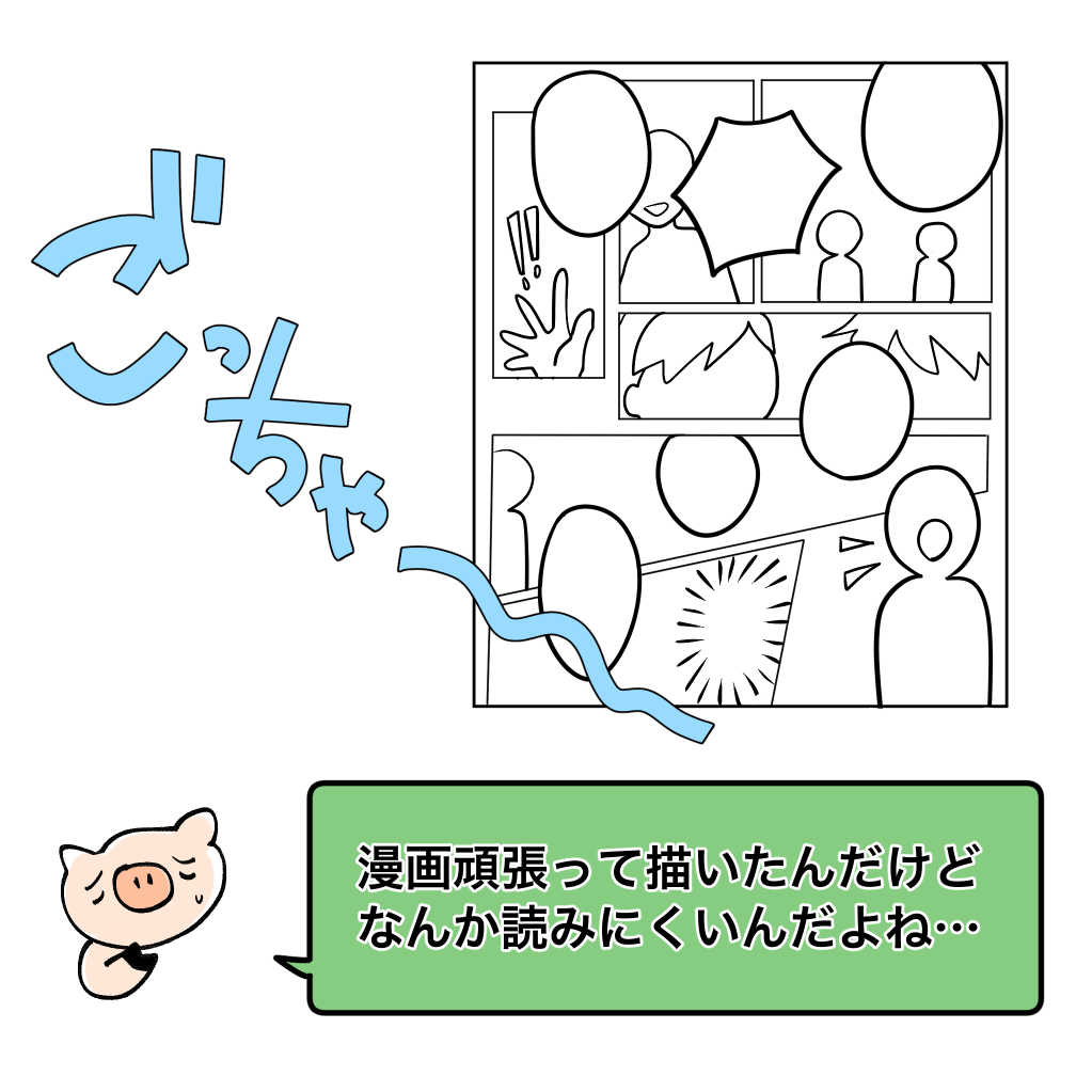
Do you enjoy publishing your work on the web, making doujinshi, or creating manga?
Some of you are even aiming to become professionals in the future!
When you draw your own comics, you may sometimes hit a wall where you think, “It’s kind of hard to read…” or “I’m getting better at drawing, but it’s not very good as a comic…”.
Here are some tips on how to make your manga more readable and easier to understand!
If you’re just starting out, I hope you’ll be able to adopt at least one of them.
1) Too many frames
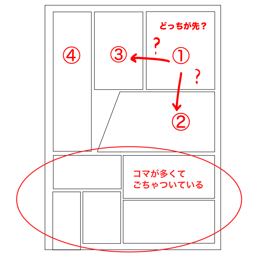
Take a look at the frame layout here.
There are too many frames, making it very difficult to read.
Also, it’s hard to know what order to read them in.
In drawing manga, not letting the reader get confused about the order of the panels is the most basic and important thing before drawing skills.
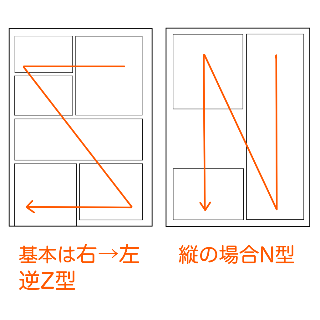
A typical story comic is read in the form of a reverse Z, starting at the top right, moving to the right, then left, then to the bottom, and then right, then left again.
When using a large vertical sesame seed in a production, we read in the form of an N.
Let’s place the frames so that they follow this line of sight.
・The maximum number of frames per level is about three.
→If you exceed this limit, the image will become very cluttered.
If you exceed this limit, the page will become very cluttered. It is also not a good idea to use too many small panels.
Try to keep a balance throughout the page, for example, “I used small frames in the top row, so I’ll make the bottom row bigger.
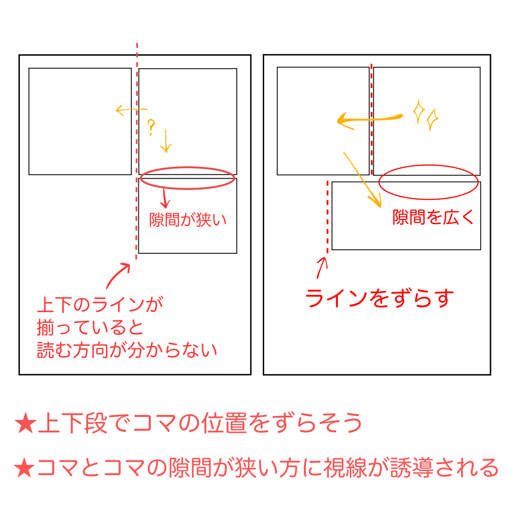
・Do not align the top and bottom panels.
→You will not be able to see the direction in which you are reading.
If you use a reverse Z layout, match the heights of the left and right panels, not the top and bottom.
・Changing the width of the gap between frames.
The eye is guided toward the narrower width of the gap between frames.
Use a narrower gap between frames for continuous scenes and a wider gap when you want to switch scenes.
2) Don’t overuse cut-off or deformed frames
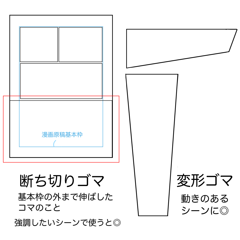
A “cut-off panel” is a panel that extends beyond the standard frame of a comic book manuscript paper.
It can make a picture look larger and more relaxed because it leaves more space outside the frame.
A “deformed frame” is a frame with a shape other than a square.
You can create movement by slanting or tilting the frame.
This is effective in sports and action scenes.
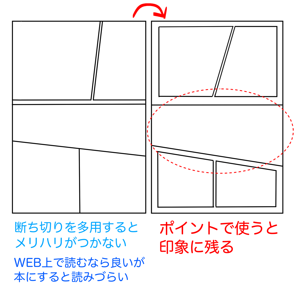
It’s tempting to use too many of them (and I do…).
The key to readability is to keep the basics within the basic frame.
If you use only one or two sesame seeds per page, it will be more effective to keep them within the basic frame.
If your manuscript is to be printed as a doujinshi, too many trimmed sesame seeds will make it difficult to read when it becomes a book.
When you are looking at your manuscript on a PC or tablet screen, you may feel lonely or inadequate if you keep it within the basic frame, but in a book, it is just right.
But in a book, it’s just right.
The same goes for deformed sesame seeds.
If you use too many of them, it will make it difficult to read, so use them only in the most critical situations.
3) Reconsider the amount of dialogue
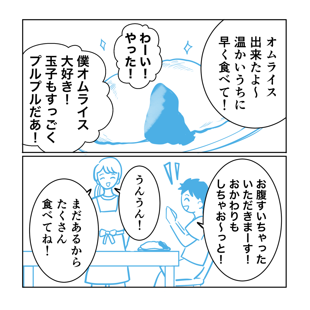
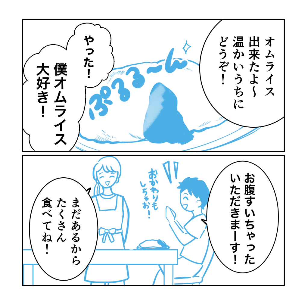
These two cartoons have the same scene and the same nuances in the dialogue, but don’t you think the screen is cleaner in the second one with less text?
When there are many things to explain, the dialogue tends to be long, but once you have “Is this dialogue really necessary?” .
It is also recommended to handwrite supplementary information outside the speech balloon or cover it with onomatopoeic drawn characters.
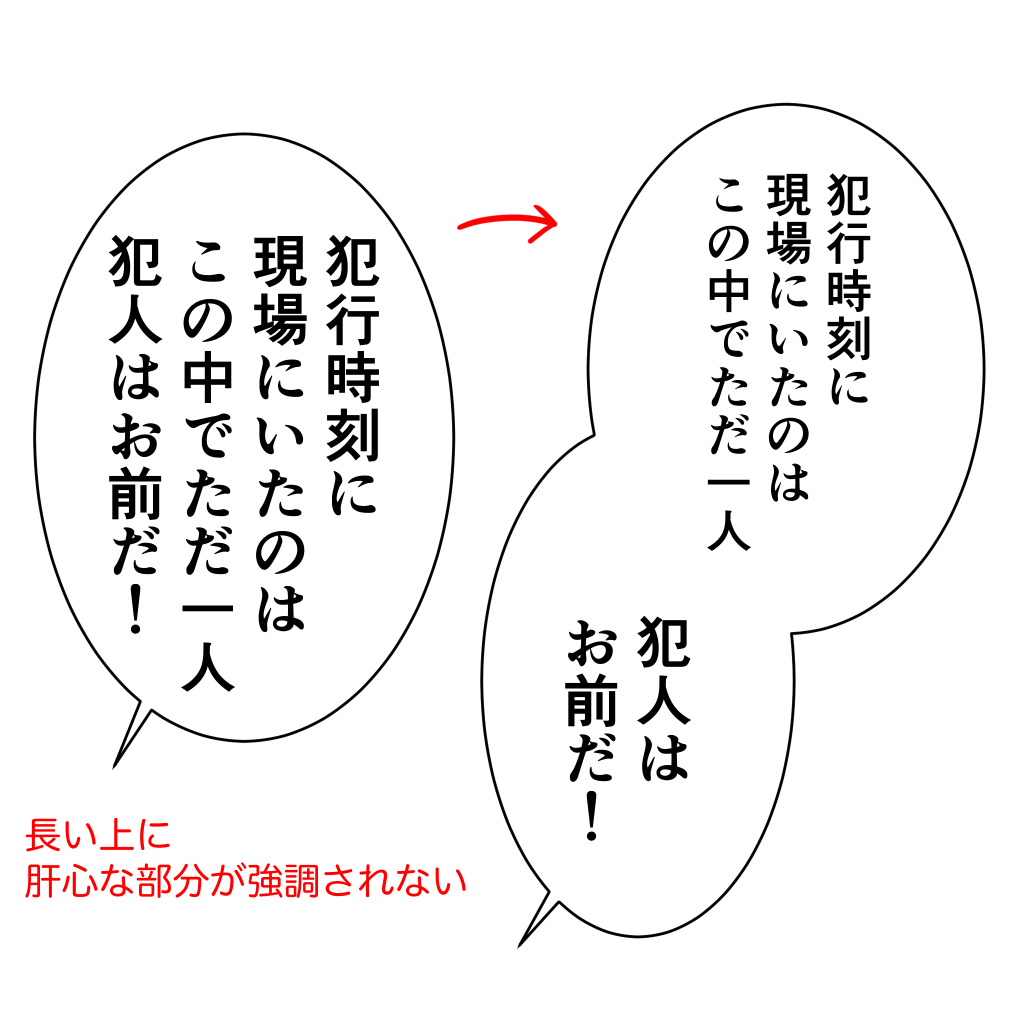
It is also a good idea to limit the length of a single speech balloon to about three lines.
If you use more than that, the reader will have a hard time following the dialogue.
For example, if you need to use long lines of dialogue in an explanation section, divide the speech balloon into two sections.
In many cases, the reader will be able to guess what you are saying by looking at the pictures without having to explain it in words.
You can also change the phrasing to reduce the amount of text.
4) “Pulled” and “Leaned” Drawings
There are many people who have trouble with so-called “face cartoons”.
Let’s try to be conscious of “pulling” and “leaning”.
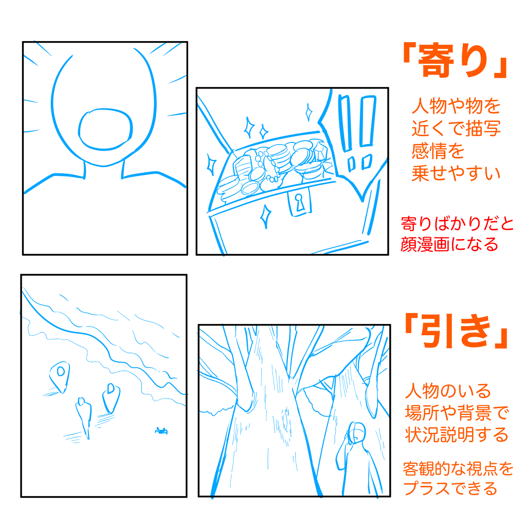
A “pull” is a picture that includes the background and the whole body of the characters.
A “pull” picture is one that includes the background and the character’s entire body, giving an objective view of the situation and surroundings.
Leaning in” is a close-up picture of the face, body parts, or bust.
This gives a clearer picture of the characters’ feelings and expressions.
In face comics, the only angle is the “leaning” angle, where the face looks good but monotonous, and the scene is not convincing because the surroundings do not change.
Let’s use a “pull” drawing to explain the situation.
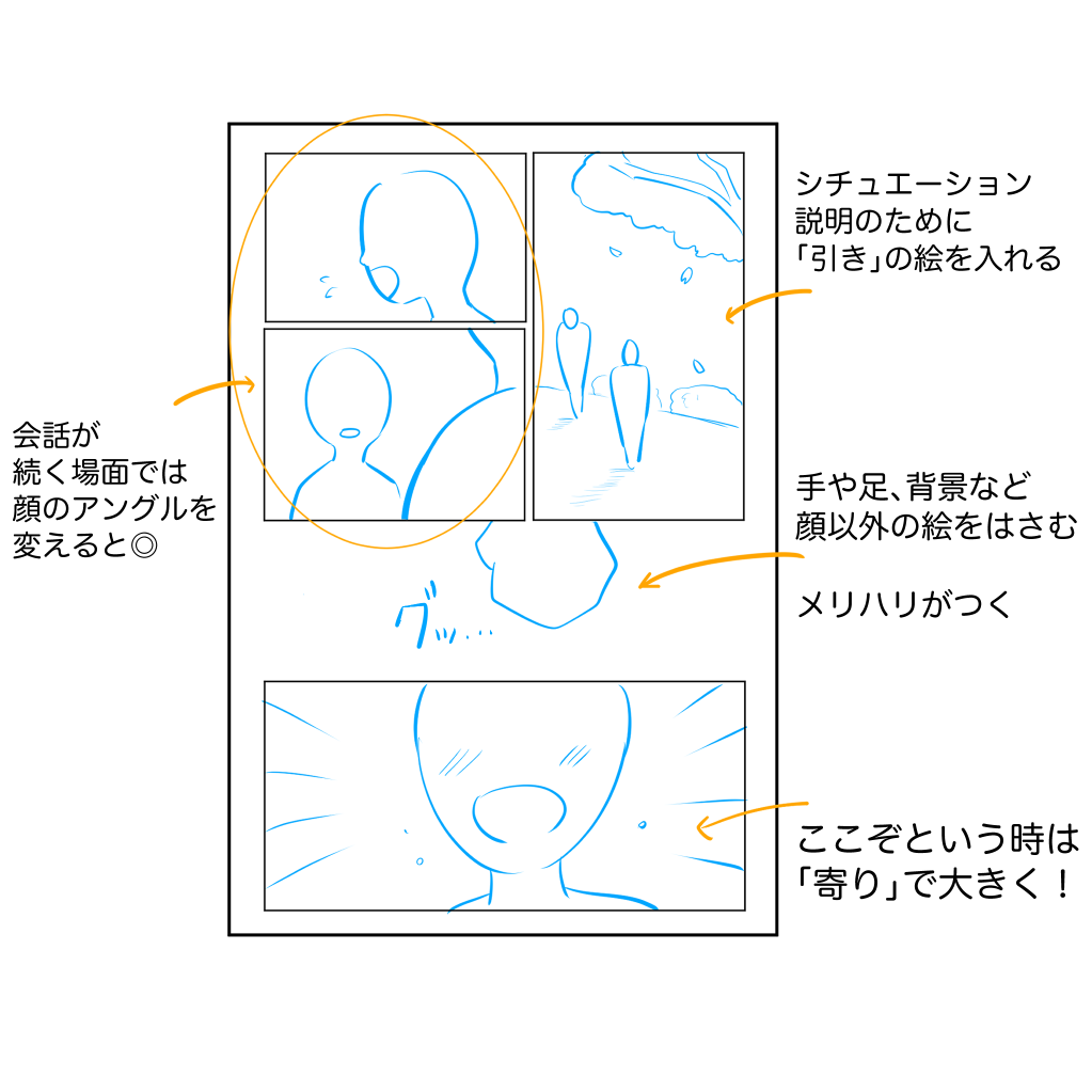
If you can’t draw a full-body picture or a background well, try to include a background in one frame of a page, or if a background is difficult, try to insert a picture of a small object or a tone.
5) Fascinate with “Decisive Sesame”
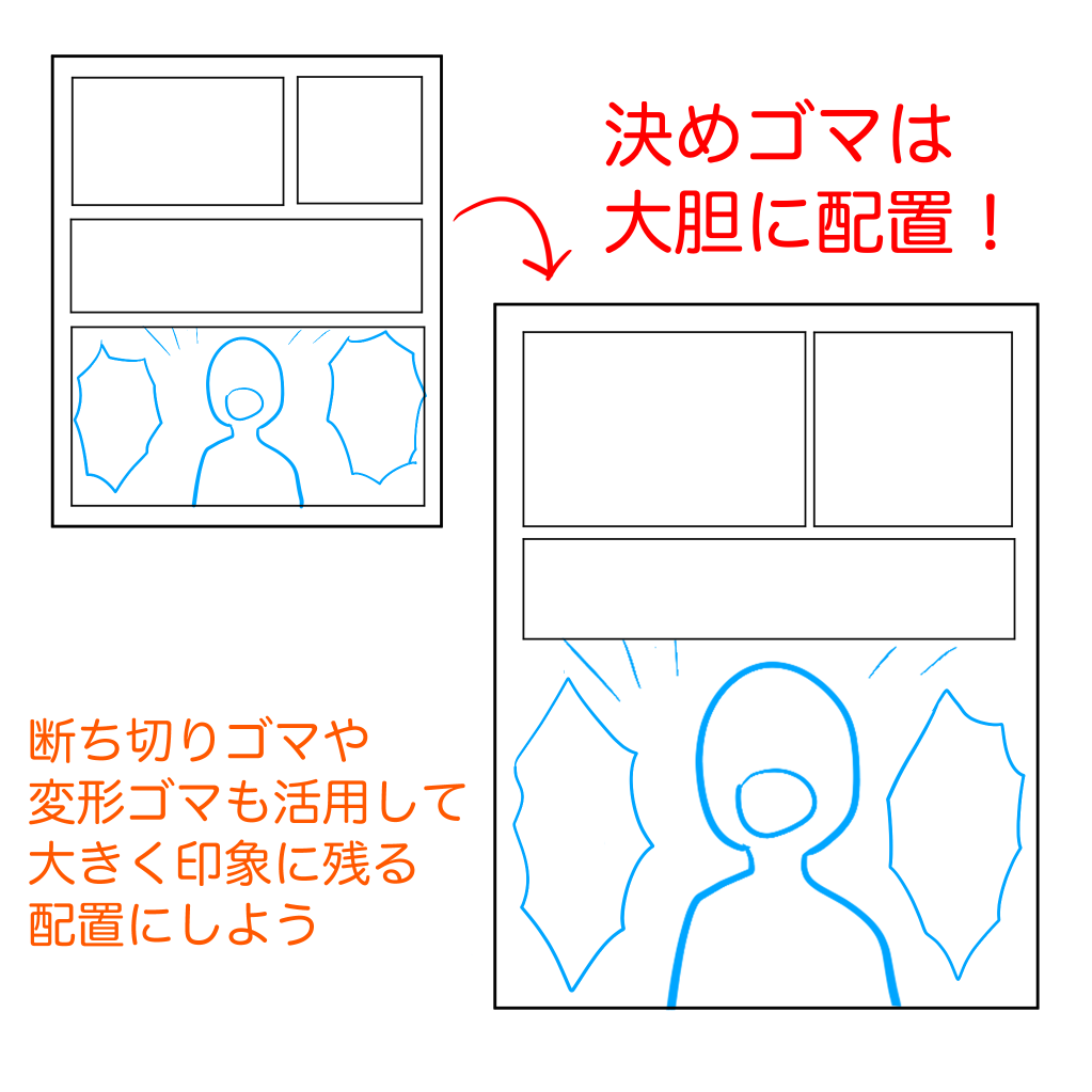
When you’re thinking of a story, you probably have one scene in mind where you think, “This is the part of the manga I want people to see! I’m sure you have at least one scene in mind.
It would be a shame if you have a certain scene in mind, but when it comes to the manga, you can’t make the most of it.
Let’s boldly create a climactic scene = decisive sesame! .
You can use more than half of the page to draw a large scene, or you can use the whole page.
In the case of a fanzine, you can even make it a double-page spread.
If you make your Decisive Goma more boldly than you think, it will increase the attraction to the reader.
It is also effective to make the panels before and after the Deciding Goma smaller to create a contrast.
6) Review the callouts
Although it is a small point, the placement of speech balloons is also a key to readability.
・Please pay attention to the height of the callouts.
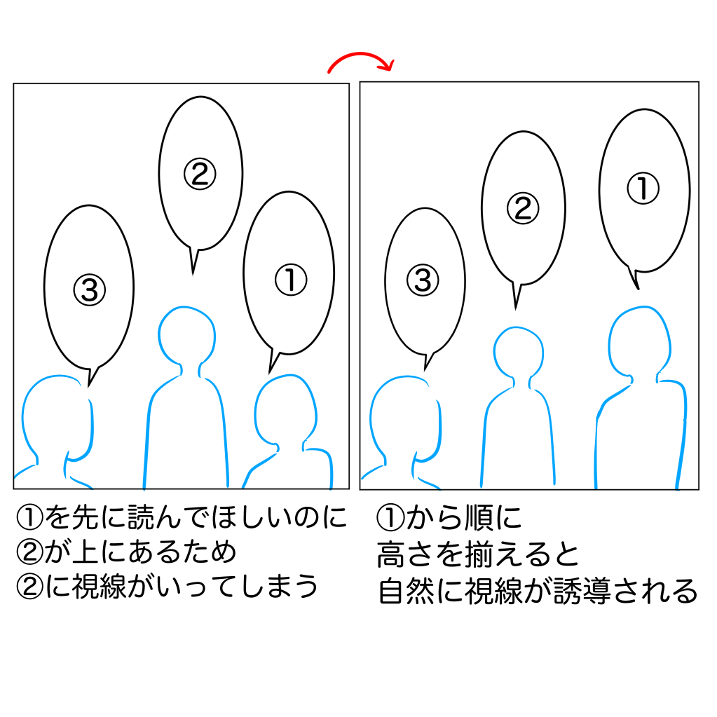
Two people are talking.
We want you to read them in the order of (1), (2), and (3), but if you are on the left, doesn’t the balloon in (2) catch your eye first?
This is because the balloon in ② is placed the highest.
If you want people to read your text from right to left, make sure that it does not exceed the height of the balloon to the right.
This will prevent confusion about the reading order.
・Does it have a horn?
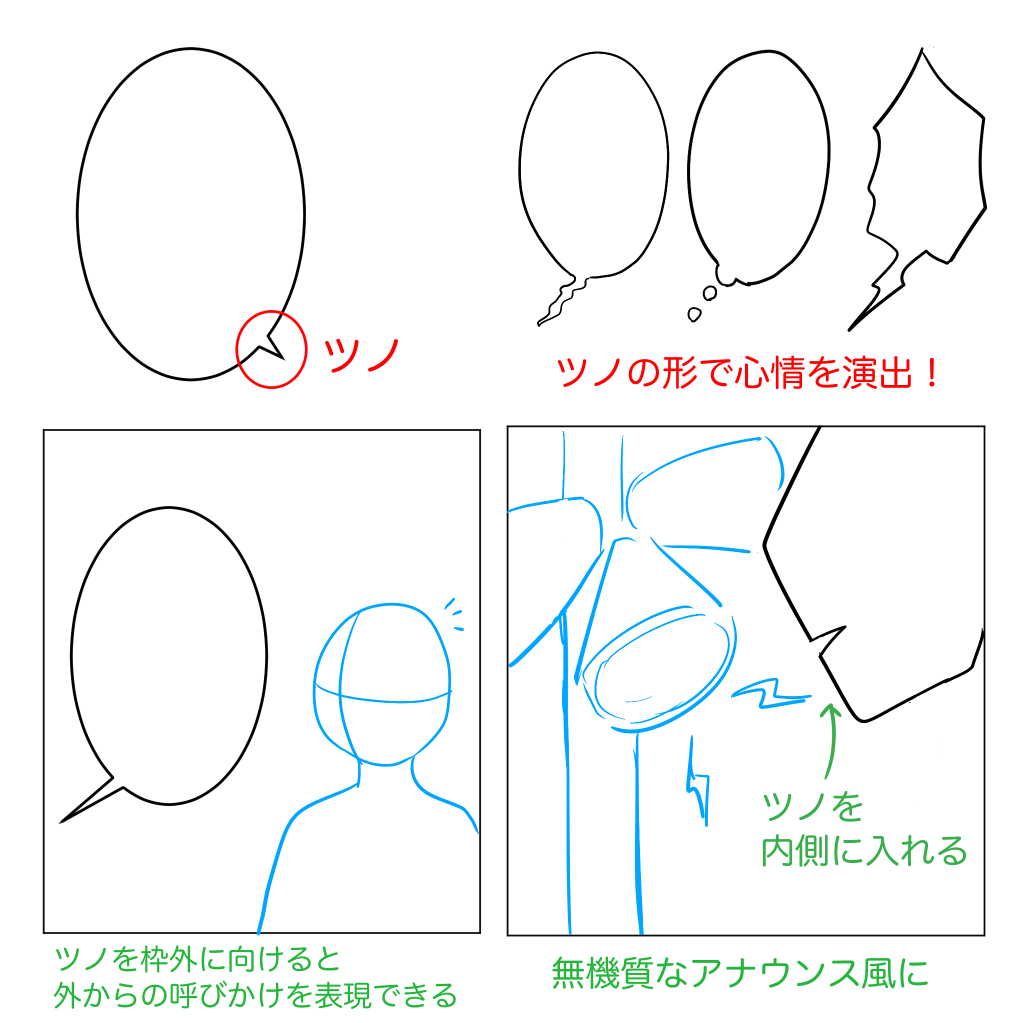
A triangular horn attached to a speech bubble.
It is meant to make it clear who is speaking by pointing it towards the person who is speaking.
Without the horn, it is still possible to guess who is speaking from the context, but especially in scenes where multiple people are speaking, it is easier to read if the horn is used.
You can also use the horn facing outward or inward to give the impression that the dialogue is spoken by someone off-screen.
You can also use the length of the horn to indicate the distance between you and the person speaking.
7) Mastering Drawn Characters
Drawn characters, the characters outside of the dialogue, are another very important element of a readable and interesting manga.
There are two types of drawn characters.
・Sub-speech, which is outside the speech bubble but says something important.
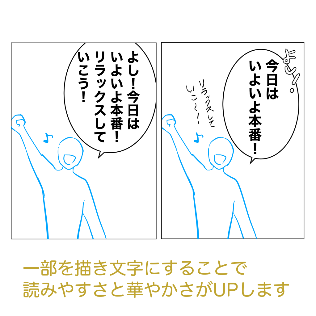
In the left image, all the lines are in the speech balloons, but in the right image, some of the lines are drawn outside the speech balloons.
In the right picture, some of the words are drawn outside the speech balloons. By drawing some of the words, the amount of dialogue in the speech balloons is reduced, and the decorative effect of the drawn words makes the speech more colorful.
It also emphasizes the important information that “today is the big day.
Drawn sub-lingual text is perfect for adding casual subplots and sentiments.
They make you look more sophisticated, so be sure to incorporate them.
However, don’t overdo it.
・Drawn characters representing onomatopoeia
Drawn characters that represent sounds.
There is a big difference between having them and not having them.
Rather than just drawing them with a pen, you can make them more effective by changing their shape and size.
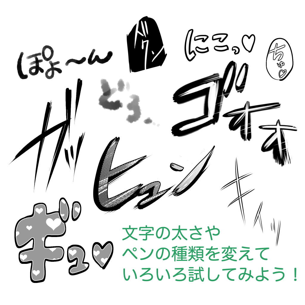
There are an infinite number of ways to draw, but choose the right line for the scene.
Swoosh! Swoosh! and so on for sharp sounds, and round and soft lines for popping and fluffy sounds.
As a recent trend, it is common to use tones or pictures within the text.
It’s a wonderful way to make a scene stand out more.
Drawn characters also have their own trends, so it’s a good idea to read and study the characters used by your favorite artists and in manga that you find easy to read.
I have introduced some techniques for creating easy-to-read manga.
If you are a beginner in manga production, please refer to this article.
(Text and pictures by Naoko Hara)
twitter:@nao_comic
twitter:https://twitter.com/nao_comic
\ We are accepting requests for articles on how to use /


