2022.08.17
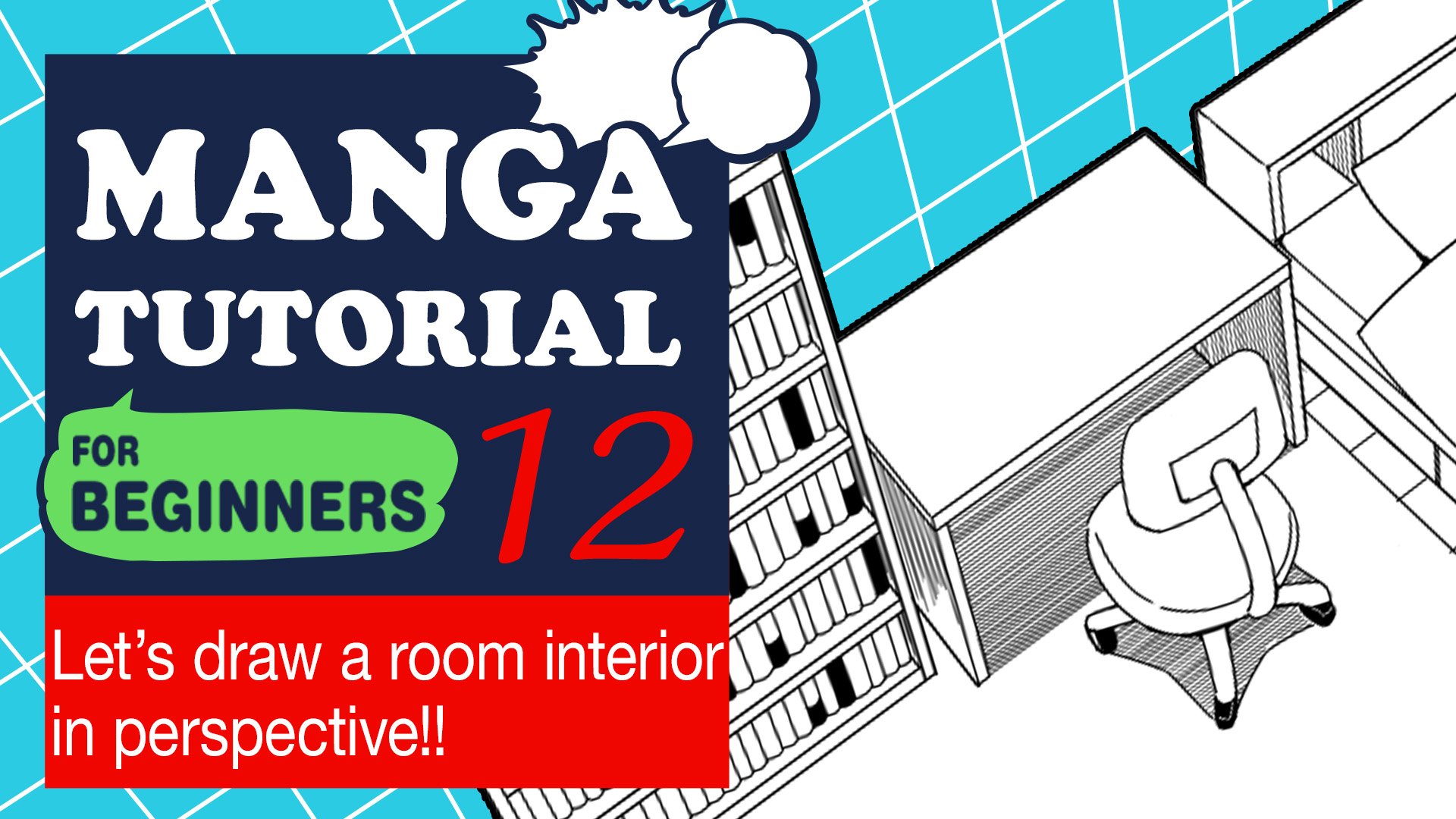
Manga Tutorial for Beginners 12: Let’s Draw a Room Interior in Perspective!
Hi, this is “ГФ”.
This time, I’ll show you how to draw illustrations —-a room in particular—- in perspective.
I’m not very good at drawing things in perspective. However at least I have knowledge pertaining to the basic rule of its law, so I hope this could help you understand it, even modestly.
Click Here for Previous Tutorials.
Manga Tutorial for Beginners 01 Process of Manga Making
Manga Tutorial for Beginners 02 Let’s Make Outline (Part 1)
Manga Tutorial for Beginners 03 Let’s Make Outline (Part 2)
Manga Tutorial for Beginners 04 Get Ready to Draw Manga with MediBang Paint!
Manga Tutorial for Beginners 05 Let’s Make Name(outline)
Manga Tutorial for Beginners 06 Let’s think about frame layout and screen.
Manga Tutorial for Beginners 07 Considerations when setting up the canvas.
Manga Tutorial for Beginners 08 Let’s draw frames and speech bubbles.
Manga Tutorial for Beginners 09 Let’s draw people and natural objects
Manga Tutorial for Beginners Vol.10 Let’s get the most out of brushes and materials
Manga Tutorial for Beginners Vol.11 Let’s draw easy artifacts. (Not in perspective)
What is perspective?
Perspective is a technique for illustrating things as we see them. Objects in the distance appear smaller and objects close by appear larger.
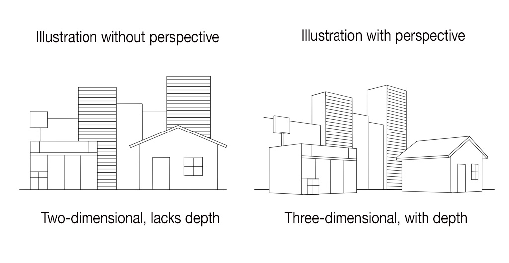
Illustrations without perspective would do well with no problem in comedy or essay comics. However when it comes to story comics (with modern settings, fantasy SF with a lot of buildings, in particular), that’s a different story. Readers of these comics would recognize perspective errors as negative factors. So you would well consider the technique of drawing backgrounds with perspective as an absolute necessity.
There are three types in perspective drawing method:
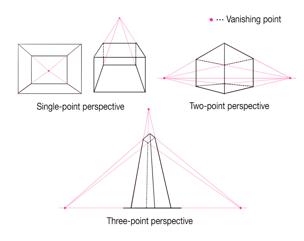
“Vanishing point” refers to a point where parallel lines in space meet.
Objects appear smaller as they get further away, and in the end, disappear. That point is called the vanishing point.
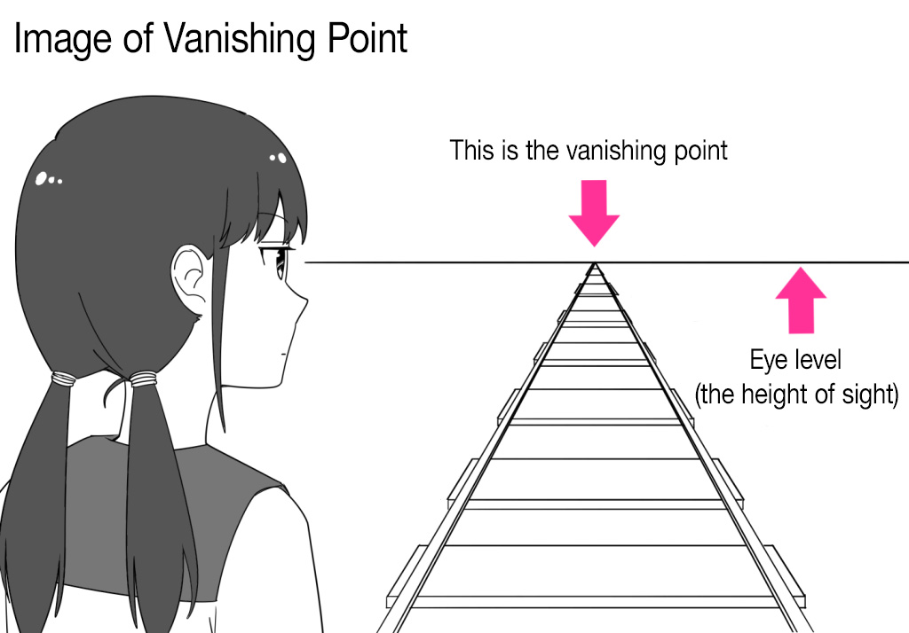
“Eye Level” indicates the height of the sight.
There’s always one eye level for one picture, same as the horizon. The vanishing point of an object on a plane parallel to the ground is always at eye level.
That means, vanishing points of objects like stairs, roofs, casement windows or doors, are not at eye level, since planes of these objects are not parallel to the ground.
Now, we shall start drawing the room.
Draw a room interior: Single-point perspective
The layout of the room we are drawing is like this, and it’s for one person.
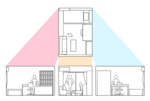
Firstly, draw a room in single-point perspective.
The picture view of the room drawn in single-point perspective will be one facing one wall.
Draw a rough sketch of it, with images of furniture or proportion in mind. You don’t have to be meticulous about accuracy of perspective at this stage. It’s enough if you could draw a freehand general layout.
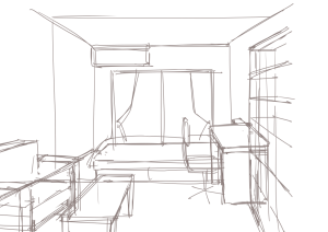
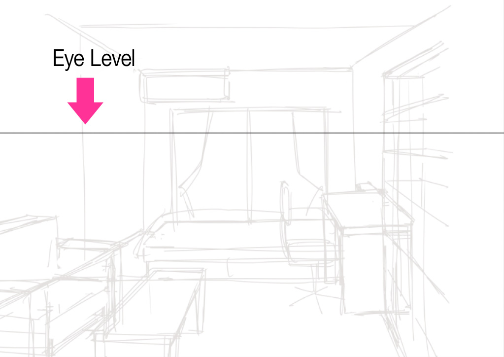
Add a new layer on the sketch, and draw a eye level line using “Crisscross Snap”.
You can decide the arrangement of the eye level by imagining the height of sight of your character standing in the room.
At this new layer, you only need to add the eye level line. Actual drawing will be on additional layers.
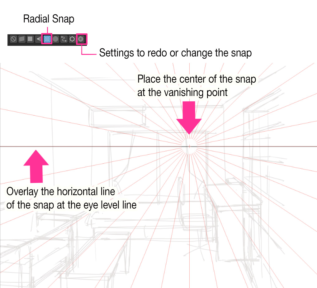
Then, set the “Radial Snap”.
As for the drawing in single-point perspective, set one vanishing point where the line of sight of the one who sees the room is focusing.
Set the radial snap so that the vanishing point is at the center of the snap. The snap settings can be adjusted using the gear icon on the right. Be aware that the horizontal line of the snap should overlap the line of the eye level.
Add a new layer and draw lines that will serve as clues. Start with walls.
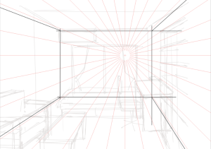
In single-point perspective, upright lines serve as vertical lines, lateral lines as horizontal lines, and depth lines as lines extending to the vanishing point.
Use “Crisscross Snap” to draw vertical and horizontal lines, and “Radial Snap” to draw depth lines.
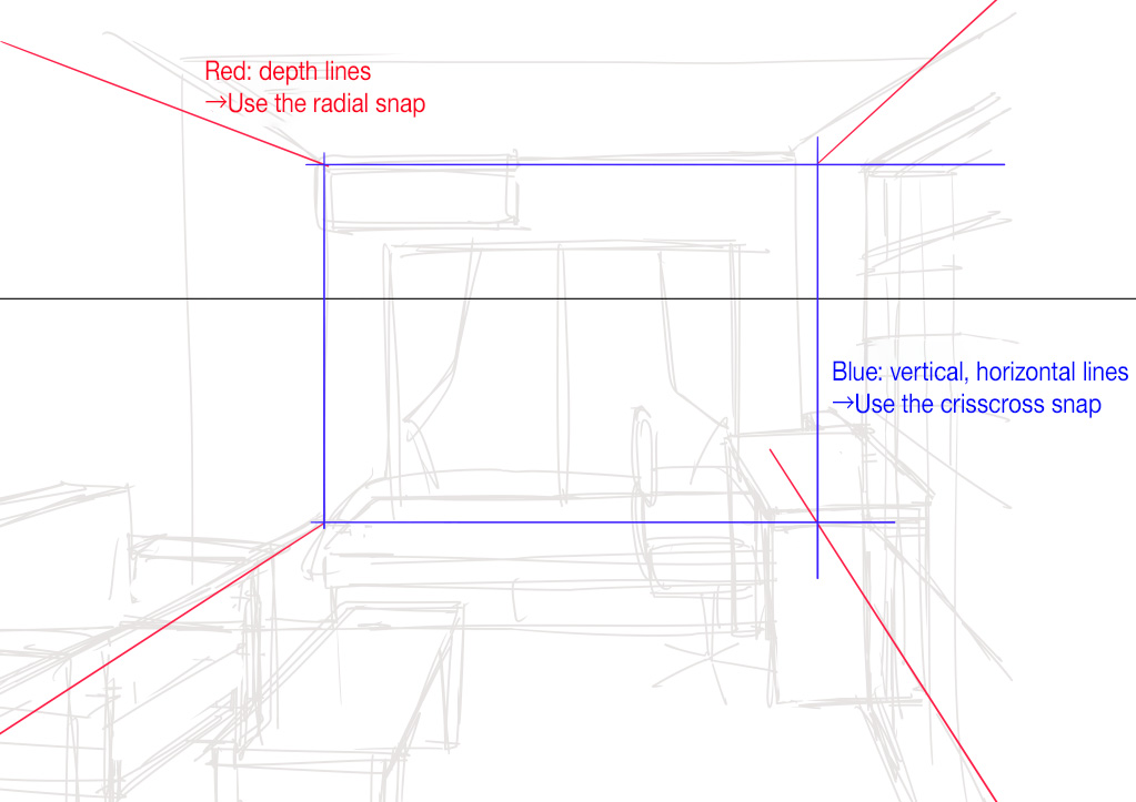
Referring to the rough sketch, draw a brief line drawing. This time, pay more precise attention to the size of furniture or proportions. This line drawing will work as a clue.
It could be effective to erase unnecessary lines or paint certain lines in a different color. The work would be easy to see.
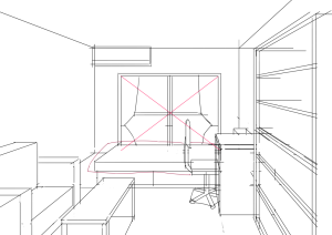
After drawing the clue lines, decrease the opacity of the layer. Then add a new layer to start drawing practical lines.
Use the snaps “Radial” and “Crisscross”, the same snaps used when drawing the clue lines, and start drawing details from objects in front, as if tracing existing lines. As you get used to it, you could skip the part where you draw the clue lines and start drawing right after the rough sketch.
Start with the bookshelf on the right.
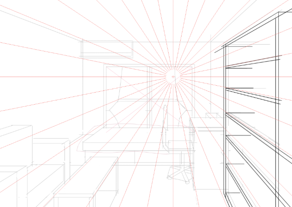
Finished drawing the shelf? Then, move on to the books on it.
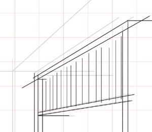
Draw vertical lines of the books using “Crisscross” snap, and…
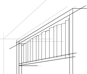
Draw round parts of the spines of the books freehand (or drawing a radial line on top of the books may help a good deal)
Different publishers and types of books have different heights and thicknesses, so avoid drawing them the same way and make them uneven to make them look more like bookshelves (You could set out several books of the same size so that they look like a series of works).
You can make it look more like a bookshelf if you draw some slanted or lying books.
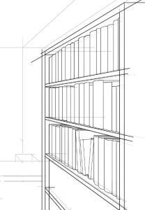
After drawing books, erase unnecessary lines.
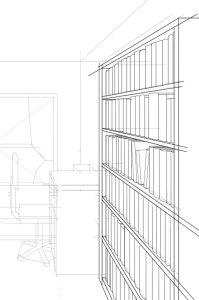
Hiding the clue lines makes it easier to find unnecessary lines.
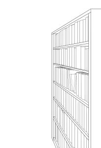
Then, move on to adding detail to shades and spines of books.
Same as the size, the design of the spines of books varies a lot, so drawing them randomly makes them look more bookshelf-like (Consolidate the design if you set out a series of books).
Also, painting some parts in black will make it look more sophisticated.
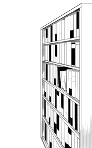
Now we’ve finished drawing the bookshelf. Start drawing other furniture in front to back.
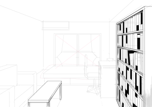
【Added table】
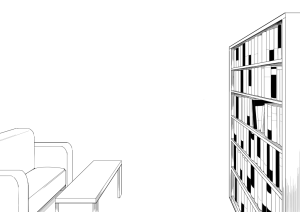
【Added sofa】
After drawing straight lines of the sofa, draw the curved lines freehand.
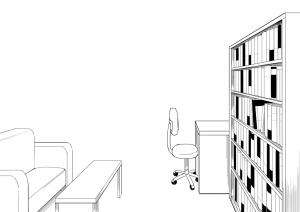
【Added desk and chair】
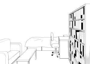
【Added bed】
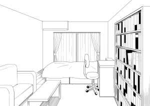
【Added window, walls, air conditioner】
The drawing of the room in single-point perspective has been completed.
We won’t go any further than drawing this time, but the quality can be enhanced by adding tones.
Draw a room interior: Two and Three-point perspective
Next, draw the same room in “Two-point perspective” and “Three-point perspective”.
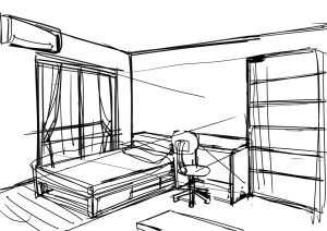
Two-point perspective is a scene with two walls, while three-point perspective is a scene where the same room is seen from above/below.
【Rough sketch in two-point perspective】
【Rough sketch in three-point perspective】
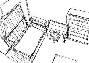
When adding vanishing points, set “Radial” snap individually. Set two snaps for two-point, three for three-point perspective.
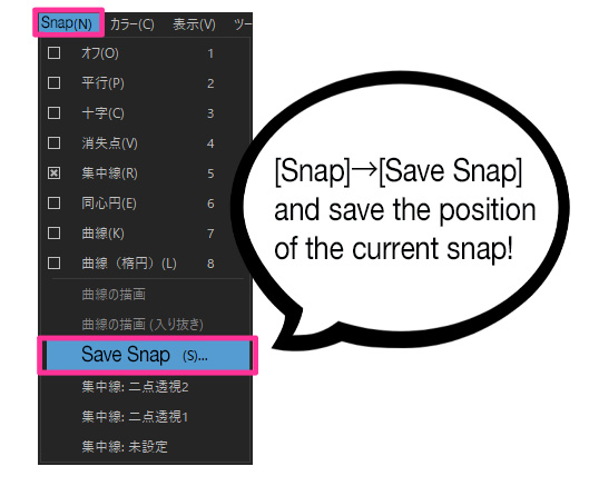
If you use multiple snaps, it is a good idea to save the snap settings in the “Save Snap” section of the “Snap menu”. That way, if you happen to delete a snap setting, you can quickly restore it. Also, since multiple snap settings can be saved, there’s no need to set up snaps each time you switch vanishing points.If you save the canvas in mdp format or save it to the cloud, you can use the saved snap settings when you close the canvas and then reopen it.
For two-point perspective,
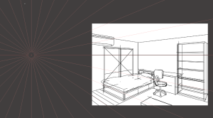
【Radial Snap1】
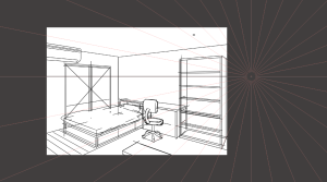
【Radial Snap2】
For three-point perspective,
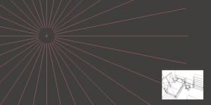
【Radial Snap1】
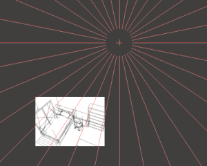
【Radial Snap2】
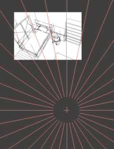
【Radial Snap3】
We’ve set up radial snaps like this.
And it’s totally fine to place vanishing points outside the canvas (Rather, in the case of two-point and three-point perspective, the more natural the background, the further away from the canvas the vanishing point tends to be).
Then, the same as we did in single-point perspective, draw clue lines using the snap and start drawing furniture in the front to the back.
【Two-point perspective】
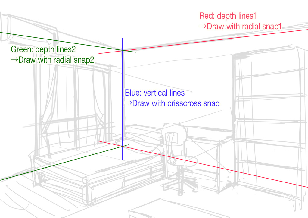
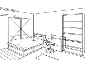
【Clue Lines】
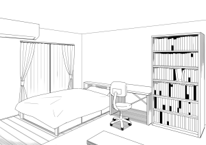
【Drawing Completed】
【Three-point perspective】
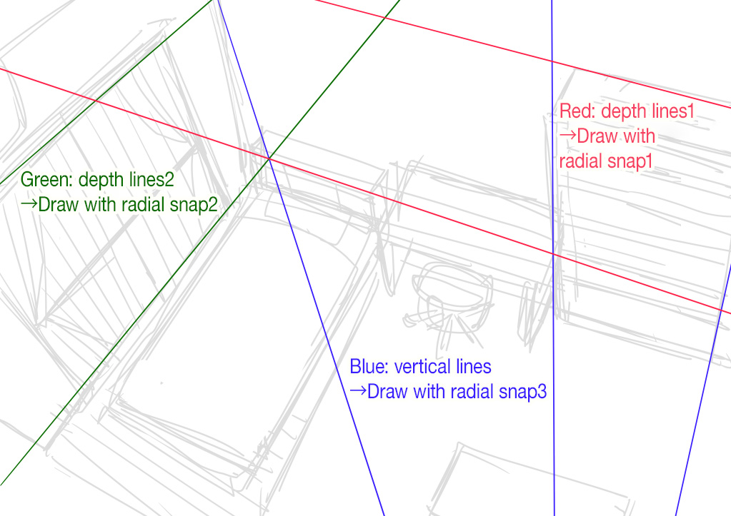
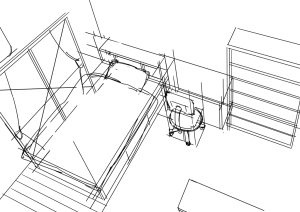
【Clue Lines】
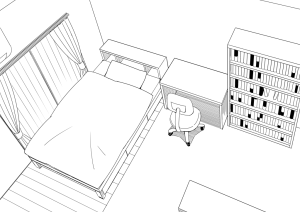
【Drawing Completed】
Add characters in the room
Add drawings of characters considering the proportion to the size with the furniture and the room.
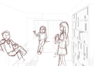
【Rough Sketch】
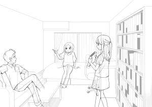
【Drawing (Clue lines omitted)】
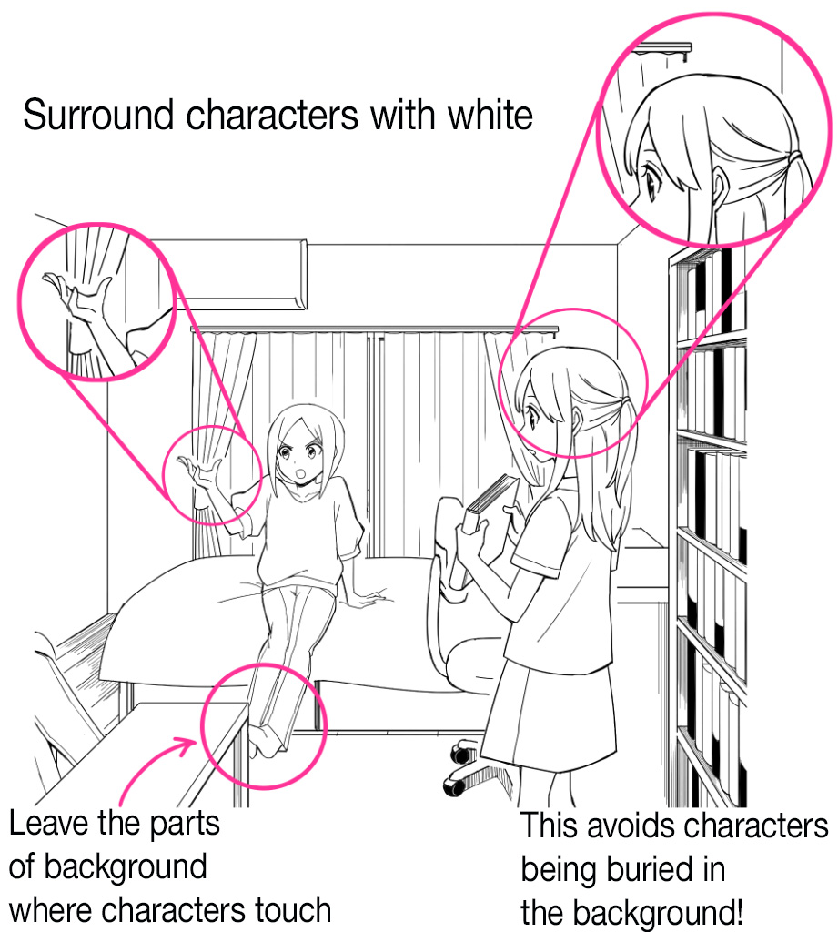
At the character line drawing stage, the details of the background that characters touch (in this case, the part of the futon or sofa on which characters are sitting) are added at the same time.
After drawing the characters, erase unnecessary lines like that of the background that overlaps with the characters. Add the mask layer if you don’t want to erase the background lines.
▼Here’s the article regarding using mask layers
Manga Tutorial for Beginners 08 Let’s draw frames and speech bubbles.
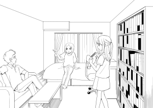
When you feel that the characters are hidden behind the background, you can highlight them by surrounding them in white.
Application: Draw anything you like
Once you have drawn a room interior, you are now able to draw streetscapes in perspective.
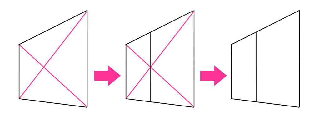
If you want to divide a square with perspective equally in two, do it like this. You can use this technique for drawing windows, etc.
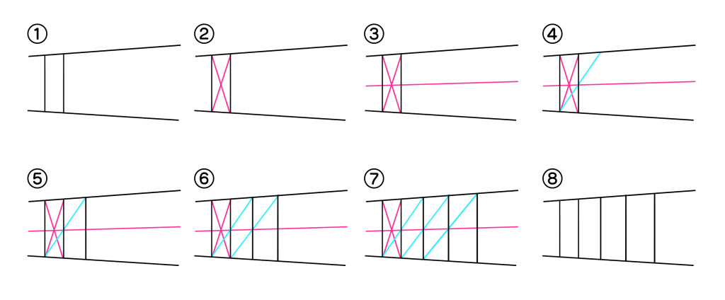
When drawing lines with equal intervals in perspective, such as fences, draw them in this way.
When there’s too many lines with equal intervals to draw, as in buildings with many windows or handrails, you can draw designs of flat surfaces on the other layer using the split brush, and paste them as textures with [transform] tool.
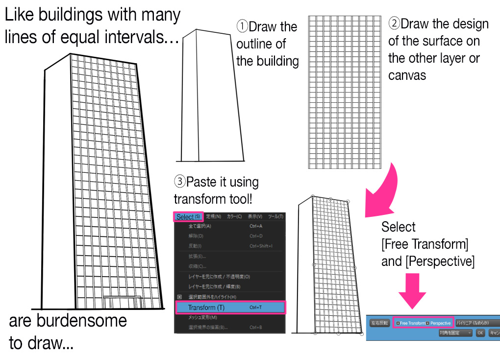
In this way, you can even draw the entire cityscape by creating boxes with various sizes in perspective, and pasting the surface design to them as a texture.
As for the stairs we’ve drawn in the last article, we can draw them easily with the notion of pasting textures to boxes with perspective.
▼This article helps a lot, although it’s about illustrations, as it shows how to draw backgrounds using surface designs as textures.
Using Textures! How to draw a beautiful background
Failure cases despite the appropriate use of perspective
Perspective is not always versatile.
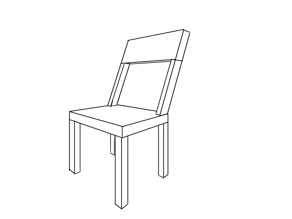
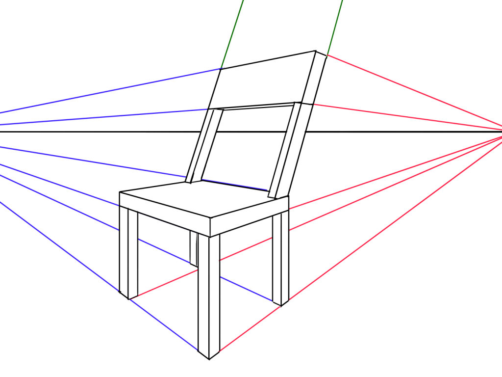
The image above is in accordance with perspective, but it looks distorted. Because their vanishing points are too close. Placing vanishing points a little further away and diminishing perspective will make the image look more natural.
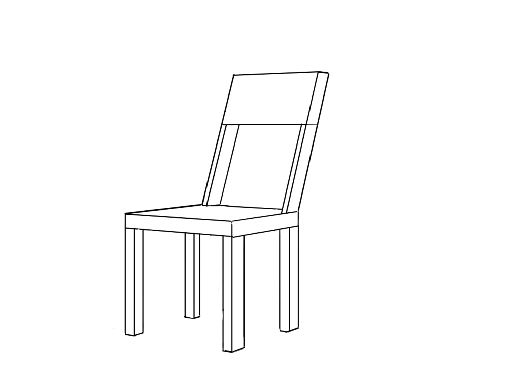
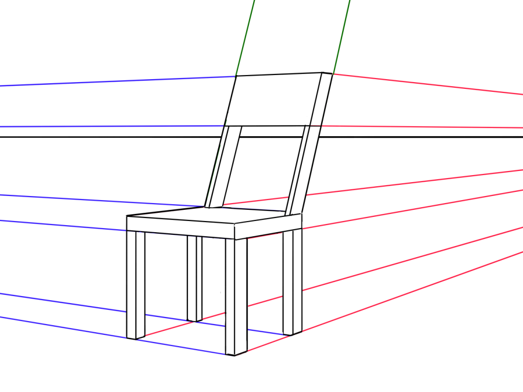
In addition, in drawing cityscapes, you might feel like drawing them like in the left image below. However in real life, it appears more planar as in the right image. This is called “Compression Distortion”.
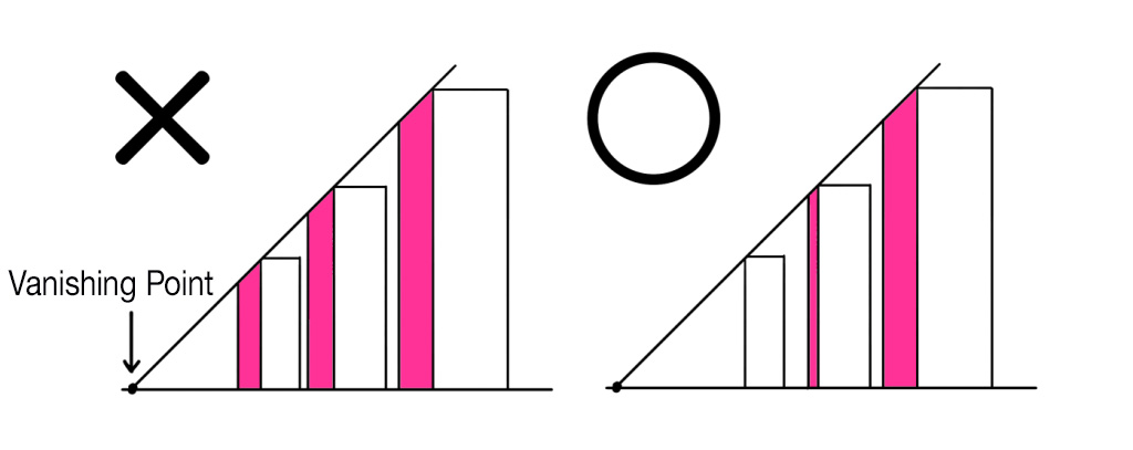
Compression Distortion refers to an effect that the greater the distance between what is seen and the person looking at it, the less depth is perceived = it appears flat.
Perspective emphasizes the depth of an image and is therefore effective when you want to create a three-dimensional or dynamic image. However, if you get too caught up in theory and use perspective on an image that should be rendered naturally, it can look unnatural.
It is important to be able to identify which images should be drawn with perspective and which should not.
This is the end of the tutorial.
Next tutorial is going to be about “Focus/Effect Lines and Lettering”!
Click Here for Previous Tutorials.
Manga Tutorial for Beginners 01 Process of Manga Making
Manga Tutorial for Beginners 02 Let’s Make Outline (Part 1)
Manga Tutorial for Beginners 03 Let’s Make Outline (Part 2)
Manga Tutorial for Beginners 04 Get Ready to Draw Manga with MediBang Paint!
Manga Tutorial for Beginners 05 Let’s Make Name(outline)
Manga Tutorial for Beginners 06 Let’s think about frame layout and screen.
Manga Tutorial for Beginners 07 Considerations when setting up the canvas.
Manga Tutorial for Beginners 08 Let’s draw frames and speech bubbles.
Manga Tutorial for Beginners 09 Let’s draw people and natural objects
Manga Tutorial for Beginners Vol.10 Let’s get the most out of brushes and materials
Manga Tutorial for Beginners Vol.11 Let’s draw easy artifacts. (Not in perspective)
「ГФ」
ART street
Click here for the collection: https://medibang.com/u/seledkapodshboi/
You can read my manga here → https://medibang.com/book/0c2101280307258390018866367/
This is also a manga that I draw under a different name. → https://medibang.com/comics/official/dobs340000005872400000000000a/
twitter: https://twitter.com/seledkapodshboi
\ We are accepting requests for articles on how to use /

